The ultimate guide to graph visualization
Everything you need to start designing your best graph visualization application.
Here’s a story about how we made World Cup predictions that (almost) came true.
After our successful prediction of the 2018 FIFA World Cup winners the sensible thing to do would have been to quit while we were ahead.
But where’s the fun in that?
We predicted which countries would reach the latter stages and who would win the 2022 World Cup based on the quality of the teams. We did this using only the shape of the network they make with other teams and clubs.
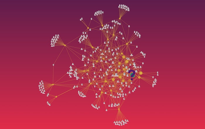
Read on to see which algorithm the theory is based on, and how our other predictions fared as the tournament progressed all the way to the final.
Skip to the end for the predictions, but first, a reminder of the approach. It’s truly an amazing result of graph theory that with just a little bit of information about the connections between things, you can make guesses about the things themselves. Let’s see how it’s done.
The official World Cup squads were announced on 14 November 2022, and published on Wikipedia.
The page contains data which you might use to measure the ‘quality’ of each player, including how many goals they’ve scored and how many international appearances they’ve made. But we’ll ignore this because I want to attempt to prove just how much we can do with the connections alone.
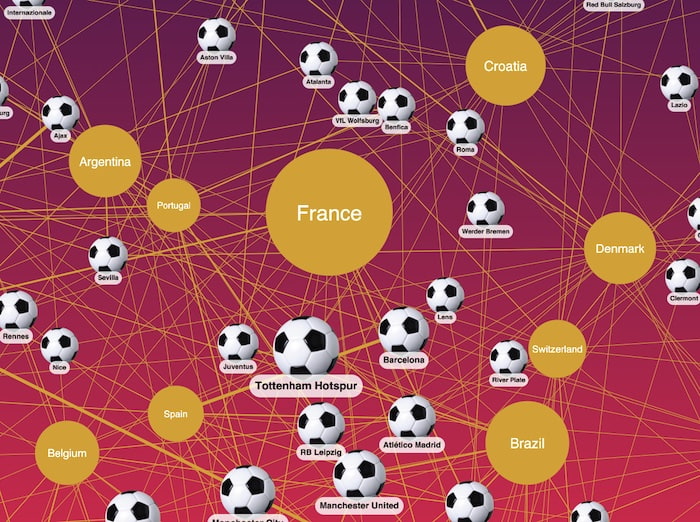
Instead, I’ll build a graph of football clubs linked to countries. If a club has a player who’s representing their country at the 2022 finals, then we draw a link between those nodes. For example if a Manchester United player is on the French squad, there would be a link between the France node and the Manchester United node:

That’s it. It sounds hard to believe that we can make World Cup predictions from this. We have no information about which teams or countries are more successful than others – we don’t even have the players themselves as nodes in our graph – they are simply ‘projected’ onto the links. Two teams are linked if they have a player in common.
The world is full of these small connections – every time you send an email, make a phone call or even walk past a wireless router with your phone in your pocket, connections are made. They seem innocuous on their own, but when you weave them into a network, and use graph theory to analyze that network, amazing patterns emerge.
I load this graph into one of our graph visualization toolkits (KeyLines or ReGraph – either will work) and add a few color choices. For fun, I style the clubs as soccer balls using the “cut-out image” feature. I’ll keep countries as simple text nodes.
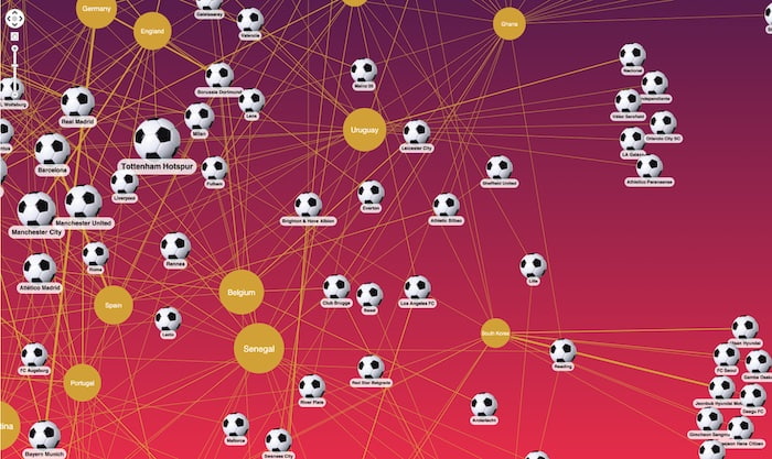
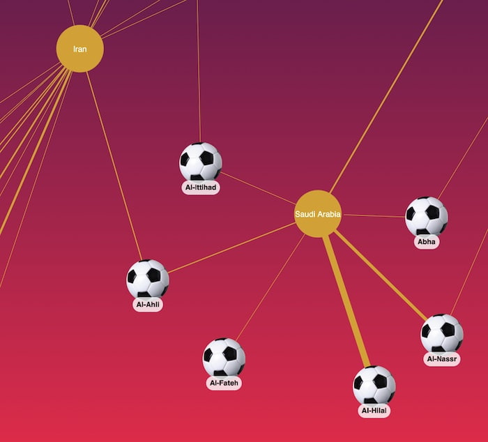
The width of the links reflects the number of players which make up the link. For example, the majority of Saudi Arabia’s players play for the same two clubs, shown with thicker lines:
To make the visualization more interactive, I’ve set up a rule so that when I click a node, the chart animates to a new view showing just that node and its neighbors. Top tip – to avoid ugly starbursts where one heavily connected node dominates the chart, remove the links completely when you’re showing an ‘egocentric’ view like this.
You may be wondering why some nodes are larger than others. They’re sized according to the eigenvector centrality (or eigencentrality) score of the node – a measure from graph theory about how important a node is in the network. If you’re new to graph theory, check out Social network analysis 101: centrality measures explained.
Teams like Costa Rica sit at the edge of the network and have low eigencentrality, because most of their players play for clubs that don’t share players with other countries.
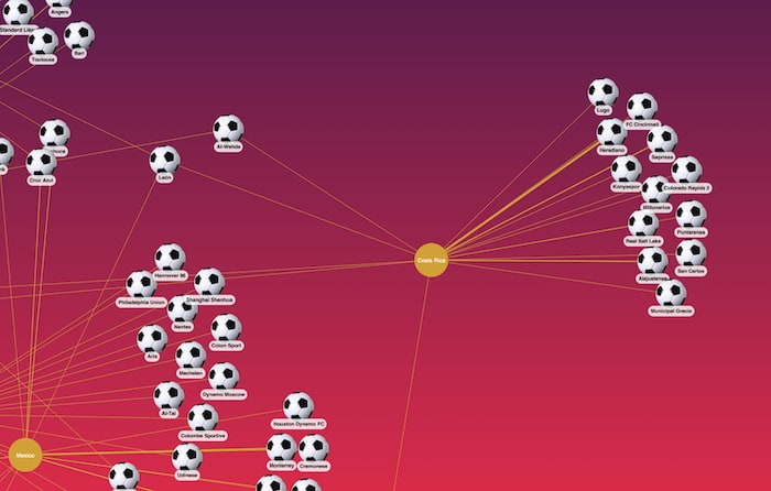
But other teams sit right at the center of the graph – they have a higher eigencentrality score, meaning that their players play for clubs which are more international and boast more players from other countries who, in turn, are also well-connected.
In 2018 we used this eigencentrality score to make a prediction about the top five teams to watch. Not only did three of those five teams make it to the semi-finals, our top scoring team, France, went on to win the trophy.
Well, if you’re French, the good news is that your team is still top of the ranking in 2022!
Here’s our top five predictions for this competition and the previous one. Teams in bold were eventual semi-finalists.
| Eigencentrality rank | 2022 predictions | 2018 results |
|---|---|---|
| 1 | France | France |
| 2 | Brazil | Belgium |
| 3 | Croatia | Germany |
| 4 | Argentina | Argentina |
| 5 | Denmark | Croatia |
So there you have it. Graph theory tips France to win a successive World Cup trophy this year. And Brazil and Denmark could be sides to watch – they’ve shot up the rankings since last time.
Although predicting sporting tournaments isn’t something we recommend you take too seriously, this kind of analysis is crucial in a huge variety of applications, from security and intelligence to fraud investigations.
If you’d like to build similar applications, contact us for a free trial of our toolkits.
As we head towards the business end of the competition, how are our World Cup predictions doing?
The bad news is that our fifth choice team, Denmark, went out at the group stage. But the good news is that our top four teams made it safely through their round of 16 knockout games and into the quarter finals:
Netherlands v Argentina
Croatia v Brazil
Morocco v Portugal
England v France
Notice that two of our top four teams play each other, so we’ll definitely lose at least one more team as we approach the semi finals. Who’s it going to be?
And will Mbappé, Giroud & co beat England to keep our winning prediction alive…?
So three of the four teams that made it through to the semi finals were in our top 4 World Cup predictions:
Croatia v Argentina
Morocco v France
We’re eagerly awaiting the final to see whether our top 4 prediction, Argentina, will be victorious, or if France – the team we tipped to win from the start – retain their world champion status.
After 64 games involving 32 teams, Argentina were crowned FIFA World Cup winners 2022. Our predicted winners – France – were worthy runners up, but graph theory just missed the mark this time. We did successfully predict a third place finish for Croatia though!
To recap, the prediction was based solely on connections, not player stats or squad performance history. The theory is that teams containing footballers with the most international connections would perform better than those whose players were in teams mostly populated with fellow domestic players. For this we used Eigenvector Centrality to score each national team with how many international connections it has.
We end up with a score that ranks every national team from the most international to the least:
| Eigencentrality rank | 2022 predictions |
|---|---|
| 1 | France |
| 2 | Brazil |
| 3 | Croatia |
| 4 | Argentina |
| 5 | Denmark |
| 6 | Senegal |
| 7 | Belgium |
| 8 | Uruguay |
| 9 | Germany |
| 10 | Switzerland |
| 11 | Spain |
| 12 | England |
| 13 | Portugal |
| 14 | Netherlands |
| 15 | USA |
| 16 | Morocco |
| 17 | Ghana |
| 18 | Poland |
| 19 | Cameroon |
| 20 | Japan |
| 21 | Wales |
| 22 | Serbia |
| 23 | South Korea |
| 24 | Canada |
| 25 | Ecuador |
| 26 | Mexico |
| 27 | Iran |
| 28 | Costa Rica |
| 29 | Australia |
| 30 | Tunisia |
| 31 | Saudi Arabia |
| 32 | Qatar |
Of the teams in the bottom half of the list, only four of them made it out of the group stages. But there was a clear correlation between being in the top half of the table and making it through to the later rounds.
There were some shocks and outliers along the way. Denmark (ranked 5th) finished bottom of the group, while Belgium, Uruguay and Germany (7th, 8th and 9th) fell far short of their predicted success. Morocco (16th) made it to the semi-finals, eventually finishing fourth.
Our top four made it to the quarter finals. Three of them played in the semi finals before the teams ranked 1st and 4th faced each other in the final. It took extra time and penalties before Argentina were crowned winners, so France lost by the closest margin.
We’ll probably try again in 4 years’ time, but until then, we’ll be helping customers apply graph theory in more practical and effective ways. Finding insights in connections is what our toolkit technology does best – for use cases ranging from fraud detection to law enforcement, supply chain analysis to network infrastructure management.
To kick off your graph visualization journey, request a free trial.