Upcoming and on-demand events
Join our upcoming events or explore our library of on-demand webinars.
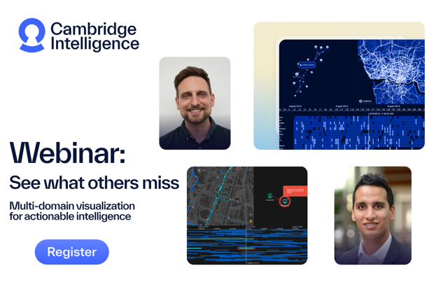
Upcoming events
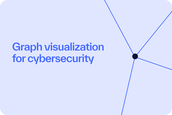
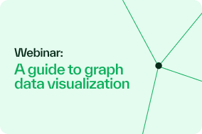
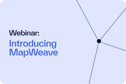
On-demand events
Frequently asked questions about Connected Insights
What is Connected Insights?
Connected Insights is a customer-only series of conversations and training sessions to help you maximize your investment in graph technology.
They’re a great chance to see what we’re working on, influence our product roadmaps and learn something new about connected data visualization.
Why should I join these sessions?
The Connected Insights series is all about helping our customers do more with connected data visualization. They’re free, concise and expert-led sessions addressing specific topics, so it’s a great opportunity to learn something new.
But it’s also your chance to give direct feedback to us – on our products, roadmaps or any other issues you want to discuss.
Who should attend these sessions?
Anyone who designs, builds and deploys connected data visualization applications. Product Managers, UX/UI designers, front-end developers and commercial leads are all welcome.
Some technical sessions are better suited to developers. See the ‘who should attend this session?’ information on the individual event listings for details.
Are the sessions open to non-customers?
Sorry, no. The Connected Insights series is exclusive to Cambridge Intelligence customers only.
If you’re not a customer but would like to be involved, get in touch with our team. We might be able to schedule a separate session with you.
Where will the online sessions take place?
We’ll use our online events platform, Livestorm. You can join the meetings from any browser – there’s no need to download anything. Learn more about Livestorm’s technical requirements.
I can’t make the time, are the sessions recorded?
To encourage free-flowing conversation, we don’t plan to share Connected Insights session recordings. Instead, we’d encourage you to join the live meetings and get the full experience!
If that isn’t possible, we’re happy to run a specific session for you and your team. Get in touch if you’d like to arrange a one-on-one briefing.
Will there be in-person meetings?
Yes! Keep an eye out for future events near you. If you think we should visit your city, let us know.