The date is 1345. The place is the medieval manor of Redgrave in Suffolk, England. The feudal system means peasants have to work the land that’s controlled by rich nobles and clergy.
As if being a lowly peasant on the lowest rung of the social ladder wasn’t bad enough, the argument you’ve had with a neighbor has landed you in court. And if you manage to survive the next few years, you’ll have the Black Death to contend with.
The period of English history that inspired Game of Thrones probably isn’t the first thing you’d associate with our graph visualization products.
Applications built with our technology help analysts ‘join the dots’ in connected data. That data can feature anything – from cyber threats to email traffic, financial transactions to business intelligence networks.
Thanks to historical court records involving the peasant community, we can just as easily visualize connected data that features a medieval social network.

In this blog post, we’ll bring a medieval community to life. Our graph visualizations will help us gain insight into network connections through lawsuits. We’ll demonstrate how clever styling and filtering, combined with powerful social network analysis, can tell us more about the fascinating evolution of a peasant network over time.
Modeling medieval records
The dataset started as original court records for the manor of Redgrave in England from 1289 to 1364. There was work to do on the raw data first, starting by transcribing 28,700 entries from 425 court sessions. More analysis and consolidation of the 74,300 names mentioned gave us just over 7,000 peasants.
Each peasant has been assigned to one of three categories, depending on their landholding status. We’ve color-coded chart items so they’re easier to spot:
- Orange nodes – peasants that don’t hold any land on the manor
- Green nodes – peasants that are tenants holding land on the manor
- Blue nodes – peasants that act as officials for the lord of the manor
- Red links – connections that involved lawsuits
- Grey links – known connections that didn’t involve lawsuits
Using time durations to filter large datasets
To make sense of our 7,000 nodes, we’ll apply the organic layout because it’s optimized for great performance on large datasets. We immediately get a sense of the network structure.
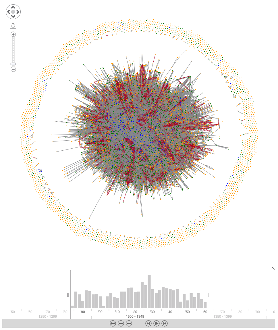
With larger components in the center, it’s easy to identify the predominantly red areas representing high concentrations of lawsuits between peasants.
The layout is great for presenting the sheer volume of data we’re dealing with. If we want to focus on individual relationships at node level, we’ll need to filter out some of the noise.
One way to do this is using the interactive time bar component. It can show only the events that occurred during a certain time period, in this example, just the relationships that existed in the year 1290.
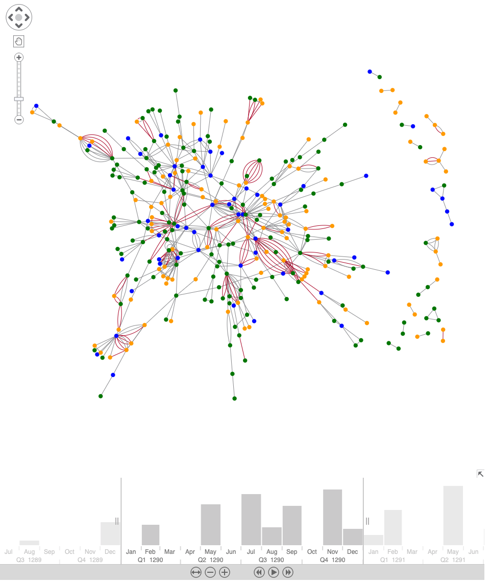
We have a much clearer view of the data, but there’s still room for improvement. Notice there are several places where multiple interactions involving lawsuits exist as individual links between the same two nodes, making the chart busier than it should be. Let’s find a better way to represent them.
Aggregating and styling links
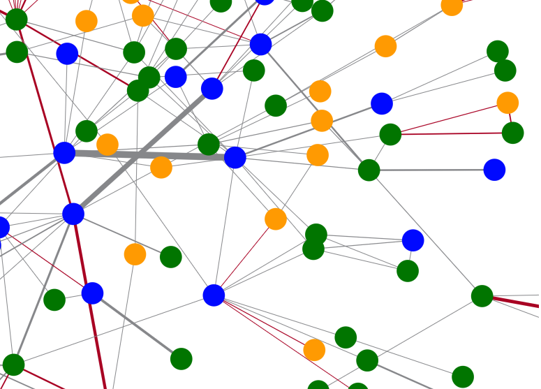
We can simplify the chart by grouping recurring connections between nodes into a single link. We don’t want to lose sight of the important information – the fact that multiple lawsuits involving the same two peasants exist – so we’ll preserve this by setting the link width accordingly.
Now we’re happy with our visualization styling, we’re ready to start spotting patterns and trends through social network analysis.
Analyzing a 13th Century social network
Our visualization products come with built-in network algorithms to help you understand social network behaviors and interactions. These social network centrality measures are ideally suited to tightly-knitted, small-world networks like our peasant community.
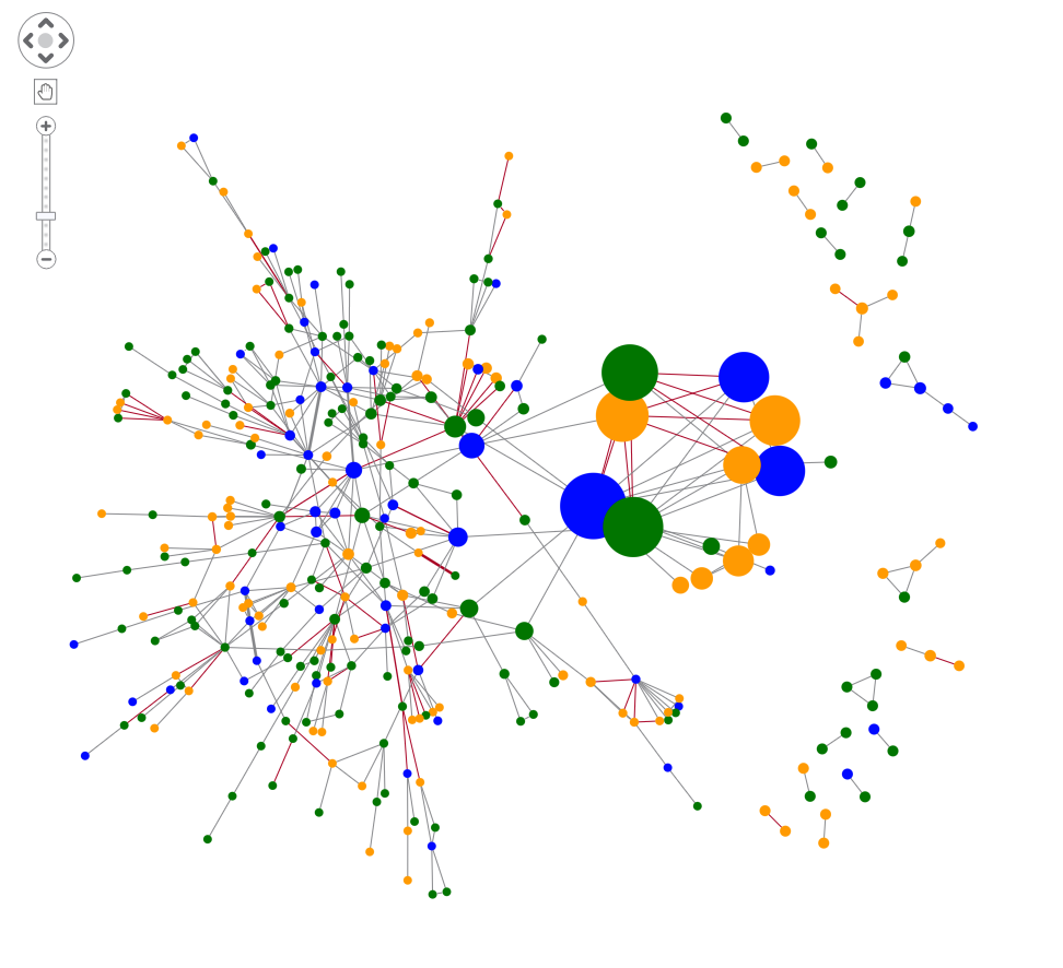
Running degree centrality helps us find peasants with the highest number of connections, and potentially the most influence or strategic importance.
To make the results clearer, we’ll also size the nodes according to their degree score.
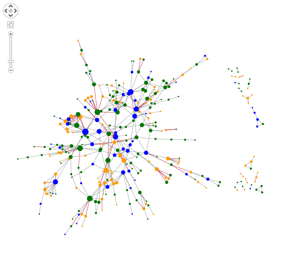
The larger blue nodes tell us that although there were fewer officials, they generally had a larger number of contacts. Their status as representatives of the manor may have given them more reason to be socially active.
The number of smaller, orange nodes indicate that peasants who didn’t hold any land had fewer interactions with the rest of the network.
Let’s try another social network measure: eigencentrality. This focuses on the number of links each peasant has, and the number of links their connections have, and so on. It’s another way to identify influential nodes, but this time taking into account connections across the entire network.
The results show a small number of peasants from all three statuses are connected to highly-connected individuals. It’s a good way to quickly identify which network nodes warrant the time and resource to investigate further.
For now, we’ll stick with our high-level investigation and see if we can spot any regular behaviors.
Identifying legal patterns and trends
Let’s focus solely on peasants connected by lawsuits in 1290.
Here, we’ve sent all other connections to the background and applied lens layout to push more densely-connected nodes to the center.

This seems to back up historical facts: lawsuits between officials were quite rare. It was much more common for peasants of different landholding status to take each other to court, so nodes of different colors are more likely to be connected by red links.
Need help understanding your graph data?
There’s insight to be discovered in every network – from a 13th-century peasant community to a 21st-century social networking platform. The tools and techniques provided by our graph visualization products help users find meaning in data and customize results.
Your data probably isn’t over 700 years old, but it might still need bringing to life. Ready to get started? Request a free trial of our data visualization toolkits.


