You’ve seen them before – those tangled network diagrams that look like a big cable-knit sweater that someone keeps knitting, and knitting. Visualizations that should illuminate insights end up obscuring them, turning potential breakthroughs into sources of frustration. But it doesn’t have to be that way.
With the right approach to graph visualization UX and UI, even the most complex visualizations can become intuitive tools for discovery – not frustration. Let’s explore how thoughtful design transforms graph visualizations from overwhelming to empowering.
- What’s the difference between graph visualization UX and UI?
- Understanding the unique UX challenges across visualization types
- Core UX principles for effective graph data visualization
- Deep dive: UX in graph visualization
- Leveraging color effectively
- Accessibility in graph visualization UX
- Accelerating visualization UX with our Figma Design Kit
- Video guide to graph visualization UX
The difference between intuitive and confusing graph visualization UX (user experience) can mean the difference between detecting a security breach in minutes versus missing it entirely. Great UX combined with well-designed UI (user interface) transforms complex, interconnected datasets into clear, actionable insights that drive better decision-making.
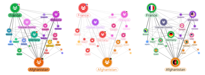
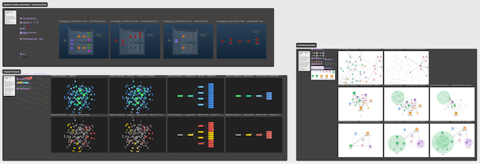
User-centric design practices make data visualization accessible to anyone, whether or not they have a technical background. They focus on users rather than business demands. In this example, we’re looking at the same network to understand it in different ways, toggling between “Impact Analysis” and “Alerts List” views:
Modern design tools like the Figma Design Kit are revolutionizing how teams approach this challenge, streamlining the visualization design process and keeping everything consistent across complex data applications.
What’s the difference between graph visualization UX and UI?
Though they’re often used interchangeably, UX and UI play distinct (but intertwined) roles in graph visualization. They’re each critical to creating tools that users love, rather than merely tolerate.
UX: Meeting real user needs
UX is about how users feel when interacting with your visualization. To understand their needs, UX asks questions like:
- Is this interface familiar to people within the field?
- Have we tested for user pain points in our designs?
- Does this prototype have the functionality the user needs?
- Are we providing more visible insights than our competitors?
- Could alternative layouts, icons or tooltips improve the user experience?
For graph visualizations, the signs of good UX are:
- Effortless understanding of complex relationships
- Fast understanding of hierarchy and flow
- Intuitive controls, like filtering, zooming, changing views or expanding nodes
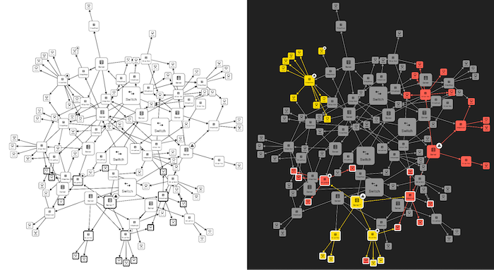
And it takes careful UI design to make that possible. While a straightforward chart like a wireframe for a website might be easy to comprehend, graphs usually depend on styling to build UX comprehension. Taking the same example as before, how much can you understand from this network graph in UX wireframe form, compared to the customized version?
UI: The interface and interactions
The visual and interactive elements you see in the graph on the right are part of the UI – the color scheme, typography, icons, buttons, layout, and transitions. UI is about making sure that:
- Elements are well-aligned and readable
- The interface supports smooth, expected interactions
- Colors are accessible
- Animations are informative and don’t just add clutter
- Styling choices such as drop shadows and color variety are optimized for legibility
It’s easy to see how important UI is for graph visualization, and how damaging it can be when it’s handled badly. Imagine a view where node labels are covering each other, colors have no particular meaning, or heatmaps are so dense they hide important information. Even if your UX is strong, bad UI will sabotage your project. And one of the biggest culprits is clutter. Remember to give your nodes room to breathe!
Why you need both
Let’s say you’re building a support analysis tool.
A strong UX ensures users can access a variety of appropriate layout options, drill into support cases through layered views, reveal any suspicious patterns and find out vital information about them at a glance.
A good UI ensures critical information is intuitively highlighted, cases group and ungroup logically through clean animations, and potential next interactions are obvious.
If either UI or UX falls short, then legibility, trust and confidence in your visualization will suffer.
Understanding the unique UX challenges across visualization types
Different visual formats bring distinct challenges in data visualization. Let’s look at some common UX issues for graph, timeline and geospatial visualization, and find out how you can adapt your approach for each one.
Graph visualizations
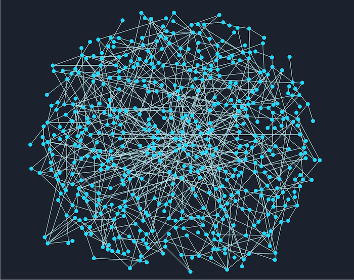
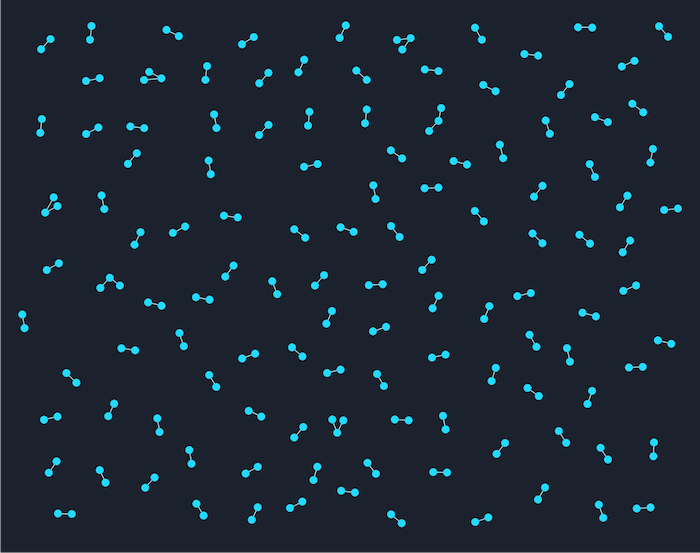
When there are too many or too few connections in your data, the structure of your graph will be impossible to visually dissect. The three most well-known visualization issues are hairballs, snowstorms and starbursts.
Hairballs
When all your entities are heavily connected, the screen can fill with nodes and links in a tangled mess that’s impossible to read. This usually comes from trying to show too much data at once. Think UX – what does your user need? They’re usually interested in the most important entities or connections, not in seeing everything everywhere all at once.
Using techniques like filtering or social network analysis is the best way to untangle a hairball. Network analysis uses algorithms to highlight the most important or central nodes in a graph, helping to surface useful patterns and reduce clutter. Find out more about handling hairballs
Snowstorms
The opposite of hairballs are snowstorms, where too few connections cause a very different problem. They happen when your data is very basic and disconnected, with no clear structure or standout elements. You can fix this problem by enriching your data. You might group people by location, for example, or link related events.
You can also uncover hidden connections by running algorithms that explore your data more deeply – for example, identifying two people who don’t email each other directly, but who both talk to the same third person a lot. Find out more about fixing snowstorms
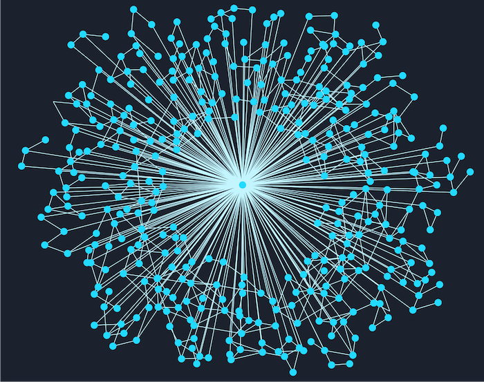
Starbursts
These appear when one particular node has far too many connections, and they take over the whole view. When users bring in additional information from the backend, a single node with too many connections can create a starburst shape with all its neighbors and take over the whole view. You can prevent this by redesigning the data model, limiting expansion, grouping less important nodes, or even removing the central node entirely and indicating connections to it through glyphs or other styling. Find out more about solving starbursts
In general, the best approaches adapt the graph visualization to the data, highlighting what’s most important to the user on a case by case basis. It often helps to start with a pre-made template layout styled for a similar project. Our Figma Design Kit includes several templates to help you skip the blank-page stage by adapting an existing chart.
Timeline visualizations
Timeline visualizations are great for showing how events unfold over time, but they come with specific challenges, especially when your data is very dense. When there are too many events close together, your timeline can quickly become overwhelming or unreadable.
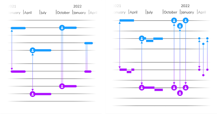
To solve this, you can group related events and give the user an option to zoom in for more details, or to expand specific overlapping moments. KronoGraph, our timeline visualization SDK, has a feature called event summaries which merges events when there isn’t space for them, and expands them across subrows when there is:
The same principle of helpful aggregation applies to timelines across many entities (which are connected by events). For these we can use a heatmap view, and scalewrap the timeline to see daily, weekly or other time-bound patterns:
The most important UI design concern for timeline visualization is chronological clarity. The order and spacing of events needs to make sense visually, but scale doesn’t always need to be linear. In certain contexts, specific entities may need more screen space, or time might need to be warped to highlight periods of high activity. We can even consider timelines where days or weeks are overlaid on top of one another, to see different patterns in time. A well-designed timeline helps users see patterns, causes, and trends over time at both high and low levels.
Good interaction design is also essential, like providing tooltips or the ability to add annotations to timelines to give further clarity. Filters, custom styling and hover effects are other good ways to help users understand when and how they can interact with the visualization.
Geospatial visualizations
When you’re creating a visualization that draws on location or route based data, you need to carefully balance the detail of the basemap with the data displayed on top. An overpowering vector or raster basemap style can distract from the data – but if it’s too subtle, it can be hard to understand where things are happening. Overlays like heatmaps, nodes, and links need to be clear without cluttering the view, and their z-order should ensure that they’re visually and interactively accessible. For instance, it’s not a good idea to overlay regional boundary outlines on top of nodes that fall within the region.
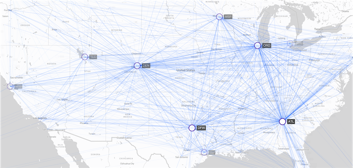
Combining links can help convey information when we are more interested in movement trends rather than precise position:
And intuitive navigation is key. Users should be able to zoom, pan, and explore naturally, especially when working with multiple layers of information. The level of information can react to the zoom level the user is at.
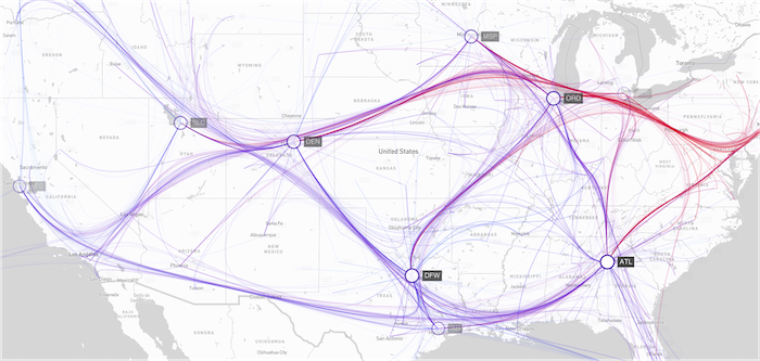
When mixing location-specific data with conceptual data on maps, use distinct styling like bold outlines or different colors to differentiate them. Location-bound elements (such as a business address) should look and behave differently from conceptual ones (such as regional performance data) during interactions – helping users understand whether each point represents an actual place, or simply data related to a geographic area:
Core UX principles for effective graph data visualization
We’ve seen that across all visualization types, the key is to adapt to the user’s needs. The more complex data becomes, the more likely it is that generalized approaches will result in confusing visualizations. Always remember who you’re making the visualization for, and what they’ll need from it.
Strong visualization UX starts with a clear foundation. Whether you’re building in-house tools, plugins or public-facing analytics platforms, these principles guide effective design:
Define the purpose and audience of the visualization
- Decide what questions it should answer
- Decide who will use it – technical analysts or casual users
- Think about whether the user is building on an existing solution
Choose the right visualization format
- Use graphs for relationships
- Use timelines for sequences
- Use maps for location-based data
Look for opportunities to add a different perspective that adds deeper insight. A visualization can include multiple views which highlight different information. For instance, imagine you have a power grid with constant outages you want to track. You need to know which substations are affected and when. In this example, a visualization with both timeline and map views would be ideal:
Use predictable layouts and patterns
- Employ standard gestures (pinch to zoom, drag to pan)
- Apply consistent styling across the graph
- Differentiate styling only when it adds important context
Ensure accessibility
- Check your color palette for accessibility
- Use linear gradients for heatmaps
- Keep font sizes readable
- Be aware that keyboard and screen reader support is the standard
Empower users to explore their data
- Give them all the essential tools they need to interact with their data
- Don’t overwhelm them with too many features or too much clutter
These aren’t just best practices, they’re essential to keeping your user engaged by giving them the level of control and insight they need and expect from you.
Deep dive: UX in graph visualization
Graphs can reveal powerful patterns – but only if users can make sense of them. Mastering graph visualization UX means understanding common pitfalls and techniques for overcoming them:
Overcrowding – Use progressive disclosure, giving ‘detail on demand’ controlled by interactive zooming, filtering, and clustering.
Unclear labels – Apply smart truncation and tooltips. Try to avoid repeating words if they appear across most nodes, especially if other styling or position can represent the same information.
Unfamiliar interactions – Follow established UI and UX conventions where they exist – intuition is key. Provide onboarding or tooltips to help the user understand how to navigate more complex visualizations.
Unclear hierarchy – Use size, color, and layouts to highlight important nodes, but don’t clutter your chart with excessive customization. For instance, if the basic color of your nodes and edges contrasts well with the background, there’s no need to use outlines unless you want to indicate key interactions and hierarchical relationships.
Lack of groupings – Combining nodes gives users an intuitive and powerful way to declutter complex networks and reduce data overload. Our Figma Design Kit includes examples of ‘combo’ styles you can use to group nodes. It also shows you example interactions the user can use to expand or collapse the combos.
Visual prototyping in Figma is a great way for devs and designers to work together, using structured, flexible design components to test and refine graph experiences before they go into early production. And the Figma Functions align directly with our APIs, so your team can hit the ground running to transform designs into demos. This maximises the time they can dedicate to solving the big UX issues and addressing user needs, instead of getting bogged down with building a UI brand kit.
Leveraging color effectively
Color can make or break a visualization. When used well, it can dramatically increase the visibility of insights. When used carelessly, it can not only clutter your chart, but also give the illusion of patterns that aren’t there.
Do:
Use a consistent color scale to represent quantitative data. Reserve accent colors for interactive elements, or important states. In graph visualization you’ll often find that black or white are the best options for accent colors, so make sure you use these colors sparingly elsewhere.
Use colors with obvious meaning. For example, if a graph shows server outages, don’t use green for the outages; and don’t use red to indicate healthy servers. Blue, pink and purple can be used neutrally in many contexts; whereas red, green, yellow and orange ‘traffic light’ coloring usually implies performance or risk levels.
Don’t:
Rely solely on color to convey meaning. Support icons or text wherever possible, and make sure your graphs look good in greyscale.
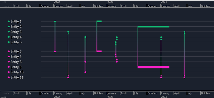
Use too many hues. By keeping palettes simple, you can assign contrasting color schemes to represent different views, giving the user instant context. Here’s an example timeline chart where every entity has its own color:
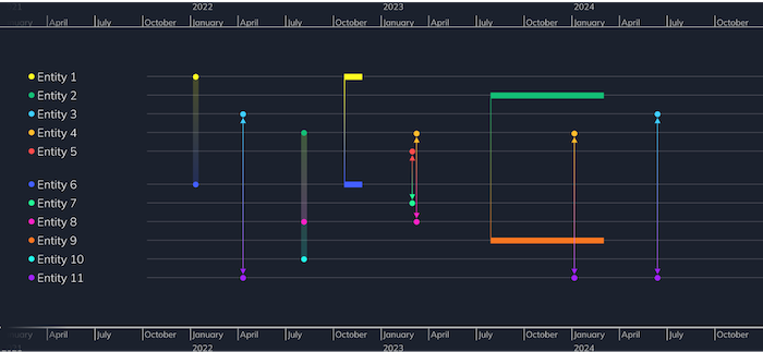
And here’s the same chart with a different color styling that clearly differentiates two separate groups. Color coding entities in this way makes their relationships and interactions much easier to understand and explore.
No matter what you’re designing, consistency is an important consideration. Add a color key alongside the graph to explain the meaning of each color; and make sure the background of the color key matches the background color of the graph. While you don’t need a color-grading monitor for web work, do make sure you have a neutral color monitor, ideally sRGB. If your monitor is slightly red tinted, and your user’s is greener, you’ll double the inaccuracy.
Accessibility in graph visualization UX
Designing accessible graph visualization UX isn’t just ethical, it’s also practical. Accessibility is also becoming increasingly enforced by law, and as more and more people are using features such as TV subtitles, or voice assistants to control their technology, it’s clear that compliance with organizational accessibility commitments can open the door to a wider audience.
Some key considerations are:
Contrast – Maintain WCAG-compliant contrast between text and background. While AA is the legal requirement, aim for AAA standards when possible — they’re more accessible and highly legible.
Navigation – Support keyboard shortcuts for navigation and interaction. Consider adding a search box, or the ability to tab index through nodes. Can you provide users shortcuts to get back to search fields? If you can navigate your graph entirely through the keyboard, you’re on the right track.
Labels – Avoid showing labels that are too small for the user to read. Instead, display a zoom indicator to encourage users to zoom in for clearer labels.
Screen readers – Provide semantic descriptions for key elements (via ARIA labels or descriptions).
Color – Consider colorblind-safe palettes like ColorBrewer.
Find out more about building accessible graph data visualization apps
The key to accessibility in your UX is providing all the right interaction options your users might need. Think about how the customer experience has changed in supermarkets over the years. Every shopping trip used to end at a checkout conveyor belt, but today we have other options, from self-checkout to home delivery and more. Offering variety in user flow means that your application excludes fewer users. So start thinking about accessibility from the first time you create a wireframe – don’t bring it in as an afterthought at the end of your project. Add-ons like accessibility dongles and toolbars are a last resort likely to fail!
Accelerating visualization UX with our Figma Design Kit
You don’t need to start from scratch when you’re designing great UX. Earlier on, we mentioned the templates available in our Figma Design Kit. It also includes a powerful set of tools specifically crafted for graph and timeline visualization, such as:
Pre-built components – You’ll find 100+ prebuilt components including nodes, entities and combos, all with their own styling options built in through variables, instance swaps and booleans.
Beautiful templates – We have starter interfaces for a variety of graph and timeline visualization use cases, from social media analytics to server impact analysis monitoring.
Figma native features – Easily adjust branding, typography, and color tokens in a designer friendly environment which you can easily share with your team for feedback.
SDK compatible styles – All components align with our SDK styling options for a smoother designer/developer handover and a better shared understanding of what’s possible within the code.
Rapid prototyping – You can use the design kit to develop your idea into a testable prototype in minutes. While Figma isn’t ideal for graph animation, it can allow you to test interactions quickly before moving to coded prototypes which can be far more time consuming.
We find ourselves constantly using our Figma Design Kit internally, to envisage new demos, or tweak old ones. It speeds up initial design stages, and allows our designers to focus on UX decisions over pushing pixels.
Video guide to graph visualization UX
In our webinar on graph visualization UX design, Christian Miles and Joe Clark, a KeyLines developer, combine their expertise to explore the importance of effective data visualization UX. They discuss common design challenges and highlight pitfalls that every designer and developer should watch out for. Throughout the session, they share practical tips to help you create beautiful, useful, and intuitive visualizations. You’ll learn:
- How to get the data & visual models right
- Which cornerstones should be at the heart of each design decision
- How to avoid overwhelming users
- How to choose an effective color palette
Elevate graph visualization UX, empower users
Graph, timeline, and geospatial visualizations are critical tools for modern data analysis, and their success not only hinges on data accuracy, but also on information clarity. Effective graph visualization UX is what determines whether insight is revealed or lost in any visualization.
By understanding UX and UI as intertwined processes, we can address visualization-specific challenges from the ground up. Wherever possible, apply core design principles that will feel familiar to your users and gain their trust. Get the balance right and your team can build applications that are high-performing, visually stunning and carefully tailored to your users’ specific needs.
If you want to find out more about what our Figma Design Kit has to offer, see our Figma Design Kit page or read more in our blog