Discover MapWeave
The revolutionary geospatial visualization SDK that uncovers every connection.
Genuine end-to-end supply chain visibility – from the global strategic level down to the tactical, live “where are my trucks right now and in what condition” level – can be a tremendous differentiator for enterprises and the software vendors supplying to them. But the complex challenge of achieving UIs that can flex to this extent, using traditional geospatial and network or flow chart capabilities, means that most software houses today end up having to compromise, visualizing just one end of the spectrum.
At best, this limits the value of the visualization to a subset of stakeholders. At worst, it doesn’t completely satisfy anyone’s needs. Users end up toggling between various systems and sources just to understand the ground truth and make effective decisions. I’ll show you how geospatial network analysis, using our graph and geospatial SDKs, eliminates the need to compromise.
To demonstrate the full capabilities of KeyLines, our graph visualization SDK, and MapWeave, our geospatial visualization SDK, I built a working demo that visualizes a complex, multi-tiered global supply chain – from raw material extraction through manufacturing to final delivery.
This geospatial network analysis system seamlessly transitions between multiple views: strategic network diagrams, detailed hierarchical breakdowns, real-time geospatial tracking, and live issue alerting. High-level flow animations show material volumes between countries. Tactical views track individual shipments with weather overlays and impact predictions.
The demo uses real-world data on Russian artillery supply chains, drawn from a 2024 Royal United Services Institute (RUSI) report “From Ore to Ordnance” that maps howitzer manufacturing from raw chromium extraction through final assembly. The visualization techniques, however, apply to any complex supply chain – whether you’re tracking semiconductor components, pharmaceutical ingredients, or automotive parts across global manufacturing networks.
Supply chains are inherently hierarchical, with raw materials flowing through tiers of component manufacturers before reaching final assembly. KeyLines’ layouts offer several great options for visualizing these hierarchical networks. I opted to use the horizontal sequential layout with curved links, which automatically adapts as you navigate through the supply chain.
Rather than starting from raw materials, I wanted users to start with finished products and work backwards: production facilities > major component manufacturers > barrel raw material suppliers > foreign suppliers. I created a simple breadcrumb navigation where each crumb corresponds to a layer in the supply chain hierarchy.
This hierarchical visualization immediately reveals dependencies and potential vulnerabilities. You can see at a glance which manufacturers rely on which suppliers, and trace any component back to its raw material sources. When certain nodes represent confirmed suppliers but the exact relationships aren’t known, KeyLines’ combo feature lets you group them and show aggregated links to downstream manufacturers without fabricating specific connections.

Network diagrams excel at showing relationships, but supply chains exist in physical space. By integrating MapWeave alongside KeyLines, I built a geospatial network analysis experience that switches seamlessly between comprehensive network visualization and the actual geographic layout of the supply chain across the globe.
The geospatial network layout in MapWeave handles both geolocated nodes (manufacturing plants, ports) and free nodes (like finished products) without any extra work. It takes the same node and link structure as KeyLines/ReGraph, so pivoting between visualizations required very little data munging.
To provide geographic context, I overlaid country borders for nations involved in the supply chain. Hovering over a country highlights it and lets you click to filter the view – showing just the trade flows between that country and the destination. Because many facilities sit close together at global scale, nearby nodes automatically group together to keep the map clean and readable. When you zoom into a specific country, the system smoothly animates to focus on just the relevant supply chain nodes.
This is where the true power of integrated visualization becomes clear. The same system that shows strategic material flows between countries can drill down to live, tactical tracking of individual shipments – complete with real-time issue alerting and impact analysis.
KeyLines has many features for showing issues and alerts on nodes and links. I used the halo feature to show alerts at Chinese supplier nodes experiencing disruptions. The built-in graph algorithms made it simple to foreground the downstream nodes that might be impacted by supply issues from those suppliers.
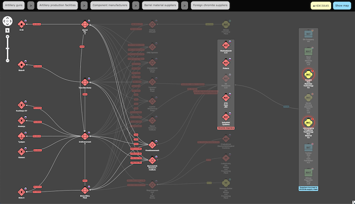
But issues don’t just exist in abstract network space – they happen in specific locations with geographic context. This is where the map projection becomes invaluable. Rather than using node halos, I styled country polygons to show where issues are occurring – yellow for impacted countries, green for the rest. When showing issues on the map, the system focuses on just the impacted nodes and their immediate connections, switching from abstract network links to actual vessel and rail shipment routes.
The “live” view reveals the cause of the disruption: a typhoon tracking along China’s northeastern coastline. To visualize this, I used the MapWeave observations layer with a tracker node following the typhoon’s trajectory. MapWeave automatically draws the path based on an array of observations (lat/lons and timestamps). A circle around the tracker shows the affected area, with the diameter gradually increasing along the predicted path to represent uncertainty.
As you drag the typhoon forward in time, you can see which shipments fall into the impact zone. Initially, a chromite shipment by vessel to Novorossiysk is clearly affected. But as the typhoon tracks northward, it becomes apparent that a separate rail shipment from Henan to Moscow may also be impacted. This explains why multiple Chinese suppliers are showing alerts – and reveals the downstream facilities that may face material shortages.
Finally, the MapWeave API makes easy work of creating strategic-level geospatial dashboard views with features like arrow links and flow animations. For this dashboard, I used slower flow velocity from adversely impacted suppliers and varied link width to represent relative material volumes.
For those interested in the implementation details, here’s how I put this together.
When I set out to build this demo, my initial motivation was to prove (as much to myself as anyone) that our graph and geospatial SDKs can integrate with the well-known JavaScript Spatial Illusions milsymbol library – particularly for styling nodes with generated SVG symbols.
The internet isn’t exactly rife with credible supply chain data suitable for this kind of visualization. But as I mentioned earlier, I found an excellent paper from the Royal United Services Institute (RUSI) and the Open Source Centre: “From Ore to Ordnance: Disrupting Russia’s Artillery Supply Chains” (October 2024). The report maps the supply chain of howitzer and ammunition manufacture from raw material extraction through to final assembly and delivery.
Focusing on self-propelled artillery howitzer manufacturing, I used the report to construct a network of supplier, component manufacturer, assembly plant, and howitzer nodes, with links representing the flow of materials to components and ultimately finished products. The report focuses particularly on chromium, a critical material in artillery barrel manufacture sourced partially from outside Russia – representing a potential vulnerability in the supply chain.
To style nodes with appropriate military symbols, I found the unique IDs (SIDC) for each symbol using the military symbol picker. I embedded these SIDCs in my JSON node definitions and passed them to the local milsymbol package at runtime to generate corresponding SVGs. Both KeyLines and MapWeave APIs make it easy to style nodes with images, including SVGs.
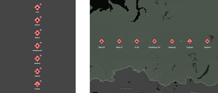
Russian artillery howitzers represented as nodes styled with their respective NATO Joint standard symbols (APP-6d) in KeyLines (left) and in MapWeave (right).
In the KeyLines chart, I gave myself a little artistic licence, adding country flag glyphs to indicate where each node is located or originates.
For interactive exploration, I used the KeyLines click event handler to restyle clicked nodes on the fly as cards displaying additional metadata – descriptions and images of the artillery pieces pulled from the US Army’s ODIN resource.
I used MapWeave’s GeoJSON layer to render country borders with interactive hover effects. The proximity combining API groups nearby nodes automatically, with onCombineNodes and onCombineLinks handler functions maintaining consistent styling as nodes merge. For country filtering, the getBounds and fitBounds APIs create smooth animated transitions.
For the typhoon tracking, I obtained observation data from Wikipedia’s page on Typhoon Lekima – a real storm that hit China’s northeastern coast. The observations array fed directly into MapWeave’s tracking capabilities, with the expanding uncertainty circle rendered using the GeoJSON layer.
The combination of KeyLines (or ReGraph, if you’re versed in React, unlike me!) and MapWeave enables you to rapidly build beautiful, interactive geospatial network analysis applications for global supply chains. The graph visualizations clearly show hierarchy and dependencies in deeply tiered and interconnected supply chains. The geospatial visualization brings the supply chain to life and makes it easy to overlay weather, incidents, alerts, and geopolitical concerns. Most importantly, it enables easy switching from strategic planning views to tactical, live visualizations of exactly where shipments are or were at a specific time – all within a single integrated system.
Ready to build your own end-to-end supply chain visualization? Request a free trial of MapWeave and see how easy it is to create powerful geospatial applications that connect strategic planning with tactical operations.
The revolutionary geospatial visualization SDK that uncovers every connection.
Registered in England and Wales with Company Number 07625370 | VAT Number 113 1740 61
6-8 Hills Road, Cambridge, CB2 1JP. All material © Cambridge Intelligence .
Privacy Policy | Security Framework


