In this blog post, I’ll create a cryptocurrency investigation tool, to demonstrate how our data visualization products help financial organizations manage their blockchain-based currencies. If you missed the first part of this series, last time we explored the challenges posed by AML compliance in the age of cryptocurrency.
Cryptocurrency investigations: the XRP API
The dataset we’ll visualize comes from the Ripple Data API v2. It gives access to XRP Ledger change data, including transaction history and processed analytics. The data covers about an hour’s worth of activity, or around 450 ledgers, created at 8-second intervals.
To get around a few timeout and call-limit problems, we collated the data into a Neo4j graph database, then loaded it into a KeyLines graph visualization chart.
Our graph data model and visual model
At its simplest, our cryptocurrency investigation data visualization tool includes two core entities – transactions and accounts.
There are two kinds of transactions:
Offers – these are what XRP Ledger calls orders to trade currencies. There are two kinds of offers:
 ‘OfferCreate’ – the object created when a user starts the process of exchanging currencies.
 ‘OfferCancel’ – the object created in our data when the offer is removed from the ledger.
There is one kind of payment:
 Payments are transfers of value from one account to another. They could be XRP-to-XRP, cross-currency or currency conversions.
Our graph data model also includes two kinds of accounts:
 Standard accounts represent a holder of XRP, they could be a sender or recipient of transactions.
 Issuers are the accounts issuing the currency – the person or business where the transaction can be redeemed for goods, services or currency.
Accounts are linked to transactions. Transactions themselves can be linked to issuers when a non-XRP currency (e.g. BTC or USD) is involved.
We’ll also add some inferred links:
- Red ‘X’ glyphs represent inferred links between OfferCancel and OfferCreate nodes
- Green ‘✓’ glyphs represent inferred links between Payment and OfferCreate transactions
The final part of our visual model is the time bar, which we’ll use to represent the volume of transactions taking place over time.
Let’s get started.
Visualizing cryptocurrency data as a graph
Once we’ve retrieved our data from the XRP API, we loaded all of it into a KeyLines chart to get an overview. The organic layout made quick work of presenting the 53,511 lines of data, taking just a few seconds:
Our 1 hour of XRP transaction data, totaling 16741 nodes and 36770 links, loaded into our cryptocurrency investigation data visualization
We get a good overview of what’s happening here, but the network is pretty dense. Using KeyLines’ filtering functionality we can simplify our cryptocurrency data visualization, focusing on some of the different components. This will help us detect various transaction patterns in the XRP ledger.
Eliminate clutter: remove canceled transactions
By filtering our nodes and links related to canceled transaction offers (i.e. the object that nullified an OfferCreate transaction), we’re left with a simple view showing only the active transactions:
Identifying high-risk transactions: filter by value
One stipulation of the FinCEN travel rule is that VASPs must verify all transactions over $3000. Using the CryptoCompare API, we can convert everything in our cryptocurrency investigation into US dollars, and then apply a filter to show only those above the $3000 threshold:
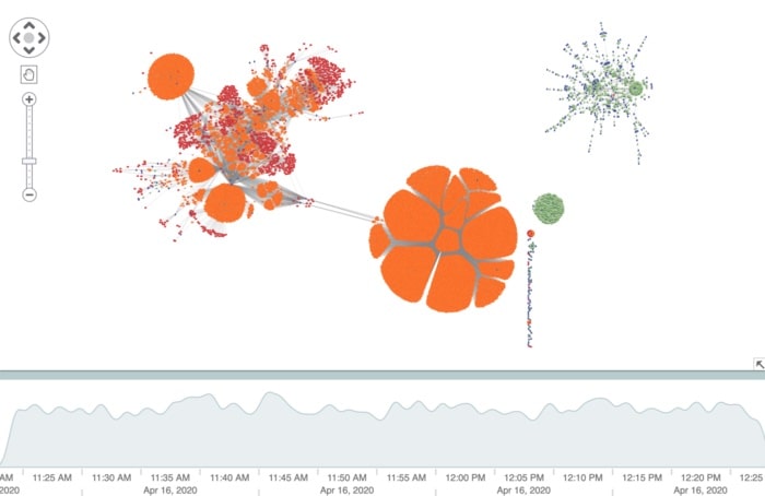
Identify time trends: filter by time
We’ve removed a lot of clutter from the chart, we can go further using the time bar component. Here we’re focusing on all $3000+ transactions taking place during a 4-minute interval:
At this level, we can start to pick out specific transaction patterns that an analyst might want to focus on, and inspect for money laundering behavior. The big orange structure shows multiple user accounts placing offers for Ripple/Yuan exchanges:
All these transactions are linked to a central issuer of Chinese Yuan
The green cluster shows consecutive payments happening between multiple user accounts, but all linked to a central issuer of BTC to Ripple transactions:
The central purple node is the issuer of transactions (green nodes) with 12 other (blue node) accounts
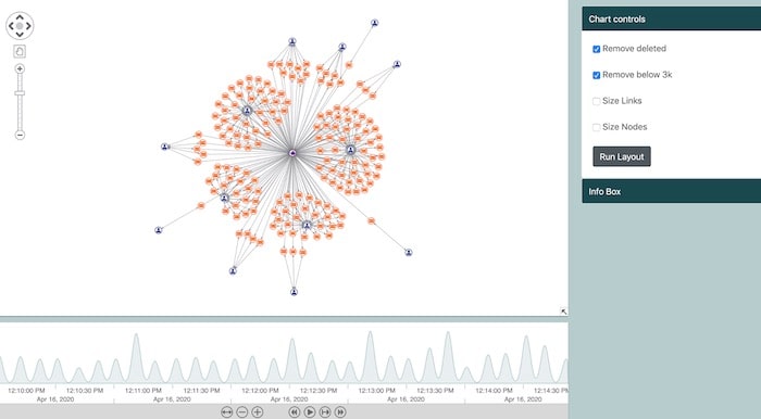
Focus on specific events
Once we’ve cleared the cryptocurrency data visualization of clutter, and identified the time period of interest, an AML analyst is likely to want to investigate some specific transactions.
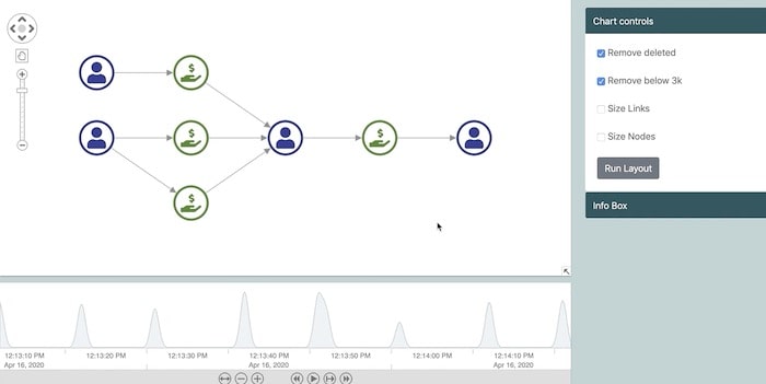
We’ve harnessed KeyLines’ event model, so double-clicking on a node will isolate a specific transaction and its connections. Using the sequential layout, we get a really clear view:
Now it is really easy to see that the selected account received funds from 3 payment transactions and contributed to another one. The lack of issuers involved in these transactions means that the only currency involved was XRP. Also from the time bar we can see that all these transactions took place between 12:13:10 PM and 12:13:20 PM.
Isolating components of the network to identify transaction patterns
We can take this a step further, using the time bar’s ‘play’ function – showing chains of transactions form around specific accounts:
Creating your own cryptocurrency investigation tool
The examples above showcase just a few of the ways data visualization can clarify complex and dense transaction data for a cryptocurrency investigation, helping to identify high-risk activity.
We can extend this with combos, to group transactions linked with specific accounts, or social network analysis to find accounts with the highest volumes of throughput.
If you’d like to learn more about graph visualization and compliance, or build your own cryptocurrency investigation tool, we’d love to hear from you. Get in touch or request a free trial.
Share: