
A key phase of the intelligence lifecycle is intelligence dissemination; the ability to share the output of an investigation in the right format with the right people at the right time.
In this blog post, we’ll use our graph visualization toolkits to build a simple app to construct and publish a PDF report based on multiple snapshots of interactive graph analysis.
What is intelligence dissemination?
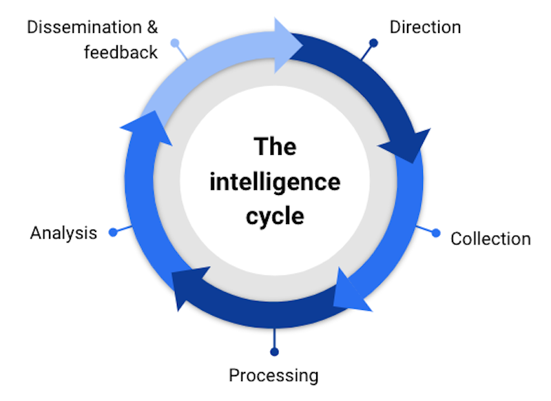
Whether you’re investigating cyber threats or money laundering or terrorist activity, you’re probably using an intelligence lifecycle.
There are numerous versions of this cycle, but they all involve planning, data collection, some form of exploration and analysis, and then a dissemination phase, where a finished intelligence product is published or shared, before the cycle begins again.
Dissemination can take many forms:
- saving the state of an investigation in digital form so others can open and share it
- publishing conclusions from an investigation as a freeform internal report
- publishing conclusions from an investigation in a prescribed external format, for example, a Suspicious Activity Report that needs to be filed with a financial regulatory body
- cutting and pasting charts from a link analysis tool directly into a document or slide deck
- producing a time-stamped documentation artifact necessary for a Digital Forensics papertrail
- producing imagery for use as evidence in court, or as justification for an arrest warrant or surveillance order (see, for example, the visualizations in this report from the recent Bitfinex theft seizure)
We’ll build a simple proof-of-concept application to generate a PDF report from user-generated snapshots of a graph investigation. It’ll show you how our KeyLines and ReGraph toolkits typically support the publishing and intelligence dissemination phases of our customers’ workflows.
The visual data model for our intelligence dissemination demo
We won’t talk much about the data collection and exploration aspects of our app here – we have plenty of other blog content advising on best practices in this area. But you’ll find that when it comes to intelligence dissemination, some of the golden rules of graph visualization get turned on their head. For example:
- using color for meaning (such as color-coding links to convey a dollar value) is no use if your data will be shared as a black-and-white document
- adding tooltips to an app to bring data-on-demand and remove clutter from the view is no use if the consumers of your report aren’t using the same app
- it makes sense to add additional labels to your nodes and links before the publishing step if they’re going to end up in a document with no interactivity
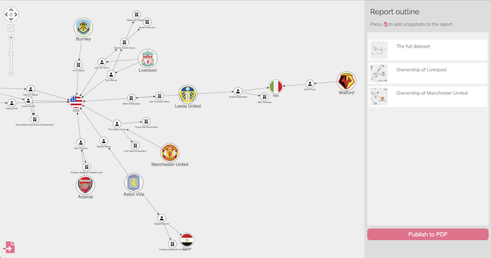
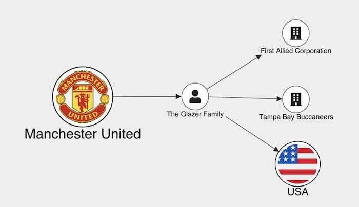
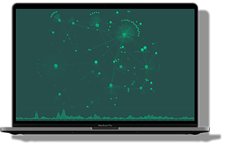
For this blog I’ve chosen a simple dataset scraped from Wikipedia, so I can investigate the business relationships of those who own England’s largest soccer clubs – a multi-million dollar industry.
You’ll notice that I couldn’t resist adding a bit of color for the clubs’ badges and the countries where the owners are domiciled – but in general I’ve kept the color scheme monochromatic and high contrast.
The basic concepts – investigation snapshots vs serializations
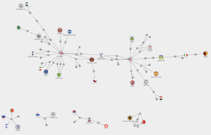
A typical graph visualization contains too much information to publish as a single static image. A common pattern is for the investigator to save, or snapshot, parts of the graph as their investigation progresses. It’s a powerful way to capture the interactive process of visualizing graphs – as investigators progressively explore, expand, filter and query data – which is as useful and insightful as the end result.
There are important considerations you need to make up-front to decide what constitutes a snapshot in your situation. Usually a snapshot represents the exact state of the graph at a given moment in the investigation.
We need to make clear the distinction between a snapshot and simply saving the state of your database query. The crucial difference is that if you open the same snapshot a year later, it should look the same. That means in my case, if Manchester United FC changed ownership next year, and somebody else opened my snapshot, they should see the state of the investigation as I saw it in March 2022 – exactly the picture above and not an updated version.
Of course it may be useful to allow a future investigator to re-run the query and find out who the current owners are – but that’s not the same thing as a snapshot. If your investigation is going to be used as part of an evidence trail, it’s vital that it cannot be altered over its lifetime.
To support this, our graph visualization toolkits provide the ability to serialize the exact state of the chart, including all its settings and configurations, into JSON format.
I’ve exploited this in my application. First I add a snapshot button to the bottom left of my page. When the user clicks on it, we serialize the current state of the chart, along with a user-entered caption and a timestamp.
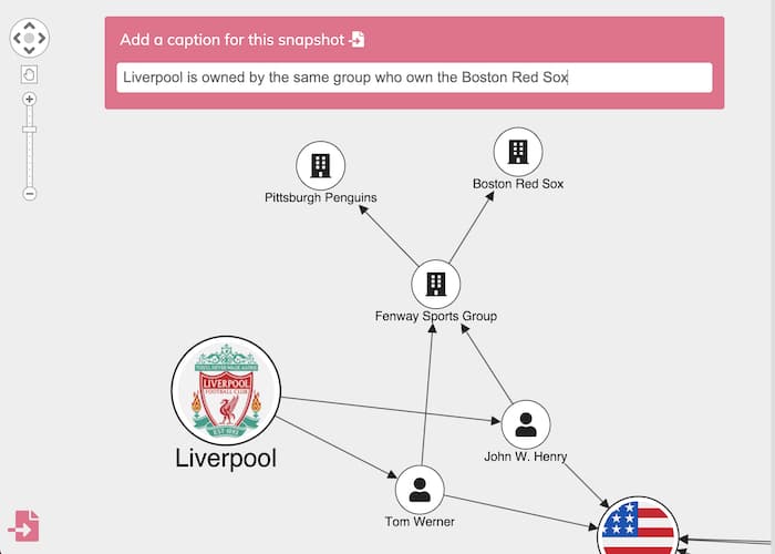
You can choose whatever you want to show in the snapshot – your largest, most complex chart or a zoomed-in area.
I also used our export feature to generate a PNG thumbnail image which helps users identify their snapshot quickly. The feature can generate vector-quality images, high-resolution SVG plots and, of course, PDF documents, which we’ll come to later.
When the snapshot is created, we add it to a report outline on the right of our app along with its image and caption:
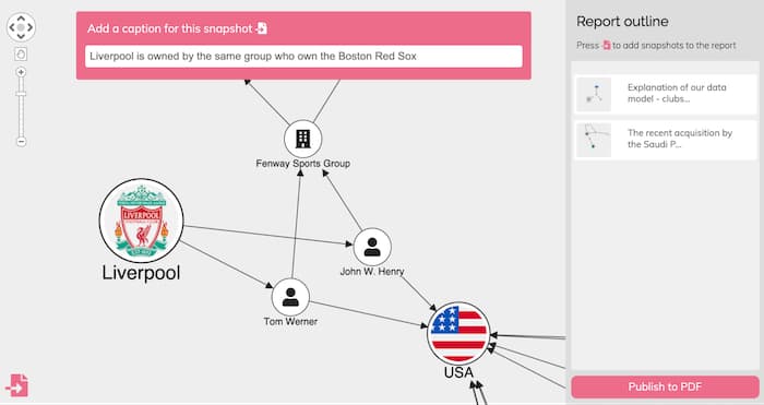
The report outline has an additional function: it doubles as an undo/redo stack. When I add a hyperlink to those snapshots, the user can click between them and jump the chart back to a particular bookmark in their investigation.
Doing this is as easy as calling chart.load() on the data saved in the snapshot for KeyLines. For ReGraph it’s a case of passing the corresponding state to the chart component in its props.
How to generate a PDF report
For now, these snapshot objects are just persisted in browser memory. In a real application this could be saved to an access-controlled database for sharing and retrieving later. In my app I’m not going to implement persistence to a database, but I do want to generate a final PDF report containing the results of my investigation.
Rather than create the PDF on the fly, it makes more sense for the user to collect and curate their snapshots. Once they’re happy with the final report, they can publish it ready for intelligence dissemination. Here’s how it’s done.
When the user clicks the Publish to PDF button, my button handler first creates a new PDF document. I use the popular and simple PDFKit JavaScript library for this – our inbuilt exporters are set up to inject high resolution chart exports directly into a PDFKit document. You can customize report templates however you like, with options to set the layout style, text, embedded fonts and more. I’ll add a simple title to our report.
const doc = new PDFDocument({ layout: 'portrait', margin });
doc.fontSize(18);
doc.text('Investigation report', { align: 'center' });
Next I’ll iterate through my snapshots and inject them into the report. To do this, I need to reconstitute each chart in turn from its snapshot. It might be a bit jarring for the user to see all of their charts flash up on the screen, so we can make use of a neat feature of our toolkits – the ability to create multiple chart instances.
By creating a hidden div on my page, and adding a second chart instance to it (I call it hiddenChart here), I can load each snapshot into this hidden chart and export it from there. That means the user doesn’t see any of the processing, just the final exported document.
For KeyLines, the code looks something like this. We loop through all the snapshots, and load each one into the hidden chart:
for (let i = 0; i < reportData.length; i++) {
    await hiddenChart.load(reportData[i].chart);
Then we call the KeyLines export function, telling it how big an image we want to inject. If the PDF needs to be blown up to show detail, you can add large, high resolution vector images here. For our report, we’ll pick a size that fits two to a page in a letter-sized portrait document.
const width = 0.8 * doc.page.width - 2 * margin;
const height = doc.page.height * 0.35;
doc.x = (doc.page.width - width) / 2;
await hiddenChart.export({
      type: 'pdf',
      doc,
      extents: 'view',
      fitTo: {
        width,
        height
      },
    });
That’s all that’s involved in injecting high quality KeyLines charts into a PDF document. To finish up, I’ll just add the user-generated caption, and add a page break for every other snapshot.
	doc.x = margin;
    doc.moveDown().text(reportData[i].caption, {
         align: 'center',
         oblique: 'true'
    });
    doc.moveDown(2);
    if (i % 2 === 1 && i < reportData.length - 1) {
         doc.addPage(); // Fit 2 charts to a page
    }
}
doc.end();
If you’re using ReGraph, our graph visualization SDK, the approach is almost identical, we would just use the export instance method on the hidden chart instead.
Here’s the finished result:
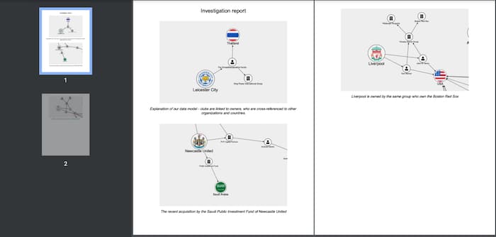
I’ve kept things simple in this example, but the key ingredients are there for a more complex export. Once you’ve got a collection of snapshots you can simply inject them into your PDF documents using our export APIs.
Intelligence dissemination made easy
I’ve demonstrated how easy it is to create a sequence of images and captions from your interactive charts. Whatever kind of report you need to create and share with your team, they can now feature customized snapshots of beautiful, insightful graph visualizations.
But our toolkits don’t just support intelligence dissemination. Want to see how they work with the entire intelligence lifecycle? Everyone who starts a free trial is entitled to a demo from one of our experts. Why not sign up today?
FREE: Start your KeyLines trial today
Visualize your data! Request full access to our KeyLines SDK, demos and live-coding playground.
Share:
