FREE: Law enforcement white paper
The ultimate guide to investigating crime, analyzing results and sharing insights using data visualization.
Human trafficking is a global issue. An estimated 2.5 million people are currently in forced labor, including sexual exploitation, as a result of trafficking, and the majority of victims are aged between 18 and 24. The International Labor Organization estimates the profits associated with trafficking make it the third-biggest criminal enterprise in the world.
Earlier this year, I gave a presentation on graphs and human trafficking at Graph Day San Francisco. This summary looks at the approach we could use to create an interactive graph visualization tool to understand trafficking patterns, and some useful data visualization techniques for law enforcement and security agencies in general.
A key part of human trafficking is the movement of victims, as perpetrators evade detection by continually transporting victims.
In 2014, two information scientists at the University of Hawaii applied network analysis to open internet sources. In their paper on detection of domestic human trafficking indicators and movement trends, Ibanez & Suthers created a graph dataset using escort adverts, cell phone numbers and advert locations. With this innovative approach, they built a graph model of the most common travel routes of suspected victims of sexual exploitation:
“The advertised phone number is a significant element in observing movement for a number of reasons. The phone number is the link to the provider enabling the John to make contact and schedule services. The area code provides information on the origin of the phone, which may indicate where the provider or trafficker is from. Phone numbers are embedded in the online classifieds as providers are advertised along circuits.”
Ibanez & Suthers
This analysis helped build visual models of the movement of victims:
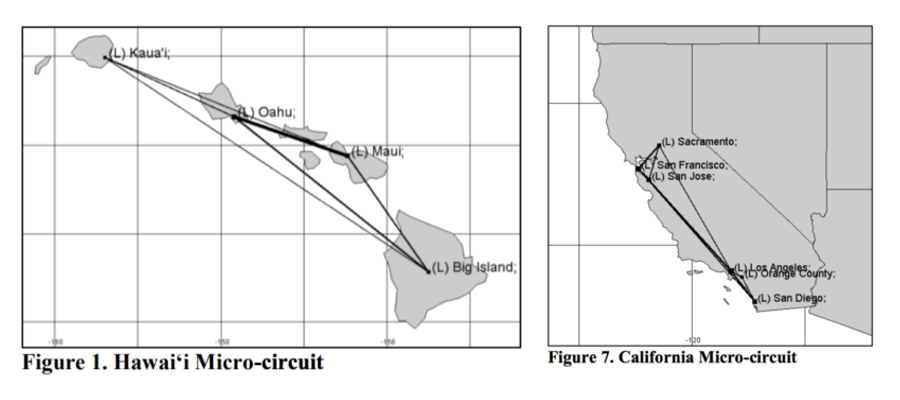
The figures give a great ‘quick visual’ of the trafficking circuits, but they take a long time to create, and you can’t interact with them.
I recreated the analysis using an application built with KeyLines. My goal was to see if an interactive approach could provide an intuitive experience for crime analysts to explore datasets and uncover evidence of victim trafficking.
The ultimate guide to investigating crime, analyzing results and sharing insights using data visualization.
Using the same approach as the article authors, I created a dataset of 20,000 classified adverts covering three Canadian provinces/territories – Saskatchewan, Manitoba and Yukon.
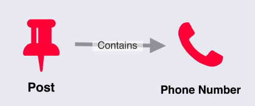
I took the raw text from these adverts and used a regular expression to extract phone numbers. The result was two nodes for my graph dataset: post and phone number. I also had a single link type: contains.
Next I chose the Elastic stack (also known as the ‘ELK’ stack – Elasticsearch, Logstash, Kibana) for some quick prototyping. I used LogStash to load the data into Elasticsearch, and Kibana for an initial visual investigation.
KeyLines can work with pretty much any data source. Elasticsearch was the obvious choice, because Elastic’s REST endpoint integrates easily with KeyLines. If I were producing this application for a production environment, and not just for a proof of concept, I might switch my backend to something more graph-friendly, like Neo4j or ArangoDB.
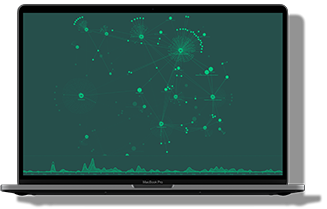
Here’s what my initial data model looked like in KeyLines:
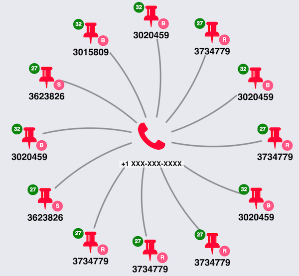
I use a few bits of KeyLines’ functionality here, including:
Through simple visual analysis of the glyphs in this small part of the graph, I can already spot a number of different locations being advertised: Regina, Saskatoon and Brandon. I can also see that they’re connected by a common phone number. This provides some evidence of movement in the underlying data source. Of course, further evaluation or statistical inference from the data would be necessary for an investigator to decide whether this indicates human trafficking.
My dataset also includes timestamps of when the adverts were first posted. This is perfect for KeyLines’ time bar. Learn more about the time bar
Here, the time bar histogram shows the total distribution of adverts over time in my dataset. The trendline shows activity related to the selected phone:
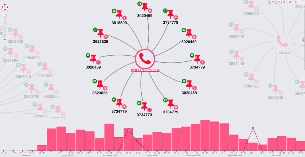
Straight away I spot two spikes in activity for this phone number: September and December 2016. Using an information panel in my application I can see these correlate to the two different locations shown in my glyph.
KeyLines’ flexible client-side approach means I can let my users choose between data models on the fly. For example, they could “bypass” nodes that don’t need to be in the chart.
I want to remove the telephone node and instead create direct links between adverts sharing a phone number. I can do this with a few lines of JavaScript:
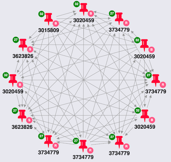
Each node has the same phone number in common, so I get a densely connected dataset. Now I can use the KeyLines combo feature to turn this model into something more insightful.
The final dimension I want to add to my application is geospatial. Each advert relates to a specific location, so I can combine the nodes and set the link weight to match the volume of movement between the locations:
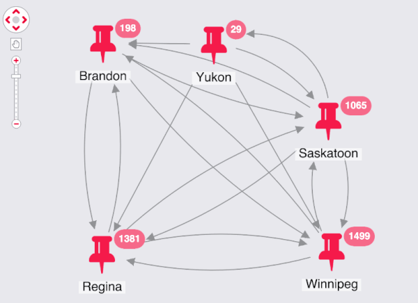
I can see the most common circuits right away. These roughly correspond to the areas with the most population in my regions, so I could use a normalization function in the future to improve the scales.
Finally, to match my application to the visuals provided in the paper that inspired this work, I geocode the locations in my dataset, supply them as coordinates to KeyLines, and enable a geospatial layout with a single line of code:
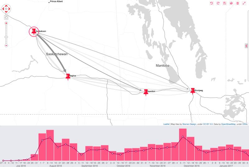
Learn more about Keylines’ geospatial feature
This example was created with publicly available data, but it demonstrates, the potential power of interactive data visualization for shedding light on human trafficking. Armed with an intuitive way to explore and understand the data, analysts can make sense of it and uncover trends and insight.
We’d love to apply this technique on real-world data. If you’d like to try KeyLines for yourself, just request a free trial or contact us.
Visualize your data! Request full access to our KeyLines SDK, demos and live-coding playground.
Registered in England and Wales with Company Number 07625370 | VAT Number 113 1740 61
6-8 Hills Road, Cambridge, CB2 1JP. All material © Cambridge Intelligence .
Privacy Policy | Security Framework


