FREE: KronoGraph white paper
Our essential guide to building powerful and intuitive timeline visualization applications.
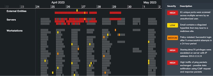
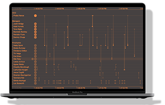
Users rely on the heatmap view in KronoGraph, our timeline analytics SDK, to spot patterns in big data fast. In the latest version, you now have more ways to customize heatmap cells and reveal your data’s insightful story at a glance.
You’ll also spot some improvements to the look and feel of the KronoGraph SDK site, including a brand new demo to help new starters get up to speed quickly.
You can now provide alternative views of your data with color-customized heatmaps. Using options to color-code a cell depending on the data it contains, you can highlight cells containing alerts, or use separate color schemes for heatmaps and events. In this way, users can see the story of their data through the heatmap itself before they’ve zoomed in on the details.
To see this in action, head to the SDK’s new Heatmap Colors story, or the updated Detection and Response showcase.
Our essential guide to building powerful and intuitive timeline visualization applications.
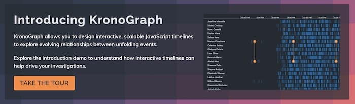
The new Introducing KronoGraph demo takes developers on a tour of the fundamentals of our timeline visualization toolkit. With interactive examples to guide you through the essential parts of KronoGraph, it’s a quick and easy way to get newcomers in your team up to speed.
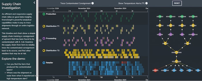
You’ll also find new handy descriptions alongside every showcase, including tips on what to explore in each interactive demos.
Timeline visualization is a powerful standalone analytics tool for time-based data, but it’s also the perfect complement to graph visualization. Keen to find out more? Simply request a free trial today.
Request full access to our KronoGraph SDK, demos and live-coding playground
Registered in England and Wales with Company Number 07625370 | VAT Number 113 1740 61
6-8 Hills Road, Cambridge, CB2 1JP. All material © Cambridge Intelligence .
Privacy Policy | Security Framework


