FREE: Managing fraud with visual link analysis
The ultimate guide to the role of link analysis and timeline visualization in fraud detection, investigation and prevention.
Insurance fraud detection is a matter of understanding connections.
To uncover scams, investigators look for unusual links between people, events, locations and times. They scour huge, noisy, complex, and often incomplete, datasets to understand which connections are genuine, and which could indicate fraud.
Network visualization – or ‘link analysis’ as it is more commonly called by fraud teams – has long been a vital part of the fraud investigator’s arsenal. Powerful and well-designed link analysis functionality embedded into your fraud detection tool is the ideal way to overcome data challenges and investigate fraud in an interactive and intuitive way.
Most insurance fraud detection systems work in a similar way. Data is collated, rule-scored and sorted into three categories: fraud, not fraud and unsure.
A team of analysts then manually reviews the ‘unsures’ – a careful balancing act between keeping genuine customers happy with fast, accurate decisions and preventing real frauds from getting through.
Link analysis is a great way to view these complex scenarios in a simple format, directly embedded in the investigation workflow.
In a real-world fraud detection tool, an investigator would be interested in a large number of data points.
The data model would depend on their business processes, structures, and operations, but some typical elements include:
This model places claims and policies at the top of a hierarchy, with the third party and policyholder information on the next level.
For the purposes of this example, however, we’ll simplify the visual data model:
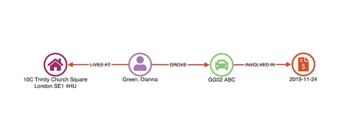
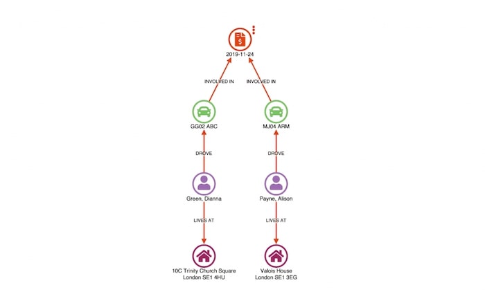
Our first step is to load the disputed claim in a link analysis chart, using the sequential layout to simplify the view.
In this example, we have two people (Stephen Porter and Julia Rodriguez) claiming for damage to their vehicles. A third person, Everett Page, is named in the claim as a witness.
After loading a claim, the user can ‘find matches’. This runs a query back to the database to find all other claims sharing any similar attributes:
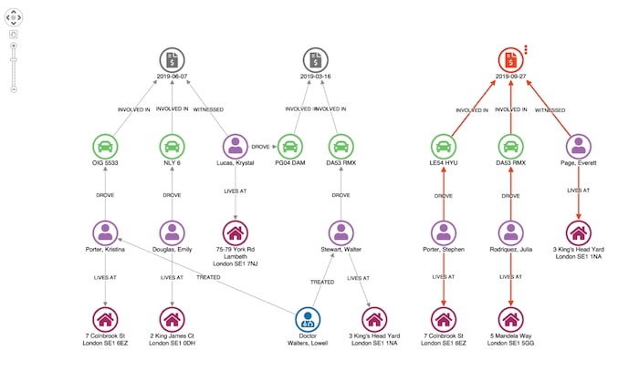
Doing so returns two other claims – 2015-06-07 and 2015-03-16 – which show matches on the vehicle and address of a claimant in the original case being investigated.
To emphasize unusual connections, we can use our toolkits’ combo feature to combine identical nodes:
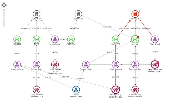
This adjusts the layout of our network so we can see unusual connections more easily.
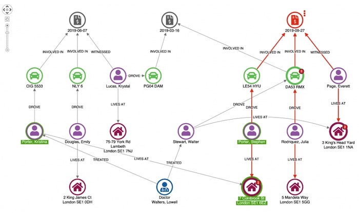
Here we see our original claimant’s address in Colnbrook Street is associated with an earlier claim. Given they share a surname it’s not really suspicious.
Here’s an example of a more suspicious match.
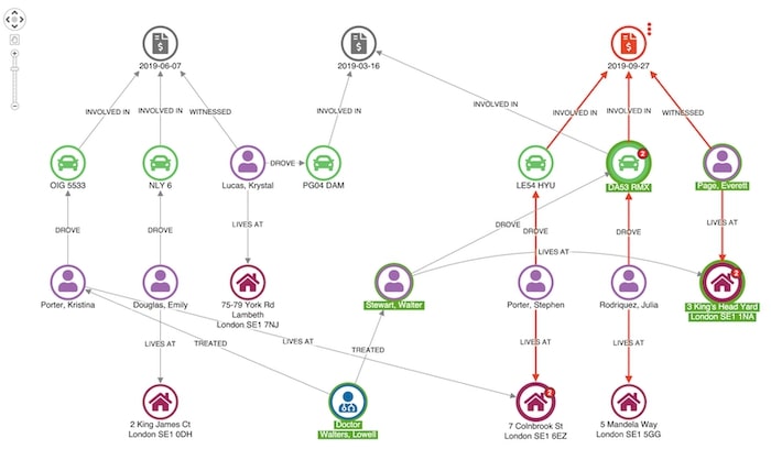
Our witness, Everett Page, shares an address with a man named Walter Stewart, who has previously made a claim relating to one of the vehicles involved in this incident.
At this point, a fraud analyst would probably want to escalate this case for further investigation. We can use a context menu to help our analyst progress this through the workflow:
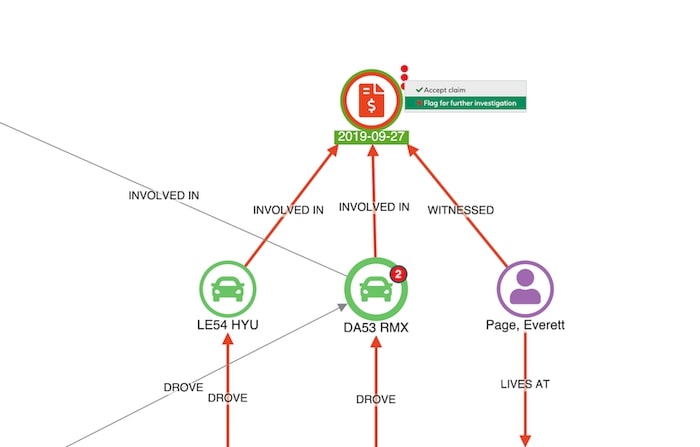
Representing data as a network offers an engaging way for analysts to rapidly understand events. Adding link analysis to your to existing claims management workflow makes the process simple and intuitive.
We could take this visual approach further with timeline visualization. This lets analysts explore the sequence in which events took place, as well as how they are connected. KronoGraph, our timeline visualization toolkit integrates seamlessly with our link analysis tools, providing a completely unique view of your connected fraud data.
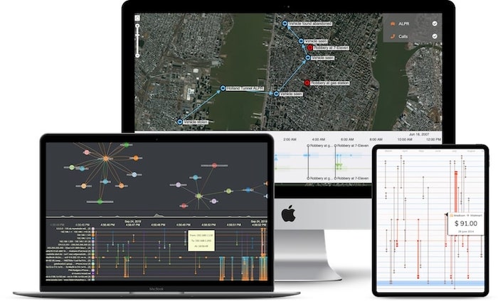
Read more about timeline visualization for fraud management.
This is a simple example, using synthesized data, of how our link analysis toolkits can make a complex and high-risk exercise simpler and more intuitive.
If you want to try our toolkits on your own data, just request a trial account.
This post was originally published some time ago. It’s still popular, so we’ve updated it with new example visualizations to keep it useful and relevant.