We’ve blogged many times about how our data visualization technology makes the world safer. But our KeyLines SDK for JavaScript developers and ReGraph SDK for React developers aren’t restricted to security, anti-fraud or intelligence tools.
Data-driven experts focused on the importance of collaboration have a radically different use case. Based on the scientific evidence that individual specialists working together in high-performing teams can solve the hardest problems, they’re developing technology that puts the right people together at the right time.
There’s broad appeal for an application that can make the right collaborations happen, but you need a powerful visualization component to bring the data to life.
We’ll look at three ways our toolkit technology can help to achieve this. First, let’s understand a bit more about the tools that many organizations are using to create the most successful communities and teams.
Apps for building effective teams
We’re not talking about group communication tools like Slack, Google Hangouts or Microsoft Teams here. They might help individuals work together better at a tactical level, but they’re not strategic solutions for designing the best collaborations.
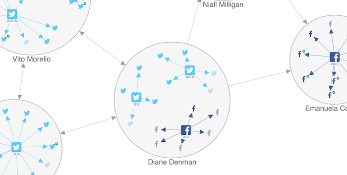
Applications for building teams in a strategic way take connected data from people’s professional networks and leverage it with proven network science theory. They start by ingesting as much connected data as possible – anything from social media networks and email contacts to teams, functions, suppliers and contractors inside large organizations.
An artificial intelligence element takes things to another level. Some apps feature an AI engine to find which nodes in the network should be connected but currently aren’t.
Dashboards of performance metrics on individual nodes is another useful addition. But to reveal real insight from connections, you have to see them.
That’s where the data visualization element – and our toolkit technology – comes in. Here are three scenarios where it’s essential.
1. Visualizing effective community cluster
Imagine you’re designing a conference to discuss the toughest graph visualization problems. With so many great events already established, how do you make yours more effective?
You might already know the right visualization experts to invite through your social channels, but they don’t necessarily know each other. How would you find out who was already connected and where the best networking opportunities lay? And how would you know what the ideal speaker lineup, panel or breakout group looks like?
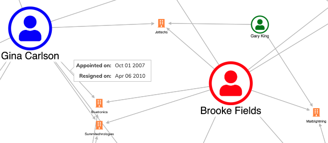
The AI engines powering collaboration apps have the answers, and graph visualization makes them real. Once AI suggests the strongest connections to personalize each individual’s network journey, our technology makes spotting those ideal collaborations easier.
The outcome?
You design an event where highly-engaged delegates maximize their personal networks. Better still, if your app has a real-time analysis capability, as more people sign up to the event, it can automatically update the visualization to achieve the best collaborations.
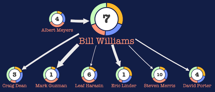
Data visualization styling options make spotting connections easier. With every individual represented by a photo, color-coding delegates from the same industries, highlighting or backgrounding connections, sizing nodes based on graph algorithm results, you get to design events where the best people come to meet the influencers in their field.
Find your use case
Want to see how data visualization can help you?
2. Visualizing high-performing teams
Every organization wants high employee engagement and an environment free of silos. Getting the right mix of knowledge and skills together in a team is key to success but it’s hard to achieve, particularly in larger organizations. There’s often a single point of contact between teams, and they can cause serious bottlenecks and communication breakdowns.
Collaboration apps help to maximize productivity by creating high-performing teams based on science. They break down barriers and save time by no longer relying on one team lead talking to another and another (and so on) to form gut-based hunches on who’d be the ideal candidates for their new project. Instead, you build effective teams fast. It can also reveal where silos currently exist and how to organize decision-making committees more effectively.
Advanced products quantify every employee using the latest developments in machine learning. Then they use network theory to examine properties such as skills, experience and characteristics.
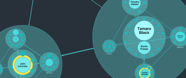
The result? A proposal for which team members would work best together to achieve a specific goal. When there’s a dynamic element too, as new people join the company, they’re automatically quantified. Finally, ReGraph and KeyLines visualizes those teams, so your users end up with a detailed map of connections showing what future success looks like.
Combos (our powerful node grouping tool) are great for showing which teams individuals belong to.
3. Visualizing the perfect candidates
If you’re a sales professional searching for the right prospect, an entrepreneur trying to find the right business partner, or a talent manager looking for the right candidate, the amount of data you need to wade through to find the right person can be overwhelming.
Our customers find the clever network filtering options in our graph visualization toolkits invaluable. They let you reduce the noise in your visualizations and drill down into the detail. Choose whatever filter logic suits the data by showing only the nodes and links users need to see and hiding the ones they don’t.
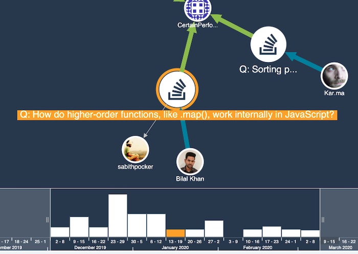
It’s quick and easy to focus on individuals who are based in a particular region, possess a unique set of skills or have the necessary qualifications. And if the collaboration application supports live updates, whenever new candidates with the right characteristics join relevant networks, they’re automatically added to the visualization. You’re always seeing the most up-to-date picture.
Innovate with KeyLines and ReGraph
There’s broad appeal for an application that can make the right collaborations happen. Work with our toolkit technology to reveal the true power in your networks and build the most effective teams and communities.
If your application needs a visualization element to bring your data to life, we’d love to collaborate with you. Request a free trial
The Twitter logo is a trademark of Twitter, Inc.


