Data visualizations aren’t just pretty pictures – they have a use. A well-designed, interactive visualization will help us understand data more quickly and effectively, which in turn leads to faster, more informed decision-making.
It can be frustrating when we see badly designed graphs.


Rather than start ranting on Twitter, we thought we’d save our followers the ordeal and compile a list of basic rules to follow when creating your own graph visualizations.
Why visualize information as a graph?
Before starting, it’s useful to remind ourselves why some design elements work and others don’t.Humans are not computers. Generally we find data intangible and difficult to process unless it’s encoded in a way our perceptive systems can quickly understand. Vision is our most powerful sense, with the highest bandwidth to the brain, so invariably the best way to encode data is visually.
We also want to exploit the brain’s ‘pre-attentive’ processing ability, i.e. without conscious thought. For example, we can instantly understand that something smaller is ‘less’ than something large.
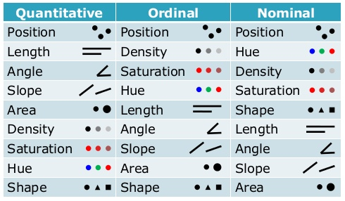
There’s been a lot of research into the visual cues most effective for this. You’ve probably already seen this kind of table in the information visualization literature:

To create an effective graph, we need to take these ideas, and some general design theory, and apply them to our work.
So here’s our…
10 rules of graph design
1. Start with the question
Without knowing what you’re looking for, no amount of data or flashy graphics is going to help you. Start with a question and build your design around that. Ideally, stick to one question at a time, too.2. Think about your colors
This applies of any kind of design. Some colors work well together; others do not. Think carefully about your color scheme. Make your colors harmonious and, if possible, meaningful. Avoid red/green combinations (not good for the colorblind) and generally any kind of rainbow palette is just going to disorientate.
On a similar note, use a plain (and preferably white) background. Using an image behind the graph is only going to distract from your data, and black backgrounds should only be used if your audience is in a dark environment.
Our guide to color design for data visualization
3. Avoid 3D
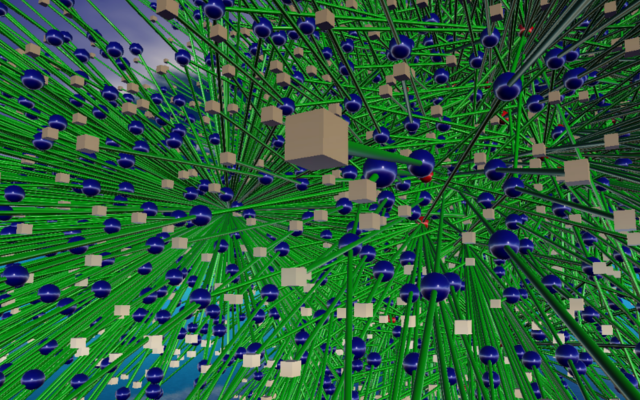
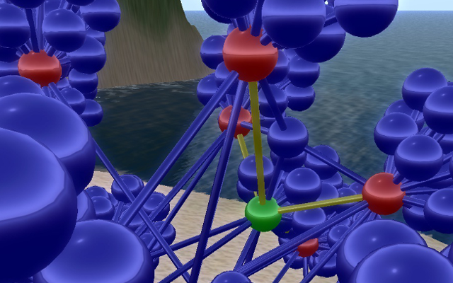
The unfortunate truth is that 3D graphs rarely work. They’re difficult to navigate without feeling seasick, suffer overlap problems and are almost impossible to print.
There’s a glimmer of hope in the realm of VR / AR headsets, but most users are years away from that. For now, stick to 2D.
4. Plan your labels
You have plenty of ways to add additional information to your graphs: tooltips, labels, menus, glyphs, color-coding, icons, animation, etc. Just remember that less is more; avoid overloading users by instead providing detail on demand.
Our Combos feature is a great way to clear chart clutter, but lots of other methods are available too.
5. Think about emphasis
Depending on your question, you will probably want to emphasize certain nodes. Again, you have plenty of options for this – size, color, border, animation, glyphs, etc. Use them sparingly.
6. Easy navigation
Allow your users to navigate the graph smoothly and intuitively. If you expect users will be using tablets or smartphones, full touch and gesture support should also be included.
7. Intuitive interaction
Allowing your user to interact with the data helps them understand and discover new aspects of it. Each graph visualization should have a unique UI and UX, specific to the individual question it seeks to answer.
8. Use a good layout
A good layout will:- Leave minimal white space without bunching elements
- Minimize node overlap
- Minimize link crossings
- Show symmetry and clusters where they actually exist
Learn more about automated graph layouts
Make use of filters
Graphs are often large – in some cases too large for your users to see patterns clearly. Users need to decide which types of nodes and links they want to focus on, filtering out those that are less important.
How to visualize very large networks
Animate sparingly
It’s tempting to animate everything in sight. Resist the urge as it will overload users and limit the usefulness of your visualization.
Bonus tip
Use a toolkit designed and built by experts. Here’s where we can help. Request a free trial


