The latest update to KronoGraph, our timeline visualization toolkit, includes a new demo which showcases the powerful benefits that data visualization brings to supply chain management.
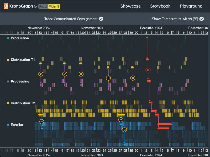
The demo uses fictitious data that’s based on the mass recall of contaminated spinach in 2006 in the USA. It shows how hybrid timeline and network visualization exposes issues in a complex supply network, traces shipments from production to retailers, and resolves problems without negatively impacting the entire supply chain.

The interactive demo helps you understand the connections between every supply chain stage, as well as what happens during each stage. The feature-rich KronoGraph timeline gives a detailed view of how and when items move through the process from origin to customer, and the complementary graph visualization maps out the distribution network so it’s easier to explore connections. Whether you’re monitoring shipping delays or investigating a weak link in the chain, KronoGraph gives you the full story, from a heatmap overview to a summary of the finer detail.
See heatmap reveal and tooltip features in action
The supply chain demo also lets you try out some of KronoGraph’s newest features. You can reveal events without leaving the heatmap view: a faster way to find patterns and anomalies in the context of the wider dataset. Toggling “Trace Contaminated Consigment” reveals the sequence of events that led to the alert at Aroma Foods, where the contaminated spinach was first discovered. KronoGraph can even give us the clues we need to work out how our product became contaminated, by revealing temperature alerts:
You can also add tooltips to heatmap cells to show everything from transaction amounts, endpoint addresses or – in this case – precise information about consignments:
Try our toolkits
If you’re already working with KeyLines and ReGraph, you won’t regret integrating with KronoGraph. Our timeline visual analysis tool adds a whole new dimension to your investigation. Try our demo to see how KronoGraph can give you end-to-end visibility of your supply chain, whether you’re selling spinach, managing an energy pipeline or shipping medical supplies.
The easiest way to get started with KronoGraph is through a free trial. Get in touch for a chat about how we can help with your project.


