Log data visualization with KeyLines
How Devo (previously Logtrust) empowers analysts to harness the connections in their big data, with the help of the KeyLines toolkit.
Highlights
- KeyLines integrated into powerful real-time big data platform, delivering easy access to network insight from any kind of data
- After a trial of several technologies, KeyLines was chosen based on superior performance, functionality and support
- Visualization application used by customers to gain connected, temporal and geospatial views of their data.
Background
Devo is a real-time big data-in-motion platform offering ‘Fast Data, Big Data’ analytics through a solution that enables real-time analytics for operations, fraud, security, marketing, IoT and other aspects of business. Guided by the philosophy ‘be real-time or be obsolete’ and a mission to democratize real-time big data tools, Devo has solved the real-time challenge facing most big data projects with its lightning-fast and uniquely powerful, easy-to-use big data analysis and visualization platform.
Designed to be accessible to analysts and business users alike, the platform provides a simple workflow for ingesting, structuring, querying, analyzing and visualizing machine data in real-time. Using a series of shareable widgets, known as “vertical apps,” users can explore and visualize their data in a variety of ways, providing interactive communication tools.
In this case study, we’ll see how the Devo team used the KeyLines toolkit to give users a way to understand the connections and structures in their data.
The Challenge
As a data agnostic tool, the Devo platform needs to support data from many different sources, in many different formats. This need was managed with the provision of vertical apps – additional functionality provided as bolt-on widgets.
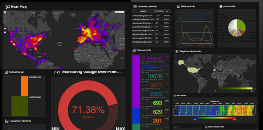
Most of the visualization apps were built using the D3 data visualization code library – providing a wide range of interactive dashboards:
But the team soon identified a need for a graph visualization-based vertical app. Sergio Bellido, VP Product Management explains:
“We noticed that our users needed a tool to bridge the gap between the tabular presentation of their data and the aggregated views available in our dashboards. Most aggregated views are only useful once you understand what you need to look for. The graph model is probably the best and most general data view possible. It gives quick ‘at-a-glance’ understanding of structure and can throw light on most datasets – so we set about building a graph visualization application.”
For performance reasons, the D3 library was quickly eliminated as a possible solution.
Data Visualization Engineer Eliseo Martinez led the search:
“Our platform can process 1,000,000 events per second, so performance in all areas is key. We knew the SVG [vector graphics] format used by D3 would not scale above networks of more than a few hundred nodes. So instead we searched for a tool based on WebGL – a much more powerful rendering technology.”
Functionality, power, speed of deployment (and speed to market) and the quality of support and documentation were all essential purchasing criteria. Among the other technologies being evaluated were SigmaJS and one of its commercial forks.
“KeyLines met almost all of our requirements from the outset. Then when the WebGL support was added in KeyLines 3.0, all the boxes were ticked and it became an easy decision.”
The Solution
Having settled on KeyLines, Sergio and Eliseo embarked on an iterative product development process, incorporating customer feedback along the way. KeyLines’ capability offered additional inspiration, leading to the team including geospatial and temporal analysis to their eventual product vision.
The result is a well-designed and intuitive KeyLines application, incorporating much of the toolkit’s most powerful functionality.
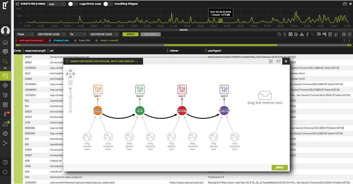
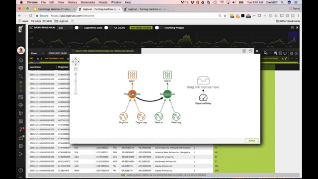
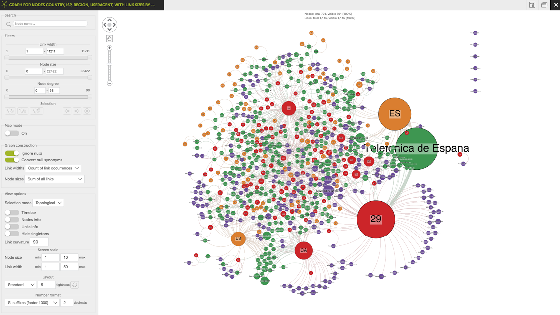
Using a clean drag & drop interface, users construct a graph model from a tabular view of their data, and define their visual styling.
Using a clean drag & drop interface, users construct a graph model from a tabular view of their data, and define their visual styling.
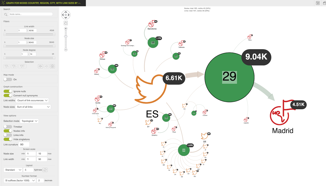
This produces an interactive visual report, which can be saved and shared among collaborators.
This produces an interactive visual report, which can be saved and shared among collaborators.
With the left-hand control panel, users can apply advanced visual analysis techniques including graph layouts, social network analysis algorithms and filtering.
With the left-hand control panel, users can apply advanced visual analysis techniques including graph layouts, social network analysis algorithms and filtering.
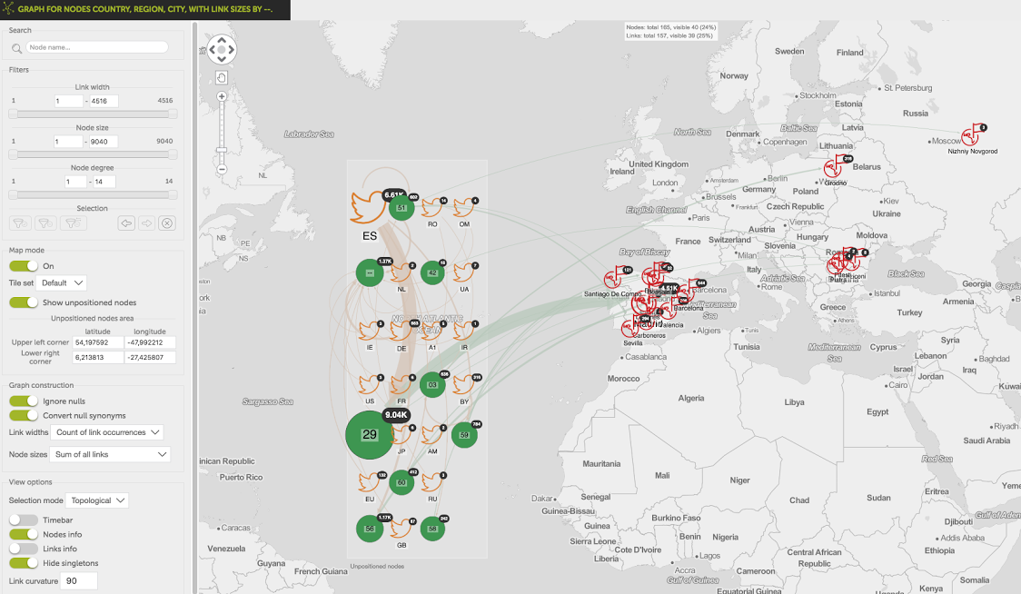
Data including a longitude and latitude attribute can also be visualized on a map, using KeyLines’ geospatial functionality.
Data including a longitude and latitude attribute can also be visualized on a map, using KeyLines’ geospatial functionality.
The Result
The graph visualization component is a key “wow” moment of the Devo platform user experience. Customer feedback has been universally positive, with customers reporting back that it has helped uncover incidents that may have otherwise been undiscoverable.
Eliseo and Sergio have plans to further develop and improve the platform’s graph analysis capability, including a more advanced use of the combos feature.
For more information, visit https://www.devo.com/
Learn more about how to use KeyLines for cyber security and log data visualization
Ready to visualize your connected data?
Bring clarity, confidence and interactive intelligence to your product – with visualizations that transform how users understand and explore complex data.
Share: