FREE: Start your trial today
Visualize your data! Request full access to our SDKs, demos and live-coding playgrounds.
In this blog post, I’ll use our KronoGraph, our timeline visualization SDK and KeyLines, our graph visualization SDK to create a slick, interactive live dashboard for analyzing cryptocurrency.
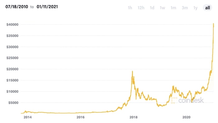
Bitcoin’s price made headlines in January 2021 after reaching an all-time high.
As the popularity of cryptocurrency continues to grow, the challenge facing anti-money laundering (AML) analysts and financial crime investigators gets tougher. In turn, there’s pressure on virtual asset service providers (VASPs) to comply with tighter regulations. Both must take a proactive approach.
We’ve blogged before about how our data visualization toolkits can build powerful apps to help users understand cryptocurrency exchange patterns and anomalies. But instead of looking at historic Bitcoin transactions, what if we could look at Bitcoin activity in real time? And why not combine a powerful Bitcoin network visualization chart, showing key connections, with a dedicated Bitcoin timeline view, featuring precise details of transactions as they happen?
Visualize your data! Request full access to our SDKs, demos and live-coding playgrounds.
We’ve blogged about Bitcoin before, so if you’re new to this cryptocurrency, check out What is Bitcoin?
After quadrupling in value in 2020, Bitcoin celebrated its 12th birthday in style by exceeding the $40,000 mark. The price has fluctuated since, but interest in Bitcoin continues to grow with approximately 330,000 daily transactions and over a million individuals mining at any time.
We’ve also seen rapid growth in technology companies building products to monitor and make sense of blockchain, the solution used by Bitcoin and other cryptocurrencies to maintain and protect the correct order of transactions.
In its simplest form, blockchain is a vast and complex series of transaction events between entities. With this in mind, the benefits of visualizing it as both a network and a timeline become obvious. Let’s explore this further, starting with examples of Bitcoin timeline charts built with KeyLines and ReGraph.
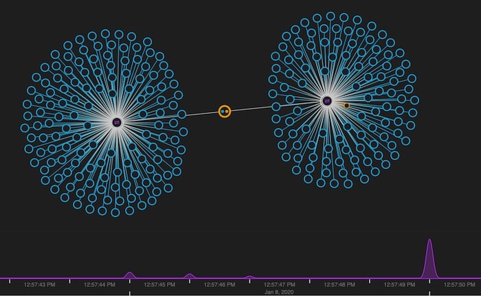
Using our graph visualization toolkits, you can build apps that bring cryptocurrency data to life. Investigators use network charts to explore blocks and individual transactions of interest, relying on search queries to answer questions about items of interest.
They rely on the time bar component to filter their data and focus on a specific interval to understand what happened in the past. This is a useful detection technique for uncovering patterns and anomalies that’s widely used by fraud analysts.
Now we’ll look at another way of visualizing cryptocurrency transactions: by building an interactive Bitcoin timeline directly from the data.
Who needs to understand blockchain technology?
KronoGraph is a front-end toolkit for building interactive timeline visualizations. Apps built with KronoGraph reveal sequences of events, showing how they unfold and how they’re connected.
Investigators who need to understand transactions better, or VASPs trying to manage their regulatory compliance, benefit from the ability to visualize Bitcoin timelines in this way.
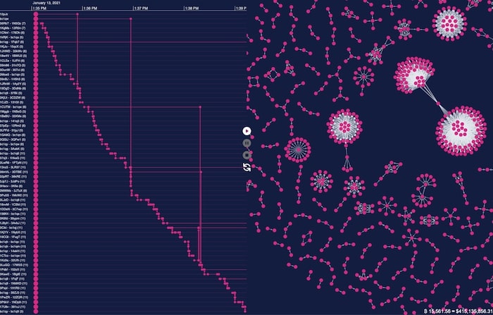
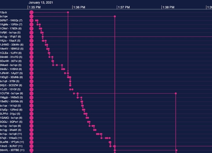
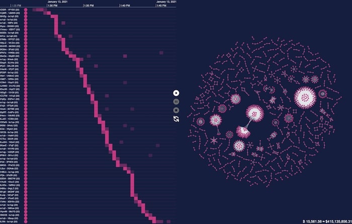
A timeline view answers crucial questions – who bought/sold what, and when? Blocks of transactions go from left to right, with directional arrows revealing Bitcoin transfers between bitcoin addresses. We’ve truncated the addresses to the first five characters to save screen space, but it’s easy to add a tooltip to reveal the full identity.
Learn more about KronoGraph
So what’s the best solution for AML and fraud investigators? Should they choose a Bitcoin timeline chart to visualize blocks as a network, or choose Bitcoin timelines to reveal the precise sequence of transactions?
The answer = both.
KronoGraph integrates seamlessly with our graph visualization toolkits to create a powerful tool for exploring time-based data in a new way.
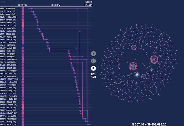
Let’s hook up to a live feed of Bitcoin transactions and visualize them in both network and timeline form.
A live dashboard featuring Bitcoin timelines, together with a network chart, means investigators can spot patterns and anomalies as soon as they emerge. With visual alerts on suspicious wallets, accounts or locations, they’re notified immediately when activity takes place that needs further investigation. Analyzing cryptocurrency has never been easier.
A dynamic approach, which adapts the visualizations in real time as transactions occur, also makes your app stand out from the competition.
Let’s get started with our dashboard.
Front-end development with JavaScript often means a large number of dependencies and complex build processes. This doesn’t have to be the case when you build an interactive app. My aim is to keep things simple, so for this dashboard, I’ll use plain (or ‘vanilla’) JavaScript and no dependencies.
We’ll use KeyLines – our pure JavaScript graph visualization library – to integrate with KronoGraph and build the dashboard.
Blockchain.info provides a great endpoint for monitoring Bitcoin activity as it happens. By subscribing to a particular WebSocket, We’re able to write code to handle each transaction in turn.
To connect to the Blockchain.info websockets, we’ll use the native browser WebSocket function:
const wsUri = `wss://ws.blockchain.info/inv`;
let websocket = new WebSocket(wsUri);

websocket.onopen = function (event) {
 state.items = [];
 websocket.send(JSON.stringify({ op: 'unconfirmed_sub' }));
};

websocket.onclose = function (event) {
 console.log('Socket closed');
};

websocket.onmessage = onMessage;

websocket.onerror = function (event) {
 console.log(event.data);
};
Here we’re sending an initial request to subscribe to all unconfirmed transactions. We then bind the onMessage function to the onmessage event listener. This is where we handle each of the transactions sent via the WebSocket.
The data provided by the endpoint is mapped to “in” nodes in our network chart (where the Bitcoin is coming from) and “out” nodes (where it’s going). The data also contains a Bitcoin transaction hash, which is the unique ID for every verified transaction in the blockchain. We don’t necessarily need this in our data model, but for now we’ll use purple nodes to represent them.

In our Bitcoin timeline, the entities (similar to nodes in KeyLines) down the left-hand side represent addresses. KronoGraph has helpfully aggregated these to fit as much data on the screen as possible. In this example, you’ll see that most entities contain (25) addresses.
The events (similar to links) on each timeline showing individual transactions. We’ve used styling options to reveal what’s happening at-a-glance. Entities shown as a brighter pink color represent addresses with more funds coming in than going out.
Converting this JSON data to the format expected by KeyLines is simple. We just need to create an array of nodes and links. KronoGraph expects a slightly different data format to account for cases where events can be connected, or can refer to more than two nodes.
KeyLines works effectively with dynamic networks, adapting to nodes and links incrementally as they’re provided to the graph. Our adaptive graph layouts option adds new items in a way that’s logical and easy to follow, so users don’t lose their mental map of where items exist on the chart. It’s also easy to use:
await chart.expand(chartItems, {layout: { fit: true, name: 'organic' }})
The equivalent function call for KronoGraph is the set function, shown here in the entire mergeWithChart function:
const mergeWithChart = async () => {
   const { chart, items, timelineData, timeline, mode } = state;

   if (['pause', 'stop'].includes(mode)) {
     return;
   }

   const fit = mode === 'play';

   itemsToTimeline(items);
   timeline.set(timelineData);

   if (fit) {
     runFit();
   }

   if (!state.layoutInProgress && mode) {
     await chart.expand(items, {
       layout: { fit, name: 'organic' },
     });
     state.items = [];
     setTotalSeen();
   }
   state.tick++;
 };

 const asyncMergeWithChart = asyncThrottle(mergeWithChart);
We want smooth animations across the dashboard as the data changes. To manage the large amount of transactions returned from the WebSocket, we’ll use a simple asyncThrottle function. This makes sure we only animate new data once the previous animation has completed.

When they’re analyzing cryptocurrency, investigators and analysts will want to pause live updates if they receive an alert or spot an anomaly in real time that needs further investigation. I’ve added pause, resume, stop and refresh controls using the excellent SVG HeroIcons to avoid a dependency on font icons in our application. I think they look great!
One neat trick: I automatically pause the updates when a user zooms into the Bitcoin timelines past a certain threshold. This is to avoid overwhelming them with new data if they’ve chosen to take a closer look.
To give extra context, in the bottom right corner of the chart we’ve included a counter of the approximate value of the Bitcoins shown in the dashboard.
In a half-hour window, I watched transactions worth a staggering $963,401,426.84!
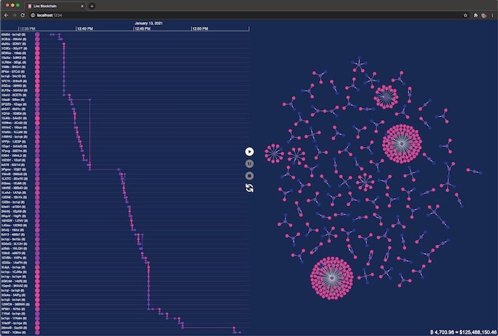
Finally, we mentioned earlier that the transaction ID we left as a chart node isn’t strictly necessary. It’s a common problem, and we’ve blogged about data modeling best practice and how the data model provided by an endpoint or database isn’t always the right fit for a visual representation. To update our dashboard, we can just link the “in” and “out” nodes directly, and remove the transaction node from the chart. It also removes the transaction events from the timeline.
We’ve used KeyLines and KronoGraph to create our own integrated timeline and chart app for analyzing cryptocurrency. It gives investigators two powerful ways to examine the same data and monitor live transactions, a valuable technique in their fight against money laundering and fraud. Our app was quick and easy to create, and (my favorite bit) dependency-free.
If you’re tempted to build your own live dashboard, sign up for a free trial of our toolkits.
Registered in England and Wales with Company Number 07625370 | VAT Number 113 1740 61
6-8 Hills Road, Cambridge, CB2 1JP. All material © Cambridge Intelligence .
Privacy Policy | Security Framework


