Summary:
This article compares chord diagrams with interactive graph visualization to show how best to represent relationships between JavaScript technologies. Chord diagrams offer a neat high-level snapshot, but they become static and cluttered as complexity grows. Interactive graph visualization makes patterns easier to explore – grouping related technologies, highlighting strong connections and using analytics like community detection to reveal usage trends. Chord diagrams work for quick summaries, but graph visualization is better for deeper, exploratory insight.
Finding an effective way to visualize connected data isn’t easy. In this post, we examine the pros and cons of one popular choice: chord diagrams.
There are so many visualization options to choose from. Focus too much on producing something that looks good and you might lose sight of the meaning behind the data. Concentrate solely on the graph data itself and you may end up with an ugly chart that’s hard to interact with. Striking the balance is key.
Done well, chord diagrams featuring arcs between nodes can make a great impact. We’ll explore how well they convey information about trends and patterns compared with the same data in a Cambridge Intelligence graph visualization.
Our dataset is also highly relevant to our toolkit technology – the State of JavaScript 2018 survey results. Let’s start by learning a little more about them.
State of JavaScript dataset
State of JavaScript is an annual survey that identifies which libraries, frameworks and languages are popular in the JavaScript developer community. With over 20,000 participants in 153 different countries last year, the results explores what developers are using, how they feel about it, and what they’re keen to learn next.
2018’s results were as interesting as ever. Key takeaways for me were:
- React has cemented its lead as the most trusted and widely-used front-end framework (64.8% have used and would recommend it).
- Use of Visual Studio Code has exploded over the past few years. It’s by far the most popular code editor amongst survey respondents. With its vast plugin ecosystem, slick Node.js debugging support and inline Git capabilities, it’s easy to see why.
- It’s hard to define, discuss and survey the use of technology. Issues around potential sampling bias, neutral question phrasing and reaching broader audiences are difficult to overcome, and the team go to great lengths to address them.
Introducing chord diagrams
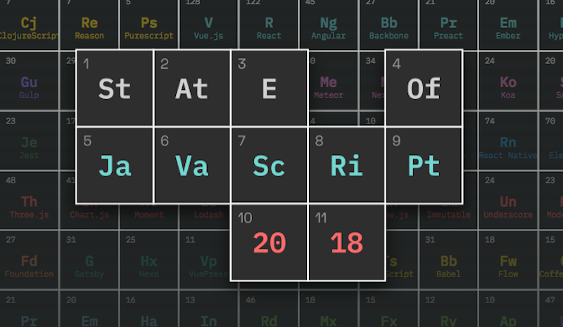
As someone who works with data visualization libraries, I was drawn to the chord diagram used in the survey. Done well, these diagrams can provide a compact, economical way to represent complex data.
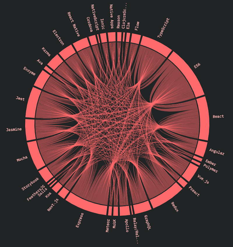
At first glance, we get an attractive summary of an important part of the data: the connections between technologies.
The nodes take up segments around the circle edge, so you can tell from the relative widths which ones are most popular. Inside the circle, links between nodes show which technologies are used in tandem.
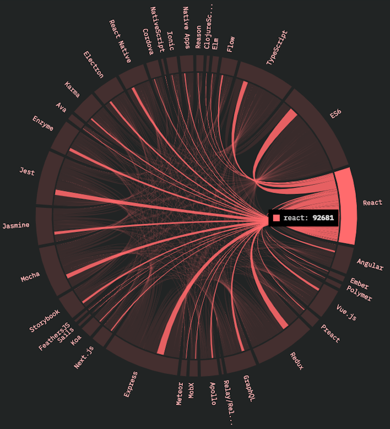
It’s not so easy to spot what’s connected in this high-level view, but, hovering over a node segment highlights its connections and reveals a tooltip.
Chord diagram drawbacks
Chord diagrams are naturally quite static. It’s rare to find one that lets you zoom or resize dynamically based on the information you’re most interested in. Unlike graph visualizations, they’re not really designed for in-depth exploration or advanced interactions.
Just like in graph visualizations, it’s easy to fall into the trap of attempting to show every link in a chord diagram at once. In this example, you need to filter out a lot of noise before you can find the insights.
Color styling is commonly used to add another context dimension to visualizations. Chord diagrams often feature a high proportion of crossed links which can make the use of colour look complicated or messy. The State of JavaScript example avoids this by using the same color for every node and connection.
The team behind the report kindly made the source data available and invited readers so share their attempts at alternative visualizations. Let’s see what KeyLines can achieve.
Greater insight using graph visualization tools
My first attempt to visualize this data looks remarkably similar to the chord diagram.
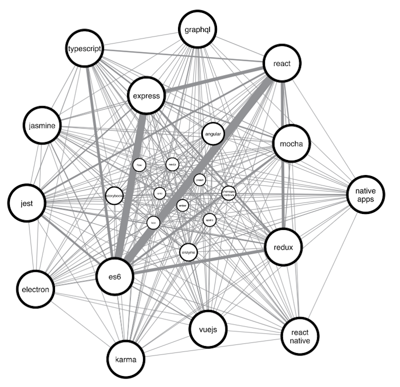
Here I’ve used the standard force-directed layout and sized nodes by popularity. I’ve also grouped multiple links between nodes. It’s already much easier to see where the greatest number of connections between technologies exist.
To make my chart look even more like the chord diagram, I’ve pushed nodes to the edges of the component using the circle arrangement function. I’ve also mimicked the fluid pattern by offsetting links to give them a slight curve. Finally, to avoid distractions from the spiderweb of less significant connections, I’ve sent those to the background and focused on key trends.
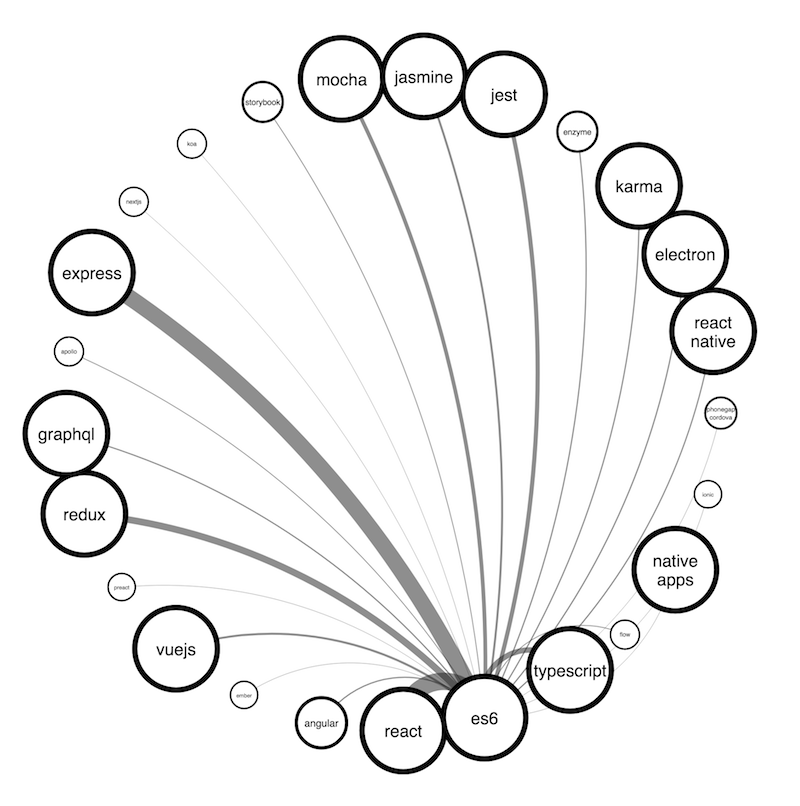
JavaScript enthusiasts will spot the different categories that exist in this network – some are front-end frameworks, others are types of JavaScript and so on.
Let’s use some other powerful toolkit features to make these clearer.
Combos and colors
Combining similar nodes into color-coded groups – or combos – creates immediate impact. It also delivers a deeper level of analysis, as we can now easily focus on the connections between nodes inside each group, as well as between the groups themselves.
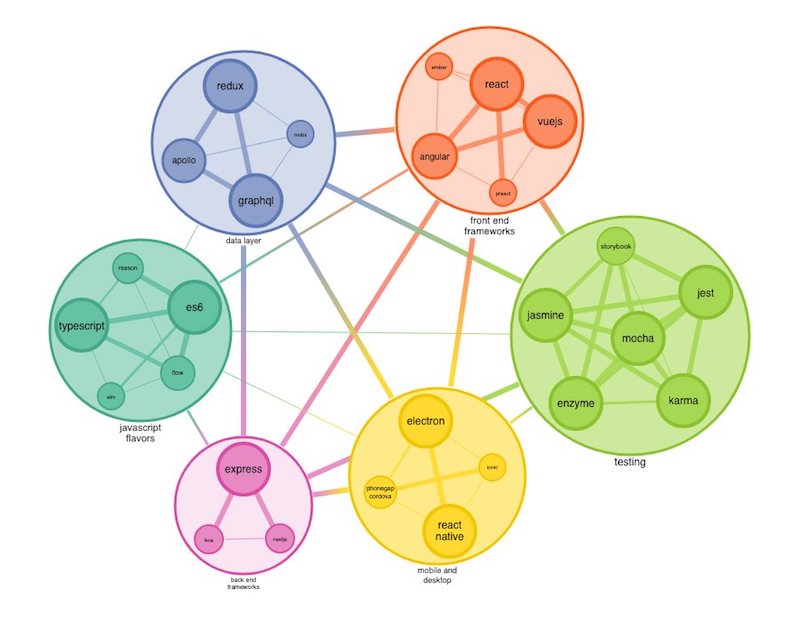
The gradual color change on links between groups help to convey the flow of information as well as provide a nice visual effect.
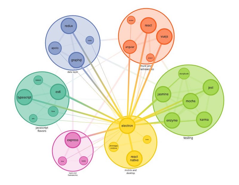
Even though technologies exist in separate combos, our toolkit still makes it easy to reveal the underlying links between specific tools. Now you’ve seen how nodes are grouped, let’s expose and examine the connections between nodes in different combos.
Selecting the Electron development framework reveals links to many other technologies. It’s a popular choice for JavaScript developers, so the high number of connections isn’t surprising.
Now we’ll dig deeper to see what further insight subnetworks can provide.
Community detection
A key purpose of the original chord diagram is to show which JavaScript technologies are most commonly used together. This could help guide developers through the wide range of choices about which technologies to work with next.
Knowing where subnetworks or communities exist in a dataset is a valuable analysis technique in many use cases. From finding terrorist cells in large organizations, to identifying chemicals that are most compatible in drug research, there’s an obvious need to make node clusters easily recognizable.
Our toolkit comes with graph algorithms that do the hard work for you. I’ve created new combos, this time based on our ‘community detection’ algorithm. This uses all the links in the network to make an educated guess on the technologies that developers are either familiar with or use together. The nodes are still color-coded depending on which technology category they belong to.
The largest combo tells us that many developers use a bunch of technologies simultaneously. The smaller ones reflect some definite patterns of use: Elm and ClojureScript use a similar functional programming style, so it makes sense that developers would be proficient in both.
Want to bring chord diagrams to life?
Chord diagrams have their uses, and the State of JavaScript team did a nice job with theirs. If you want to move to the next level and run fully interactive, in-depth data analysis, we offer the advanced graph visualization tools you need. Go ahead and request a free trial.
And if you’re a JavaScript developer looking for somewhere new to apply your skills, you might like to know that we’re hiring.
Share: