FREE: The ultimate guide to graph visualization
Explore proven strategies for building successful graph visualization applications.
This blog post explores the vibrant world of color theory for data visualization. It uses both timeline and graph visualization examples to demonstrate how color theory helps you design charts that look good, and make data more compelling.
Colors can make or break your data visualization.
A carefully selected color palette helps you to harness the pre-attentive processing powers of the human brain, and makes insight clearer and easier to find. A badly chosen color palette obscures the information your users need to understand, and makes your data visualization less effective and harder to use.
We’ll use examples from our KeyLines, ReGraph and KronoGraph toolkits throughout.

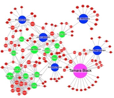
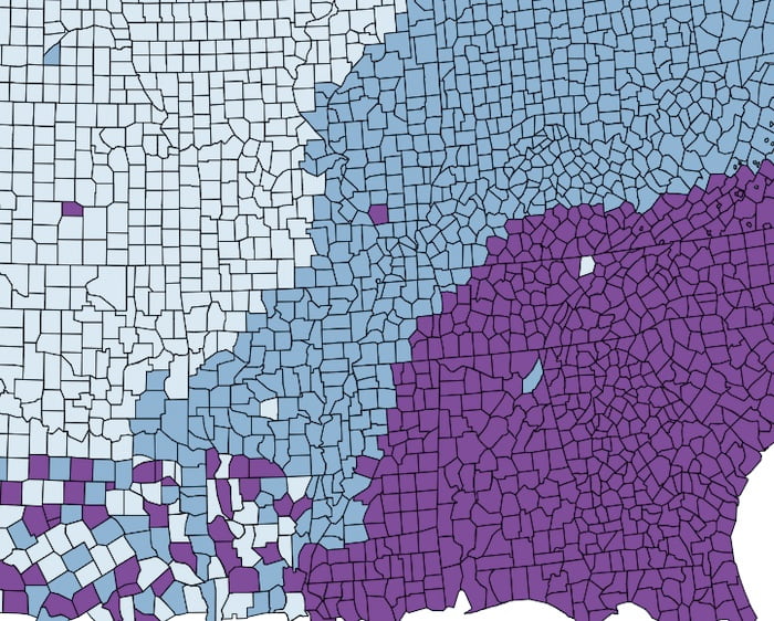
We’re not big fans of the next version, though. It breaks several basic color rules.

Explore proven strategies for building successful graph visualization applications.
Color is a highly subjective topic. Reactions to individual colors will vary between people and cultures. Color theory, on the other hand, is an advanced and evidence-based science that can teach us a lot.
For this blog post, we’ll focus on one color theory concept: the HSL model.
HSL breaks color down into three separate channels: hue, saturation and luminance.
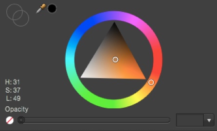
With these three measurable channels, we can start to generate rules for selecting color palettes.
Let’s walk through a step-by-step process for enhancing your visualization with color.
This may be obvious, but your first step is to decide which aspect of your data you want to represent with color.
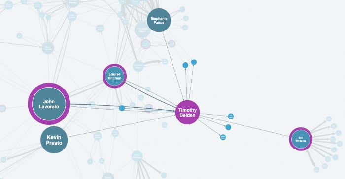
In a network of email accounts, for example, each node could have multiple attributes:
Only one of these attributes can be tied to color. It is up to you to choose one that your users can understand quickly, and will lend itself to a color scale.
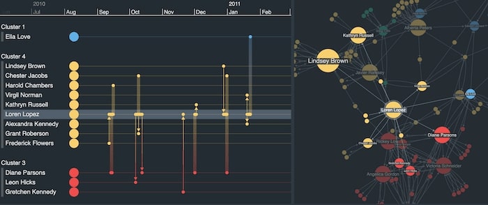
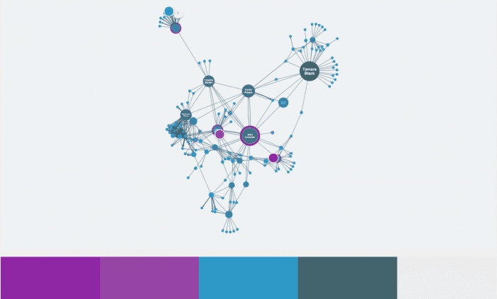
We’ve taken a similar approach in this combined network and timeline visualization. It features phone calls between students, with color used to represent which friendship group or cluster each caller belongs to.
Don’t forget – you can represent data attributes in many different ways. Color is just one of the tools available. Think about color alongside other options like labeling, glyphs, node sizing, edge weighting, etc.

Our Figma Design kit makes designing beautiful and intuitive data visualizations easy.
Once you’ve chosen an attribute to apply a color palette to, you need to decide which scale to use. Different scales require different types of palette.
The superb Color Brewer tool defines three types of scale:
Based on the scale you chose in step 2, you can decide how many hues you need in the palette:
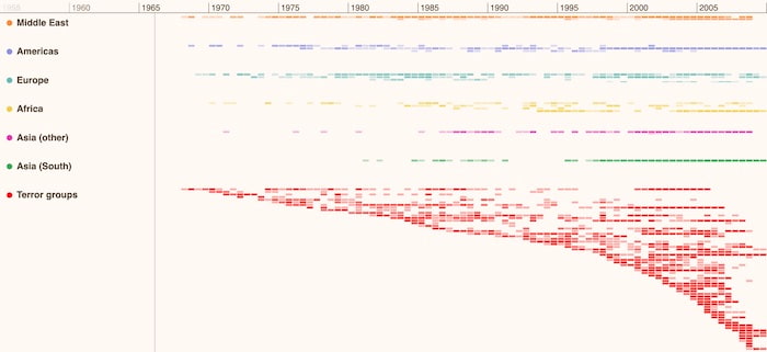
This timeline visualization presents a record of global terrorist activity as a heatmap. Identifying past hotspots or patterns of behavior by terror groups can help security agencies with their ongoing risk analysis. Each region has it’s own distinct hue, and through clever use of saturation, it’s clear at-a-glance which world regions were most affected and when.
Once you’ve picked your colors and been clear about what they represent, stick with them. A consistent color scheme helps to develop your user’s mental map of the data. Even if you provide slightly different versions of the same data, it’ll feel familiar right away.
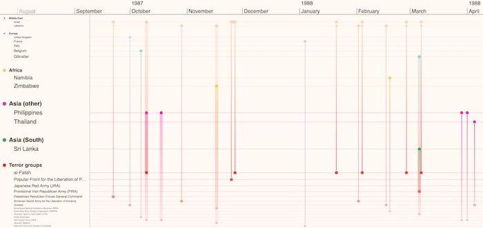
In our risk analysis timeline example, we can zoom in to focus on a specific time duration of interest. The timeline visualization looks different now, with countries and terror groups linked by the events that connect them. Also notice how entities, timelines and gradient links between events match the world region colors we saw in the previous heatmap version.
Before getting too creative, take a look at your data to see if there’s an obvious set of colors.
Your application or corporate style guide might be a good starting point. If you don’t have one of those, see if there are any color sets your users are likely to understand without a legend.
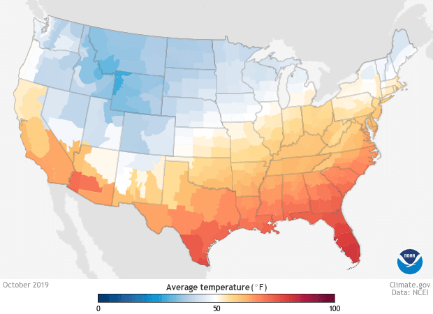
Take this visualization, for example, looking at weather temperatures. Blue and red are readily understood without any explanation, and are easily distinguishable.
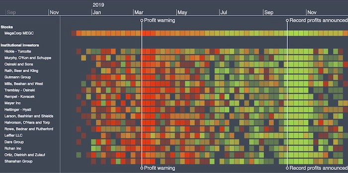
This timeline visualization investigates possible insider trading by institutional investors. Displaying shares as green or red, depending on whether they were bought or sold, is a simple but effective technique that makes the data easier to understand.
Now you know how many hues are required, you can do the difficult bit: create a palette.
In most cases, your best option is to use one of the many excellent web resources. ColorBrewer is one of the best for picking schemes for sequential, diverging and qualitative data. Or if you have a starting point in mind, Adobe Color creates palettes from a single color.
There are several groups of colors that work well together. You can identify them by their relative positions on the color wheel:
If you decide not to use one of these tools, you should at least follow this basic advice:
By now you should have a beautiful palette based on color theory for data visualization. Nice work!
There is one final task you need to do: convert your HSL values to RGB.
Colors in Cambridge Intelligence products can be specified in several formats, including the 17 CSS standard named colors, hexadecimal (or shorthand hexadecimal), and RGB. You can do this conversion using an online tool, or programmatically using a simple JavaScript formula.
We’ve barely scratched the surface of colors in this post, but it’s enough to get you started. If you want to learn more about using color theory for data visualization, see:
Visualize your data! Request full access to our SDKs, demos and live-coding playgrounds.
This color theory for data visualization post was originally published some time ago. It’s still popular, so we’ve updated it with new example visualizations to keep it useful and relevant.
Registered in England and Wales with Company Number 07625370 | VAT Number 113 1740 61
6-8 Hills Road, Cambridge, CB2 1JP. All material © Cambridge Intelligence .
Privacy Policy | Security Framework


