Modern Customer Relationship Management (CRM) is about more than simply tracking behavior and enlisting customers to campaigns.
Marketing is now focused on relationships and customer data is so varied and widely available, that CRM has evolved to play a much bigger part in business strategy.
It’s about staying one step ahead – of competitors and customers, and uses knowledge graph concepts at its core.
Predicting customer actions
Predictive modeling systems use algorithms to predict a customer’s likelihood to do something. Often these are focused on retention, e.g. how likely is my customer to leave and join a competitor?
Companies often use a ‘next best action’ field in their CRM systems to equip frontline staff with the information they need to retain a customer (or, in marketing speak ‘reduce churn propensity’).
This post explores how churn propensity can be predicted with graph analysis, and how KeyLines can enable front-line staff to prevent customers from leaving your service.
Propensity modelling in the telecoms industry
An established example of propensity modeling occurs in the mobile network provider industry.
Using social network analysis (SNA), high risk customers can be identified by looking at the social network of a churning customer.
E.g. if the closest friend of a customer (identified by volume of calls/texts a month) has recently left the network, that customer’s churn propensity will increase. Perhaps it’s worth offering them a bigger discount when their contract renewal approaches?
Couple this with other carefully calculated factors that influence churn, e.g. complaints or late payments, and you can generally build a pretty good picture of who’s looking at leaving your service, and who’s planning to stick around.
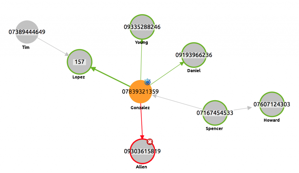
Lets take a look:

Gonzalez is our target customer because his phone contract renewal is coming up, represented with a stopwatch glyph.
We can also see that one of his most common contacts, Allen, has recently churned – demonstrated by the red node and glyph. The link that represents the flow of communication between Allen and Gonzalez has been colored red to illustrate the possibility of negative word of mouth.
Depending on your variables/influences for customer propensity, you can customize KeyLines events and display to show it visually.
Seeing the bigger picture
If Gonzalez does leave the service, the damage is realistically limited to his immediate connections – of which he has five. Not such a risk to the business.
However, this isn’t always the case. A wider use of Social Network Analysis (SNA) here could be to perform wider network analysis to identify strategically important customers.
You can read more about SNA measures here. For now, we’re going to look at degree centrality.
Degree centrality and churn risk
Degree Centrality is a simple SNA measure that counts how many connections a node has within a network.
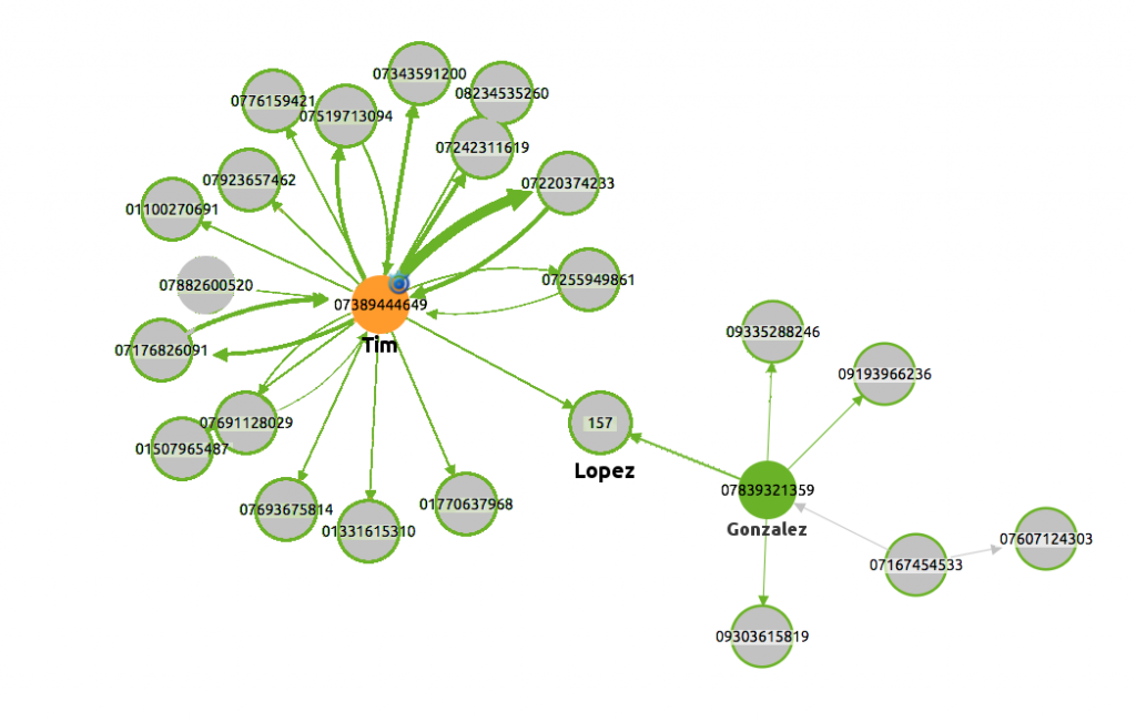
For a visual example, let’s look at one of Gonzalez’s second-degree connections, Tim:

In the screenshot above, Tim also has a glyph representing he is approaching his renewal. If Tim churns, he has the potential to influence more customers than Gonzalez due to his greater degree centrality.
He is in contact with 17 other customers, compared to just 5 for Gonzalez. Armed with this knowledge, a retention agent can be given greater freedom to negotiate with the customer at the time of his renewal.
This can also be visually highlighted in KeyLines with node size/color, halos, labels, glyphs and various others – though this would be more suited to a greater network size.
Data tells a story – let KeyLines share it
This post demonstrates visualizing churn, but the applications for this are much wider. Best next action systems and propensity models are the future of CRM and as long as you have quantifiable values, you can use KeyLines to visualize anything.
Maybe you are preparing to release a new product and want to give some early trials in order to spread positive word of mouth – you can use KeyLines to highlight the most connected customers in your network. Or, with a big enough cut of customer social data, you can determine your best ‘seeding’ opportunities.
To try KeyLines for yourself, sign up today for a free trial: Try Keylines, our JavaScript graph visualization SDK


