
Fake news is nothing new – bad journalism and propaganda have always existed – but recent concerns about its affect on politics and current events have made headlines. How do you spot it? One effective way is by comparing patterns of behavior to identify legitimate activities and anomalies. By visualizing anomaly detection, we see those outliers more clearly.
What is fake news?
The term ‘fake news’ usually refers to completely fictitious articles that are written to be as viral as possible. These hoax stories are published on websites with names that sound authoritative, then shared to a Facebook and Twitter audience who tend not to fact-check their sources. As a result, publishers earn advertising revenue (the original creator of the fictitious Ohio lost votes story predicts it netted him $5000, for example) and influence public opinion.
In recent months a number of social networks and news outlets launched crackdowns on the spread of fake news. Facebook, for example, is rolling out a program to combine user feedback with behavior analytics and 3rd party fact-check sites to flag fake news.
In this blog post we’ll look at fake news as a graph problem. We’ll see how graph visualization tools like KeyLines can help social networks stop the spread of hoax stories by visualizing anomaly detection.
How can websites detect fake news?
The challenges of detecting fake news are similar to the problem of detecting review fraud. It involves:
- unverifiable data – social networks do not verify the identity of their users. They do not take credit card details or check IDs. They also cannot adequately block determined repeat offenders.
- a huge volume of data – Facebook has 1.6 billion active users each month and relies heavily on users to flag inappropriate content, meaning many thousands of flagged items require manual review.
- evolving behaviors – fake news is created and shared by real people, not bots. They may change their behaviors over time to circumvent detection.
Approaches that rely only on algorithmic detection are not enough. They’re inflexible and lead to false-positives meaning fake news slips through, and genuine news gets flagged as fake. Similarly, just relying on user flags is time-consuming and prone to abuse.
Instead we can try a two-stage hybrid approach:
- Content is assigned a reliability score based on flags/reports, account history and input from 3rd party fact-check sites. Highest risk content is automatically flagged as fake. Lowest risk content is ignored.
- Borderline content is manually reviewed by visualizing the anomaly detection in a graph visualization component.
Let’s see how we can use KeyLines to intuitively and quickly review borderline content, and separate the real from the fake.
Building the fake news graph
Just like detecting review fraud, the key to detecting fake news is connections – between accounts, posts, flags and websites. By visualizing those connections as a graph, we can understand patterns that indicate fake content.
Let’s start by looking at the data points that sites, like Facebook, have available:
- Account (or Page)
- Account age
- Account history / behavior
- Account connections (friends, groups, etc)
- Post
- Device fingerprint / IP address
- Timestamp
- Number of flags / shares / reactions / comments
- Article
- Host URL
- Site owner / age, etc (via whois lookup, or similar)
- Title, content and author
There are many ways to map these data points to a graph structure, but we can start by creating nodes for our three main items: accounts, posts and articles.
We also want to see IP addresses – to check for patterns in where posts are coming from – so we can add those to our model. The result is something like this:
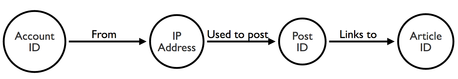
Now we can visualize this network and start looking for suspicious patterns.
Our fake news dataset
There are no publicly available social media data available that includes accounts, posts, articles and flags. Instead, we synthesized our own using data from two sources:
- BS Detector – a browser plugin for flagging fake news
- Buzzfeed Fact Check – a dataset covering user sharing patterns on Facebook
The data isn’t going to be realistic, but it’s enough to help us validate this approach, and understand better how a graph visualization component would fit within a content investigator’s workflow.
Loading the data
There are several ways to integrate a graph visualization component into an investigator’s workflow.
The first is as part of a reactive investigation. This is when a case that’s been flagged for manual screening is loaded into a chart for the investigator to assess. Additional nodes are added through user interaction, revealing context and connections to give a broader picture. Using this, the investigator can make a decision about the legitimacy of some content.
An alternative approach is to batch load a number of posts, and their connected nodes, into a KeyLines chart to uncover anomalous patterns. This is a more proactive, but labor-intensive activity, taking the reverse approach to the above.
This is the visual model we selected for our fake news dataset:
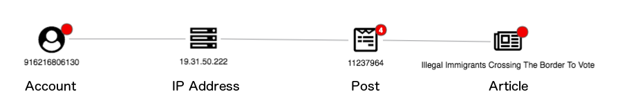
We’ve used icons to help users identify the different node types. We’ve also used red glyphs to identify warning signs such as a ‘new’ account, and the number of flags and articles from domains previously connected with fake news.
Initial load
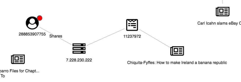
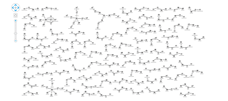
Before we can identify unusual patterns, we need to define normal behavior. Here’s what happens when we load 100 Post IDs into KeyLines:
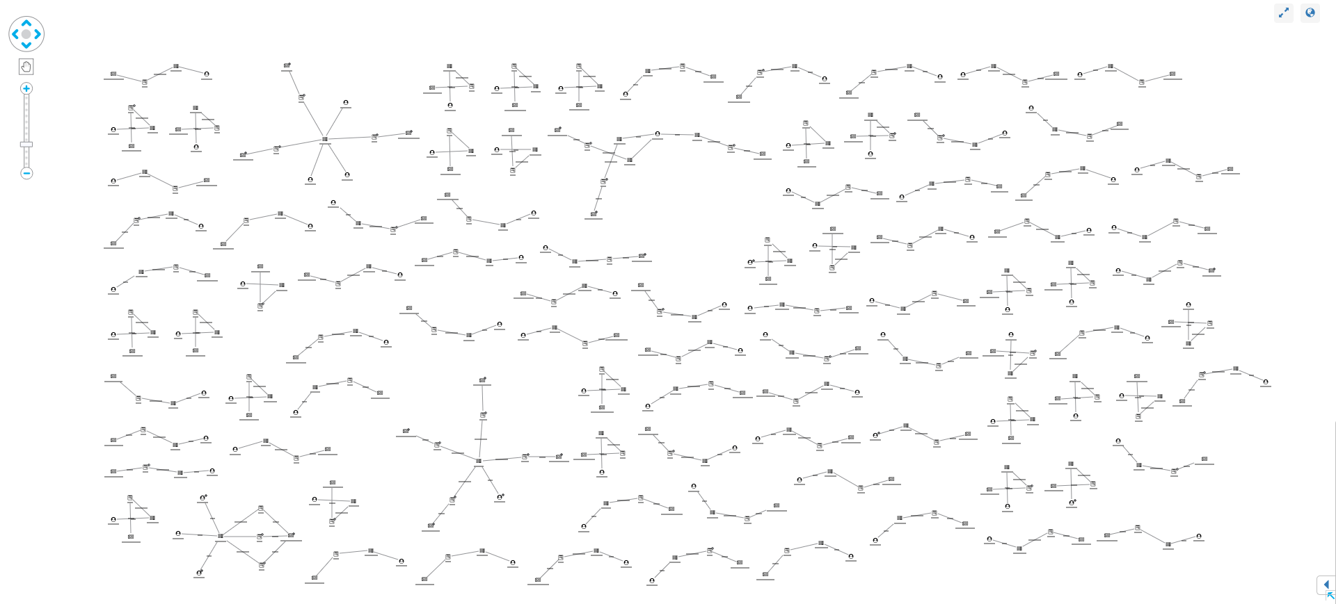
Our synthesized dataset is much simpler and probably has a higher rate of anomalies, but even in this example we can see normal and unusual behavior:
Normal posts look similar to our data model – featuring an account, IP, post and article. Popular posts may be attached to many accounts, each with their own IP but, generally, this linear graph with no red glyphs indicates a low-risk post.
Other structures in the graph stand out as unusual. Let’s take a look at some.
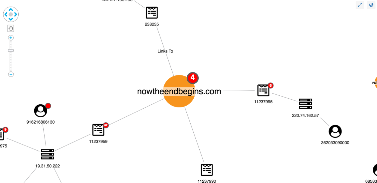
Monitoring new users
In this scenario, new users should always be treated as higher risk than established users. Without a known history, it’s difficult to understand a user’s intentions or identify their sharing patterns. Also, as we mentioned before, even with event fingerprinting and IP bans, social networking sites cannot definitively stop repeat offenders from creating new accounts.
Using the New User glyph, we can easily pick out those new users:
For a clearer view, let’s use the sequential layout:
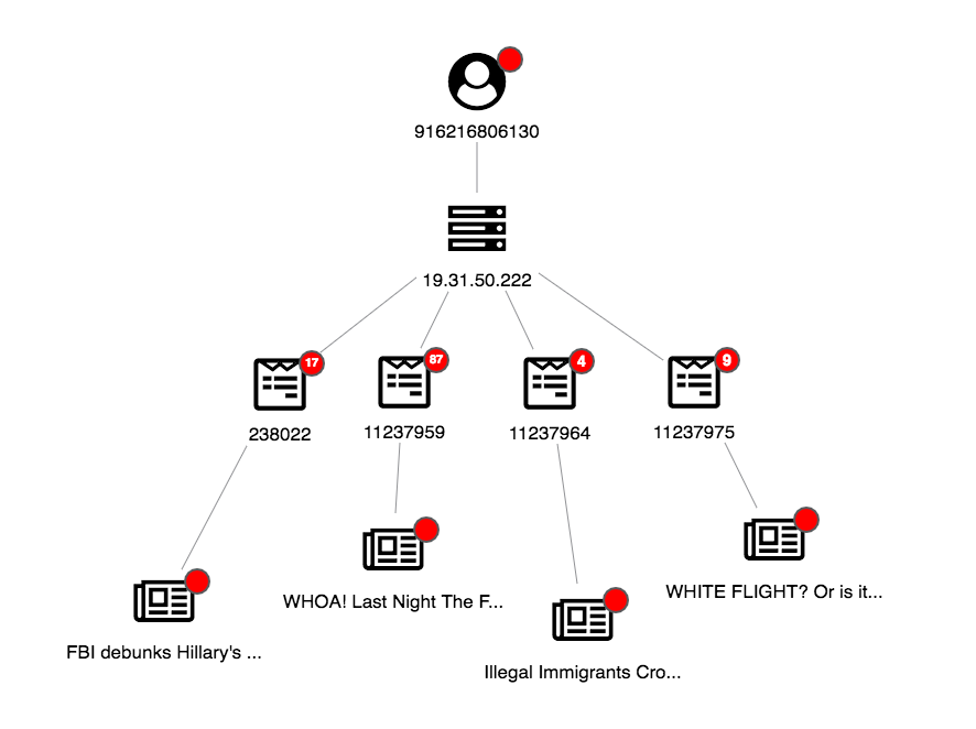
This is a clear-cut case: visualizing our anomaly detection results reveals a new user sharing questionable posts linking to fake news websites.
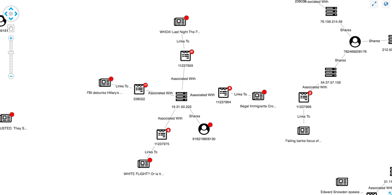
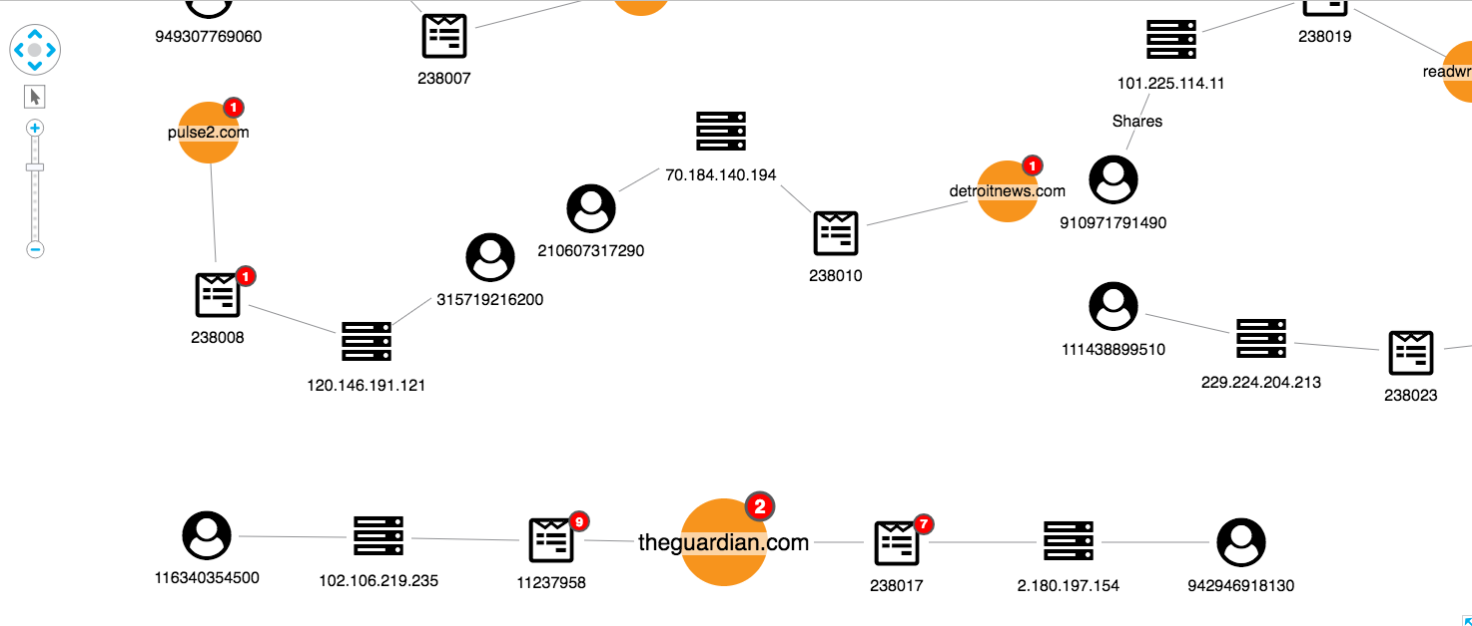
Identifying unusual user behavior
In addition to identifying fake news from our red glyphs, we can also use a graph view to uncover suspicious user behavior. Here’s one strange structure:
We can see one article has been shared multiple times, seemingly by three accounts all using the same IP address. This suggests a link farm – a set of fake accounts collaborating to artificially increase an account’s popularity – present in our dataset. By expanding both the IP and article nodes, the investigator can get a full view of the accounts associated with the link farm.
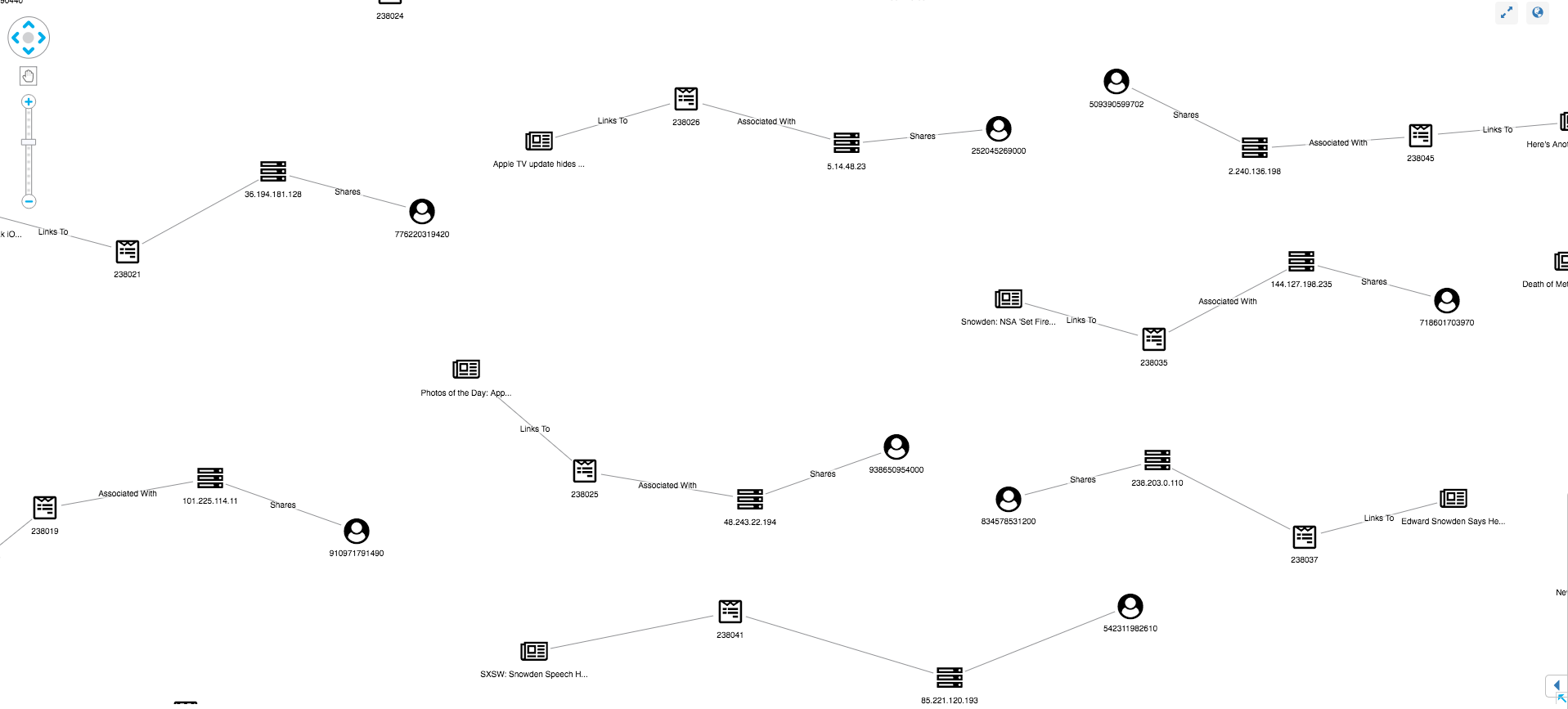
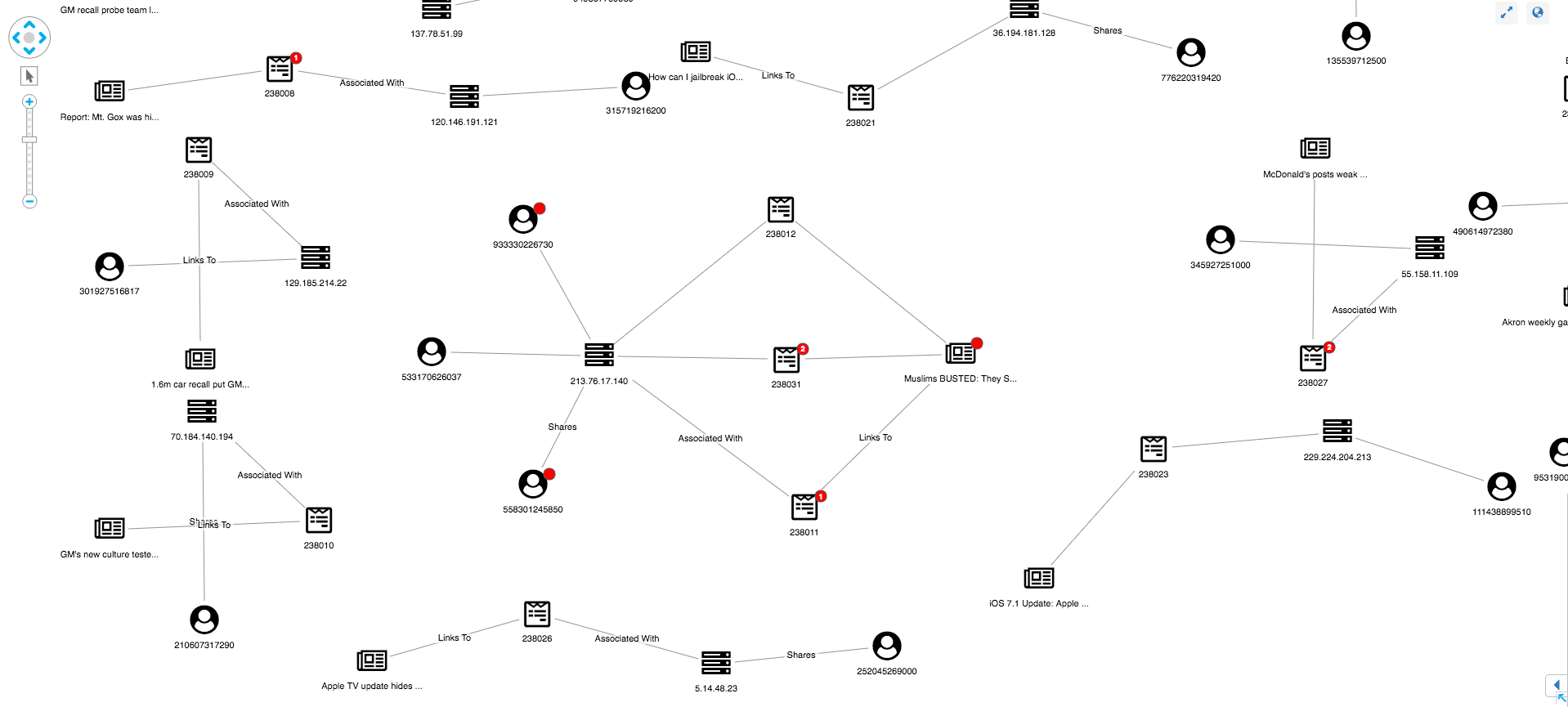
A domain centered view
In addition to monitoring users, social networks should monitor links to domains known for sharing fake news. We’ve represented this in our visual model using red glyphs on the domain node. We’ve also used the combine feature to merge articles on the same domain:
This view shows us our data from the perspective of the websites being shared, rather than just the individual articles. From here we can pick out suspicious domains:
We can also see possible false positives, which is an inevitable part of an investigation approach relying on user input:
Visualizing anomaly detection for yourself
This post is just an illustration of how graph visualization techniques can be used to understand the complex connected data associated with social media. We’ve used simplified data and examples to show how social network analysis could become part of the crackdown on fake news.
We’d love to see how this approach works using real-world data. If you’d like to try KeyLines for yourself, just request a trial or contact us.
Share:
