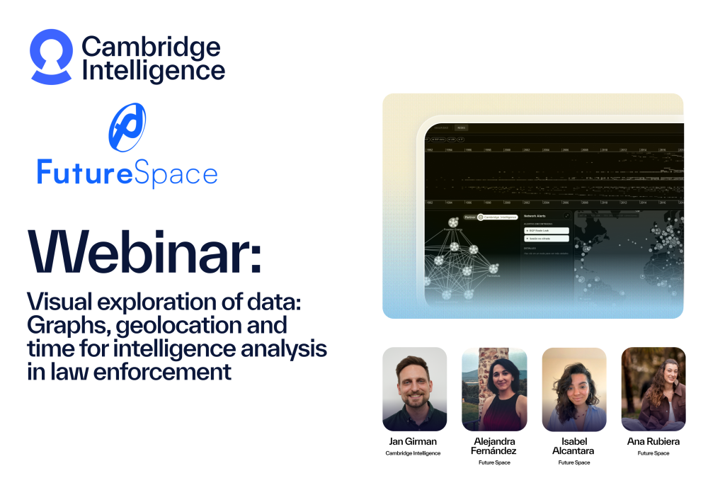
Time data is everywhere: in every internet activity, every communication, every geopolitical event.
In this webinar, data visualization expert Corey Lanum shares some best practices for visualizing time-based data using KeyLines and ReGraph, our graph visualization tools, with KronoGraph, an innovative way to build scalable timeline visualizations.
He shows you how to:
- neatly filter and summarize complex time-based connected data
- reveal insights that bring out the story behind your connected data
- pick the right time-based data visualization techniques for your project
Explore our graph, timeline, geospatial visualization resources
Transcript
Corey Lanum: Good morning. Thanks for taking the time to watch this video. What we’re going to cover today is how we can take the concepts from graph visualization and apply them to data that has a date/time component, so that we can visualize how our graphs are changing over time or temporal patterns in our data. My name is Corey Lanum.
I’m the chief product evangelist at Cambridge Intelligence, and I’ve also written a book on the subject called Visualizing Graph Data. We covered a lot of what we’re going to cover in this video in the book, but there are some new developments over the past couple of years that we’re also going to show you here today.
So strap in. It’s going to be a fun ride, and expect this to take about thirty minutes. Thank you. What a lot of people don’t realize is that time data really is everywhere. Even if you don’t think you have a date/time component to the data that you want to visualize, you probably do. So every internet activity, such as IP packets, they all have the date/time stamp embedded in that packet.
Every communication, things like emails, have the date/time stamp associated with when that email was sent. Geopolitical events often have the date that those things occurred. Even if it is just as simple as when did I learn about this data or when did I add it to my database, that’s useful information that we want to take advantage of when we’re visualizing it so that we can see how this data is changing or evolving over time.
The traditional way that we visualize graph data is with a node-link visualization like what you’re seeing over here on the right. This example shows a series of money transfers between accounts, and we’re implying that the money went from the cash deposits at the top of the chart to the property holdings company at the bottom of the chart via a number of different intermediaries.
But we don’t really know that by looking at the graph because there’s no date-time embedded in the data. We don’t realize whether a certain transaction took place before, simultaneous with, or after another transaction. It could be that these things are spread years apart and have no relevance to one another.
So we need a new way of looking at data that is not strictly the node-link visualization that you see over here at the right. Let me show you another example. Here is an example of a traditional node-link visualization of the kind that you’d typically see. In this example, we’re looking at an insurance fraud case, and we have nodes that represent individuals.
We have claims. We have damages for auto insurance. We have the cars themselves and so on. And we see what we think might be substantial fraud. We see a particular individual who is involved as a witness in several different accidents who all went to the same mechanic for the same type of repair. Now, that looks suspicious, but what we don’t see by looking at the visualization in this way is how far spread apart these are in time.
If this was all within a month, it’s definitely suspicious and something we should investigate a bit further. If it was two accounts that took place over the course of ten years, then maybe it’s not something we care about or need to pay any further attention to. So that’s the value that you get by looking at data that has a date-time component in your graph.
So what do we want from a time visualization? What do we want to better understand about graph data by taking advantage of the time component? Well, the first one, obviously, is when did certain events happen? As we saw in the example that has the money transfers, knowing specifically when that transfer occurred is really valuable information that you don’t want to lose.
But that’s not the only thing. Not just a single instant in time like a money transfer, but also what time ranges were nodes active. If you look at the example over here on the right, you see that I owned a specific car from two thousand eleven to two thousand eighteen, for example. That’s a range of time, not just a single instant in time, but also something that would be really useful to be able to show coherently in a graph visualization.
We also want to be able to identify spikes or patterns of activity where certain things were more active than usual so that we can identify that and maybe zoom in onto that time range to pay a bit closer attention to it. Another thing that’s really useful is sequences. Did certain events occur before, after, or simultaneous with other ones?
So I took an example like the money transfer one that we looked at earlier, but put on the label of the node the date and time that something happened, and we can see that these are spread across time, with some of them happening within a year of each other, another one a decade previously. So that’s a really useful thing to be able to understand, too, but you want to intuitively know these things and not have to read the label on every link to better understand it like we do here.
So let’s start taking a look at some of the techniques we can use to visualize this time data in an intuitive way. Well, the first thing that comes to mind is that we can treat time as any other property, and we can use some of the visual properties of the nodes and/or links to show that. So that’s what I’ve done in this example here; I’ve used the color of the link to indicate how far in the past something is.
So this is the same example we looked at on the previous slide, where certain money transfers were happening more recently or some were happening far in the past. And the further in the past something is, the redder I have made that link so that you can identify those ones that happened further back, kind of like the redshift that we see in galaxies when we’re looking out in the cosmos.
This technique can work in certain circumstances, especially if you want to just be able to quickly identify a few outliers. Here are things that happened decades ago. They are bright red, and everything else is a normal shade of black because it’s more recent data that we’re looking at. But it’s not useful to better understand sequence, for example.
It’s really hard to tell whether something is redder than something else or something like that. So it’s not useful in most circumstances. Another example that can be really helpful in some circumstances is what we call small multiples, or basically a bunch of different graph visualization charts that show various snapshots of how that data looked across time.
I’ve got an example over here on the right, which is a really key example of how this can be particularly useful. So this example is showing us the evolution of the United States Congress over several decades and the cross-authorship of various bills and who has publicly sponsored them. The red nodes represent Republicans, the blue nodes represent Democrats, and each Congress is represented by a different chart, and it flows across time with the earliest examples at the top and the later examples at the bottom.
This example appeared in the PLOS journal, but I think it’s really useful because it helps show both various different wave elections. For example, nineteen ninety-five and two thousand eleven elected a lot more Republicans, and so you see the red dot grow as opposed to something like nineteen eighty-nine or nineteen ninety-one, where you saw many more Democrats in Congress.
But it also shows that decrease in bipartisanship over time. In the early examples in the ’40s and ’50s, you see a lot of links between the nodes of various colors, indicating that bills were authored by members of multiple parties. Whereas that has all but disappeared since about two thousand three to two thousand five, where we see very, very few links between the blue nodes and the red nodes.
So this can be a really helpful way of showing how the structure of your data is changing over time. How is the structure of the United States Congress changing between various elections? But it would be very difficult to drill down to an individual node in this example. So I can’t tell how my specific congressperson voted or who they authored bills with over the course of several different elections because that’s not the purpose of a graph like this.
It’s not showing me the details. It’s just showing me the broad strokes. So in an example like this, where the intent is to show the change in partisanship over time, it’s really good, but it’s not helpful for drilling into the details. Another example, and this is the capability that we provide in our graph visualization products called KeyLines and ReGraph, is what we call a time bar, and it’s a way of identifying those spikes in activity when certain things were active.
The histograms down there at the bottom of the screenshot on the right-hand side are showing us the time periods where we’re seeing a lot of activity, and the selection lines, which are the red, green, and orange lines that you see, are showing me the patterns of activity associated with a specific node.
And this can allow us to drill down or look more carefully at specific segments of time and see only the data that occurs during that window. But it does make it a little bit more difficult to see specific sequences. Did something happen before something else or afterwards? Because it’s condensed down into that time range.
Let me show you this in a more interactive example. The next thing we’ll think about is timelines. A timeline view has been a way of looking at how data changes over time for centuries. You can think all the way back to the Bayeux Tapestry of 1066. And a timeline is a useful way of flowing time from left to right and watching a sequence of events as they occur over time.
You can see some examples of that over here on the right, the top one being a heat map looking at various points in time where certain things were more active than others. The Sankey diagram, which is more of a process flow—certain items lead to other items and lead to third items and so on. The stock price ticker, which is showing the value of a discrete item over time as it changes, or the sort of project-planning type view, which is showing dependencies of items over time.
This is a very useful way of looking at data over time, but what we’re missing is the graph representation. We’re missing showing how items are connected to one another and how those connections may establish or remove themselves over time. At Cambridge Intelligence, we have a new product called KronoGraph, which attempts to solve the issue of how do we show graph data over a timeline so that we can identify how these patterns are changing over time.
I’ve got an example of that on the right-hand side here. We have entities, which are the equivalent of nodes, as our horizontal lines, and then we have events, which are items that connect those nodes that happen at a specific point in time, as the vertical lines, and you can see that they’re aligned over a timeline so that we can see specifically when they occurred.
So there are some patterns that stand out when you visualize the data this way. Let me show you this in a more interactive example. In this example, we are looking at credit card transactions where our cardholders and our merchants are the entities or nodes, and the transactions themselves are the events.
We’ve color-coded the events by whether they are disputed transactions or not, and you can see when certain transactions were disputed, we can see when activity clusters together in certain areas, and it’s all interactive. So we can zoom in, say, for example, on these four sequential transactions at the Apple store that were all disputed.
And you can also see that we’re filtering the number of entities that we’re showing over on the left to show only the items that fall within the time window that we’ve selected. And we can zoom and pan around to watch how that data is changing over time. In the previous example that we showed you, we were looking at a few dozen different events, and it was pretty easy to drill down and look at the individual details of a specific event.
But in reality, graph content usually is much, much larger than that. Sometimes we can be talking about millions or billions of nodes and links. And it’s not realistic to expect to show all of that in a single visualization all at the same time. So what we need to do is we need to think about ways of grouping or combining both our nodes and our links together to be able to show patterns among the groups first and then drill down to look at the individual items inside of those groups.
We do that with a feature we call combinations in node-link visualizations. Let me show you that really quickly. Here, for example, we’re looking at a chart that is comprised of members of Al-Qaeda in intercepted communications. Each person is a node, and the link between them shows that those two people have had communications between them.
Now, we’re using the glyph on the node to show the country that that person lives in. And this chart is starting to get a little bit too busy to understand. There’s two hundred and twenty nodes on this chart, and it’s not easy to understand patterns or to see any detail of any individuals because there’s just too much on the screen.
One of the things that we can do in our graph node-link visualizations is to be able to group nodes together by any common property. So as an example of that, here we’re grouping together nodes based on the country of the person that is inside of them. And now we see a simplified or summarized view of the chart that shows us the individuals inside of each country and how the countries themselves are connected to one another through their Al-Qaeda networks.
But I can still drill down, zoom into, say, France, for example, and look at how people are connected both within that country, but then also to other countries on the globe. Now, can we do the same thing with a timeline view? In this example, we’re showing forty years of terror activity around the globe from nineteen seventy to two thousand ten, and that’s a lot of different events.
We can’t show that all in the traditional timeline view that I showed you earlier because there are so many links that it would just totally obscure the screen. After all, you only have so many pixels in which to display things. So we’ve taken that same approach that I just showed you where we’re grouping together items, except we’re doing it in two dimensions.
We’re grouping together both the events and the nodes or the entities. So with the events, we’ve changed those vertical lines to represent each event into more of a heat map type view, so that I can see when certain things were active and that I can drill down into that timeframe to look at the individual events.
But we’ve also grouped together the entities so that we can see patterns among the groups themselves. So for example, here in Africa, we’ve got twenty-eight countries in Africa. I can expand that to look at the individual countries inside of that, and then maybe pin one. So I can focus just on Algeria and the terror events that have happened in Algeria in the last forty years.
But let’s unpin this and look at the total amount of activity. We can see, for example, that in Africa, we had a distinct spike in our terror activity around nineteen ninety-four. So we’ll zoom in on nineteen ninety-four, and once we get to a view where it does make sense to look at the individual events themselves, then you can learn a lot more of the data by zooming in and identifying those.
So now we have drilled down to a specific event, where five French nationals were killed in Algeria in August of nineteen ninety-four. We’ve just started from forty years of global terror activity and been able to drill down to a single event on a certain date in August of nineteen ninety-four. So here what I’ve shown you is starting with that heat map view, which allows us in broad strokes to understand which periods of time were more active than others or where to start my investigation, where to drill down, and what areas of time I should be focusing on.
But then transitioning from that view into the timeline view, which shows me the individual events and the connections between those events and the nodes that are responsible for them. I want to show you another example here where we’re looking at windows of time, not as absolute units of time, but as cycles or patterns of life.
Let me show you that example. So here we have the heat map view, like what we were looking at earlier, which is showing me the pattern of activity of internal emails within an organization over the course of ten months in two thousand ten. And the heat map is showing me who is active and when. And I can drill down, like I did before, to an individual day, say, for example, May fourth, two thousand ten.
Here are my employees and who they were emailing among themselves. That’s a very linear view of time. I’m looking at May fourth, May fifth, May sixth, all in order here, and I can maybe identify when I should focus on and when I should start. But that’s not always the way that you want to investigate these things.
Perhaps I’m more interested not specifically in individual days when there was activity, but what time of day, independent of the actual day itself. So we call that either pattern of life or scale wrapping. I’m going to turn that on here. And what we see now is that we’ve condensed all of those days across ten months into a single view, showing me a single twenty-four-hour period, regardless of which day this activity happened to take place on.
By doing so, we actually are looking at patterns over the course of the day. We can see that my employees will typically start their workday somewhere between seven o’clock and nine o’clock AM, and they’ll taper off starting around six, but there are some night owls who are active up until about nine PM.
I also see a lot of activity right at midnight, which is unusual and something I may want to look at more, in more detail. But I can, if I zoom in, see that this activity is very likely some sort of automated process. It’s originating from one person and going out to many other recipients in the midnight hour.
So not likely to be somebody who’s actually awake and active and sending email at that point in time. Alternatively, I can wrap the scale around a different metric, maybe a week, so I can see of the ten months of data, when during the week are we seeing this activity? And so the heat maps are now showing me what is a very clear diurnal pattern and also a weekly pattern.
On individual days of the week, activity starts like we noticed before, you know, at eight or nine in the morning and tapers off around six. But then we also see that that’s true during the workweek, but much less is occurring on the weekends, as you might expect. And I can see some heat maps here which are showing me areas of the weekend that I may want to zoom in a bit more.
You know, here’s a number of employees who are active on Saturday afternoons, for example. Something I may want to notice if I’m trying to identify who’s working outside the normal course of business or when are things happening maybe that they shouldn’t be. So can we combine the traditional node-link visualization with the timeline type view that we were just showing you?
I think the answer is yes. There’s a lot to be learned from both looking at the when associated with graph data, when are things happening, and also the who, which nodes are connected to which other nodes and which ones should be worthy of paying closer attention to. So let’s return to the money flow example that we were looking at earlier.
Now I have that same data on the left-hand side in a timeline view and on the right-hand side in a node-link representation. By showing both at the same time and allowing interactivity between the two, you get a very good picture of what’s going on in this data set. For example, earlier we couldn’t tell the sequence of activities, but here when I hover over this link, which represents a ten thousand dollar transfer from one account to another, I can over on the left-hand side see that that ten thousand dollars is actually comprised of three separate transactions between two accounts, which took place over the course of three months in twenty twenty-one.
Similarly with the other side, I can go in that direction by zooming in on only the events that happened in the first week of June twenty twenty-one. I’m highlighting those on the graph representation to show me which were the active nodes during that time frame. So what have you seen so far? What I’ve shown you is lots of different approaches, different ways of looking at time data in a graph, some of which are more effective than others, some of which are effective in certain circumstances and perhaps not others.
It really depends on what type of insight you’re trying to give your customers. Each one of the techniques I’ve shown you today has some benefits and has some drawbacks, and which one you select depends a lot on the use case and what you’re trying to show to your end users. The time bar piece is built into our graph visualization tools.
Those are called KeyLines and ReGraph. KeyLines is for JavaScript developers, ReGraph is for React developers. And then the timeline component is a separate product that works alongside KeyLines or ReGraph, and actually in JavaScript or React, and that’s called KronoGraph. Both are tools that are available today from Cambridge Intelligence.
Thank you very much for watching, and please do reach out to us if you have any questions or if you’d like to try any of the tools that we’ve shown you.
Share: