In this blog post, I’ll describe my first experience of creating a visualization. Using KeyLines to analyze greenhouse gas emissions in the US, I’ll share insight into two things I’m passionate about: cutting-edge technology and the environment.
Getting started with KeyLines
From the minute I started with KeyLines, the developer documentation was my friend.
The newly-updated quick start guide on the KeyLines SDK site took me quickly through the basics. I had to refer to the API reference and Google a few things to get the JavaScript syntax right, but in half an hour I managed to create a chart, load some data, run a few layouts and include some basic events.
Keen to learn a little more, I also looked through the ‘Basics’ documentation pages aimed at KeyLines newcomers. Now I was ready to find the data I wanted to visualize.
United States Environmental Protection Agency data
Interested in contributing factors to climate change, I started hunting for connected data on greenhouse gas emissions.
The United States Environmental Protection Agency (EPA) run a Greenhouse Gas Reporting Program. The latest report shows that in 2017, over 7,500 facilities across nine industries released 2.91 billion metric tons of carbon dioxide equivalent directly into the atmosphere. That’s roughly half of all US greenhouse gas emissions for the year.

There are lots of connections worth exploring there – which individual facilities emit the highest proportion of what gas? Which US state is responsible for the greatest emissions?
This data is available to download from the EPA. Next I had to work out how to present it.
Choosing the right data model
There’s so much detail in the EPA data. I had to work out what was the most important information to visualize, what to ignore, and how best to represent it on my chart.
Having never modelled data before, I found useful tips on keeping this practical and simple in the Graph data modelling 101 blog post.
I decided on:
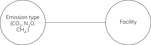
- nodes for each of the three main greenhouse gas emission types: carbon dioxide (CO2), methane (CH4) and nitric oxide (N2O)
- other nodes for each of the facilities, with properties including industry sector, US state and total emissions reported
- links to show the emissions reported by each facility
Straightforward data loading
KeyLines works with data from any source, so once I’d copied over my .xlsx spreadsheet and KeyLines parsed it into the JSON format it needs, I could load nodes and links into a chart.
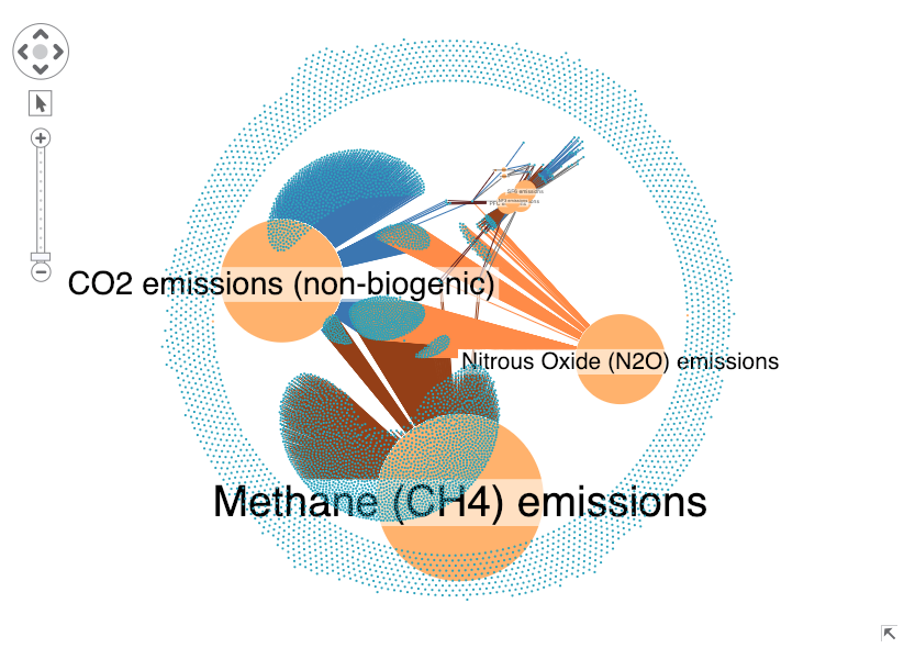
There’s so much data! The only instantly-recognizable nodes are those representing gas emission types. I had some work to do.
I knew how I wanted my chart to look, but I wasn’t sure how to make it happen. Here’s where the demos on the KeyLines SDK saved me time and effort. I could search for the effects I wanted to achieve, play around with examples, and (the best bit for a JavaScript novice) copy the code to reuse in my own visualization.
Effective grouping
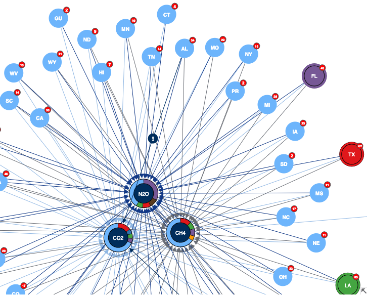
My first challenge was figuring out how to manage data clutter. Even after I’d included a filter to focus on the highest emissions, there were still hundreds of facilities to deal with.
Using combos to group facilities from the same state made things clearer. Glyphs show how many facilities each state contains.
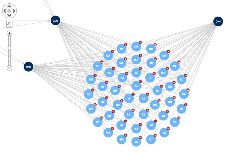
I can open a combo to show the facilities when I want to drill into the detail. Facility nodes are sized depending on their emission levels: the greater the emissions, the larger the node. Using a concentric arrangement inside the combo, notice how larger nodes are centered so they’re easier to spot.
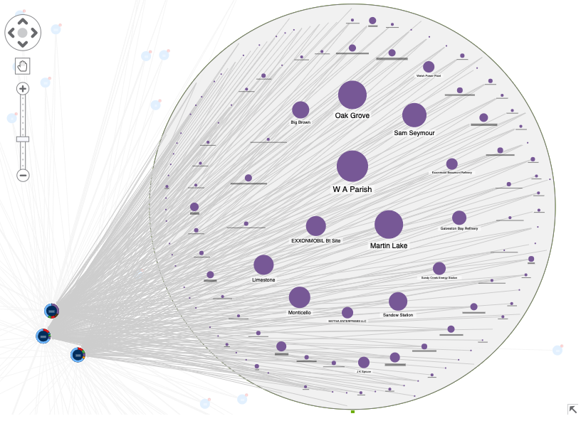
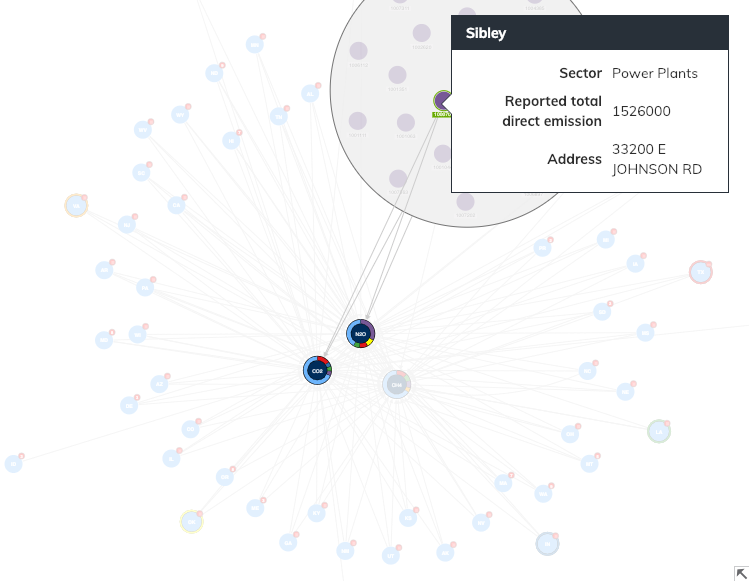
I also added tooltips on hover so I can reveal node property information about each facility when I need it, without cluttering the chart with too much information up front.
Customized visual styling
Looking through the KeyLines SDK demos gave me lots of ideas for styling. The hardest bit is working out which customization options will bring the data to life. It’s easy to make the mistake of cramming in lots of cool styles that don’t help with the end goal.
I wanted my visualization to show at a glance which states are emitting the highest proportions of each greenhouse gas. Color-coded donuts do a good job at making the answer clearer.
The color of each of the highest-emitting states matches up with the greenhouse gas node donut segments. The majority ‘blue’ segment represents emissions from all other states combined. In this way, we can see the 6 states with the highest emissions, and which gases they’re responsible for.
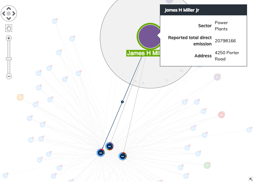
Meaningful alerts on links
To focus on the subset of connections I’m interested in, you can see from the image above that if I click on a particular node, the items it’s linked to stand out and everything else is sent to the background.
I also learned that glyphs aren’t just for nodes – they can also alert you to important information about links. The ‘!’ glyphs show which states contain a facility that emits more than 16,000,000 metric tons of CO2.
Indiana as a state is a high emitter of CO2 – we know that already, because its color matches a color-coded halo on the CO2 node. But it’s also home to one of the top two highest emitting facilities.
Interestingly, the other facility responsible for the largest total direct CO2 emissions is in Alabama, which isn’t a top emitting state.
Why analyze greenhouse gas emissions data?
Greenhouse gases trap the sun’s heat in the atmosphere and increase the earth’s surface temperature. Without them, our planet wouldn’t be warm enough for habitation by millions of species, including humans.
But greenhouse gases are now at their highest levels in history, and they’re causing the earth’s temperature to rise at an unprecedented rate.
Over the last 150 years, the increase in greenhouse gases has almost entirely been caused by human activities such as the production and burning of fossil fuels. In the last 30 years, global emissions of carbon dioxide alone has increased by almost 50%.
As a result, ice caps are melting, seas are warming and levels are rising, and there are more extreme weather events than ever before. The United Nations lead the initiative for every country to work together to limit the global temperature rise to below 2 degrees centigrade.
Monitoring reported greenhouse gas emissions worldwide is an important part of this project.
Next steps
I’m happy with how quickly I managed to visualize the data, but I’ve only scratched the surface of what’s possible.
Next I could use the data’s latitude and longitude location properties to visualize emissions on a map. Geospatial analysis might reveal the impact of states on greenhouse emissions more clearly. Loading emissions data from previous years would give us an opportunity to use time-based analysis to see how emission levels have changed. Social network analysis methods applied to sectors and organizations across states could reveal interesting patterns at a national level.
With detailed documentation to guide me, there are many interesting ways to develop my project into something even more insightful.
Ready to start your KeyLines journey?
My first KeyLines visualization took me from complete novice to enthusiastic apprentice in a short space of time. I really enjoyed the experience.
Whether you’re an occasional coder or a qualified expert, if you’re ready to see what KeyLines can do for your data, request a free trial to get started.


