FREE: Graph visualization and artificial intelligence white paper
Find out how successful businesses work with the latest graph visualization and AI technologies to make fast, business-critical decisions.
Natural language processing (NLP) is an exciting, but tricky, form of artificial intelligence where machines are capable of reading, understanding and deriving meaning from human language.
Graph technology provider, GraphAware, has developed an innovative way to use NLP that helps users find insight in their connected data fast. Their flagship software platform is Hume, a graph-powered insights engine.
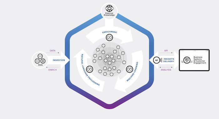
Hume ingests data from multiple sources and applies NLP among other transformation and enrichment workflows. Then it creates knowledge graphs that are visualized using KeyLines, our graph visualization toolkit for JavaScript developers.
There are many fascinating use cases for Hume’s insights engine. In this blog post, we’ll focus on a proof of concept project for the European Space Agency (ESA). Let’s explore how Hume and KeyLines are helping ESA to strengthen its understanding of Natural Language Processing (NLP) capabilities and graph visualizations.
Hume has a collaborative knowledge graph at its core. This knowledge graph creates a ‘digital twin’ of your business that breaks down silos and reveals important data that was previously buried or ignored.
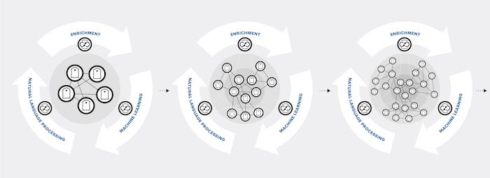
In a typical natural language processing workflow in Hume:
The European Space Agency (ESA) pushes the frontiers of science and technology, promotes economic growth in Europe and provides specialist information to organizations in the technology sector.
In the dynamic world of satellite technology, there has been a huge increase in the amount of public data available. ESA’s challenge is to keep track of it all.
ESA was keen to try new ways to monitor the satellite technology market. Their vision was to develop an enrichment workflow, powered by automated machine learning, that would take unstructured textual data on a segment of the space ecosystem and use it to create and develop a knowledge graph.
First, GraphAware consultants configured Hume to automate the ingestion of unstructured data. This data consisted of PDFs, CSVs and RSS feeds. Then, ESA worked with Hume to define and improve the NLP models, with experts reviewing and labeling many data sources and ‘teaching’ the machine learning algorithms how to recognize and extract key information automatically.
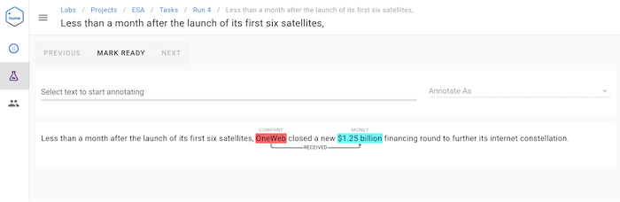
The models separate the extracted text into ecosystems of similar information, such as companies, financial details, technologies and so on. For more information about the machine learning aspect of Hume and ESA, check out this GraphAware blog post.
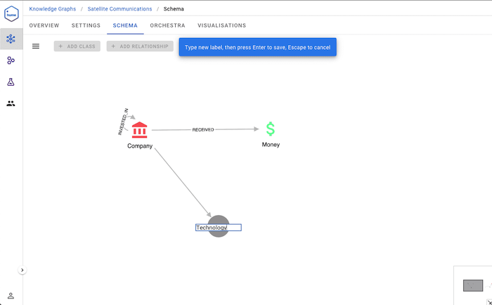
The goal was for the NLP element to eventually recognize entities and relations among them in a predictive way every time new data became available. Then it can fill in gaps and validate connections between entities based on what it already knows.
From the output, Hume creates a knowledge graph of structured information. And we know from previous knowledge graph blog posts that this visualization format helps users to understand their data.
In their initial proof of concept project, ESA has visualized data on a segment of the space ecosystem and discovered new insights.
The visual model matches the knowledge graph entities to create charts that look and feel familiar. To save time and effort, duplicate entries are resolved using KeyLines’ clever node merging capabilities.
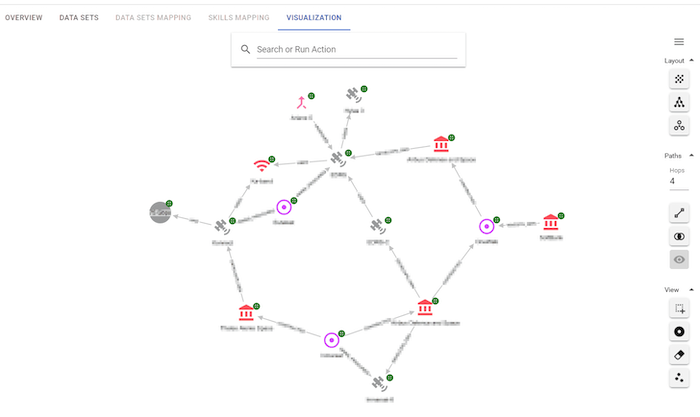
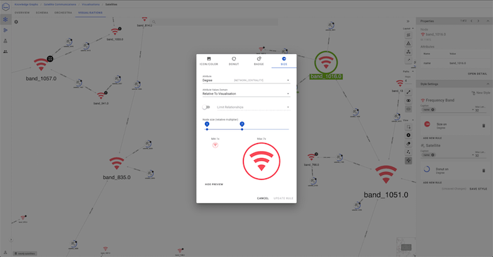
In this visualization, notice how each node is customized to reflect its real-world equivalent and make them instantly recognizable. With KeyLines, you can style virtually every aspect of your visualization. There are clever animation options to highlight key nodes, the ability to add donuts with segments representing numeric proportions of data, and a range of other styling options, many of which are leveraged by Hume already.
To dig deeper into the data, users interact with the visualization to reveal additional information about a specific ecosystem in the graph. They can save these actions so they’re easy to look up again in future.
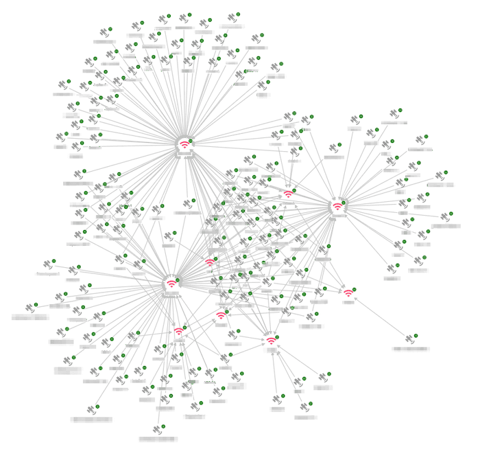
For ESA, this is an ongoing project that will get smarter with time. As new data is added, the machine learning models are applied and the knowledge graph updates itself so KeyLines can visualize the latest information.
With a reliable, structured data source and advanced graph visualization technology working together, it’s much quicker and easier to validate and understand connections between organizations, projects, technologies and other entities.
We’ve touched on some of the advanced KeyLines features Hume has integrated and ESA is exploring, but there are more to come.
In the near future the time bar could also be incorporated into the project, making it easier to understand how connected data evolves and behaves over time. Filtering by time and date is a powerful investigative technique that helps users spot trends and outliers.
ESA users could also benefit from the ability to group similar nodes using combos, our intuitive node-combining feature. It’s the easiest way to hide chart clutter – essential when you’re working with large, complex graphs – but you can still dig into the detail when you need to.
The Hume platform that the European Space Agency is using is based on the latest NLP models combined with scalable knowledge graphs to find insights in huge datasets. They recognized the importance of bringing those connections to life through graph visualization.
You don’t have to work with NLP or knowledge graphs to benefit from graph visualization. We can help you visualize your connected data, no matter what format it’s in. To start your journey, simply request a free trial.
Find out how successful businesses work with the latest graph visualization and AI technologies to make fast, business-critical decisions.
Registered in England and Wales with Company Number 07625370 | VAT Number 113 1740 61
6-8 Hills Road, Cambridge, CB2 1JP. All material © Cambridge Intelligence .
Privacy Policy | Security Framework


