The latest major releases of KeyLines and ReGraph – our award-winning graph visualization toolkits – bring advanced customization features that empower software product designers to realize their visualization design without compromise.
Their applications will stand out from the crowd thanks to unique and powerful graph visualization tools that guarantee a rewarding and insightful user experience.
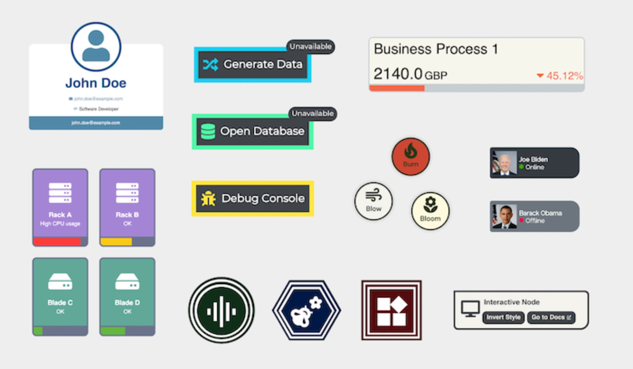
With infinite customizability, the sky’s the limit when creating nodes for your visualization design
KeyLines and ReGraph power fraud detection, cyber threat management and security workflow applications for hundreds of organizations and government agencies around the world. The latest versions bring an advanced level of styling capability, breaking down the barriers between design and development, and offering greater flexibility and freedom than ever before.
Watch this webinar for an expert tour.
“As part of our challenge of mapping complex cloud estates and their cybersecurity risks, we required a strong partner with graph visualization capabilities and new levels of user interactivity.
The support team helped us work with the new customization options to find elegant solutions for presenting our complex information at scale – convincing us that Cambridge Intelligence was the perfect fit for our use case.”
– Shai Alon, Director of Product, Orca Security
An interactive graph visualization component is a key part of any application that’s designed to uncover insights in connected data. But there’s a lot to consider when choosing the right visualization solution. It needs to be a perfect fit for the data, the users and the questions they need to answer. It needs to make a great first impression, and look like a seamless part of the application – not a flashy add-on. The interface needs to feel familiar and logical, letting users uncover quick and meaningful insights. And – in an ideal world – it needs to bring the designer’s exact vision to life.
Infinite flexibility and customization capability is the secret ingredient needed to tick all of these boxes.
‘Complex labeling’ for nodes really improves the UX for our application. Now that we have more control over formatting and color coding, our visualizations pack in so much more insight without overwhelming our users.
– Nathan Braslavski, Data Visualization Lead, Blockchain Intelligence Group
Realizing the vision without compromise
Getting the perfect look and feel for a graph visualization is now easier than ever with KeyLines and ReGraph. Designers have unlimited control over the styling of their visualization components, which means that users can enjoy a consistent and reliable experience, extracting maximum value from their data.
Bringing data visualization into the workflow
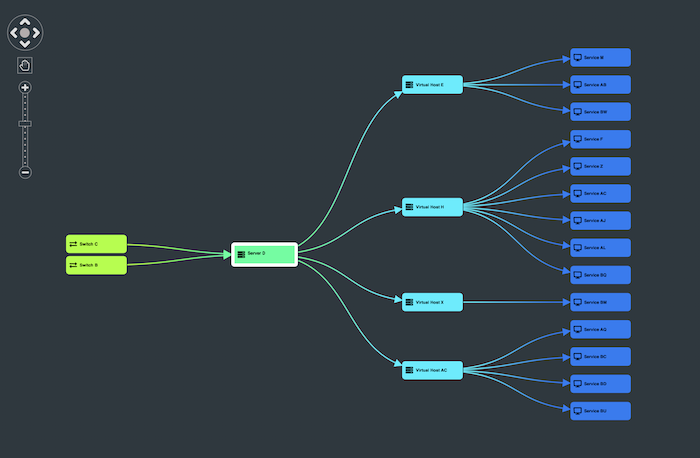
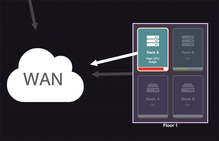
The latest customization features support an intuitive, user-led experience, allowing them greater freedom to manipulate, edit and interact with the chart they’re exploring. Users can remove elements of the chart, to focus on a specific area of interest without changing their dataset. Zooming in, they can reveal detailed insights, such as a criminal record or product description, via enhanced labeling. They can even use hyperlinks embedded in the chart, to navigate to external sites for further information:
Style AND substance
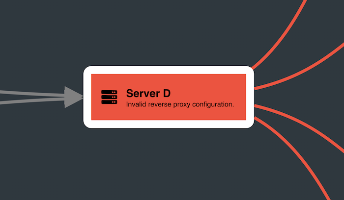
Clever customization isn’t just about aesthetics. Custom shapes, glyphs, icons and labels give ‘detail on demand’ without overwhelming the user with information. Styling can show how data evolves, too, with conditional formatting for alerts, or dynamic customizations such as color changing status bars:
“Our customers have very high expectations of their data visualization components these days, especially when it comes to customizability. We’ve responded with a real step change in the customization capabilities of our toolkits.”
– Dan Williams, Head of Product Management at Cambridge Intelligence
It’s easy to get up and running with KeyLines and ReGraph. We provide expert tech support and advanced collaboration tools to help design teams explore what’s possible for their project. If you can dream it up, we can help you build it.
KeyLines 7.0 and ReGraph 4.0 are available now for all customers and evaluators to try, including new demos, a live-coding playground and detailed developer documentation.
Find out what’s now possible with the world’s best graph visualization libraries – sign up for a free trial today.
Share: