
Graph visualization is a vital component of any cyber security strategy. Without it, analysts struggle to uncover insight from complex logs, which limits their investigative powers and leaves systems vulnerable.
In this blog post, we’ll use a dataset related to ransomware to show how a KeyLines graph data visualization tool simplifies complex information and makes post-attack forensics interactive, intuitive and insightful.
Spotting patterns in Ransomware attacks
Ransomware is a kind of malware, designed to hold computer files hostage to extort money. It’s usually hidden inside a Trojan – a file disguised as something harmless – which triggers the malware download. The malicious software encrypts the victim’s data and demands money in exchange for the decryption key.
Criminals can make hundreds of millions of dollars from sophisticated attack software. Shutting them down is a cat-and-mouse game involving law enforcement agencies and ISPs.
Our dataset and data model
The Ransomware Tracker (now discontinued), run by abuse.ch, maintains a list of over 6000 domain names, IP addresses and URLs associated with ransomware. It’s an excellent resource for anyone interested in cybercrime infrastructure. You can download the entire dataset in a CSV format, and then convert it into a KeyLines JSON object.
Each ransomware attacker uses a unique combination of vectors to infect the victim’s machines – email attachments, exploit kits, malvertising – but the malware itself is always delivered via a server and host.
Here’s our basic data model:
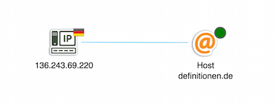
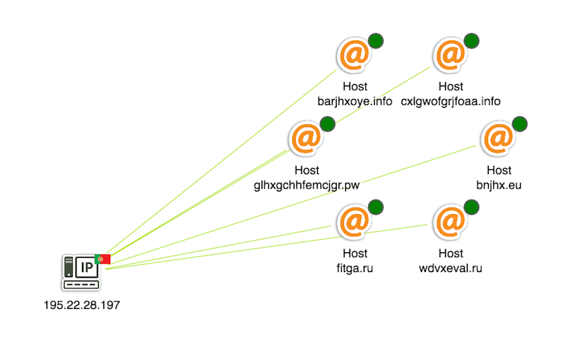
- An IP node represents a server, with a glyph showing its geographic location
- An @ node represents a host, with the glyph showing if it is active or inactive
- The link is color-coded by ransomware family
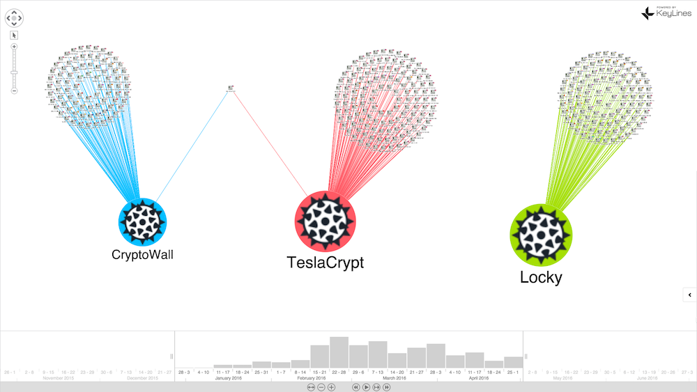
There are three ransomware families in our data: Crytowall, TeslaCrypt and Locky.
Combining Time Bar, Combos and Filtering
KeyLines is a JavaScript software development kit (SDK) for building your own graph visualization applications. There are plenty of demos and step-by-step guides to get you started, showcasing individual bits of functionality through to full sample applications.
One popular design pattern is to combine the Time Bar with Combos and Filtering. These three together form a powerful tool to quickly simplify large and complex data.
Understand network structure with layouts
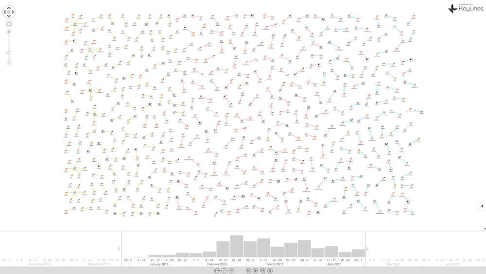
The initial load of our data (using KeyLines’ standard layout) at first seems a little unremarkable:
But running the structural layout to group nodes according to their structural similarity, reveals some anomalies:
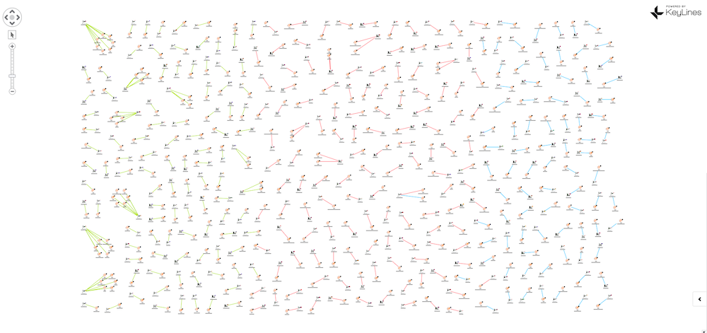
There’s a number of unusual structures on the left-hand side, with green links indicating Locky. When we zoom in, we can see multiple hosts running from single servers in various countries. These rogue servers would be prime targets for ISP shutdown:
Remove clutter with combos
We can also use KeyLines’ combos feature to group nodes with shared properties:
This view reveals what’s happening on a macro level. We can see the relative volumes of attacks in our dataset by malware family, and the countries affected.
In just a few clicks, we’ve transformed hundreds of rows of data into a comprehensive network visualization. Here’s what happens when we uncombine the country nodes:
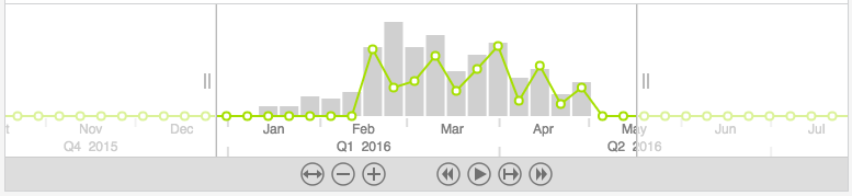
See temporal patterns with the time bar
Next we’ll add a time bar so we can see when events occurred. We can see that Locky becomes active around February 16, 2016, which is also the day that around 500,000 machines were infected in a single attack.
The first known attack in our dataset was 6am that day, from a Maldovan server:
Isolate anomalies with filters
Finally, let’s look at filters. The KeyLines API makes it easy to apply filters based on any logic you want. We’ve opted for malware family, so we can see the geographic structures of different ransomware:
Try it for yourself
This is a simplified example of how KeyLines’ powerful visualization capability can help us explore and understand large volumes of complex connected data. With layouts, combos, the time bar, and filtering, analysts can quickly understand and unravel complicated scenarios.
To try this demo for yourself, register for a free trial of the KeyLines toolkit or get in touch.
Share:
