
This blog post describes three compelling use cases to help you get the most out of map visualization. We’ll use Neo4j geospatial data and the KeyLines graph visualization toolkit to get connected data onto maps.
One of the world’s first maps featured the night sky. Surprisingly, it also featured connected data.
Over 1,000 years ago, Chinese astronomers used manuscript to plot 1,300 stars, recognizing the importance of making connections between clusters to identify constellations. Their mathematical projections turned out to be remarkably accurate, despite relying solely on the naked eye.
Back to the 21st century – whether it’s monitoring traffic flow at rush hour or identifying routes used by persons of interest – the ability to visualize connections on maps is still highly valuable. Fortunately, we have a wealth of technology to help us gain insight from links between locations.
By combining the power of graph databases like Neo4j with the features of KeyLines, exploiting geospatial information has never been easier.
We’ll start by looking at dashboards.
Maps as dashboards
From 30,000 feet above, the earth looks very different. You get to survey the entire landscape, notice key features and ignore details that aren’t so important from a distance. Adopting a bird’s eye view is useful in software applications, too. Dashboards offer the “big picture” at a glance, and a mapping element is an insightful component.
Map dashboarding is common in the world of cyber threat intelligence. It also helps global and national IT networking companies manage system performance to monitor faults quickly and efficiently.
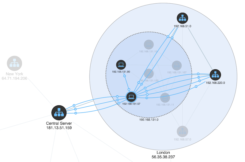
In a typical scenario, the dashboard shows the health of a network on a world map, with links representing the status of connections.
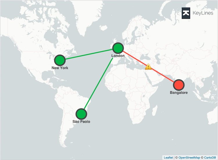
The magic happens when analysts drill into a particular location to get detail on demand. The dashboard becomes the access point to the vast amounts of data in the Neo4j graph database.
KeyLines provides the incremental data loading and ways to visually group items.
Notice we’ve switched from a topographic view of the Neo4j data with real geolocations to a topological view. What’s important at this level is the content itself, not its geographic accuracy. The iconic topological London Underground Tube map is a great example.
In our dashboard, items are grouped by location but laid out in a more schematic way. Our top-level “nodes” are just visual representations of a “location” property in a database. So on the dashboard, we use a single node to summarize all nodes with the New York property.
As this is a Neo4j map visualization, we can run a Cypher query achieves something similar with links. This one uses links to represent a summary of connections between “New York” and “London”:
match (:Device {location: ‘New York’})-[l:LINK]-(:Device {location: ‘Paris’}) return count(l)
When the user wants to dig into the detail, a very different Cypher query interrogates the real nodes and links in the data. But in the dashboard view, what you see doesn’t have to exactly mirror the underlying graph database. The improved geo component in KeyLines 5 lets you move smoothly between these different visual models.
Map visualization as a way to give new perspective on old information
Sometimes data just doesn’t make sense until you see it in the context of the world you live in.
The police are well aware of this and have used maps as investigative tools for years. It’s why so many detective movies include that scene where investigators stare quizzically at a big map on the incident room wall covered in pins and string.
The world of fraud investigation is only just beginning to see the benefits.
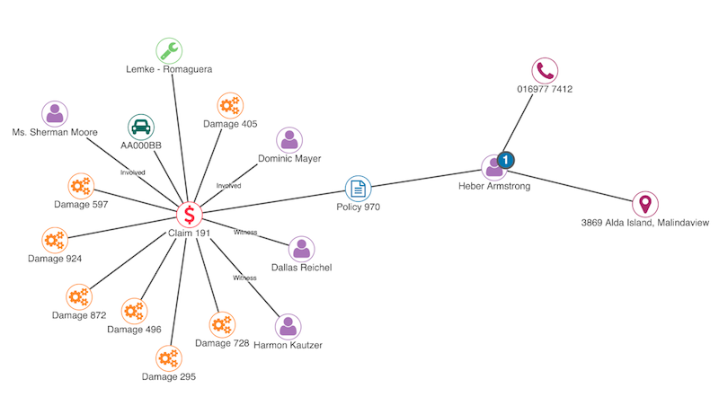
Here’s a data model representing typical insurance fraud claims. People are linked to policies, policies have claims, claims involve vehicles, witnesses, repair shops and damage reports.
When you try plotting this information on a map, there’s a challenge. Most of the data in your database doesn’t have geospatial information. The items that do – addresses of policy owners and repair shops – aren’t directly linked to each other.
There is a clever solution that combines the flexibility of any database with the advanced map visualization features of KeyLines 5.
A Cypher query tells us which repair shop is associated with a policy holder’s address by examining every claim that links the two.
match (p:Person)-[:MADE]-(:Claim)-[c:REPAIRED]-(g:Repairshop) return distinct p, g
KeyLines then takes these people and repair shops, and makes a virtual link between them.
What insight do we gain from seeing these links on a map? How does it help our fraud investigation?
In this case, they show the journey people made to take their damaged car to get fixed.
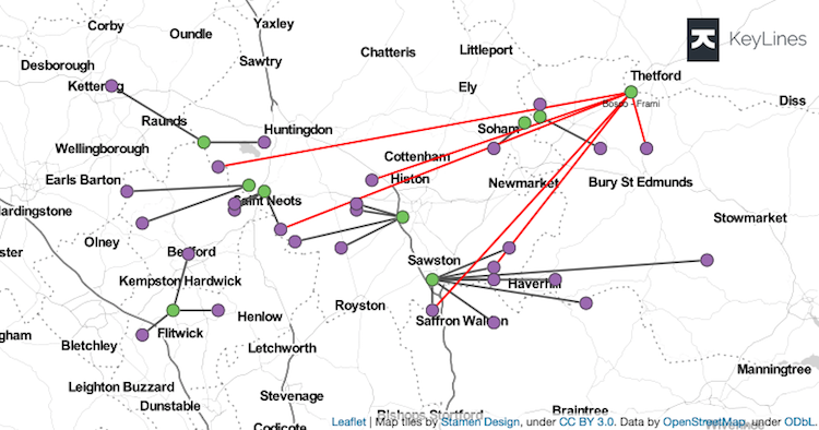
It’s only after we’ve used KeyLines to take this visual modeling journey – transitioning from raw Neo4j graph database data to a visual model on a map – that we spot an anomaly.
Notice how most people (purple) travel to their nearest repair shop (green) to get their car fixed. But some travel unusually long distances to one repair shop in particular (red links). Is it just the best one around? Or should we look into whether they’re fraudulently inflating claims?
Map visualization as familiar context
We get many requests from law enforcement and intelligence communities to support their mapping source of choice. U.S. law enforcement are familiar with Esri’s ArcGIS mapping ecosystem, just as the Ordnance Survey National Grid reference system is well known to British police forces.
Everyone has their favorite map tiles, from satellite views to vector-based street maps.
This isn’t just about what looks good. It’s no use visualizing battlefield intelligence if you can’t overlay the latest satellite imagery. You might miss insights if your graph data can’t exploit tools like geofencing to track whether key targets stray outside virtual boundaries.
We’ve used this feedback to drive development of KeyLines.
You can choose from a huge ecosystem of map tile providers, projection systems and third party plugins to integrate with KeyLines. If your graph database instance contains any kind of geospatial information then you’re good to go. KeyLines doesn’t just put it on a map, it puts it on exactly the map you want.
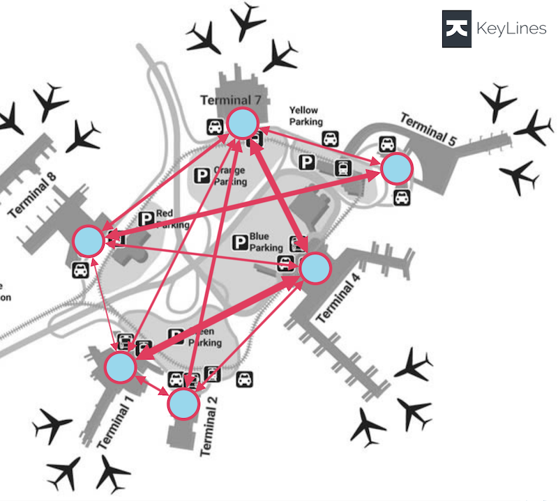
With this flexible approach, finding map insight isn’t restricted to typical street or country views. We can take the “CRS.Simple” Coordinate Reference System (CRS) and plot graph data with an image as a “map” backdrop. From prisons to casinos, airport terminal maps to crime scenes, floor plans make great mapping context.
Stick with what you know
A final point about familiarity. These use cases also showcase the range of customizable options available in KeyLines. Every detail of the chart – its colors, styles, iconography and layout – can be quickly and easily modified to suit the needs of your users. If giving a familiar and intuitive user experience is important, styling is a great way to do it.
Find out more
This post looks at some of the ways you can combine a Neo4j graph database with KeyLines to help find insight in your geospatial data. Integrating with Neo4j is easy – just follow our useful Neo4j tutorial.
If you need to take your geospatial data visualization to the next level, try MapWeave. It comes with expert support, docs, inspirational demos and a smooth DevEx, plus easy integration with our other SDKs.
Share:
