FREE: Start your trial today
Visualize your data! Request full access to our SDKs, demos and live-coding playgrounds.
This blog post explores how graph visualization brings digital twins to life.
Before joining Cambridge Intelligence, I spent five years developing full-stack AI and simulation solutions for the supply chain and defense industries. Graph visualization SDKs would have been a huge asset to those projects.
To prove this, I built my own digital twin using the KeyLines graph visualization toolkit. Let’s see how advanced data visualization can illuminate these models and uncover powerful insights.

What comes to mind when you think of a digital twin?
Perhaps you see a futuristic hologram of a jet engine. Or a colorful animation of widgets working their way through a supply chain. Though the term can mean different things to different people, the simplest way to describe digital twins is as synthetic models of real-world systems.
Digital twins help to monitor performance, simulate scenarios, predict consequences and explore the likelihood of different outcomes. They work at any scale, from a single machine to an entire manufacturing process. They answer tricky ‘what if?’ questions that can prevent costly downtime, minimize maintenance costs, eliminate inefficiencies and improve scenario planning.
Digital twins can represent, monitor and simulate complex networks, like critical infrastructure, supply chains or knowledge graphs.
Imagine a digital twin of a global shipping fleet, that reveals where a vessel is now, where it’s needed next week, and what might happen if a key shipping route or port is blocked. Effective modeling and contingency planning could save millions of dollars.
In the defense industry, digital twins reduce the need for sophisticated and expensive wargaming exercises and operational planning – potentially saving lives and protecting vital infrastructure.
Teams managing critical infrastructure, like power networks, can create digital twins to monitor real-time performance and predict issues before they escalate. By simulating different scenarios, they can plan for demand, identify vulnerabilities, prevent power supply disruption, reduce downtime and maintenance costs, and improve network resilience.
Whatever the use case, the potential for sophisticated graph visualization in digital twin projects is huge. Let’s look at an example, using data from the UK power network and KeyLines.
My two data sources cover both the consumption and supply side of the UK power network:
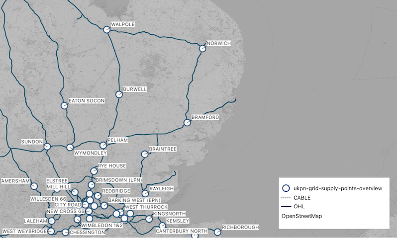
I visualize the two data sources with QGIS. For a more realistic representation of the UK’s transmission network, I use a simple Python dictionary to define connections between the grid supply points (GSPs) and the transmission lines. These points are where the local and national transmission networks meet.

UKPN’s data model required a little more wrangling, as different elements of the hierarchy are listed individually – there’s one GeoJSON object for GSPs, another for the areas they distribute to, another for the primary and grid substations, etc.
Using GSP and substation IDs and coverage polygons (to link grid substations to GSPs) I create a KeyLines-ready JSON object of nodes and links. GeoPandas comes in handy, so I can visualize the GeoJSON while working, and determine if substations and coverage areas intersect, with just a few lines of code.
Next, I load it into KeyLines to visualize and analyze it, although I could just as easily have used ReGraph, the graph visualization toolkit for React developers.
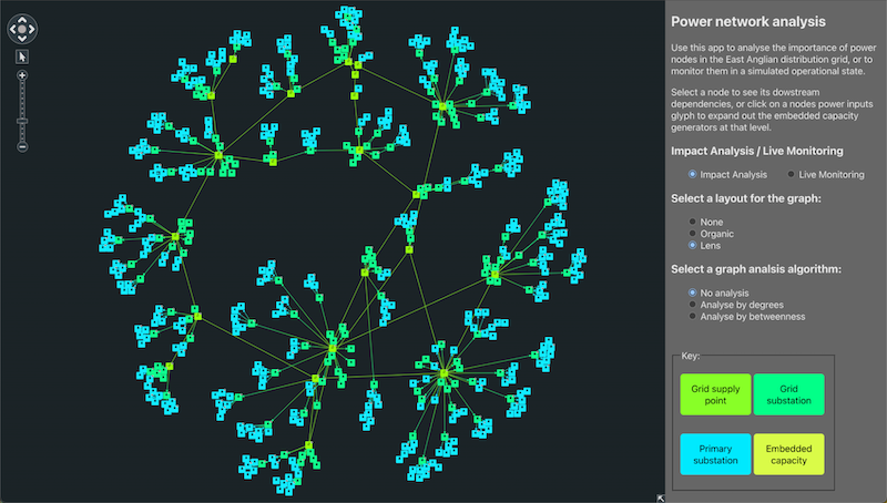
To save me coding from scratch, I adapt one of the pre-built demos and get my digital twin of the power network up and running fast:

We could easily visualize our network on a map, but I chose not to for this project. I want to see how much insight I can get from the network topology alone – without its geospatial context.
The downside of this non-geospatial approach is the need to decide where to place the nodes relative to each other. I want the visualization to look good, adapt beautifully and use as much available space as possible, without losing the data’s logical structure and hierarchy.
This is where KeyLines’ layouts come into play. The organic and lens layouts are strong options for a network with many interconnected top-level GSPs. Here they are in action, with no added customization:
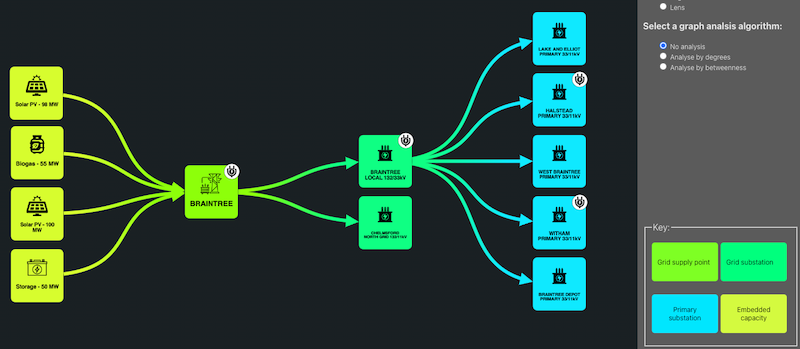
Distribution networks are highly hierarchical, flowing from GSPs down to grid, primary, and secondary substations. I want to give users a way to see this hierarchy, without getting lost in a tangle of parent-child nodes.
I can do this with an on-click event, which identifies all the downstream items from a selected node, hides everything else from my chart and runs the KeyLines sequential layout:
Node and link styling is another essential element of clear and concise network data visualization. It helps to focus the users’ attention on the most important bits of a network.
By capturing the hierarchy level and node type on each node’s metadata, I can programmatically style the nodes with different colors and icons, and show the links’ directionality:

Network digital twins can be massive and complicated, so it’s important to decide what users need to see straight away, and what can be packed away and revealed on demand.
In my power network digital twin visualization, embedded capacity generators and battery storage facilities are hidden by default. Instead, I used a glyph to highlight the GSPs and substations they feed into, which users can click to see the fuller picture. The layout automatically updates, and keeps the chart tidy and easy to read:
Now that I’ve visualized the power network, it’s time to analyze it.
This is where things get much more complex. In my experience, the same two challenges arise time and again:
The visuals designed and prototyped for these projects stretch open-source libraries or UI frameworks beyond their capabilities – massively increasing costs, risks and deadlines. The constant compromises are frustrating because, without clear visualization and smooth workflows, even the smartest algorithms and simulations can’t reach their full potential.
The solution is KeyLines’ network analysis. Its algorithms handle all the heavy lifting for me, automatically scoring nodes based on their context in the network.
I use degree centrality to identify the nodes with more connections:
And then I use betweenness centrality to highlight nodes on the most paths through the network:
In both cases, I size the nodes based on their score. With no data on the power flow itself, the centrality algorithms immediately reveal the most important nodes in the network.
In the degree centrality example, the Bramford GSP is the largest node. I expect this because it sits above the largest distribution network, so it has the highest number of immediate connections. Disrupting it would have the biggest downstream impact.
The betweenness centrality example shows a different picture. The Pelham GSP is the most important node. This is interesting because Pelham sits above a relatively small distribution network but, on closer inspection, we see its connections to six other GSPs. If Pelham was out of action, its position as the network linchpin would have a massive impact.
So far we have some beautiful, insightful and smart graph visualizations. But are they digital twins? Many would argue they’re not: that a true digital twin must be connected with its real-world counterpart.
I would say this isn’t strictly true, but that’s a debate for another time. Instead, I turned my static power visualization into a live twin of the real power network.
Animated visualizations for better understanding
Animation is an effective way to bring a network digital twin to life. And KeyLines makes it incredibly simple. Here’s what I achieved with a single line of code:
KeyLines is smart enough to animate the flow to match the links’ directionality.
From visualization to a live monitoring digital twin
I wasn’t satisfied with faking a live dashboard using clever animation tricks. I want this to be as close to a real-life digital twin as possible.
In addition to their infrastructure data, UK Power Networks publish a dataset of live faults, showing power cut data updated in near real-time. I filtered the latest JSON snapshot to just the planned and unplanned power cuts from the last 48 hours, and mapped those events to my network’s Primary Substations.
Here are the results. I use node sizing to highlight the faults, and node color to differentiate between planned (amber) and unplanned (red) outages. The affected nodes also have a new glyph, with another on-click event to show the fault metadata on-demand.
Digital twins are commonly used to test ‘what if?’ scenarios, so I want to create a basic, but logical, outage simulation with my power network twin.
To do this, I invent an issue on a grid substation in my dataset. KeyLines’ built-in ‘neighbours’ function lets me easily identify and style all the links and nodes downstream from my faulty grid substation, effectively simulating an outage map.
To emphasize the downstream impact, I change the styling of the links and add glyphs to indicate a disruption to power flow.
Finally, I want to distinguish between simulated and real outages. To avoid adding another color to my chart, I use KeyLines annotations. These let analysts add the data’s underlying narrative to the chart itself, making it easy to share findings, contribute expertise and draw attention to what’s important. They’re always legible, regardless of zoom level:
This is another example of how the KeyLines API makes it easier to build powerful user experiences. Creating a custom annotation feature for my UI would be a huge time-sink, but I managed it with a few lines of code. KeyLines manages all the complexity – from annotation padding and sizing to its zoom behavior and positioning on the chart.
KeyLines’ graph algorithms were another time-saver here. Simply knowing which nodes are downstream from another meant I could easily simulate the realistic impact of an outage higher up in the network.
The entire simulation capability in my digital twin visualization required ten short lines of KeyLines JavaScript – and zero lines of bespoke code.
You’ve seen how easy it is to build a digital twin visualization tool with KeyLines. With a little data-wrangling help from Python, I quickly created a powerful network digital twin with real-time infrastructure monitoring and ‘what-if’ simulation capability.
The toolkit approach to graph visualization provides almost unlimited options to take things further, such as:
If you’re ready to have a go for yourself, we offer free trials of KeyLines, ReGraph and KronoGraph SDKs.