Combos are a game-changing way to explore your most complex networks. Exclusive to KeyLines, they allow users to simplify complexity and get detail on demand by grouping nodes and links together.
Often, you don’t need to see all the data at once to answer a question, but you also don’t want to lose context when focusing on a certain area. Combos overcome this dilemma by removing the clutter while still leaving the information in the chart for the user to explore by opening and closing combos.
Combos are a powerful new tool that you can quickly and easily build into your KeyLines application. Let’s look at two scenarios to show you how your users can enhance their data analysis and understanding with combos.
Scenario one: Decrease noise and reveal links
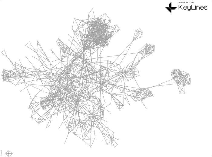
Social networks can be exceptionally dense. Charts with lots of nodes and even more connections create a nightmare hairball for an analyst to try and untangle.
Combos meet this challenge by allowing users to intuitively explore the data at their own pace, providing a clear high-level overview before they drill into the detail.
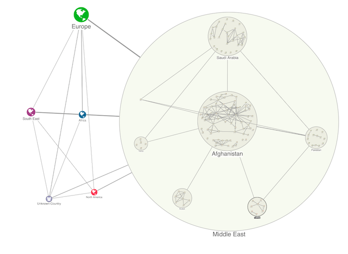
The dataset below represents an international network of suspected terrorists and their country and region of origin. Initially, the chart presents a tangled web of connections and it’s difficult to spot key relationships. By combining terrorists by region and country, we simplify the complexity and the visualization starts to make sense.
Now that we’ve combined nodes by region and country, we can use nested combos – combos inside combos – to browse the chart at different levels. This reveals overall graph trends without losing insight into individual nodes.
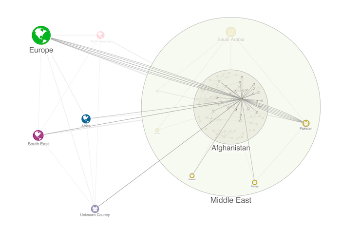
Combos aren’t just for high-level analysis. Sticking with our dataset of suspected terrorists, we can drill into detail to reveal a suspect’s direct connections across the chart.
Below, we’ve focused on a suspect in Afghanistan. The nodes linked to them have been brought to the foreground, making it easier to analyze key suspects without distraction.
Now let’s look at a completely different scenario to see how combos can be used to understand a complex healthcare network.
Scenario two: Drill into the detail
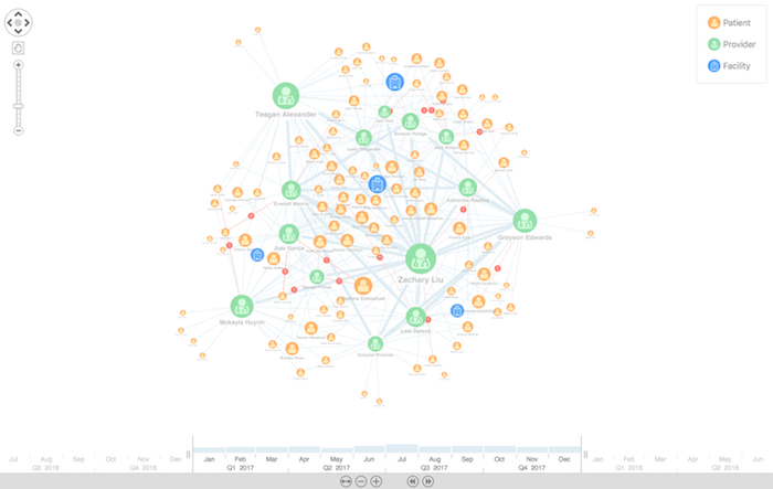
The fictitious dataset below represents part of a city’s healthcare system. We’ve color-coded nodes to make them easy to identify:
- blue nodes are medical facilities
- green nodes are doctors
- orange nodes are patients
We’ve styled the links too. The light blue links represent patient visits or doctor referrals, and the red dots on links represent a complaint made by a patient against a provider. Links are weighted by volume of visits and referrals. The chart is very busy, making it difficult for us to see what’s going on.
Using combos, we can group the doctors with the facilities they work in, instantly reducing some clutter.
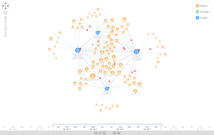
The chart above gives us a clearer high-level view. It’s now easier to see that some patients have connections to multiple facilities, whereas other patients are associated with one facility only. It would have been hard to get that insight without combos. Now let’s look inside the combos to go even deeper.
Let’s zoom into Dr Huynh, who has some complaints against her. We can expand her facility’s combo to see more information:
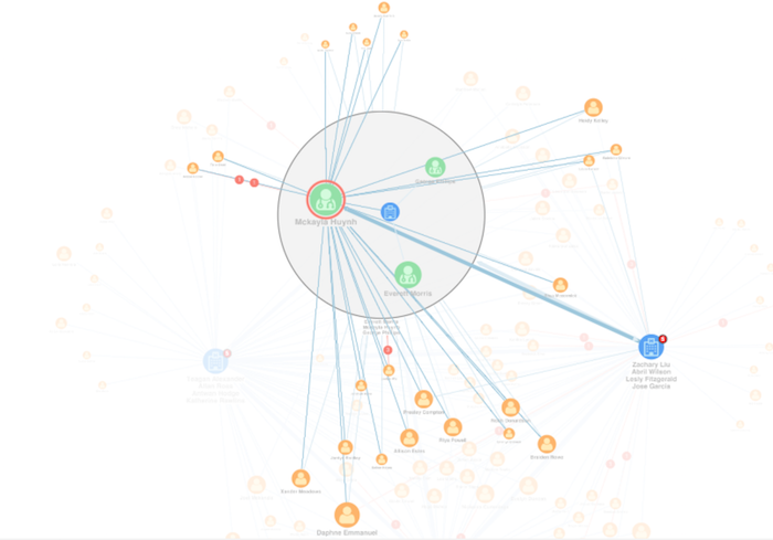
We can see details of her patients, and the number of complaints she’s received. We can also see that she receives a high number of referrals from another facility, suggesting that she may be a specialist of some kind.
Let’s open the combo of the facility she receives referrals from:
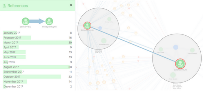
Now we can see that she receives all her referrals from Dr Liu. We can also see the number of referrals Dr Liu sent across the year. With these findings, an analyst can begin making recommendations and developing solutions. For instance, it may be worthwhile for the facility Dr Liu works in to get an in-house specialist to avoid having to refer patients to another facility.
Hungry for more combos?
These are just two examples of how combos can help make sense of real-world data. Combos can also be used to gain fast and clear insight into network connections such as IT networks, oil and gas, telecoms, and supply chains.
Take a look at this blog where we show how combos can be used to spot alerts in network topologies. We also have plenty of demos on the SDK for you to explore.


