
We’ve blogged before about how to create a graph model from a typical anti-fraud dataset which forms the basis for a visual model and a user interface. Now we’ll explore best practices for timeline data modeling, how it differs from graph data modeling, and examples of how some customers design their data models to create effective timeline visualizations.
Introducing timelines
A timeline is a way of visualizing sequences of events. The most basic form of timeline is simply a list of named events with timestamps. You’ll find these timelines in infographics everywhere, often beautifully illustrated.
In real investigations for security, anti-fraud and other important use cases, timeline data models are much larger and more complicated. We have to deal with a wide range of data sources:
- timestamped connected data, such as emails, SMS messages, network traffic – with connections made between identifiers at specific times
- events with duration, such as phone calls, videoconferences or long-running computer processes
- time series, such as a data stream of network performance over time
It’s precisely this rich, investigative data that our KronoGraph timeline visualization toolkit is designed to cope with – often complemented with a graph visualization using one of our graph toolkits, KeyLines or ReGraph.
Let’s see how clever timeline data modeling creates rich, interactive time-based visualizations.
Timelines of connected data
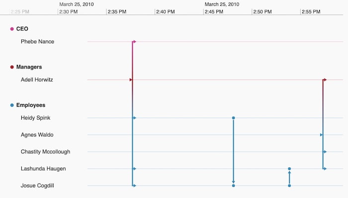
We begin with the most fundamental element of a timeline, an event. An event is simply something that has a timestamp – such as an email.
The interesting thing about certain events, such as emails, is that they are associated with connections between entities. Each email has a sender and one or more recipients – we call these participants entities – and we can model a sequence of emails as a set of connected timelines of these entities.
Let’s look at a simple example email dataset where each row corresponds to a single email:
| Email ID | Sender | Recipients | Timestamp |
|---|---|---|---|
| email_00001 | [email protected] | [email protected], [email protected], [email protected], [email protected] | March 25, 2010 14:37:30 |
| email_00002 | [email protected] | [email protected] | March 25, 2010 14:48:10 |
| email_00003 | [email protected] | [email protected] | March 25, 2010 14:53:01 |
| email_00004 | [email protected] | [email protected], [email protected], [email protected] | March 25, 2010 14:57:21 |
We also have supporting data in a linked table of a relational database. The email address is the identifier which ties the two tables together.
| Employee ID | Name | Title | Management level | |
|---|---|---|---|---|
| 1 | Adell Horwitz | [email protected] | Head of Marketing | Manager |
| 2 | Agnes Waldo | [email protected] | Product Manager | Employee |
| 3 | Chastity McCollough | [email protected] | Product Owner | Employee |
| 4 | Heidy Spink | [email protected] | Digital marketing manager | Employee |
| 5 | Josue Cogdill | [email protected] | Marketing Executive | Employee |
| 6 | Lashunda Haugen | [email protected] | Product Owner | Employee |
| 7 | Phebe Nance | [email protected] | CEO | CEO |
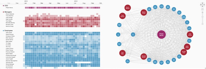
When we model this data in KronoGraph, we typically recommend the following approach:
- The email addresses correspond to entities, and the emails themselves become events
- Each event has a timestamp and a set of ‘from’ and ‘to’ entityIds
- Use the Name field from the enrichment table to label our entities
- Entities can have types which determine how they are visually presented. We’ll use the Management level field to assign types to entities, and choose styling and labels for these types. Types aren’t a necessary part of a timeline, but they help with the visual presentation, particularly when you have many entities.
Here’s the result:
This visual model for timeline data tells me not only the sequence of events in time, but also the participants, helping me build a visual model of how these connections evolved.
Many of our KronoGraph customers use these timelines in parallel with a graph representation of their data. We’d model our email data differently for a graph visualization. The typical graph visual model would map the email address owners to nodes, and combine all emails between any pair of people into a single link. Here’s how our email dataset looks in our KeyLines or ReGraph charts:
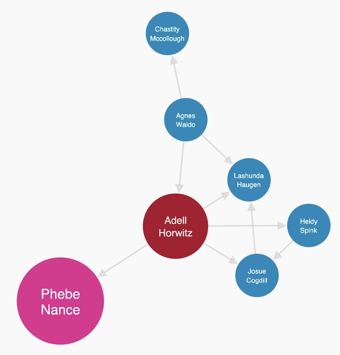
The graph gives good insight into the relationships in the data – the fact that Adell Horwitz is so central to this little network might not be easy to spot in the timeline. But the graph doesn’t tell you anything about the sequences of emails sent, or which connections were group emails and which were private communications.
Once we’ve finished our timeline data modeling, we can load in much larger datasets. KronoGraph (on the left) intelligently switches to a heatmap view when the data volume gets too large, but there’s no change to the data model. Zooming in always gets you back to the individual events in the timeline.
Although it covers the majority of cases in the intelligence and anti-fraud sectors, we can go beyond the simple connected entity model for events. Let’s explore some of the other popular timeline data models our customers use.
Timeline data modeling: working with duration
In this example, Cesar, Willie and Mable begin a video conference. During the conference, Guy starts a call to Dr. Greenfelder which continues after the video conference ends.
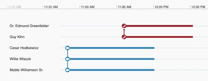
Duration is usually captured as a start and end time for each event, and that’s all you need to pass to KronoGraph to see this representation. We’ve also added custom styling, using font icons and arrows to distinguish between phone calls and videoconferences. Events can have types in the same way entities can!
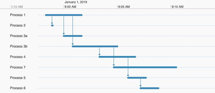
Timeline data modeling: process dependencies
This example shows the relationships between long running processes. A process might spawn another one, so we really have two different kinds of events. The processes themselves have start and end times, but only map to a single entity; the dependencies have only a single timestamp, and connect two entities.
No problem for KronoGraph – the entityIds array can have single or multiple members, and we can combine these event types into a hybrid visual model, often called a gantt chart:
Timeline data modeling: time series data
Time series data is everywhere, and it doesn’t follow the discrete event model. Instead, a time series is made up of a list of observations of some variable over time, and is usually drawn as a line graph.
One of the most valuable aspects of KronoGraph is the way you can overlay multiple different models on the same timeline. In this example we have:
- A time series dataset measuring network performance over time
- A set of connected entities representing network traffic between IP addresses
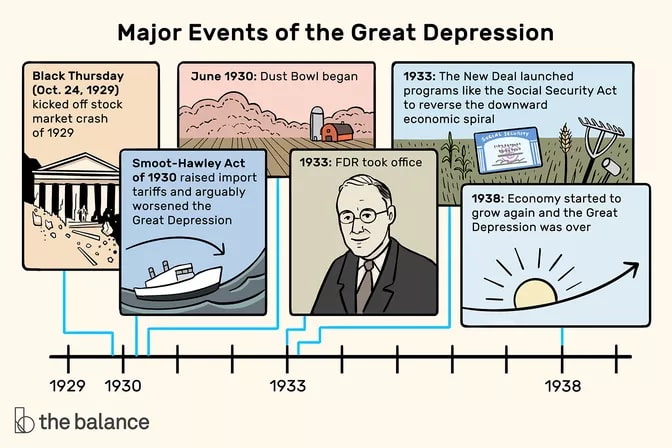
A marker annotating a specific moment in time, in this case, a DDoS network attack. (Remember the Great Depression timeline at the start of the blog? Markers are the most basic of all timeline elements, with text describing what happened at a moment in time.)
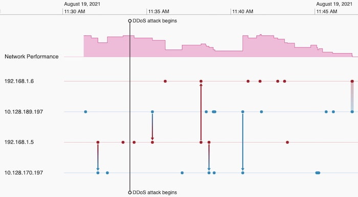
This gives us an easy visual way to spot correlations between the datasets – all in one place, all tied together with our simple model of events, entities and time series.
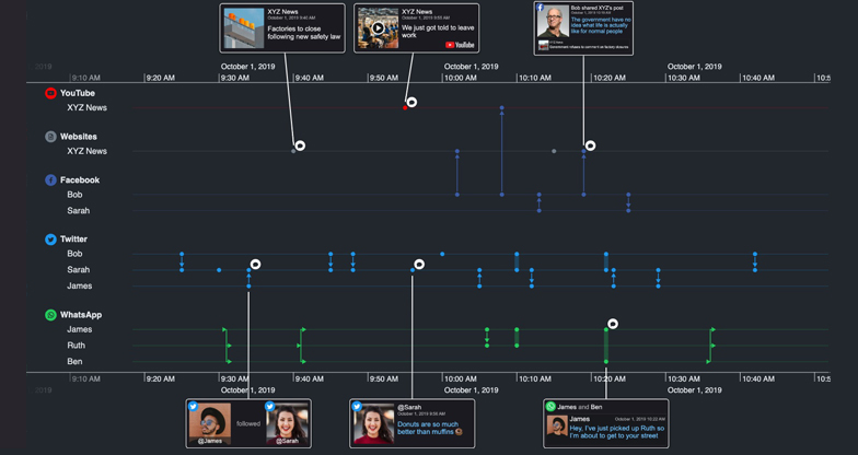
Timeline data modeling: media-rich data
KronoGraph’s focus is on modeling large, real-world datasets – rather than creating hand-crafted infographic images. However, don’t let that stop you from adding rich illustrations to your timelines.
In our final example, we use KronoGraph’s powerful application development APIs to add custom front end components to a timeline, to create the ‘infographic look’ while still having a scalable data model that can handle any dataset, large or small.
Want to try it for yourself?
No matter how complex your time-dependent data is, we’re confident that you can model it in KronoGraph. Contact us for a free trial.
Share:
