Working on a graph visualization project? You might assume that graph databases are the way to go – they have the word “graph” in them, after all. But while they’re a great fit for many applications, they’re not necessarily a prerequisite for visualizing graph data successfully.
Graph databases look for deep relationships
If you know you’ll be running complicated queries through more than a couple of layers of data, then it’s likely that a graph database will handle the complex relationships in your data most efficiently.
But you might prefer to stick with the tried and trusted technology you already rely on – and that could work out for you. Many of our customers have used non-graph data stores to build applications with all the speed, scale and insight you’d get from a graph database.
Do I need a graph database?
It depends on your project. Think about:
- The type of data you’re working with – structured? Unstructured? Under construction?
- The amount of data you need to store
- The queries your users will need to run – do they focus on relationships, or entities?
- Performance – is speed important for your project?
- Your team’s experience – will there be a steep learning curve?
No matter what your answers are, you have more options than you might think. Let’s look at situations where graph databases come into their own – and find out how using the right solution for visualizing graph data can help you get some of the benefits of a graph database without needing to use one.
The advantages of graph databases
A natural habitat for complex connected data
Many of our customers use a relational database for their graph visualizations. Despite its tabular format, this type of datastore can handle a lot of graph-type problems. But it can be a real challenge to fit huge amounts of connected data into a database that isn’t optimized for that purpose.
Developers often work around the problem with join tables – or they add relationships to a NoSQL database. But datastores that depend on this type of hack will struggle with complex, ad-hoc or exploratory queries that focus on the relationships in a dataset.
A graph database gets around this by natively representing connected data as a collection of data elements and their relationships. That means faster access to your connected data, and a consistent response time with even the largest datasets.
If you’re running complex analytical or pathfinding queries with four or more node “hops” from your root node, then a graph database is usually the best solution for you.
Save time on mapping and modeling
The human brain works by making connections. That’s why people prefer maps and charts to lists and tables. When you design your data model, you’ll probably begin by sketching out your data in a graph format – representing entities as nodes and relationships as links.
Working in a graph database means you can take that whiteboard model and apply it directly to your schema with relatively few adaptations.
Interested in building your data model?
Check out our ultimate guide to modeling graph data
Schema flexibility
Graph databases are adaptable, allowing your data model to evolve without disturbing the wider database structure. They’re great at handling additions, gaps and anomalies in your data that a traditional tabular database might find tricky to accommodate.
They speak the local language
By far, the biggest advantage of a graph database is graph query languages. They’re designed specifically for graph data, and let you frame your query in terms of the problem you’re trying to solve. They’ll get you a fast answer – rather than creating an obstacle course of SQL queries that slows down your system.
Traversal queries are especially handy. They treat nodes like stepping-stones, beginning at a starting point (or root node) and then follow links and nodes according to specific criteria and conditions. And because the nodes and links in a graph database “point” to each other, you can explore the largest graph data stores with a consistently speedy response time.
Graph queries are especially helpful if you’re looking for things like:
- Relationships to a specific entity
- The shortest path between two nodes
- Common connections between nodes
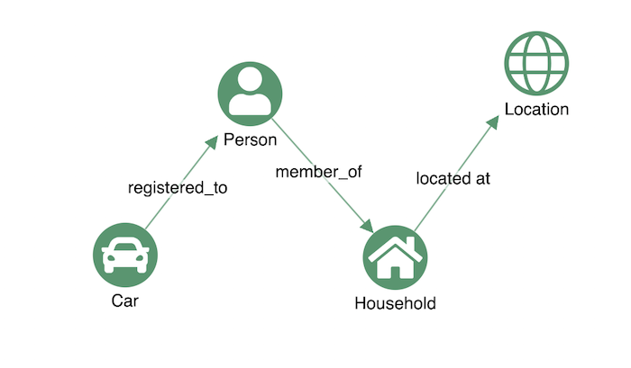
Let’s say we have a dataset of vehicles registered to American citizens. We want to find all the red cars registered to drivers aged between 18 and 25, who live at an address that also has a female resident over 50, in the state of Connecticut.
If we were working with a relational database, the SQL query would be awkward to construct. We’d need to pick up data from various tables, and bundle them together with a series of expensive JOINs, like this:
SELECT Car.car_id
FROM Car
JOIN Driver ON Car.car_id = Driver.car_id
JOIN Person ON Driver.person_id = Person.person_id
JOIN Household ON Household.household_id = Person.household_id
JOIN Location ON Household.location_id = Location.location_id
WHERE Car.color = 'red'
  AND Person.age BETWEEN 18 AND 25
  AND Location.state = 'Connecticut'
  AND EXISTS (
    SELECT *
    FROM Person p2
    WHERE p2.household_id = Household.household_id
      AND p2.age > 50
      AND p2.gender = 'female'
  )
Because we’re focused on relationships – registrations, memberships and locations – a graph database is the better option. A graph query (in this case written in Cypher) would look for a specific pattern, and run more smoothly:
MATCH (c: Car)-[:registered-to]->(d: Driver)-[:member-of]->(h: Household)<-[:member-of]-(p: Person)
WHERE c.color = "red" AND 18 < d.age < 26 AND p.age > 50 AND p.gender = "female"

MATCH (h)-[:located-at]->(l: Location)
WHERE l.state = "Connecticut"

RETURN c
We could take our graph query to the next level, and use a graph algorithm to find out what’s interesting about the relationships we’ve identified. Graph algorithms can pick out degrees of separation between individuals, for example, or find the most influential people in a graph – as we’ll find out later on.
But it can raise issues at the modeling stage if you’re trying to make it do something it isn’t designed to do. Let’s have a look at some potential pitfalls.
A graph database could bring you some challenges…
Too many databases
If you’re updating an existing system, your graph database probably isn’t replacing your existing data stores. It’s more likely that you’re taking data from one or more legacy sources, and copying it to a graph database. Now you have yet another database to scale and maintain – you’re making more work for yourself.
Too many nodes
Any database can cause this issue, but I’ve found that users of graph databases are particularly prone to “overnodification” – the temptation to add every entity and property as a node. We’ve seen how a graph database stores data as a graph, often making life easier at the modeling stage when you’re designing a graph visualization. But your visual model shouldn’t always match the model of data in your database.
In this example, rather than making use of properties, we’ve assigned separate nodes for a person’s first and last name, and for their location and address:
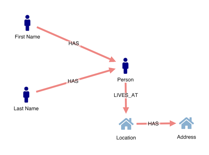
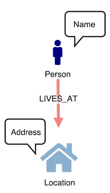
Unless properties are shared between multiple nodes, for instance offices with the same registered company address, or people with the same family name, we’ve “overnodified” here – and cluttered up our data model. If our users want to run queries that focus on relationships between people and households, they need to see people and locations as nodes, and names and addresses as properties of those nodes:
Too many links
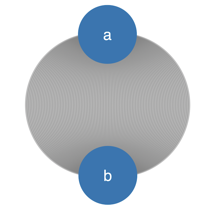
Much like overnodification, a common pattern I’ve noticed with graph database users is a tendency to show every link when visualizing graph data. This can cause some ugly visual anomalies.
For instance, if you’re working with a data model where two nodes have several links, there’s a risk of seeing them rendered in a formation we like to call an “onion”:
These connections each represent communications between person “a” and person “b”. In the below example, we’ve remodeled the data to summarize those communications as a single link, including the date and time data as a property. But if that data is important to the user, we need to make it easier for them to digest. In this format, they may as well be reading straight from a table of data.
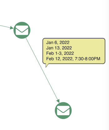
If we want to bring time data into the mix in a way that works, what are we missing here?
- We have no sense of patterns or clusters in time
- We have no information about sequences in our data
- We can’t represent an event that connects more than two nodes
So how do we unlock this critical additional dimension to our data? Combining graph and timeline visualization is the answer – and you can get time-based insights, and much more, with or without a graph database.
Visualizing graph data with a time dimension
If you’re working with connected data, it’s likely that you have a time dimension – even if you think you don’t:
- Communications data has a send and receive timestamp
- Insurance data has claim dates and policy start dates
- Cybersecurity data has packet and log entry timestamps
- Knowledge graphs have publication dates
- Financial data has transaction dates
- Law enforcement data has report dates
If it would help your users to explore the time dimension of a dataset, you need to bring timeline visualization into your application – and you can do that with or without a graph database.
All of our toolkits are database agnostic, and KronoGraph, our unique timeline visualization toolkit, is no exception. It’s the first toolkit for scalable timeline visualizations that reveal patterns in time data. Whether you need to investigate phone calls between two people or IT traffic across a whole enterprise network, KronoGraph provides a rich, interactive view of the data.
Getting graph insights without a graph database
Choosing the right technology for visualizing graph data is key. With a good visual analytics tool, you can replicate some of the benefits of a graph database without actually needing one.
You’d be surprised how many insights you can get by representing a simple dataset that only has one or two different node types, using a powerful graph visualization tool.
In this example, we’re representing a single table as a graph, using KeyLines, our Javascript graph visualization toolkit:
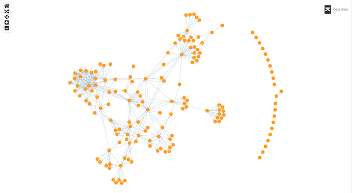
Our dataset simply comprises a list of emails, their senders and their recipients. Straight away we can pick out the shapes of teams, represented as clusters of connected nodes.
But if you’re investigating email data, you probably want a quick understanding of individual roles and organizational hierarchies – the relationships in your data.
You might want to look at:
- Neighbors – who has the most connections?
- Pathfinding – what’s the shortest or most efficient route between nodes in the graph?
- Centrality – how much influence do people have via their connections?
A graph database has algorithms for all of these, but if you’re using a different type of datastore, you could use a data visualization tool like KeyLines (or ReGraph, our React graph visualization toolkit) to do the calculations for you – as well as presenting the data in an intuitive way.
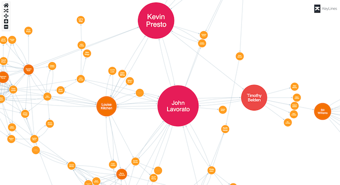
In this example, we’ve used KeyLines’ centrality algorithms to score the email accounts in different ways, to pick out the influencers in the organization:
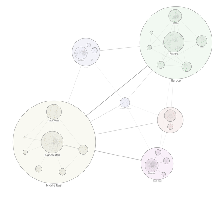
You can also take advantage of KeyLines’ styling features, such as combos. If you want to visually categorize your data into common groups, that’s something not all graph databases directly support. It’s a powerful technique that will allow users to better understand the data. These visual groupings of nodes and links are easy to expand, collapse and rearrange, making it easier to interact with your dataset – and easier for the end user to interpret your chart.
That’s a lot of insights into our connected data – and not a traversal query in sight. KeyLines can show us the graph quickly uncovering patterns and dynamics of interest without the need of a graph database.
Conclusion
If you’re working with complex connected data, a graph database is often the way to go – here’s an introduction to six of our favorite options. But you should think carefully about whether it’s right for your particular project, before you make a decision.
We’ve talked about some of the alternatives to a graph database, but whatever tool you use, for your visualization component it’s best to keep your options open. Our toolkits are database agnostic, which means they can integrate with any datastore. Request a free trial and find out for yourself how easy it is to build powerful and insightful graph applications that don’t depend on a graph database:
Share:
