Watch any good (trashy) police drama and you’ll quickly spot a few cliches. The maverick cop (tough, but with a heart of gold and tragic backstory). The conspicuous killer (the most famous guest star). The irritating chief of police (the only character who can afford a tailored suit).
Among the equally cliched dialogue (“you’re letting it get to you, go home…”) you’ll probably hear demands for a “list of suspects and timeline of events”.
In real and TV policing, timelines are key. They help investigators understand what happened and when, revealing the clear picture they need to solve crimes.
What if it were possible to create these timelines automatically? If investigators had dynamic, interactive, timeline investigation tools? Even better, what if they integrated seamlessly with the link analysis tools they already use? That’s why we built KronoGraph, our timeline visualization toolkit.
In this blog post, we’ll look at one scenario where law enforcement and intelligence agencies use timeline investigation tools to make the world a safer place: call data record (CDR) analysis.
Analyzing call data records (CDR)
Communications and call data holds valuable insight for police and intelligence agencies. They use data from lawful interception, cell phone downloads, tower dumps, and open-source intelligence (OSINT) to build criminal cases and monitor persons of interest. Timeline visualization is the perfect way to analyze it.
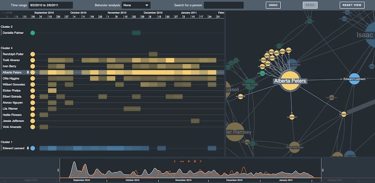
Here’s a small part of a dataset representing 23,000 phone calls and messages between 27 students:
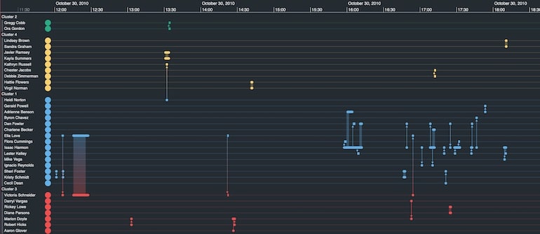
The students, our entities, are listed down the left-hand side of the timeline investigation tool. Their phone calls and text messages are shown as events connecting the entities. The scale runs along the top and bottom of the view.
This simple visual model is flexible enough to accommodate any time-based data. As long as there’s a time or date stamp, KronoGraph will visualize it.
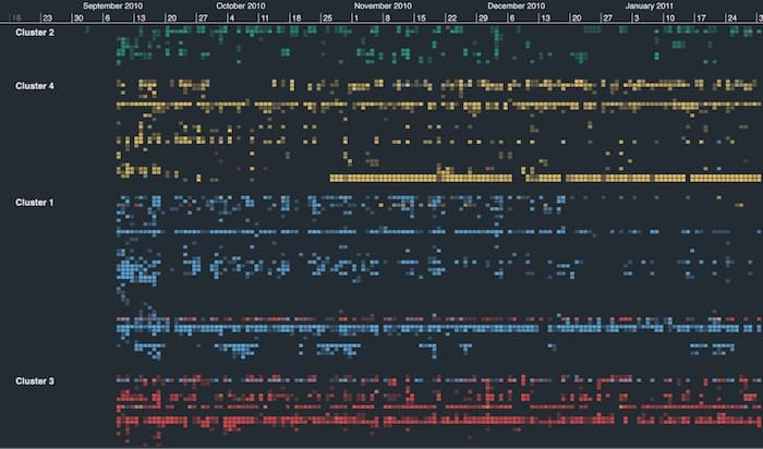
As we zoom out, two smart aggregation techniques simplify the view:
- Events (phone calls and messages) transition to a heatmap of activity over time
- Entities (the students) group into four clusters, defined in the original data
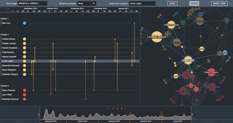
There’s another powerful way to navigate KronoGraph timelines. Let’s take a look at the lens view.
Focusing on key timelines without losing focus
No matter how large your dataset, KronoGraph can display every timeline in a single visualization. With this birds-eye view, it’s easy to spot spikes in activity, and which clusters contained less communicative students.
When we’re ready to take a closer look, we simply enter lens view. This means you can inspect individual timelines without losing context. The scrollbar makes analyzing the details of each call record a smooth, intuitive experience.
Now we know how to navigate our timelines, let’s see what happens when we expand analysis to include network visualization.
Integrated timeline investigation tools
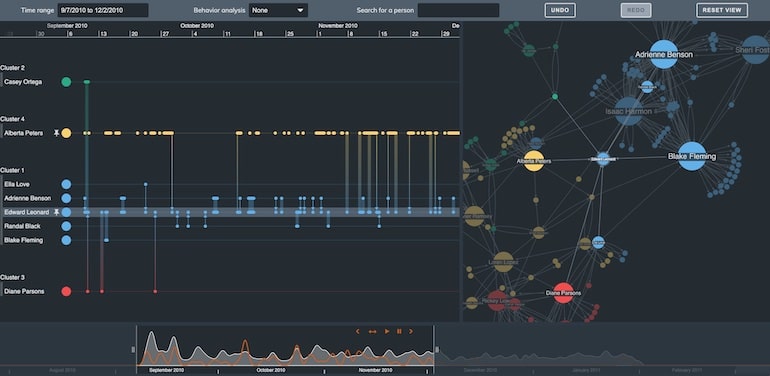
Now, imagine this isn’t a dataset from a social studies research paper, but call data records from an organized crime investigation. The investigators will need to understand the wider network dynamics, to see who’s in charge.
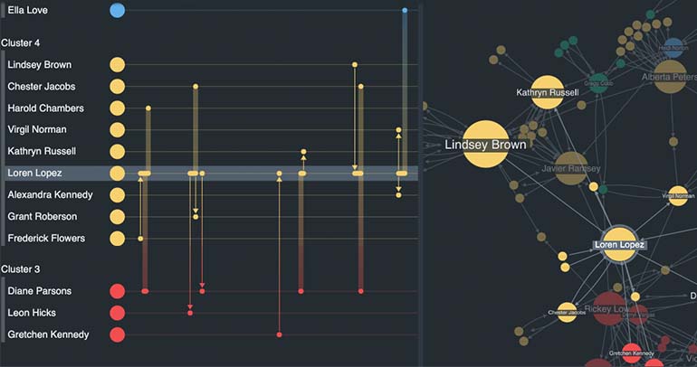
Combining KronoGraph with one of our link analysis toolkits, we get a dual view of our suspects and a timeline.
This hybrid visualization gives two powerful views of a vast and complex CDR dataset. The link analysis chart shows who speaks to whom. The timeline shows when and how they communicate. The interaction is bidirectional, too. Selecting or zooming in one view automatically updates the other:
Digging deeper into call data records with centrality measures
We’ve used another social network analysis measure, degree centrality, to highlight the best-connected people in our link chart. Alberta Peters is one of the most prominent Cluster 4 nodes.
Our timeline investigation tool shows she mostly speaks to other people in her cluster, especially Todd Alvarez.
She also speaks to Edward Leonard in Cluster 1. All the communication is one-way, though. Why doesn’t Edward return Alberta’s calls?
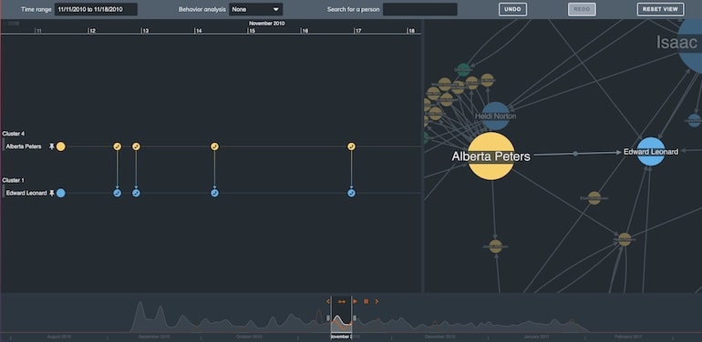
Let’s focus on Edward instead, keeping Alberta pinned (so she always stays in our view).
We can see Edward doesn’t communicate as frequently as other people, but he’s one of only a handful of people with connections to all four clusters.
Is Edward running the network? An interesting lead for an investigator, and one that would be impossible to uncover looking only at the data.
A sneak peek at scale wrapping
We could take our analysis further with a surveillance method called Pattern of Life analysis. This is when law enforcement observes a suspect’s activity to understand their habits and predict their behavior. It’s another great use case for timeline investigation tools.
In this example, we’re looking at a different dataset representing emails sent within a business. Using a feature we call scale wrapping we can change the flow of time in our timeline.
Instead of viewing the email traffic over a linear time period, we can tell KronoGraph to show us the email traffic by hour of day, or day of the week:
Simply changing our scale reveals new patterns that are otherwise buried. Keep an eye on future blog posts for more detail of scale wrapping, and examples of how it makes pattern of life analysis a breeze.
Find out more about KronoGraph timeline scale wrapping
Build your own timeline investigation tools
Visualizing communications records in KronoGraph helps investigators unpick and understand data on a vast scale. By interacting with the timeline, they can focus on periods of interest and individual connections that help reveal what’s going on.
If you’d like to explore your own data in this way, for law enforcement or other popular data visualization use cases, request a free trial.
FREE: Start your KronoGraph trial today
Request full access to our KronoGraph SDK, demos and live-coding playground
Share: