
Introducing the Enron Email Corpus
In 2003, the Federal Energy Regulation Commission published 1.6 million emails sent and received by Enron management between 2000 and 2002. Research scientists at MIT then purchased the dataset and set about tidying, reformatting and de-duplicating it for public use.
We took this data and loaded it into the product. Today I’m going to use the Enron demo to try and reverse engineer some of the investigation to understand the management structure of the organization using social network analysis.
Contact us to request a free trial.
Visualizing the network topology
Upon opening the demo, I can see that the nodes represent people within the Enron corpus and the links between them are incoming and outgoing emails.
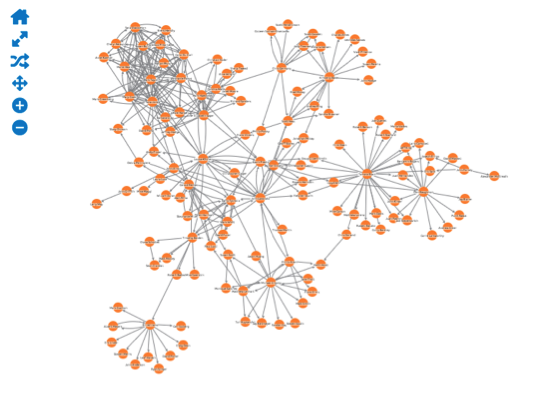
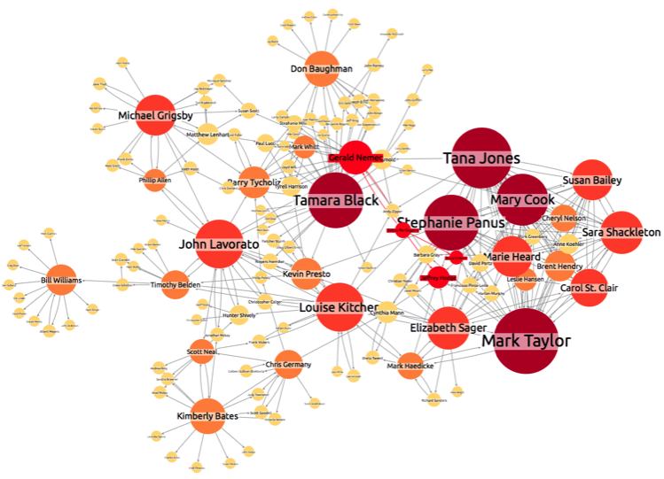
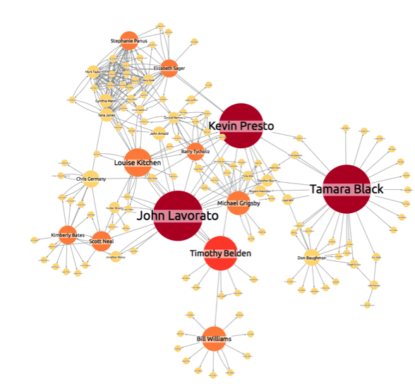
I can see the overlying structure of the organization’s communication and that there’s a tightly-knit cluster tangled up in the top left. Let’s switch “email volume” on:
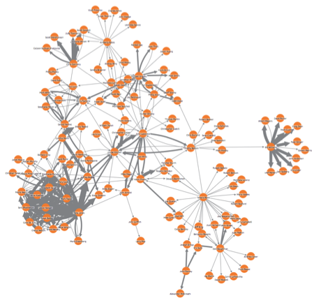
Showing email volumes really highlights the tightly connected area on the left of the network. But there also seems to be some smaller communities on the edges of the network map. For example, Bill Williams on the far right-hand side:
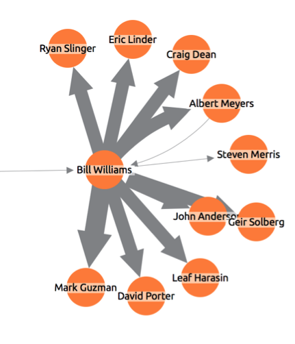
We can assume that Bill is some kind of team manager. But it seems strange that he has only a single stream of communication coming from the larger network and communicates only with nodes that are isolated from the core network. This seems a good place to start.
Finding a starting point
A quick Google search reveals that Bill was directly involved with manipulating energy production to fraudulently benefit Enron executives. He was heard in court via a recording instructing a high level member of staff from a power station to deliberately withhold power and make up an excuse for doing so, causing blackouts for thousands of homes throughout California.
Using network links to trace connections
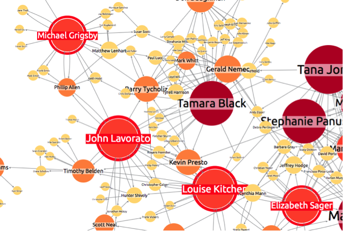
I can exploit that knowledge in an effort to find more through Bill’s relationships. If I click on the node, I can highlight his immediate connections from the rest of the network.
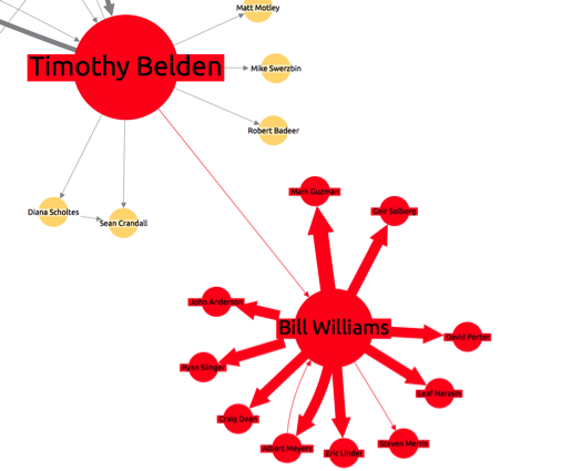
This shows that Bill is connected to the wider network through only one other person; Timothy Belden. Reports tell us that Bill was a senior trader – on the assumption that he wasn’t acting alone, his connection to Timothy Belden seems quite suspicious and the emails between them become of importance to the investigation, as they may offer a lead to potential associates of Bill.
The importance of connections
We’ve already highlighted the alleged “mastermind” behind Enron’s Californian scandal. The connection between Bill and Timothy now becomes of even more significance – whilst Network Visualisation alone can’t prove or disprove guilt, it saves what could have taken weeks sifting through emails to identify who was talking to who, and allows investigators to spot hidden structures of communication within the network.
Now let’s try something a little more advanced…
Using SNA to identify different positions in a hierarchy
I’m going to see if I can locate important people in the company (or at least the person at the top of the hierarchy within the network).
Degree centrality
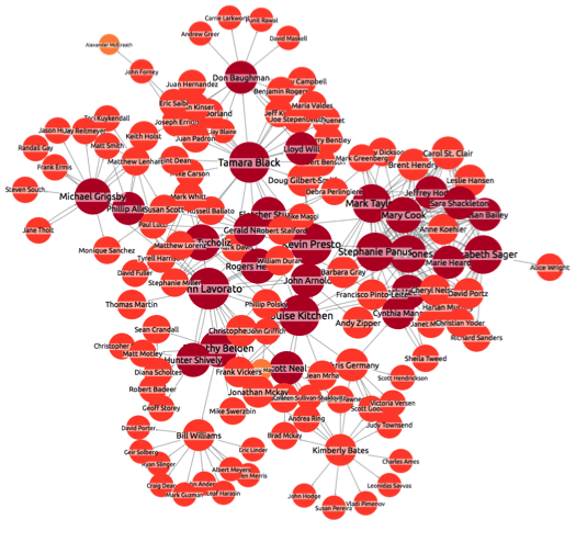
Degree centrality is purely a measure of how many direct connections a person/node has. In this demo, higher degree centrality is associated with bigger node size and darker color. Someone at the top of the chain of command is probably likely to have a fair few connections, but not the most. They should only be talking directly with ‘department heads’ or equivalent.
Lets take a look at the network with degree centrality switched on:
At first glance Mark Taylor and Tana Jones look like important people, but the volume of connections they have suggest they actually occupy roles distributing information, such as internal communications. I think our main suspects for senior management now are Michael Grigsby, John Lavorato, Louise Kitcher and Elizabeth Sager. The others of the same size seem too closely intertwined with the group on the right of the map.
Closeness Centrality
Closeness centrality is a measure of how close a node is to every other node in the network. Using this feature in the demo, a node is sized and colored based on the cumulative amount of degrees it is away from all other nodes. Let’s take a look at our network now:
Ok, that’s a little overwhelming. We’ll stick to the names we dug up from the degree centrality filtration and see how they look here.
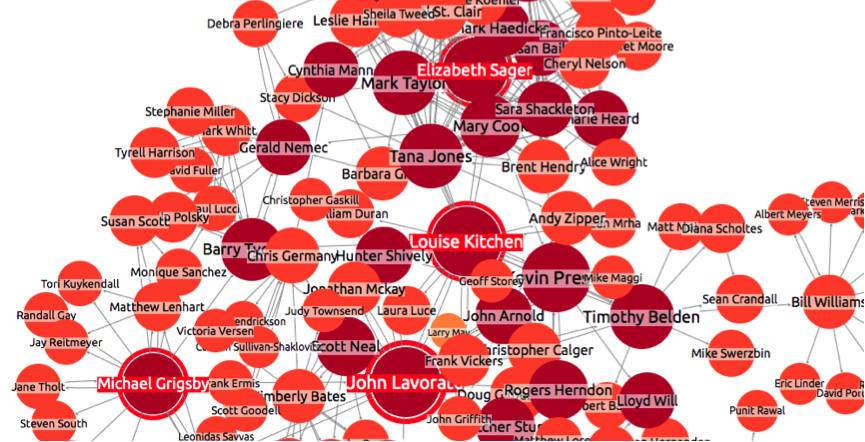
I’ve highlighted the names I selected previously. They all show a high level of closeness centrality – something that we would expect to see from a director, as, theoretically, their connections should flow efficiently down the hierarchy. There is, however, one differentiating factor between the four – the closeness of the people in their immediate networks.
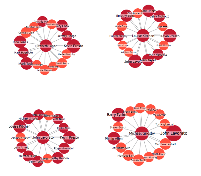
As you can see above, the people in John Lavorato’s immediate network have a higher closeness centrality than any of our other potential directors. It makes sense that equally well-connected department heads and managers would surround the director.
Let’s see if we can make an educated guess on the Director’s name based on the third centrality measure supported in the toolkit…
Betweenness Centrality
Betweenness measures how well a node connects separate communities within the network. I’d expect to see a higher level of betweenness centrality in a director, as in theory they should have managers from different areas of the business reporting to them and therefore should form a link across different departments. Let’s see if any of our prospective directors match this profile:
Of our original four, John Lavorato seems to have the greatest betweenness centrality and therefore best matches our profile for director, especially given the higher closeness centrality of his immediate network. Let’s see how I did…
Success! Using SNA measures to detect structures within networks
Reports confirm that Lavorato was in fact the chief executive of Enron Americas. There are certainly more efficient ways of identifying the CEO of a company, but this exercise shows how social network analytics and data visualisation can be used to bring out hidden structures in complex connected data, where the hierarchy is not so obvious – for example, when dissecting a fraud ring or pinpointing where the leadership lays in a terrorist cell.
Purely through using Cambridge Intelligence SNA measures, I was able to pick out the two of the key players in the Enron scandal and isolate the top of the hierarchy. If this exercise demonstrates anything, it is the investigative power of network visualization and analysis.
Interested in social networks?
Our white paper on visualizing social networks provides a thorough introduction to the methods and techniques you can use.
Share:
