In this technical blog post, I show you how to get KeyLines, our JavaScript toolkit for graph visualization, working inside Amazon Neptune graph notebooks, the Python library for Jupyter Notebooks. I demonstrate how developers can easily build the powerful visual analytics tools their data scientists need.
Jupyter & Amazon Neptune’s graph notebook
JupyterLab is a popular platform for data scientists needing to run graph analysis on network data. It’s a shareable, extensible and versatile approach, with a wide ecosystem of integrations and tooling.
If you’re interested in how our products integrate directly with the Jupyter stack, see our blog post about Python graph visualization using Jupyter and ReGraph
One popular integration is Neptune graph notebooks – an open-source Python library that lets users run queries and create basic graph data visualizations of their AWS Neptune data.
While these graph notebooks are great for advanced data scientists with coding experience, many users don’t have the time or knowledge to design the complex queries required. Instead, they need advanced and intuitive graph visualizations, customized for their needs.
Here’s where they turn to KeyLines, ReGraph and KronoGraph – our graph and timeline visualization SDKs.
All three are interactive JavaScript libraries for embedding visualizations into web pages, including Neptune graph notebook cells. Once loaded, developers can customize the graph data to match data science workflows and use cases, performing analysis through intuitive interactions rather than complex queries.
Let’s start connecting KeyLines to the AWS Neptune graph notebook. We’ll use an example fraud dataset provided by AWS.
Configuring AWS Neptune graph notebook
You’ll find details of how to connect the open-source Jupyter Notebook to Neptune in the AWS documentation.
While it’s possible to install graph notebooks locally, we’ll host them on Amazon SageMaker. This means they’re automatically configured to connect to the Neptune instance.
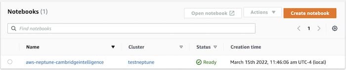
When we log into JupyterLab, we see four graph notebooks automatically created to help us get started.
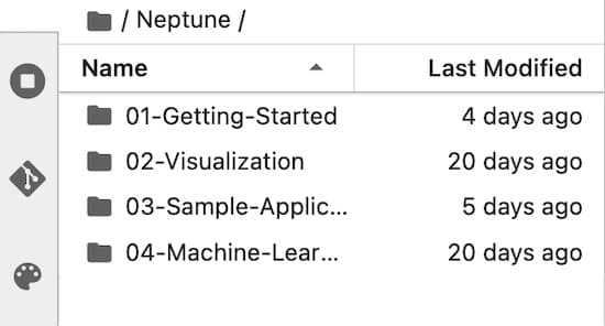
Let’s look at 03-Sample-Applications which contains our fraud example.
The text in the notebook is helpful and straightforward. You can run through the examples yourself (check out the getting started section on GitHub), but we’ll highlight a few key concepts.
Before we start integrating KeyLines, we need to understand some of the magic commands that graph notebooks offer. These convenient functions save time and effort, and can either apply to a single line (prefaced with %) or to the entire cell (prefaced with %%).
The ones we’ll use are %seed, %%graph_notebook_vis_options, %%gremlin, and %%javascript.
%seed populates the Neptune database with useful sample data so that we can test our queries. In the fraud example, run the first line (Shift+Enter) which contains this magic command:
%seed --model Property_Graph --dataset fraud_graph --run
The second cell contains the %%graph_notebook_vis_options cell magic, which defines the visual model for displaying query results. We’re not going to use the built-in visualization engine much, but we’ll run this cell anyway so we can contrast this visualization with KeyLines. It assigns a color and icon to each type of node in the database:
%graph_notebook_vis_options

{
  "groups": {
    "Account": {
      "shape": "icon",
      "icon": {
        "face": "FontAwesome",
        "code": "uf2bb",
        "color": "red"
      }
    },
    "Transaction": {
      "shape": "icon",
      "icon": {
        "face": "FontAwesome",
        "code": "uf155",
        "color": "green"
      }
    },
    "Merchant": {
      "shape": "icon",
      "icon": {
        "face": "FontAwesome",
        "code": "uf290",
        "color": "orange"
      }
    },
    "DateOfBirth": {
      "shape": "icon",
      "icon": {
        "face": "FontAwesome",
        "code": "uf1fd",
        "color": "blue"
      }
    },
    "EmailAddress": {
      "shape": "icon",
      "icon": {
        "face": "FontAwesome",
        "code": "uf1fa",
        "color": "blue"
      }
    },
    "Address": {
      "shape": "icon",
      "icon": {
        "face": "FontAwesome",
        "code": "uf015",
        "color": "blue"
      }
    },
    "IpAddress": {
      "shape": "icon",
      "icon": {
        "face": "FontAwesome",
        "code": "uf109",
        "color": "blue"
      }
    },
    "PhoneNumber": {
      "shape": "icon",
      "icon": {
        "face": "FontAwesome",
        "code": "uf095",
        "color": "blue"
      }
    }
  },
  "edges": {
    "color": {
      "inherit": false
    },
    "smooth": {
      "enabled": true,
      "type": "straightCross"
    },
    "arrows": {
      "to": {
        "enabled": false,
        "type": "arrow"
      }
    },
    "font": {
      "face": "courier new"
    }
  },
  "interaction": {
    "hover": true,
    "hoverConnectedEdges": true,
    "selectConnectedEdges": false
  },
  "physics": {
    "minVelocity": 0.75,
    "barnesHut": {
      "centralGravity": 0.1,
      "gravitationalConstant": -50450,
      "springLength": 95,
      "springConstant": 0.04,
      "damping": 0.09,
      "avoidOverlap": 0.1
    },
    "solver": "barnesHut",
    "enabled": true,
    "adaptiveTimestep": true,
    "stabilization": {
      "enabled": true,
      "iterations": 1
    }
  }
}
The options won’t affect the way the data is visualized in KeyLines – we’ll simply replicate some of them in the JavaScript later.
Now take a look at the 3rd cell. It starts with %%gremlin cell magic so notebook knows that what follows is a Gremlin query:
%%gremlin -g type -p v,inV,outV

g.V('account-4398046521820').
  in('FEATURE_OF_ACCOUNT').
  path().
  by(
      project('type', 'value').
      by(label).
      by(valueMap('account_number', 'first_name', 'last_name', 'value'))
  )
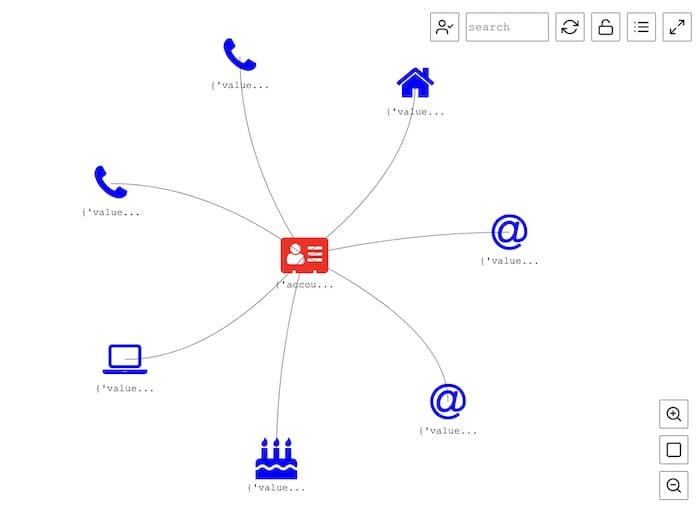
The gremlin query sends a specific vertex (account-4398046521820) and the items it is connected to. In our data model, these are the various data elements associated with that account, such as addresses and phone numbers. Let’s run this cell and review the raw output:
1.    path[{'value': {'account_number': ['0004-3980-4652-1820'], 'last_name': ['Li'], 'first_name': ['Yang']}, 'type': 'Account'}, {'value': {'value': ['27.121.78.75']}, 'type': 'IpAddress'}]
2.    path[{'value': {'account_number': ['0004-3980-4652-1820'], 'last_name': ['Li'], 'first_name': ['Yang']}, 'type': 'Account'}, {'value': {'value': ['[email protected]']}, 'type': 'EmailAddress'}]
3.    path[{'value': {'account_number': ['0004-3980-4652-1820'], 'last_name': ['Li'], 'first_name': ['Yang']}, 'type': 'Account'}, {'value': {'value': ['+338874217933']}, 'type': 'PhoneNumber'}]
4.    path[{'value': {'account_number': ['0004-3980-4652-1820'], 'last_name': ['Li'], 'first_name': ['Yang']}, 'type': 'Account'}, {'value': {'value': ['[email protected]']}, 'type': 'EmailAddress'}]
5.    path[{'value': {'account_number': ['0004-3980-4652-1820'], 'last_name': ['Li'], 'first_name': ['Yang']}, 'type': 'Account'}, {'value': {'value': ['Dezhou, 002']}, 'type': 'Address'}]
6.    path[{'value': {'account_number': ['0004-3980-4652-1820'], 'last_name': ['Li'], 'first_name': ['Yang']}, 'type': 'Account'}, {'value': {'value': ['1984-03-13 00:00:00']}, 'type': 'DateOfBirth'}]
7.    path[{'value': {'account_number': ['0004-3980-4652-1820'], 'last_name': ['Li'], 'first_name': ['Yang']}, 'type': 'Account'}, {'value': {'value': ['+553264258350']}, 'type': 'PhoneNumber'}]
Neptune returns the results as a series of paths or custom objects that the native notebook knows how to handle. (Later we’ll pick these apart to use the results in KeyLines.) In this instance they’re easy to read because a path is just a link from the account node that we queried to a connected node.
The built-in visualization is clearer, because even the most basic graph brings data to life. You can see that an account has an address, a couple of phone numbers, an email address, etc.
Integrate KeyLines to add visual analytics
Typically, users embed KeyLines into a web application to create an interactive graph analytics tool. We can do the same with Jupyter Notebooks because, although it’s designed for Python, it supports JavaScript too. This gives data scientists advanced graph visualizations from inside the tools they use most often.
First we download KeyLines from the KeyLines SDK site which contains a keylines.js file.
Next, in JupyterLab, we upload keylines.js to the server containing the graph notebooks. We do that through the nbextensions framework in the notebook, which allows the use of 3rd party libraries. Make sure it’s in the nbextensions directory with this command:
sh-4.2$ cd ~/.ipython/nbextensions
sh-4.2$ cp /home/ec2-user/SageMaker/Neptune/keylines.js .
Now we’ll enable access to the KeyLines JavaScript library inside the notebook’s cells using one final cell magic command:
%%javascript
We make sure KeyLines doesn’t exist in any previous run of the cell by using JQuery, which is included automatically in the notebooks:
$('#kl').remove();
Then we add KeyLines as an element to the DOM using an included global variable called element:
element.append('<div id="kl"
style="width:900px;height:1000px"></div>');
We’ll use a specific width/height for our chart here, but you may want to tailor it to a size that works for your notebook:
require(["nbextensions/keylines"], function (KeyLines) {
  //The following lines are all part of the KeyLines API
  KeyLines.promisify();
  const chartOptions = { iconFontFamily: "FontAwesome" }; // we will later want to use font icons
  //allows us to use promises instead of callbacks
  KeyLines.create({ type: "chart", id: "kl" }, chartOptions).then((chart) => {
    chart
      .load({
        type: "LinkChart",
        items: [], //no items for now, we'll add those in a future step
      })
      .then(chart.layout);
  });
});
This JavaScript loads a blank chart, fits it to the window and applies an organic graph layout (even though it’s empty right now).

Bring the Neptune data into KeyLines
The final step is to take the results of the Gremlin query we issued earlier into KeyLines. There’s some work to do here because the query is returning Python, but KeyLines expects JavaScript.
First, We store that list in a variable so that we can access it later. We’ll use the –store-to argument in the %%gremlin cell magic for this.
We’ll run a query for finding identity theft from AWS’s example fraud dataset. This will search for instances where an IP address was used in transactions but was not associated with an account.
Remember that the Gremlin query generates a list of path objects that are used in the return. We’ll store the query results in a variable called results by adding the store-to argument:
%%gremlin -g type -p v,inV,outV,inV,outV --store-to results

g.E().hasLabel('FEATURE_OF_TRANSACTION').
  outV().as ('feature').
  where(
      and(
          out('FEATURE_OF_ACCOUNT').count().is(eq(0)),
          out('FEATURE_OF_TRANSACTION').count().is(gte(4))
      )
  ).
  out('FEATURE_OF_TRANSACTION').
   union(
      out('ACCOUNT'),
      out('MERCHANT'),
      in('FEATURE_OF_TRANSACTION')
  ).
  path().from('feature').
  by(
      project('type', 'value').
      by(label).
      by(valueMap('account_number', 'value', 'amount', 'created', 'name'))
  )
Now we have our query results. We can’t just pass it to KeyLines yet (or even to JavaScript for that matter), because the JavaScript cell doesn’t know what to do with these path objects.
Remember that the path objects are just a list of nodes that are connected to one another. So the following code does two things:
- it parses each path into a “left” side, which is the origin node of each link, and a “right” side, and creates arrays of those objects, which is the destination of the link
- it creates a global variable called passtojs which it loads as a JSON object in the window so KeyLines can access it
import json
jsresultsleft = []
jsresultsright = []
passtojs = {"left": "", "right":""}
for path in results:
jsresultsleft.append(path[0])
jsresultsright.append(path[2])
passtojs["left"] = jsresultsleft
passtojs["right"] = jsresultsright
jsresults = json.dumps(passtojs)
from IPython.display import Javascript
Javascript("""
window.results={};
""".format(passtojs))
Now, we’ll parse this data into the KeyLines format and load it into a chart. We’ll edit the JavaScript from earlier which created a blank chart and add code to set the visual properties, including the font icon and color of the nodes of each type. We’ll also loads the data from the global variable:
%%javascript
$('kl').remove();
element.append('<div id="kl"
style="width:900px;height:1000px"></div>');
require(["nbextensions/keylines"], function (KeyLines) {
    // We can use the KeyLines API as normal in here
    let visMap = {
     Account: {id: 'account_number', color: '#6495ED', fontIcon: 'uf2bb' },
     IpAddress: {id: 'value', color: '#FF7F50', fontIcon: 'uf109'},
     EmailAddress: {id: 'value', color: '#B22222', fontIcon: 'uf1fa'},
     PhoneNumber: {id: 'value', color: '#BDB76B', fontIcon: 'uf095'},
     Address: {id: 'value', color: '#8B008B', fontIcon: 'uf015'},
     DateOfBirth: {id: 'value', color:'#008B8B', fontIcon: 'uf1fd'},
     Merchant: {id:'name', color: '#e09d16', fontIcon: 'uf290'}

    }
    KeyLines.promisify();
    let items = [];
    for (let i=0; i<results.left.length; i++ ) {

//create the node that represents the left side of the link, drawing the font icon and the labels from the data
      items.push({type: 'node', fi: {t:
visMap[results.left[i].type].fontIcon}, t:
results.left[i]['value'][visMap[results.left[i].type].id][0], id:
results.left[i]['value'][visMap[results.left[i].type].id][0],
c:visMap[results.left[i].type].color})

//create the node that represents the right side of the link, drawing the font icon and the labels from the data
      items.push({type: 'node', fi: {t:
visMap[results.right[i].type].fontIcon}, t:
results.right[i]['value'][visMap[results.right[i].type].id][0], id:
results.right[i]['value'][visMap[results.right[i].type].id][0],
c:visMap[results.right[i].type].color })

//create the object for the link itself, linking left to right, getting the ids of the endpoints from the data
      items.push({type: 'link', id1:
results.left[i]['value'][visMap[results.left[i].type].id][0], id2:
results.right[i]['value'][visMap[results.right[i].type].id][0], id: 'link' + i })
    }

    KeyLines.create({type: 'chart', id: 'kl'}).then(chart => {
        chart.options({ iconFontFamily: 'FontAwesome' });
        chart.load({
            type: 'LinkChart',
            items: items

        }).then(() => {
            chart.zoom('fit');
        }).then(() => {
            chart.layout();
        })
    })
});
Running this cell returns a KeyLines chart with the results of the Gremlin query.
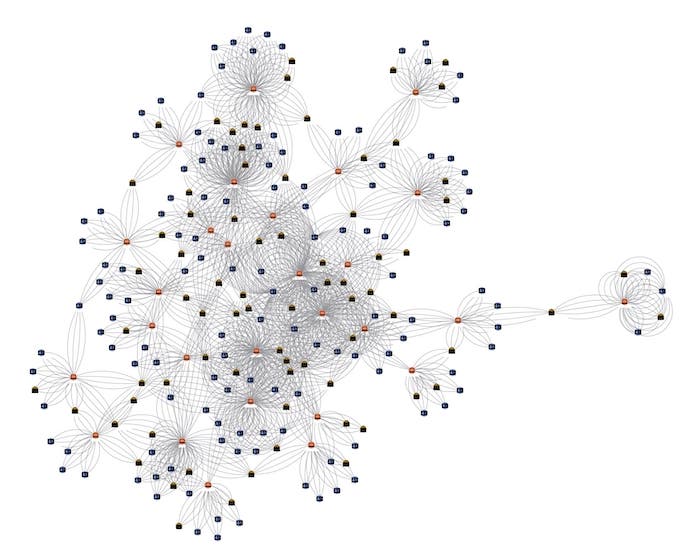
We’ve kept things simple here but the different node types stand out automatically: orange nodes are the merchants, pink ones are IP addresses, and blue ones are customers.
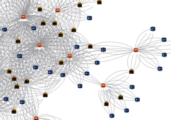
However, the chart is a little busy because we treated each transaction as an individual link, so there are multiple links representing repeated transactions between the same IP address and merchant.
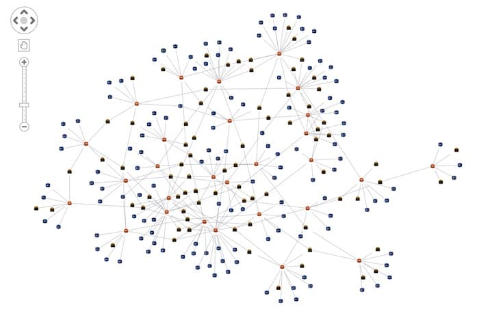
To simplify the graph, let’s draw a single link between the nodes regardless of how many transactions there were. We can do that in the JavaScript without having to go back and edit the Gremlin query. We can instead edit the id value that we passed into the array to make the link a concatenation of the two endpoints instead of a unique value. This means that KeyLines recognizes duplicates and won’t create multiple links with the same id:
items.push({type: 'link', id1:
results.left[i]['value'][visMap[results.left[i].type].id][0], id2:
results.right[i]['value'][visMap[results.right[i].type].id][0], id:
results.left[i]['value'][visMap[results.left[i].type].id][0] + ' ' +
results.right[i]['value'][visMap[results.right[i].type].id][0] })
Run the code to display this chart:
Taking visual analytics tools one step further
Adding KeyLines to an AWS Graph Notebook – or any Jupyter Notebook – may seem daunting at first as you have to work with two different languages and pass data back and forth. But you only have to configure this once, then you can use KeyLines to query the Neptune database and explore your way through the data, taking advantage of KeyLines’s advanced visualization capabilities and simple API.
We’ve produced a basic KeyLines chart example here, but you can go much further. Advanced features such as node groupings, filtering and a time bar would create a visual analytics tool that’s slick, feature-packed and intuitive.
Want to try KeyLines for yourself? The SDK gives you full access to the API along with example code and beautiful demos. Request a free trial today.
Share: