Working in the data visualization field, I’m intrigued by different datasets and using graph visualization to explore, understand and interact with them. I came across an interesting New York taxi cab database and this study: “What Insights Do Taxi Rides Offer into Federal Reserve Leakage?”. I was curious to see what I could uncover using KeyLines – the graph visualization toolkit – to create an NYC taxi data visualization.
The data includes information on taxi trips taken in the city and the study found an increase in cab activity between the Federal Reserve Bank of New York and major Wall Street banks around the time of central bank policy meetings.
In this blog, we’ll see how the graph visualization approach can be useful when working with large and complex datasets like this one. Let’s take a look!
A quick intro to KeyLines
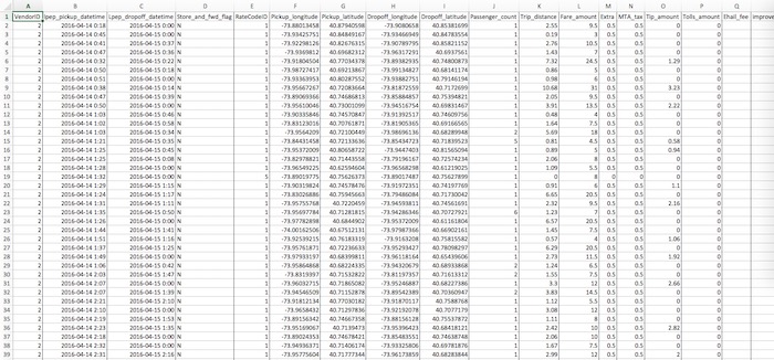
Looking at data as a table, like the one above, it’s difficult to gain any insight. KeyLines is a toolkit for building game-changing interactive visualizations that unlock insights in complex graph data. By visualizing connected data as a graph, you can quickly find and investigate anomalies in data.
NYC taxi data and data model
Before we start, we need to decide on our data and visual model.
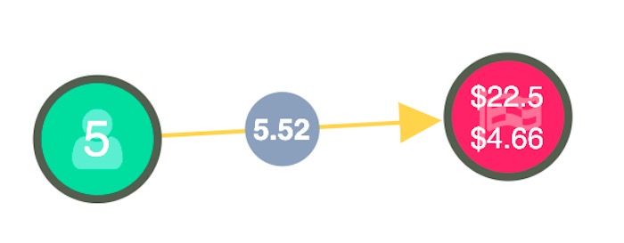
The visual model you choose depends on the questions you need to ask of your data (graph data modelling 101) but I used:
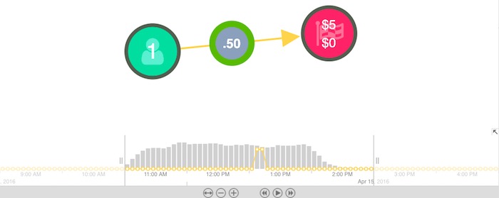
- Green nodes to represent a pick-up location, with a value indicating the number of passengers.
- Red nodes to represent a drop-off location with values showing the total fare and any tips.
- Grey glyphs on the links to highlight the distance of the journey in miles.
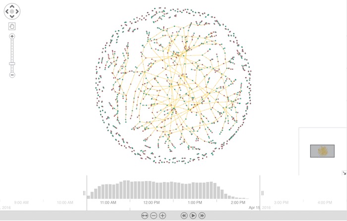
Now that we have our data and data model, we need to load it into KeyLines and run a layout. I chose to load a subset of data from 15th April 2016 between 11AM and 2PM. It looks something like this:
Using KeyLines geospatial – an integration for visualizing connected data on maps – I was able to visualize the data on a map. Depending on your needs or preference, KeyLines allows you to switch from a map view to a topographic view in one click.
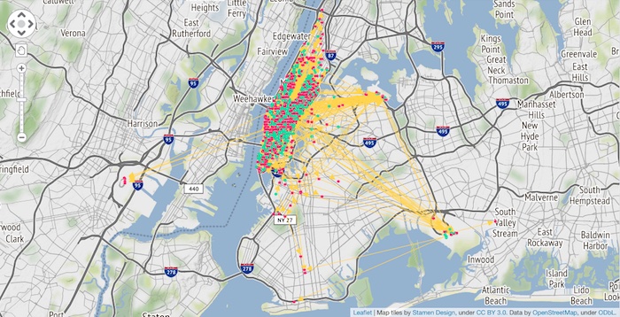
Now we can see our NYC taxi data visualization, we can begin to spot patterns which may not have been as obvious in a textual format – providing users with the accurate, fast insight they need.
Our chart is quite cluttered, let’s clear it up a bit.
Visualize dynamic networks with the time bar
Data is often large-scale, complex and noisy. Using filters we can reduce some of that noise to focus on the data of interest. Most graph data has some kind of temporal element, so the time bar is a really useful tool. It enables us to filter by time period, to isolate activity from a specific time period:
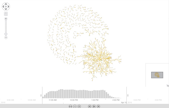
The above chart gives us a great overview but let’s zoom in to gain more insight. By selecting a glyph, the time bar reveals information relevant to the selected trip and shows it as a yellow trend line in the histogram.
Let’s see how social network analysis (SNA) measures can help us understand this dataset better.
Understand influence with centrality measures
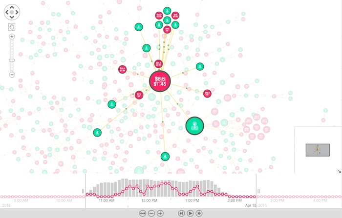
By default, all the nodes are the same size, but using KeyLines SNA measures, we can resize the nodes based on their importance. Here I’ve sized them based on their EigenCentrality – a measure of influence. This helps us quickly spot the popular drop-off and pick-up locations in our dataset:
Now, let’s focus our attention on combos, KeyLines’ exclusive node-grouping functionality.
Reduce clutter with combos
Combos are an intuitive and powerful way to explore your most complex networks. By combining nodes into groups we can clear up some of the clutter, and understand some of the macro-trends happening in our data.
I used combos to combine the nodes into geographic zones, and added donuts to indicate the volume of pick-ups (green) and drop-offs (red).
I’ve also grouped the links and weighted them by volume. This helps us easily spot the more popular routes:
Charts with many nodes and connections are a challenge for any analyst to deal with. Using these simple techniques, we can simplify a complex scenario into a single visualization that can be understood at a glance – a great starting point for any data investigation.
NYC taxi data visualization & KeyLines
Visualizing data in an interactive and dynamic way can help you uncover patterns and recognize connections you may not have been able to with alternative methods of analysis. Discover the true power of graph visualization by trying out KeyLines yourself. Request a free trial here.


