It’s a fact: your friends have more friends than you do.
Life isn’t a popularity contest. Which is just as well, because if it was based on the number of friends you have compared with the number your friends have, you’re likely to lose. The reassuring news is that it’s the same for pretty much all of us, thanks to the friendship paradox.
Sociologist Scott L. Field’s 1991 paper, ‘Why Your Friends Have More Friends Than You Do’, identified the friendship paradox phenomenon. It’s based on the logic that the mean number of friends of friends is always greater than the mean number of friends of individuals.
Think about the most popular person you know. Being friends with someone who is part of many different social groups automatically makes your average number of friends smaller in comparison. And it’s the same for everybody else they’re friends with.
The theory has since been verified using social network data from Twitter and Facebook. In this blog post, we’ll use the advanced features of our graph visualization products to test the friendship paradox. We’ll show how advanced styling and customization makes it easy to gain insight from evolving networks.
Visualizing large datasets quickly and easily
We’ve used data from GCconnex, the Government of Canada’s internal social networking platform. Although it’s a private, professional network, the behaviors are similar to those you’d expect to see in a large friendship group.
Nodes represent colleagues from different departments, with links representing those who’ve connected with each other (a bit like becoming friends on Facebook).
Here we’ve used the organic layout – the latest addition to the Cambridge Intelligence layout family. It places larger components at the center, with links spreading outwards to get an idea of the overall structure.
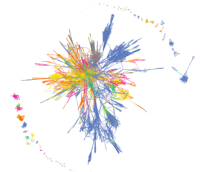
Organic layout is a great choice for large datasets, and this one features over 5,000 nodes and nearly 10,000 links. Our tests have shown that it performs five to six times faster than standard layout.
If we want to test the friendship paradox in this huge graph visualization, we’re going to need to simplify the chart. Let’s see how combos helps us do that.
Simplifying charts with combos
A quick and easy way to filter our chart is by grouping colleagues by department using combos. This is our advanced feature for combining nodes that have something in common. It declutters the chart into a more manageable set of items.
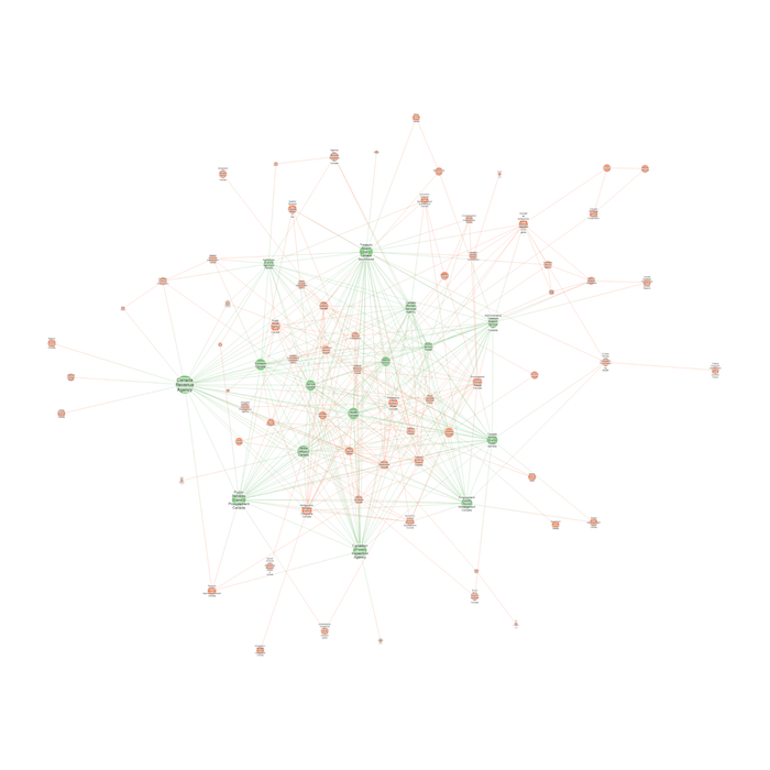
We’ve also used some intuitive styling to help focus on the theory we’re testing:
- If the combo is orange, that department contains more colleagues whose friends have more friends than they do.
- If it’s green, that department contains more colleagues whose friends have as many or fewer friends than they do.
- The orange and green color gradients on links helps make the status of connections clearer.
In simple terms, if most of the combos are orange (which they are), the friendship paradox is true.
We’ve also sized combos depending on how many friends that department has: the larger the combo, the more friends its colleagues have relative to other departments. The majority of smaller orange combos makes it easier to spot at a glance that the theory is true, even at high zoom levels.
Let’s explore another styling option to make the chart clearer still.
Clever node styling using donuts
Styling nodes to say something about their connections is a smart way to bring out insight. Here, we’ve removed department names (they’re not relevant to our theory) and added donuts to each combo node. Donuts show the numeric proportions of departments that prove whether the friendship paradox is true or false for that group.
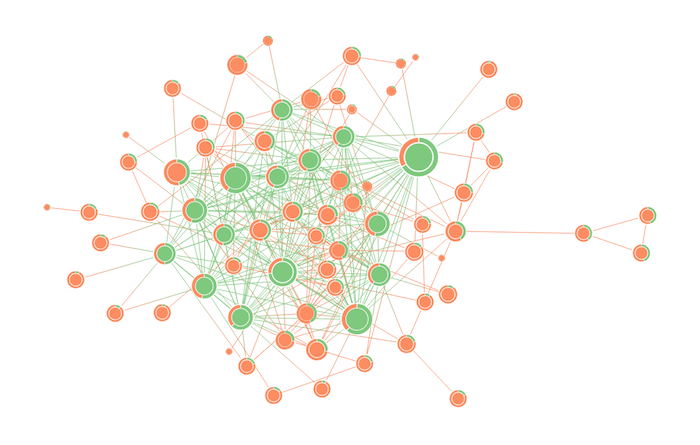
Donuts are perfect for displaying relative data values that can be quickly understood. Here, we’ve gone one step further. Whichever proportion of the halo is the majority affects the color of the combo node itself.
It’s now much clearer even at scale that the friendship paradox is true. Now let’s see whether it remains true as the network evolves.
Adaptive layouts for evolving charts
Social networks change over time. The time bar is an effective way to identify when connections were created, how long they persisted, and when they ended. Animate this and you’ve got an interactive way to showcase relationship durations.
When we apply the force-directed standard layout, the contents are distributed evenly to give data a consistent structure that’s easier to work with.
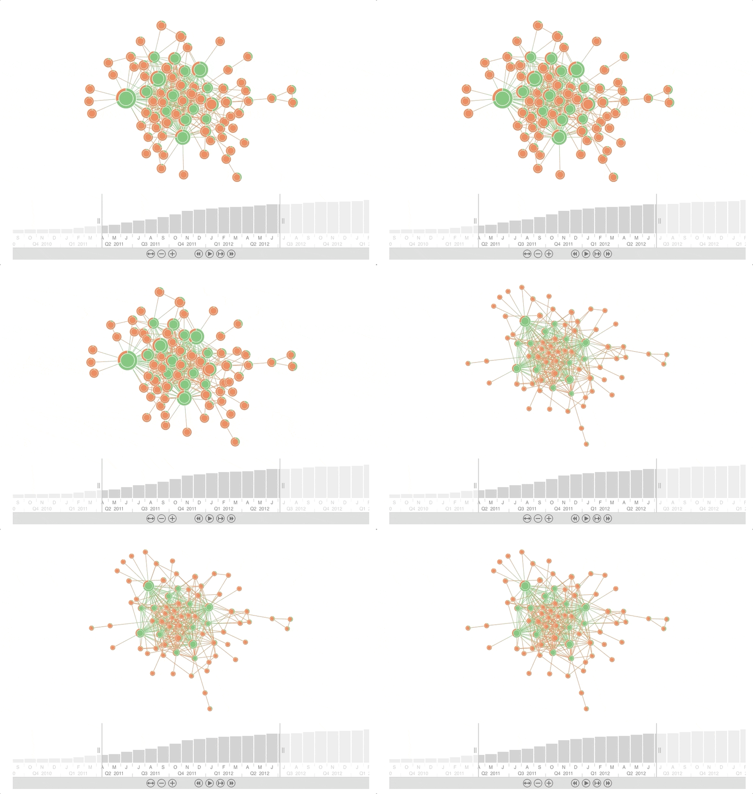
The layout’s adaptive mode automatically adapts to items added, changed or removed from the chart, helping us spot how the network changes over time without losing our mental map of where nodes exist.
Visualizing a social network has given us some proof that the friendship paradox is real. Let’s take a closer look at how we can apply this method to some other useful scenarios.
How the friendship paradox helps graph visualization analysis
Typically, you’d use the advanced Social Network Analysis (SNA) features in our visualization products to identify highly-connected individuals. The friendship paradox is an alternative metric that could provide similar results.
We can take the paradox further. Whether you’re investigating a suspected organized crime group, looking for bottlenecks in an IT network, or searching for the source of a cyber attack, using our visualization tools to identify the key players in a network can help you target analysis and gain insight.
In large organizations, knowing which people are the busiest can help managers assign work more efficiently. Similarly, knowing whether an unhappy employee is likely to have influence over the majority of people in the office might impact how you handle their issue. In knowledge management, an awareness of the most popular reports, articles or themes could help manage existing and inform future content.
In the field of public health, running this metric against data visualizations created with our technology could determine those who are more likely to contract and pass on contagious diseases, and help detect future outbreaks. Vaccinating entire at-risk groups can take a long time, so identifying those people you should vaccinate first could limit the spread of infection.
Try graph visualization for yourself
We’ve shown how visualizing GCconnex social network data using Cambridge Intelligence visualization products is an enlightening way to demonstrate the friendship paradox. Who cares if your friends have more friends than you do? It’s the quality – not the quantity – of friendships that truly matter (or that’s what we keep telling ourselves).
We’d love to make friends with you, so feel free to get in touch or request a free trial.


