FREE: Start your trial today
Visualize your data! Request full access to our SDKs, demos and live-coding playgrounds.
Data visualization is the quickest and most powerful way to give organizations a deeper understanding of their connected data. Our visualization toolkits have been used in countless critical use cases including fraud detection, law enforcement and security, cyber security, infrastructure management and regulatory compliance. By focusing on the connections, tools built with our SDKs uncover patterns and relationships in even the most complex data sets.
But don’t just take my word for it – some of our most successful customers have given us great feedback. I’ve listed six of my favorite examples below. Read on to find out why these organizations chose to use our visualization technology in products that:
… and much more.
“ReGraph was the best visualization solution we found to offer our customers the responsive, interactive charts they need to understand complex networks and take their journey into their own hands.” – Jonas Simanavicius, Co-Founder and Chief Technology Officer at Synternet (formerly Syntropy)
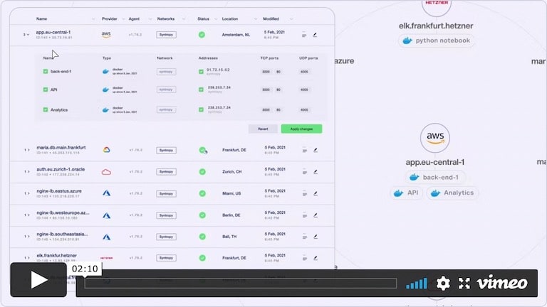
From analysts scouting for network problems to developers launching a new application, all of Synternet’s customers are looking for the same thing: safe passage for their data, along routes that are easy to access, reliable and fully risk assessed. To achieve this, Synternet built a whole new layer to the current internet framework, enabling journeys across the internet that guarantee speed, efficiency and sustainability.
Synternet’s global data routing network rescues users when they’re stuck in traffic jams or isolated by broken connections, revealing exclusive alternative routes that will get them safely to their destination. It’s a user-centric system, so customers depend on them to provide an accessible and up-to-date map of the networks they need to navigate.
That’s where graph visualization comes in. It’s a uniquely intuitive way to understand network connections. When you’re charting a section of the ever-evolving internet, you need software that’s strong, smart and reliable. We were delighted when Synternet chose ReGraph, our graph visualization toolkit for React users, to bring their internet superstructure to life.
“With interactive visual tools, [our users] can pull the thread of complex problems, unraveling insight as they go to answer more detailed business questions.” – Fabien Vives, C3 AI’s Principal Product Manager
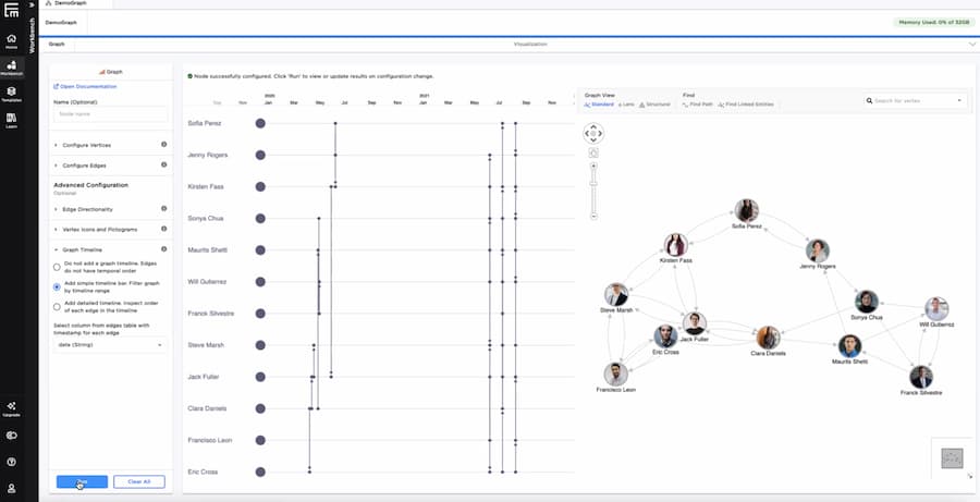
The data involved in enterprise AI is massive, messy and many-layered – and it often depends on a complicated structure of technologies from several different vendors. C3 AI’s model-driven architecture simplifies the landscape, providing a single unified platform to encourage users to dive straight into advanced data exploration.
The secret to their success was their early investment in graph and timeline visualization technologies, powered by our ReGraph and KronoGraph toolkits. Interactive visual tools enable users to bring connected data analysis seamlessly into their AI workflows, examining their connected data and turning it into business insight.
In the screenshot above you can see Ex-Machina, one of their most successful products. Not every organization has an expert team of data scientists, but that’s not a problem with Ex-Machina: interactive and intuitive graph and data visualization on a no-code/low code platform make AI-driven analysis accessible to anyone.
“KeyLines’ visualizations are intuitive, with a level of interactivity that puts the user in charge – so they can scale in and out, and quickly hone into areas of concern. KeyLines’ advanced analysis functionality means they can surface the right information at the right time – so they can respond quickly, without wasting time chasing red herrings.” – Aloke Guha, former CTO of OpsCruise (now Virtana OpsCruise)
KeyLines was the perfect fit for Virtana OpsCruise, a modern applications observability platform that offers its customers “clarity amid the chaos”. As you might expect from a Gartner Cool Vendor, they back up this offer with a solid user experience, guaranteeing actionable insights into complex cloud-based applications. Purpose-built for Kubernetes, Virtana OpsCruise uses our advanced data visualization technology to enable a 360 degree view of services.
When an application starts to fail, DevOps engineers need to find the root cause, fast. That’s no easy task with modern cloud-based applications, which have thousands of moving parts. Virtana OpsCruise uses KeyLines’ functionality to make millions of individual metrics understandable to the user, presenting complex data in a digestible and context-rich format. And interactive visualizations put the user in charge during an alert investigation, revealing “information on demand” that allows them to focus on areas of concern and contain any problems before they spread.
“If something goes wrong, it’s like CSI mode. People need an overview of everything that’s happening but presented in a way that’s clear and insightful, so they can make fast and accurate inferences on what is wrong and actions needed to remedy the problem.
“KeyLines drives this with a single-pane approach that scales in, out and across different levels of complexity as required. It answers the questions ‘what’s going wrong, and how can I fix it?’, so DevOps engineers can more quickly resolve issues and limit the potential fallout.”
“All our work is based on the fundamental belief that while products and software solutions are powerful tools, investigations are driven by Funtipeople, their intelligence, intuition, and experience. KeyLines’ power and interactivity mean we can bring our users even closer to their data insight, driving successful investigations.” – Pierangelo Satriano, CTO of Sistemi & Automazione

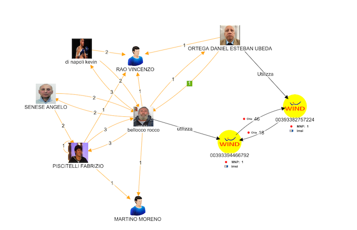
No crime drama is complete without an investigation wall: a chaotic mess of newspaper clippings, photos and drawing pins, all connected with string. In real life, advanced data visualization can bring order to the chaos.
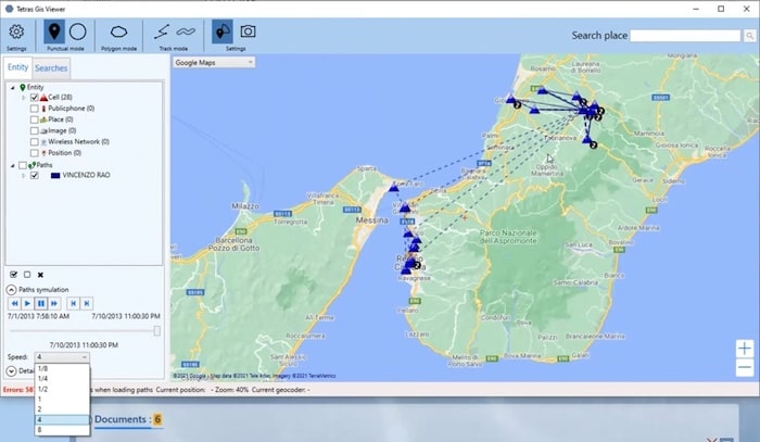
Even if they’re working with digital assets and not print-outs, law enforcement investigators face a huge and ongoing data challenge. Sistemi & Automazione’s TETRAS, a leading platform for law enforcement COMINT analysis, addresses this challenge by turning raw data into admissible evidence. KeyLines’ powerful visual analysis functionality brings that complex data to life in a format that’s easy to understand and share in a collaborative forensic investigation.
A couple of years ago, we co-hosted a webinar with Sistemi which identified the five components needed for successful COMINT analysis in law enforcement (Successful COMINT data analysis in 5 steps). Since then, Sistemi have continued to explore KeyLines’ functionality, using our technology to keep TETRAS at the forefront of the European COMINT market.
“KeyLines met almost all of our requirements from the outset. Then when the WebGL support was added in KeyLines 3.0, all the boxes were ticked and it became an easy decision.” – Data Visualization Engineer Eliseo Martinez
Devo understand that securing organizations against an expanding threat landscape starts with data, and the ability to analyze it at scale. That’s why, when they set themselves the challenge of reinventing data and security analytics with a new cloud-native solution, they turned to KeyLines.
They designed a logging and security analytics platform that relied on a powerful visualization component – one that could digest vast amounts of complex data and deliver fast answers. It needed to meet the highest standards of speed, scale and clarity to bring their vision of “Fast Data, Big Data” to life. Having trialed various alternative technologies, they chose KeyLines for its superior graph visualization functionality.
This graph visualization component is definitely what brings the “wow” moment for people using the Devo platform. They told us that their customer feedback has been universally positive, with many happy users reporting that they’d managed to uncover incidents that could have stayed hidden forever without the right technology.
“[…] The Knowledge Graph visualization built on top of the KeyLines toolkit generated much excitement at [the European Space Agency], demonstrating that custom insights could be delivered and visualized easily […]” – Vlasta Kus, Lead Data Scientist, GraphAware
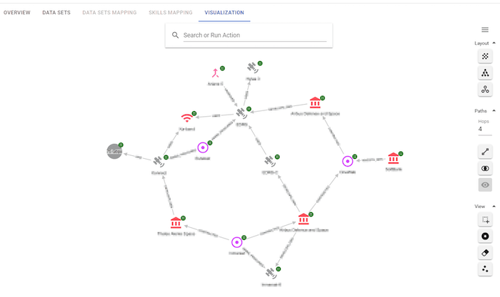
GraphAware’s Hume is an insights engine that uses Natural Language Processing (NLP). It can process information from several sources, and when it encounters unstructured data stored as free text (PDFs, CSVs and RSS feeds, for example), it uses artificial intelligence to extract new insights and connections.
The knowledge graph above represents the space and satellite ecosystem. It’s not just a map – it’s an interactive chart generated using KeyLines, our graph visualization toolkit for JavaScript developers. It’s from a proof of concept project that GraphAware developed with the European Space Agency (ESA).
Together they explored NLP and advanced graph visualization as a method for gathering and analyzing unstructured public data on a section of the space and satellite ecosystem, and bringing it into a scalable and collaborative knowledge base. They quickly found out that accessing a dynamic universe of unstructured data was only the first step. It took KeyLines to achieve the giant leap they needed…
Anyone who wants to maximize insights from their connected data can benefit from graph visualization. Whether you’re fighting crime, spotting satellites or something completely different, we’d love to work with you. To start your journey, simply request a free trial.