Ready to visualize your graph data but not sure where to begin? Corey Lanum covers everything you need to start a successful graph data visualization project.
He’ll show you how to:
- define and model a graph
- work with graph data
- follow graph data visualization best practice
The webinar and illustrated write-up gives you a non-technical, high-level introduction to graph visualization, and its advantages.
A beginner’s guide to graph data visualization
Prefer a written version? Here’s an illustrated write-up.
I’m Corey Lanum, Chief Product Evangelist here at Cambridge intelligence. 
We first recorded this beginner’s guide in 2017, and the new version for 2022 is an update on that, with some new technologies, some new concepts, and new techniques for how to visualize graphs.
I’ve been excited over the last 20 years to watch the explosion in popularity of graphs and graph concepts to a variety of different business domains. I’ve written a book on the subject, called Visualizing Graph Data, and I’ll use examples from that in this guide.
We’ll take things back to basics, and drill down into graphs. When and why are they useful? How do we visualize them? Why does it make sense to think of our data as a graph?
We’ll also talk about modeling. How do I take data that might be stored as columns and tables and rows, and turn that into nodes and links and properties? We’ll look at techniques we can use to improve value to our end users. We’ll finish with a more advanced topic: graphs that vary with time, or which visualize time and geospatial data.
What is a graph?
Graphs are not your data – they’re a model of your data. The connections between the data are equally as important as the data elements themselves.
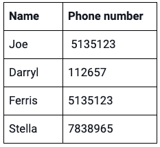
Graphs are important when we have connections between the data. As long as your connections make sense and are useful to you, just two columns in a single table is enough to make a simple graph.
In this example we have a list of people and phone numbers. Each person can have multiple phones, and each number can be used by different people when it’s recycled. When we have a many-to-many relationship between data elements, that’s where graph data visualization can be useful.
Understanding connections in data
A list of cars and their VIN (Vehicle Identification) numbers won’t make a useful graph because it’s a one-to-one correspondence. Every car has a unique number, and every VIN number is connected to a single car, so there’s no inherent connection in that tabular data.
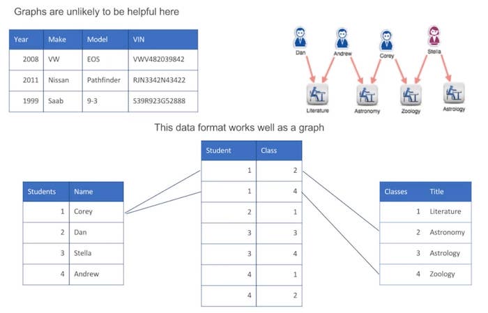
In the example at the bottom, we have a traditional relational database with a list of students with a primary key, and a list of classes with a primary key. In between we have what’s sometimes called a link table, which shows which students are enrolled in which classes.
Each student is in multiple classes, and each class has more than one student in it. It’s that many-to-many type relationship that makes the useful visualization that you can see on the upper right.
[We’ve a series of blog posts on the basics of graph data visualization, starting with part 1: Why graphs?]
Graph model vs graph database
A graph model of your data is not the same as using a graph database. There are many benefits to using graph databases, because they often store the data natively in a graph format. But it’s not necessary to use a graph database to think of your data as a graph, to model your data as a graph, and to visualize it that way.
This landscape of graph databases is constantly changing. Many customers use Amazon Neptune, because it’s embedded inside AWS and easy to take advantage of.
Neo4j has been around for a long time, and is incredibly popular because it’s easy to use, and easy to get started with. ArangoDB is a relatively new entry into this market, but interest is growing because it’s a multi-modal database.
Why visualize graphs?
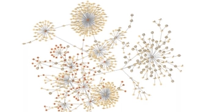
It’s hard to think about graphs without imagining dots, and lines connecting those dots. In the example on the right, we’re showing what the most well-connected items are, just by modeling data as a graph. The nodes that have a lot of links are central to the network. It’s intuitive to people who don’t necessarily need to know what a graph is or to understand about modeling.
In some situations it’s valuable to produce a graph model of your data, but the actual visualization is not going to produce any value for the end user. The example I like to use is a recommendation engine. With those, the end-user only cares about getting the recommendation – they don’t want or need to understand how the graph algorithm works.
Best practice techniques
Let’s find out how to design visualizations that’ll help users understand their data and make faster business decisions.
Unless you’re distributing your graph data visualization in a printed format, you want to make it interactive. And the more interactive the better. The more the user can drill into the data that they’re looking at, zoom in, pan around, find the data elements that are of interest to them – the more valuable it’s going to be.
Query and expand
Instead of taking my entire data set and showing it to the end user all at once (which gets unwieldy) we can use the “query and expand” function.
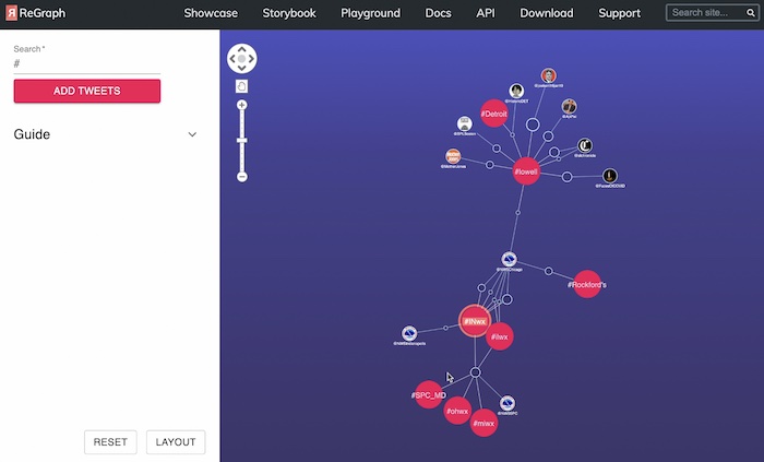
In this example we’ve tied ReGraph, one of our graph data visualization products, to the Twitter API. We can issue a query to find all tweets with specific hashtags. The hashtags and accounts are the nodes, and the links between them are the tweets that reference the hashtag. I’ve searched for anybody using the hashtag “lowell”.
The National Weather Service has tweeted a severe thunderstorm warning for Lowell, using this hashtag. So what other hashtags are they showing? I’ve got Illinois weather and Indiana weather. And who else is tweeting about Indiana weather? Well, the National Weather Service Indianapolis – and so on.
So “query and expand” allows the user to understand what they’re looking at, see the results of their query as a graph, and then expand on that information. It creates an exploratory interface where you can get good value, and the user can decide what subset of the data they want to see, so we’re not overwhelming them with visual clutter. But sometimes it does make sense to show the user a broader data set, and allow them to filter down to what interests them.
Filtering and grouping
Filtering is a powerful way to work through larger data sets, and it allows you to play “what-if” games. What if we remove certain nodes from the chart? How does the rest of the visualization adapt?
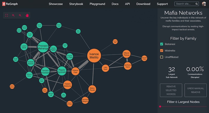
In this example, we’re looking at several Mafia families in Sicily. The individuals are represented by the nodes. They’re color coded by which family they are a member of, and then we’ve got some unaffiliated nodes here too. And the links are showing the relationships between those families.
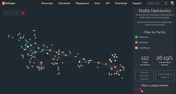
We take the three largest nodes and pull them out, and look at how the structure changes when they’re removed. Or we can remove not just individual nodes, but entire subsets of them – for instance, unaffiliated people. Then I can look at the simplified chart and make decisions based on that.
Combined nodes, or combos, allow us to take subsets of data and group them under a single node, and then look at how the groups are connected to one another. This is a powerful way of simplifying a busy chart. In this example I’m looking at members of al-Qaeda. The links between them are showing when those people have communicated with one another.
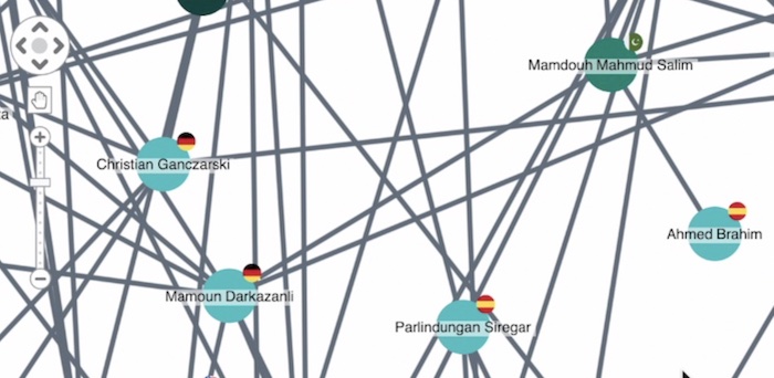
We can use glyphs to show additional properties of the nodes. In this case, the glyphs are flags showing the country that each group lives in.
The grouping can be by any common property. We’re going to group by country and show how they’re connected. This allows us to step back from the individuals and take more of a geopolitical view. How are the countries connected through their al-Qaeda networks?
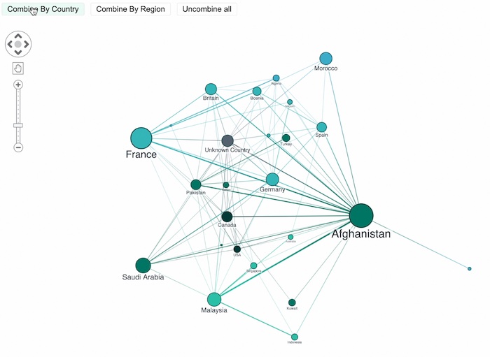
We’ve also sized the nodes to show the rough number of individuals inside each group. The key thing here is that this is a simplified, summarized view of the data.
We’ve taken what was originally 220 nodes, and boiled it down to about 20. And the end user can drill into any one of those countries and see the members of al-Qaeda who live in that country.
Grouping is a useful way of helping end users understand what they’re looking at, and then get down to the detail of what it is that they want to see.
[For more on visualizing with big data, read Corey’s insightful blog post: Graph visualization at scale: strategies that work]
Effective visual properties
You can style various visual properties to help show interesting things about your data. This KeyLines chart shows internal emails in an organization, and we’ve changed the visual properties of the links and nodes. Link width is a good way to show the strength of a relationship. Here, the width of the link is bound to the number of emails between those people.
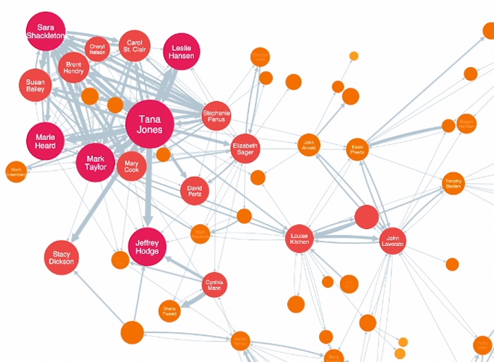
Thinner links show relatively infrequent communication, and thicker links are showing heavy communication. We can add arrow heads to show directionality.
We’ve done a similar thing with the nodes, taking the size and color, and binding it to a property in our data. In this case we have a score associated with each node, for an algorithm called “closeness”.
Closeness is a way of calculating how central a node is, or how well connected it is to the network itself. Now you see the bigger nodes and the redder nodes are the ones that are more well connected. The end user doesn’t have to know what closeness is, or how it’s calculated, or how it’s stored in my data. They just see, for example, that Tana Jones is a central node, and maybe is somebody worth paying closer attention to.
Less is more
It’s key to make sure that you don’t overwhelm your users. In this example I’ve got many different glyphs representing me on the chart. I’ve got the flag to show a country, I’ve got other glyphs with text in them. I’ve got a bubble which is showing me even more narrative detail associated with it. I’ve got glyphs and a label on the link, and then the item that I’ve linked to also has glyphs with text in them. It’s just too much.

My suggestion is to take just two or maybe three key visual properties, and bind those to the underlying source data. If you do more than that, it just gets confusing. You can always provide additional detail about a node when the user clicks on it or hovers over it – or allow the user to decide which properties are useful to bind to the data.
And avoid labels where possible. I’ve seen way too many charts with labels on links, where every link has the same label, or the majority of links show that type of relationship. It adds to the clutter and isn’t useful. I like to use link color in that case, as opposed to labels.
[Read our practical design guide on how to avoid wrecking your graph and timelines]
Working with temporal data
It can be useful to watch how your data or your graph evolves over time, and there are a few different ways to do it.
In this example we’re looking at money flow. The node-link visualization on the right strongly implies that cash went from a cash deposit through a casino account into an individual’s checking account, and then so on through some other people, down to a property manager. However, we don’t actually know that by looking at the graph, because the sequence of those money transfers matters quite a bit.
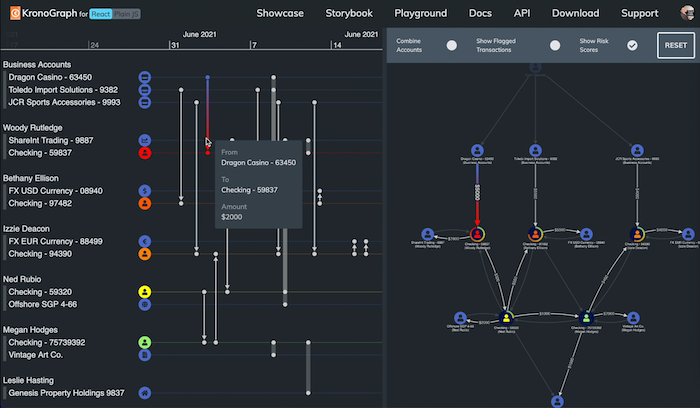
If a transfer between two checking accounts happened 10 years ago, then it’s irrelevant to this money flow scenario we’re describing, because it didn’t take place within the same time frame of all of the other events here. And there isn’t a good way to display that information in a traditional node-link visualization. The sequence makes a big difference.
There are different techniques to help us show that. The first is to add a date-time component to the actual data itself.
In this example I’ve got a set of text messages. Each phone is a phone number, and the link between them is showing a text message between them. The node-link chart shows us the structure of the data: who’s communicating with whom else. And we’ve set the link width to show the strength of the connection – the number of text messages between those two phones.
We’ll look at when those text messages happened. Each has a date timestamp, which is a property of that link.
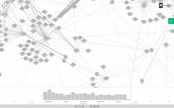
The time bar at the bottom shows us when those messages occurred. They spiked in September, dropped off in October and then leveled off after that. Our data set happens to cover five months in 2010 and early 2011, but it’s useful for an end user to focus on a specific window of time. We can drill down into a single week in October, or even just a few hours of the day, and filter the node-link representation, to visualize only the information from that window.
It’s useful to look at subsets in time-based graph data, especially in an anti-fraud or a security type scenario where I want to see unusual patterns in my data. If I want to focus on just one individual, I select him in green on the link chart, and I’m also looking at his text messages superimposed on the histograms. I can see that he was using his phone in September, stopped using it in early October and then picked up usage significantly after that.
Maybe I want to compare that to the person in orange, who has two distinct spikes in activity, one in September and one toward the end of the year, but not much outside of that range. It can be a powerful way of identifying patterns of activity that I want to investigate further.
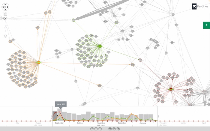
And you can do that from right within the visualization. For example here, with the person that I selected in red, whose activity is exclusively in the month of September, maybe I want to zoom in and see which specific days in September he was active. And as I drill down into an individual subset of the time range, instead of removing everything else from the chart, I’m just fading it out. This is useful when you want to maintain the context of everything else on the chart, but highlight certain items.
But if we’re focusing on the sequence of events, or the time component is front and center to how we want to understand and visualize our data, then we don’t necessarily want to show a link chart. What’s linked to what else is less important than the “when”.
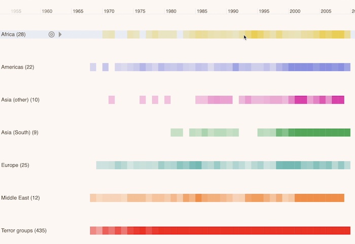
This timeline shows us 40 years of terror activity around the globe. If we were to show this as a graph, it would be overwhelming. There would be way too many events, and we wouldn’t have any sense of the time when the events happened. Events that were separated by decades could be shown right next to one another in the graph.
So instead, we’re looking at this as a timeline. It’s still graph data. We’re representing the country where the event took place as a node, and we’re representing the group that was responsible as a node, and the link between them is the actual terror event that took place. But because each terror event takes place at a specific point in time, we’re showing a timeline to represent that.
The heatmap shows the times with higher instances of terror activity in denser colors, giving us a quick insight into when certain areas were active. In Africa we can see that there was a distinct spike in the 1993 to 95 range, and then another spike between 2005 and 2010, but relatively less activity outside of that range.
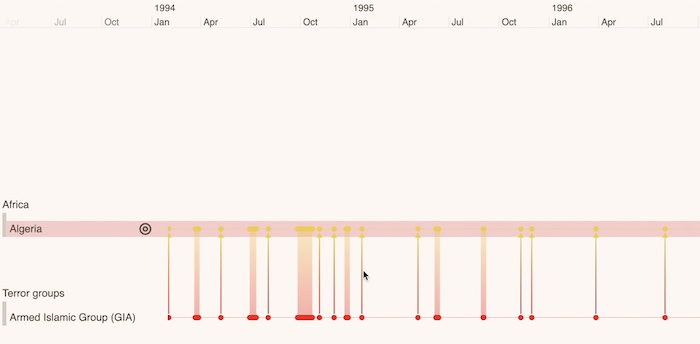
We can also focus on a specific country. Here we’re looking at terror activity that took place in Algeria, and displaying it on the timeline. I can drill down and zoom in on a window of time to show a specific event in Algiers in January of 1995. We started from 40 years of terror activity and we’ve condensed that down, or drilled down, to show an individual event that happened in January of 1995.
We can also filter based on time. Here we have activity in Colombia, where the federal armed forces saw activity in 2000. That can be a useful way to narrow down to individual events, and you’re not overwhelming the screen with clutter.
Exploring geospatial data
For graphs that have locations, it’s useful to take a node-link visualization and superimpose it on top of a map. In this example, I’ve got the hundred busiest U.S. airline routes. The airports are the nodes, the link between them is color coded by the airline that flies between those cities.
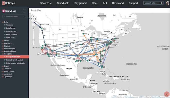
You can see some clear patterns here. Atlanta is clearly a Delta hub, Dallas Fort Worth is clearly an American Airlines hub, and so on. But unless we knew our airport codes, we wouldn’t necessarily know where those airports actually were. Taking this and putting it over the top of a map is helpful.
Have you seen KronoGraph, our SDK for timeline visualization?
Who uses graph visualization?
We’ve seen that graph data visualization is useful in domains such as defense, intelligence and law enforcement. And I’m always seeing new scenarios in which graph data visualization makes a lot of sense, or it’s starting to get picked up. Supply chain is becoming particularly important in the last year or so, where we’re trying to understand how to make a supply chain more resilient. Cyber security is also a growing domain for graphs.
Our tools will give you a significant head start in producing value graph visualizations. They’re made for embedding inside your applications, so they’re toolkits as opposed to end user products.
In this guide we’ve demonstrated all three of our tools: KeyLines for JavaScript developers, ReGraph for React developers, and KronoGraph, which is supported in Javascript or React, for building timelines. We have free trials of each of them, so give them a shot, and keep these techniques in mind.
