
With the advent of LLMs, the holy grail of a complete enterprise knowledge base that can be queried by anyone in an organization is closer than ever, but the battle continues to ensure that the answers can always be trusted.
One of the most promising technologies in this battle is GraphRAG. This is the idea that by grounding an LLM’s answers with the results of queries of a structured graph database, it can avoid hallucinations and combine the general knowledge from its AI model with proprietary enterprise knowledge from the graph.
There is a whole industry dedicated to the design and development of these underlying knowledge graphs and their corresponding ontologies and semantics… but in this blog we ask a different question: what’s the role of visualization in GraphRAG?
Graph visualization has its own ecosystem, and you’ll find it everywhere from anti-money laundering to cybersecurity. But in an enterprise knowledge context, if a user can just ask a question and get an accurate, grounded answer, is there any need to show them the graph behind the results?
To find out, we put together a simple GraphRAG application using OpenAI for the LLM, DBpedia as a substitute for an enterprise knowledge graph, and a frontend stack of React and ReGraph for the visualisations.
We wanted to see where in the process the visual graph adds value. Here’s what we found.
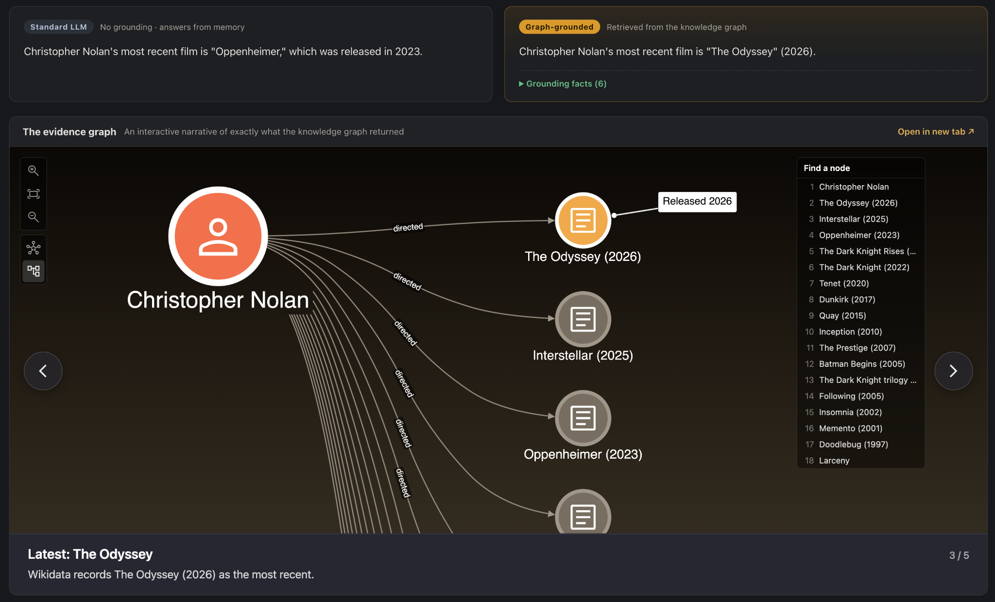
Our GraphRAG demonstrator – top left is the ungrounded LLM result, top right is the grounded result from the DBpedia knowledge graph, and below is the visual narrative of the grounding process.
1. Database design and debugging
Designing and building (and maintaining) a knowledge graph takes time and effort. A visualization comes in incredibly useful when you’re trying to make sure you’ve built the right thing.
In our simple example, we chose to use DBpedia as a substitute for a genuine GraphRAG source (strictly speaking some would argue it’s only true ‘GraphRAG’ if we’re building the graph from unstructured text ourselves.) It’s freely available and has plenty of knowledge we can query to test the results.
DBpedia is a curated knowledge graph derived from Wikipedia: every article is a resource with a canonical URL (e.g. http://dbpedia.org/resource/Christopher_Nolan), and facts are RDF triples (subject → predicate → object) queried over SPARQL.
We’ve previously explored how to query and visualize DBpedia data in our DBpedia knowledge graph tutorial.
To keep things simple, we’re going to limit our knowledge graph to a small subset of the whole DBpedia. We’ll just make a GraphRAG tool which knows about actors, directors and movies – so we restrict the traversable predicates to just dbo:starring and dbo:director over the dbo:Person and dbo:Film node types.
We also need to make decisions on how much control to give the LLM over the way the database is queried. Rather than asking the LLM to write general-purpose SPARQL queries, we design a “classify-and-extract” LLM call which maps the user’s question onto one of five fixed archetypes, including connection, repeat collaborators, co-appearances and so on. This means the LLM chooses which pre-written query to run, but never designs queries of its own.
A trade-off for sure, but this is one of the most important choices facing AI interface designers right now – finding the balance between freedom and guardrails, for powerful but trusted AI responses.
“Finding the balance between freedom and guardrails is one of the most important choices facing AI interface designers right now.”
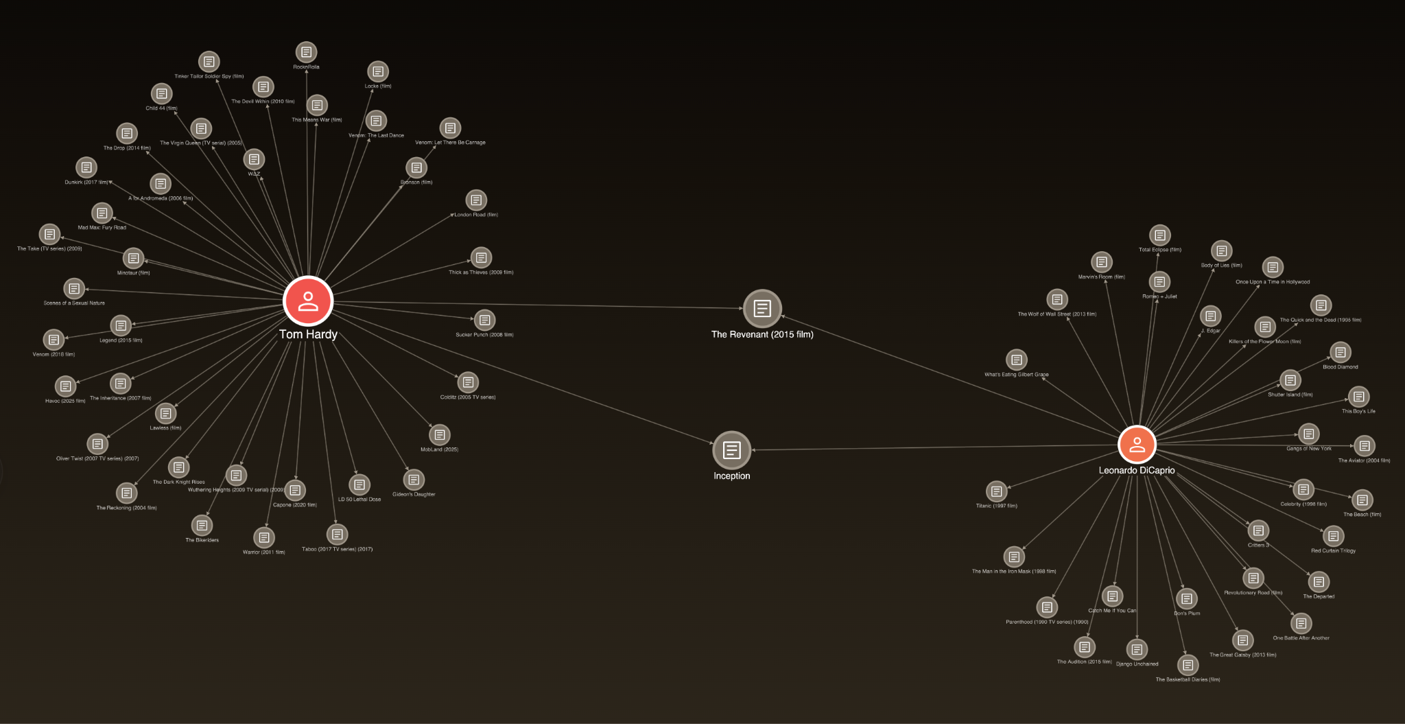
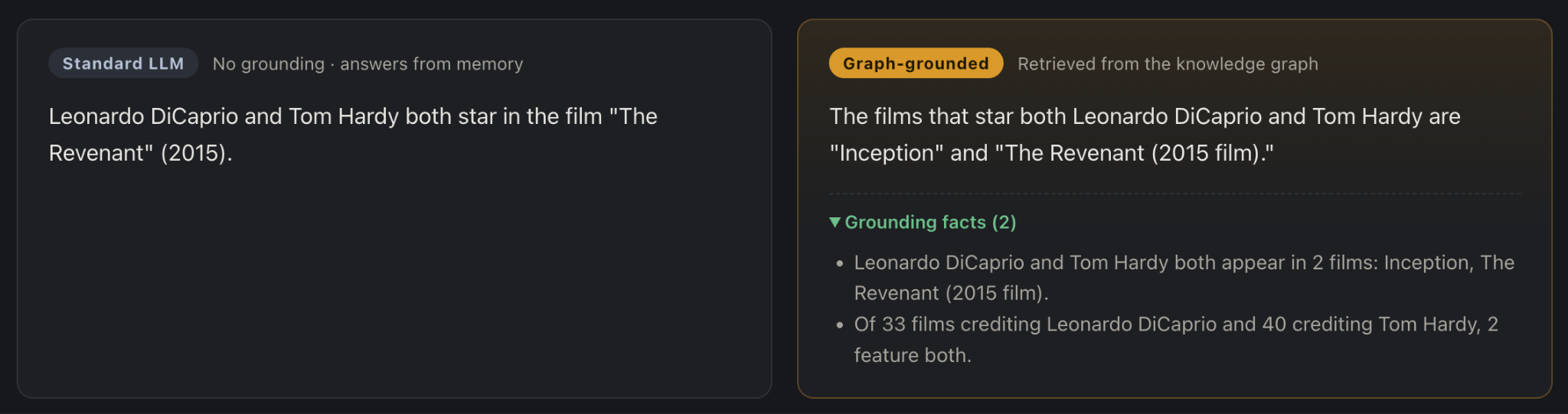
With this up and running, it’s incredibly helpful to use a graph visualization to check our work. We start by using the exact same subgraph returned by the query, and pass it to ReGraph with some simple styling for different node types, and a design scheme which makes more important (better connected) nodes larger. Here’s the result of the query generated by the question “Which films star both Leonardo DiCaprio and Tom Hardy?” The image gives us confidence that we’ve wired everything up correctly.
2. Explaining answers
This is the big one. If a visualization can give an end user confidence that an answer is correct by showing why it’s correct, then suddenly our AI-generated answers become vastly more trusted.
Our approach to test this was as follows:
- For every question, we produce two answers from the same AI model (GPT-4o) at temperature 0. The first is an ungrounded baseline where we ask the model to give the answer from memory without doing any additional internet searches.
- The second answer is the graph-grounded answer, constrained strictly to the retrieved facts.
- We then illustrate these facts with a graph “narrative” which uses ReGraph’s annotations and styling options to draw attention to the grounding facts.
The two answers don’t always differ, but in many cases they do, such as the question above.
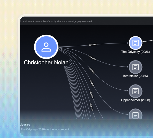
And here again, in answer to “What is Christopher Nolan’s most recent film?” – perhaps because of old training data, the grounded answer does better than the memory-only answer:
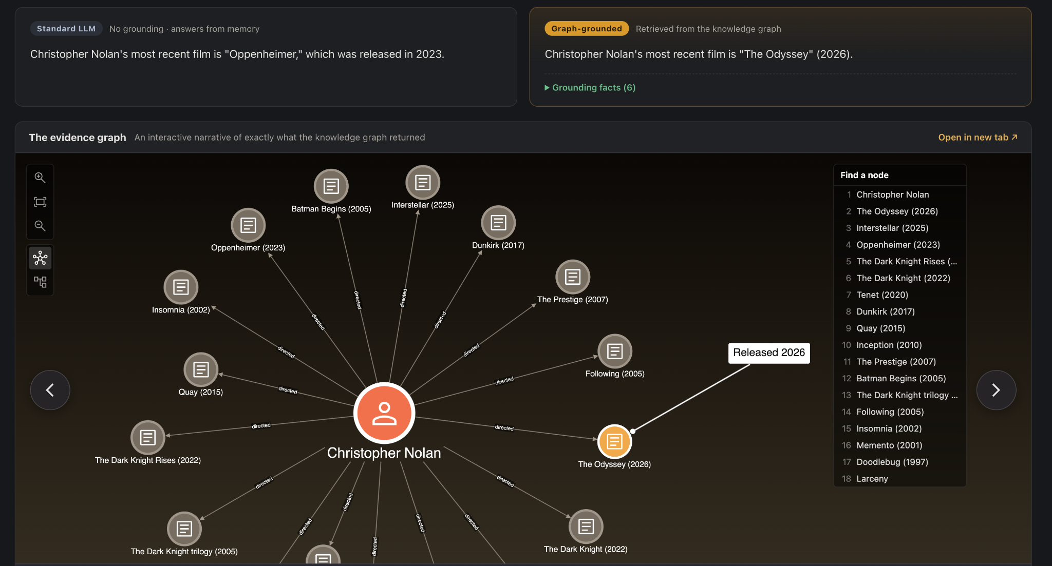
There’s a subtle psychological aspect to our choice of graph visualization here. You can see we’ve chosen to visualize the full “halo” of all Nolan’s films, even though the actual answer only involves one film. By showing the answer in the context of a much bigger question (what are all of Christopher Nolan’s films?), we’re able to validate the answer somewhat ourselves, and come away feeling more confident as a result.
3. Explaining anomalies and warnings
Where the visualization really came into its own is when things go wrong. Knowledge graphs aren’t perfect, data is messy, and a simple question often has a confusing answer.
For example, if you peek at the ranked results in the image above, you’ll see that the films are listed in order of recency, but Interstellar is showing as released in 2025, which is clearly incorrect. What’s going on here? Clicking through from the node to the underlying wiki data explains the answer – Interstellar was indeed re-released in 2025 to some audiences, after its original 2014 release.
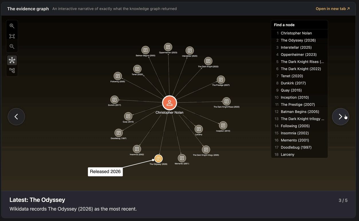
The problem then, is that we’ve got one node corresponding to two different releases of the same film. It occurred to us that this kind of “exception handling” could be exactly where a visual explanation could deliver value. When something goes wrong, how can we explain it to a user who is not a database expert and just wants to get a confident answer?
To test out an approach, we added some deterministic, code-based insight detectors over the retrieved subgraph. These look for a curated list of issues, e.g. temporal re-release anomalies, rare-bridge films between two large catalogs, etc., and append them as extra “narrative chapters” in the visualization. Taking advantage of ReGraph’s diffing and animation features, it’s super easy to allow the user to step through the chapters of the narrative and learn more about the insight in question:
4. Explaining graph-specific conclusions
One of the benefits of GraphRAG, as opposed to any other forms of Retrieval Augmented Generation, is that you get all the advantages of being able to do full graph traversal queries such as shortest paths and similarity metrics.
“Who is closer to Kevin Bacon — Meryl Streep or Tom Cruise?” is an easy question for a graph query, but a nightmare for an ungrounded LLM. Without grounding, the model claimed Cruise was one step closer; with the DBpedia grounding we get the correct answer that the two actors each have a “Bacon number” of one!
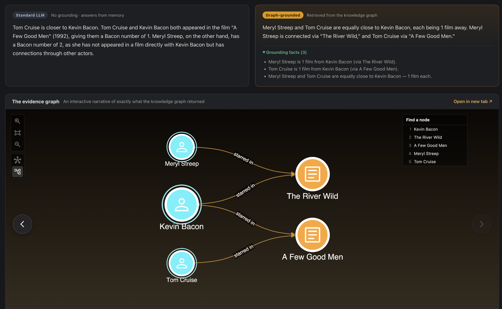
The more complex the graph query, the more valuable the visualization becomes in explaining the answer.
5. Further exploration
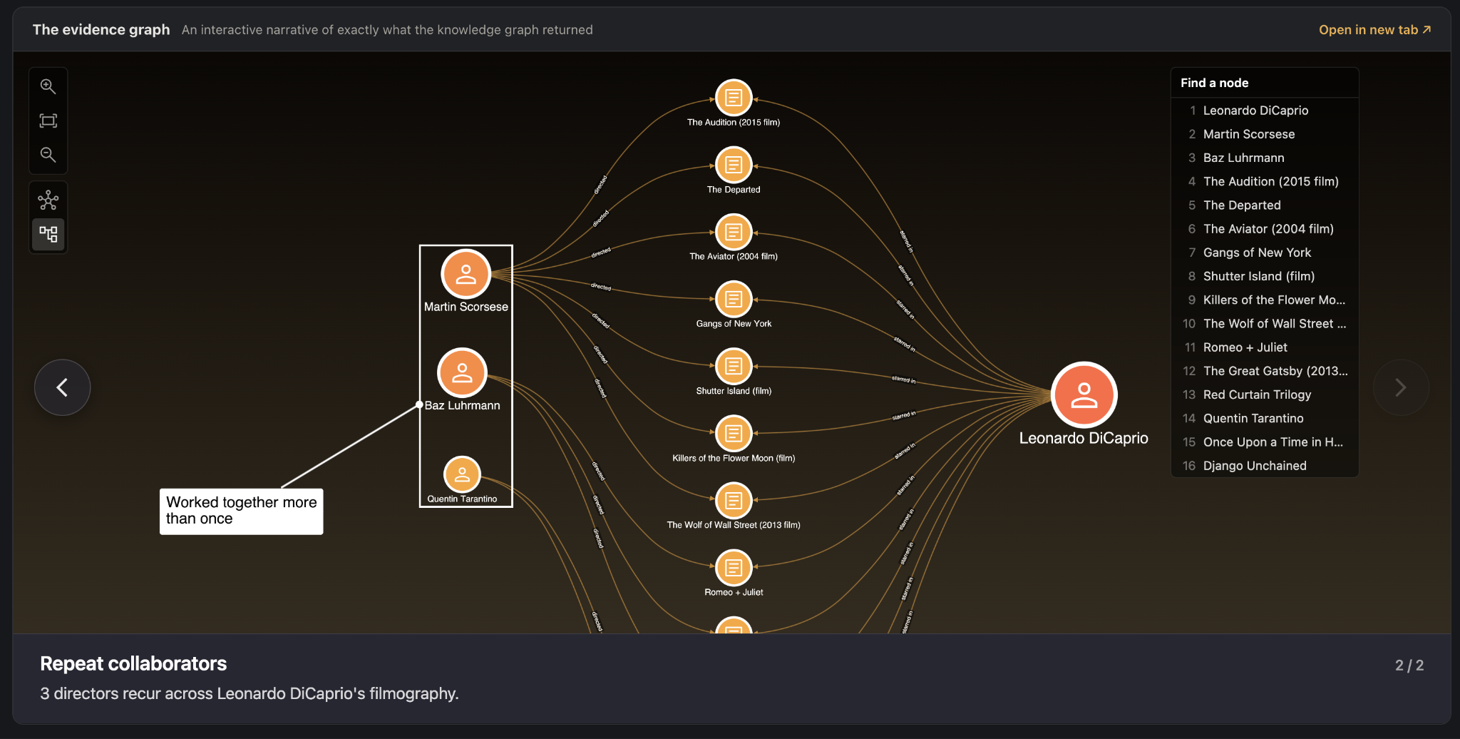
The visualization’s last trick is to allow the user to keep going beyond the original question. The joy of knowledge isn’t just about getting an answer in the shortest amount of time. Sometimes the question is just the beginning of a longer voyage of discovery, and there’s nothing more satisfying than clicking around a graph watching the nodes and links evolve to tell you more about your subject.
“The joy of knowledge isn’t just getting an answer in the shortest amount of time. Sometimes the question is just the beginning of a longer voyage of discovery.”
By synchronizing the LLM-based text answer and the accompanying visual subgraph, and by enhancing discoveries with animation and narrative commentary, a user can lose hours to exploring the data. We certainly did.
If you’d like to know more about the details of the experiment, or see how easy it is to add these interactive visual narratives to your own GraphRAG application, get in touch.
Ready to add graph visualization to your GraphRAG application?
Build interactive visualizations that explain grounded answers and let users explore the data behind them.
Share: