
“A picture can help you understand why the AI has said what it said.”
Cybersecurity teams deal with overwhelming amounts of data and alerts generated across increasingly complex infrastructure. AI is effective at detecting unusual behavior and summarizing activity, but understanding what alerts actually mean is still a major challenge.
Visualization plays an important role in providing context for AI in cybersecurity. Whether it’s mapping attack paths, understanding cloud infrastructure or analyzing timelines of suspicious behavior, visual context helps users understand why the AI has said what it said.
In this conversation, Dan Williams, CPO at Cambridge Intelligence, discusses how visualization helps security teams interpret AI-driven insights, reduce alert fatigue, and navigate increasingly complex cybersecurity environments.
Watch the full conversation below, or continue reading for the edited discussion.
AI and anomaly detection in cybersecurity
Logging is the lifeblood of cybersecurity. We produce unbelievable amounts of logs, and AI, machine learning, and deep learning are really good at analyzing large amounts of information and spotting things.
So detecting unusual behavior: this kind of pattern doesn’t normally happen, or this machine has never talked to this IP address before, and now suddenly it started doing it.
You can do that kind of detection on what the machines are doing, but you can also do it on people too. If you have social engineering or phishing attacks, it’s all about getting people to do things. AI is also good at looking at: is this a normal pattern of behavior? Does this person normally log on at this time of day, then go straight to this particular folder and start downloading files from it?
That might be an unusual pattern.
The problem with alert fatigue
One of the things that LLMs are very good at is summarization. If you think of that logging: you collect the data, then you detect things, then you produce alerts and warnings about what’s going on.
We hear often in the cybersecurity space about alert fatigue. So many of these things coming through: hundreds, thousands of alerts. You might want to look at this. This thing might be a vulnerability. That’s a bad way of configuring your cloud setup. It’s overwhelming.
Any user of cybersecurity software needs to know:
- What’s going on?
- What does it mean?
- What does it impact?
- What do I need to do about it?
You have to figure that stuff out quickly.
Why AI summaries alone are not enough
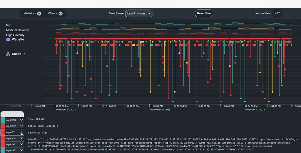
Log Visualization demo powered by KronoGraph
That’s where visualization comes in. A text summary alone of what’s going on is not enough to help people do their job, especially when the sheer amount of information is that high.
You could explain something in words, but it’s quite a complex thing you’re trying to describe. If you’re talking about exploitation of a vulnerability, a configuration, posture management problem, or suspicious activity involving non-human identities, it’s a lot to understand.
The need to explain the context of what these alerts mean is really high.
Visualization, painting a picture of what’s going on, is a huge part of making this AI software useful.
Visualization as a map for complex systems
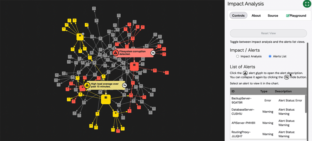
Impact Analysis visualization powered by KeyLines
If it’s a cloud security application, then drawing your cloud infrastructure in a way that helps you understand where this problem is, what the attack vector is, and what configurations are causing the problem is incredibly useful
If we’re looking at identity access management or patterns of behavior, you might want to see a timeline of how a particular sequence unfolded: the logins, then moving to file or folder, then downloading things. You want to see how that plays out over time.
If it’s an incident report of an attack that’s happened, you might want to see the process chain: the phishing link was opened, then this executable was run, and this changed these privileges. Then you see this cascade of what happened.
These pictures show you how these problems fit in relation to the wider infrastructure.
What we’re really doing is mapping. We’re mapping out complex systems, and we are helping users navigate those systems. That’s what a map is. It helps you understand where you are, what’s around you, where things are going.
Whether it’s a network topology, a cloud architecture, a process tree, or a timeline, these maps help us understand what’s going on.
Understanding attack paths and cloud infrastructure
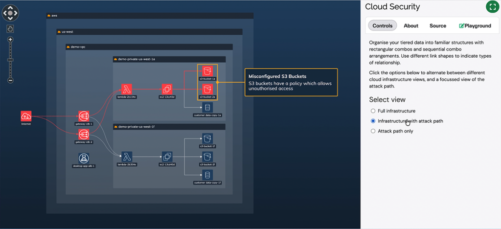
Cloud Security visualization powered by KeyLines
One really important part of the picture and the mapping is setting the individual data points in some kind of wider context and structure.
A great example of that is cloud security. People don’t often think of their cloud infrastructure as a network. If you’re using AWS and you’re buying various services and switching them on — an S3 bucket, a compute cluster, a load balancer — you’re thinking of them as services.
"You don't need to see all of it, but you need to see enough of it to know where you are."

But it’s becoming increasingly normal to view these in an architectural diagram. End users expect things arranged in a certain way. They expect boxes within boxes.
What our libraries allow you to do is impose that structure on the graph and on the network so that I can see an attack path, but I can also see the boxes, the regions, the virtual machines, or the zones of my architecture and how they sit together.
That’s super powerful. You don’t need to see all of it, but you need to see enough of it to know where you are.
Why context matters for AI-driven decisions
With AI, we’ve seen what it can do, but we’ve also seen that it’s not always right. Sometimes it’s phenomenally convincing and believable at some things and then hopelessly wrong at others.
This is where visualization, storytelling, narrative, and context all come in, because a picture can help you understand why the AI has said what it said.
If the AI thinks something has been misconfigured and it allows a path from the outside world through to a particular database or data source where valuable data sits, then you can look at that picture and see the problem.
Any kind of context like that is incredibly powerful. Visualizations help us ask questions. They help us think differently.
The future of AI-assisted cybersecurity interfaces
It’s very hard to predict the future in any of this. What we’ll see is a more seamless integration of AI with other parts of libraries.
In the same way we expect we can interact with a mouse or a keyboard, I think we’ll come to expect that we can press buttons or ask a vaguer question and let the software help us figure out how to do that.
As a result, we’ll see the interfaces and user experiences becoming much more powerful, and they won’t be so siloed.
We’ll see richer visualizations — timelines and graphs — complementing AI, with people able to interrograte them in ways they couldn’t before.
The future is quite exciting.
Learn more about graph visualization and cybersecurity
Visualization is how teams regain control and cut through volume and complexity.
Share: