
Whether users are opening combos, spotting hidden hierarchies or exploring hundreds of thousands of timeline events, there’s the challenge of keeping your application responsive while helping users move smoothly between the big picture and the details.
Our latest SDK updates improve performance at scale, make interactions more intuitive and introduce new ways to combine graph, timeline and geospatial visualization.
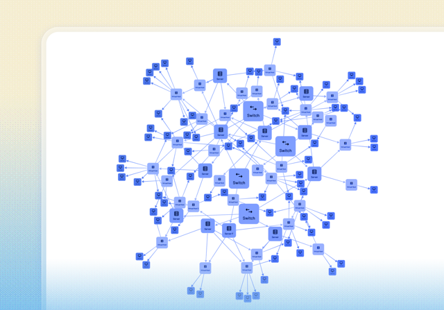
Faster layouts and smoother animations
The sequential layout in KeyLines and ReGraph now runs up to eight times faster on datasets with automatically assigned levels. This helps users spot hidden hierarchies within densely connected networks more quickly.
Chart animations are also much smoother, especially on charts containing large numbers of nodes within combos.
The sequential layout in KeyLines and ReGraph now runs up to eight times faster on datasets with automatically assigned levels.
More intuitive layouts with combos
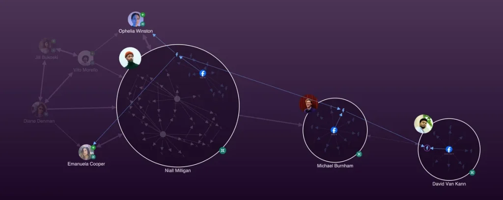
Group multiple social accounts to spot patterns in social media activity in our updated Social Media Analysis showcase
We’ve improved the experience of opening and closing combos in KeyLines and ReGraph, resulting in better visibility of items when drilling down into grouped data.
Our Social Media Analysis showcase demonstrates this behavior by grouping multiple social accounts, helping users spot patterns between individuals’ social media activity. We’ve also improved overlap removal for combos and made nested arrangements faster.
Exploring hundreds of thousands of timeline events
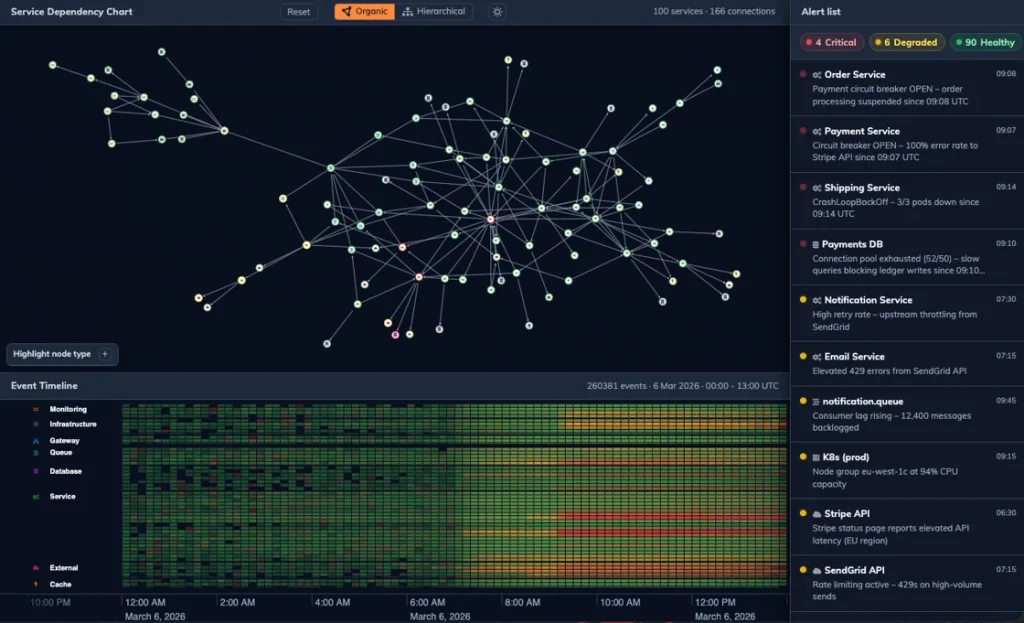
Pan and zoom heatmaps at scale with KronoGraph’s new Cloud Monitoring demo
We’ve significantly improved KronoGraph’s heatmap performance at scale. Rather than working with tens of thousands of events, you can now explore hundreds of thousands of events at once in the timeline.
This makes it easier to pan and zoom smoothly, moving between the big picture and a detailed view of the data. Our new Cloud Monitoring showcase demonstrates this performance with a large dataset, as well as the interactions between graph and timeline visualization.
New performance and testing guidance
If you’re working with particularly large datasets, KronoGraph’s documentation now includes a Performance Tips section to help you make the most of the SDK and optimize the performance of your application.
We’ve also added a new Testing Tips section, including advice on automated integration testing of KronoGraph timelines within your application.
Global and local infrastructure visibility
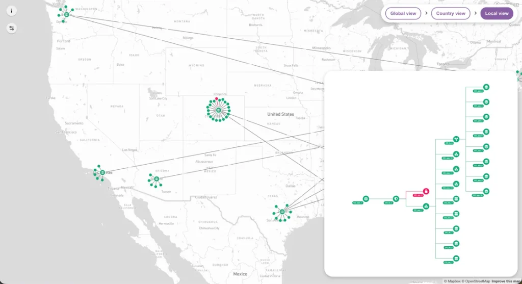
The Global Cyber Infrastructure showcase integrates MapWeave with ReGraph
Our new MapWeave and KeyLines showcase demonstrates how graph and geospatial visualization can work together to provide global and local infrastructure visibility and support persistent monitoring.
The showcase uses MapWeave to visualize a global cyber network while KeyLines provides detailed views of subnetworks at specific locations. It demonstrates how teams can move between the overall geographic picture and the connected infrastructure at an individual location.
Moving geolocated network nodes
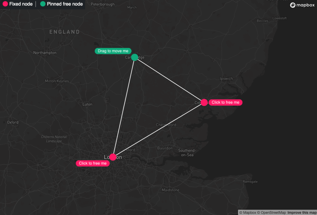
MapWeave’s Relocate Fixed Nodes developer example
Since launching MapWeave, we’ve received a number of questions about allowing users to move networked nodes with specified locations.
We’ve now created a developer example showing one way to enable end users to move these geolocated nodes within an application.
See the changes for yourself
These updates make it easier to explore complex datasets across graph, timeline and geospatial visualizations. Faster layouts and heatmaps improve performance at scale, smoother interactions help users explore grouped data, and our latest showcases demonstrate how multiple visualization approaches can work together.
All these improvements are available across our latest SDK releases, alongside the usual bug fixes.
Ready to explore the latest SDK updates?
Request a free trial to access our interactive showcases and see the latest graph, timeline and geospatial visualization improvements in practice.
Share:
