
Before the 2026 FIFA World Cup kicks off on June 11th, join us for a prediction of the winner using nothing but graph theory!
Every day, analysts in the intelligence and law enforcement community must make assessments and decisions based on limited, fragmented information. One of the most powerful tools in their arsenal is link analysis. It’s a technique that focuses on the connections between things (phone calls, emails, relationships, observations, etc.) and it’s a remarkable way of shedding light on patterns and drawing attention to unusual or important subjects.
We’re going to apply the same techniques to a tiny set of data about the teams in the tournament, to illustrate just how powerful these techniques can be. In 2018 we predicted the World Cup winner correctly; four years later in 2022 we were just one final penalty shoot-out away from getting it right a second time.
How will we do this time around?
What information do we use to make the World Cup prediction?
For our prediction, we make life as difficult for ourselves as possible. We start with absolutely no prior knowledge of how good any teams, clubs or players are at football. In fact there’s only one input into our model – the clubs that a country’s national squad’s players come from.
The countries announced their final squads on June 1st. We used them to generate a graph – a network of nodes and links – where each node is either a country or a club. We link a pair of these together if they have a player in common.
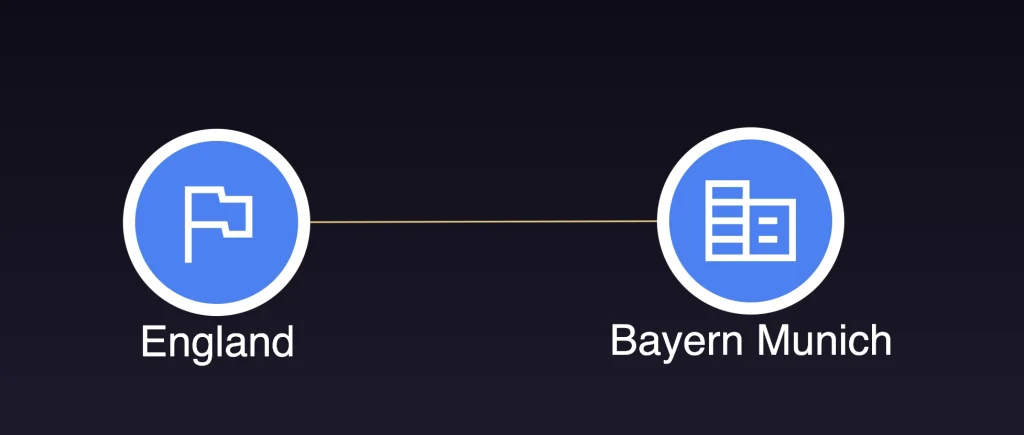
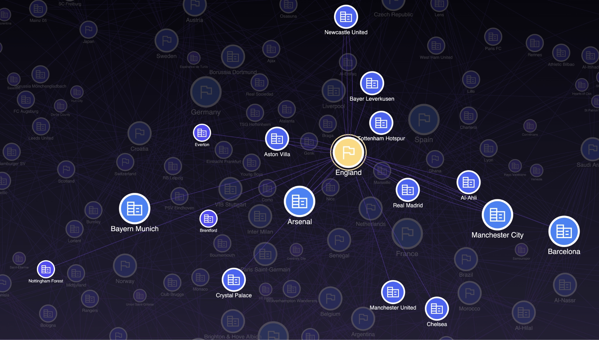
For example, England’s Harry Kane plays for Bayern Munich, so we’d make a connection between these two nodes:
Repeat this for every player of all 48 countries at the tournament, and we get a complete graph:
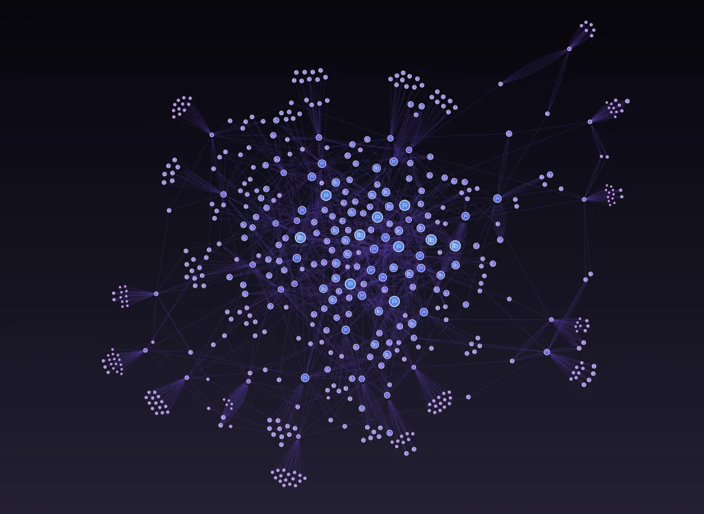
It’s pretty – but what can we do with it?
How we rank teams
You’ll notice that some nodes are bigger and brighter than others. That’s because we’ve coloured them according to their eigencentrality, a measure from the science of graph theory.
The theory is this: for a country to do well, it must have players from good clubs. And if a football club is any good, they will be able to afford a lot of international superstars. And how do we know if those players are international superstars? Well if they are, they must play for a successful country. So we need a measure of the ‘internationality’ of the countries, which in turn comes from the internationality of their feeder clubs, which in turn comes from the internationality of their players, and so on. This recursive accumulation of ‘importance’ based on the importance of the nodes you’re connected to is called eigencentrality, and this is the measure we’re going to use to rank clubs.
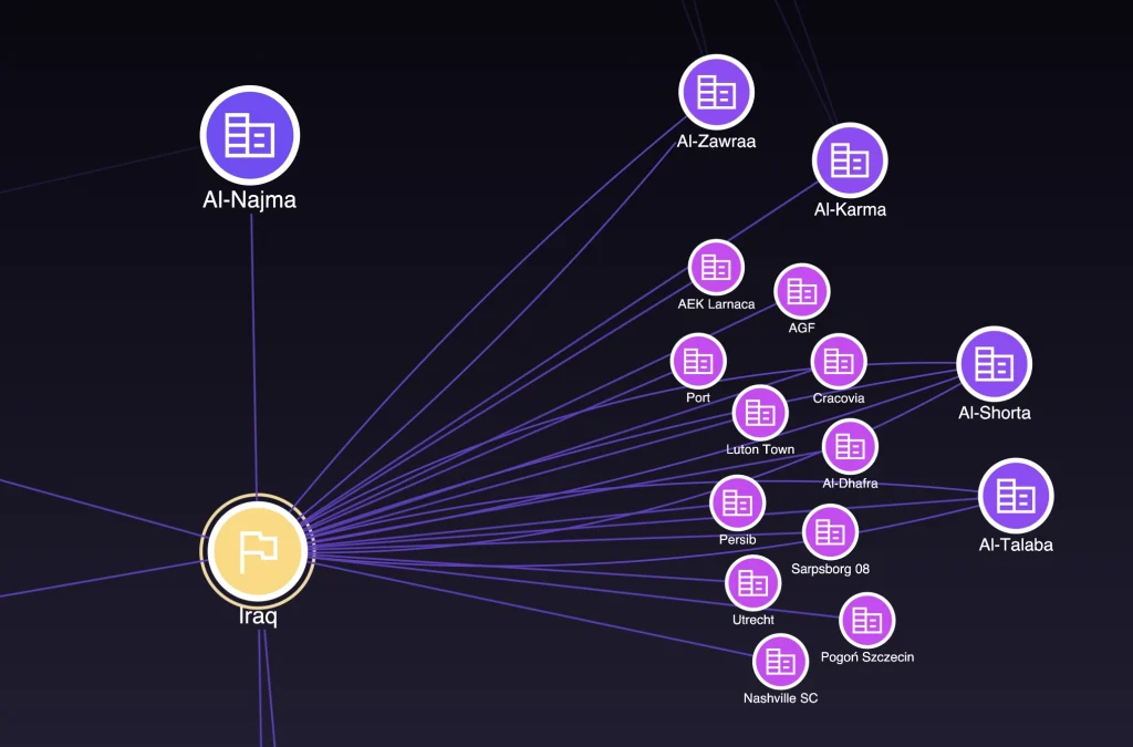
As an illustration, the country with the lowest eigencentrality score is Iraq. The majority of Iraq’s players play at clubs which don’t have players from other World Cup countries in their teams. This makes them appear at the fringes of the graph, a long way from the center.
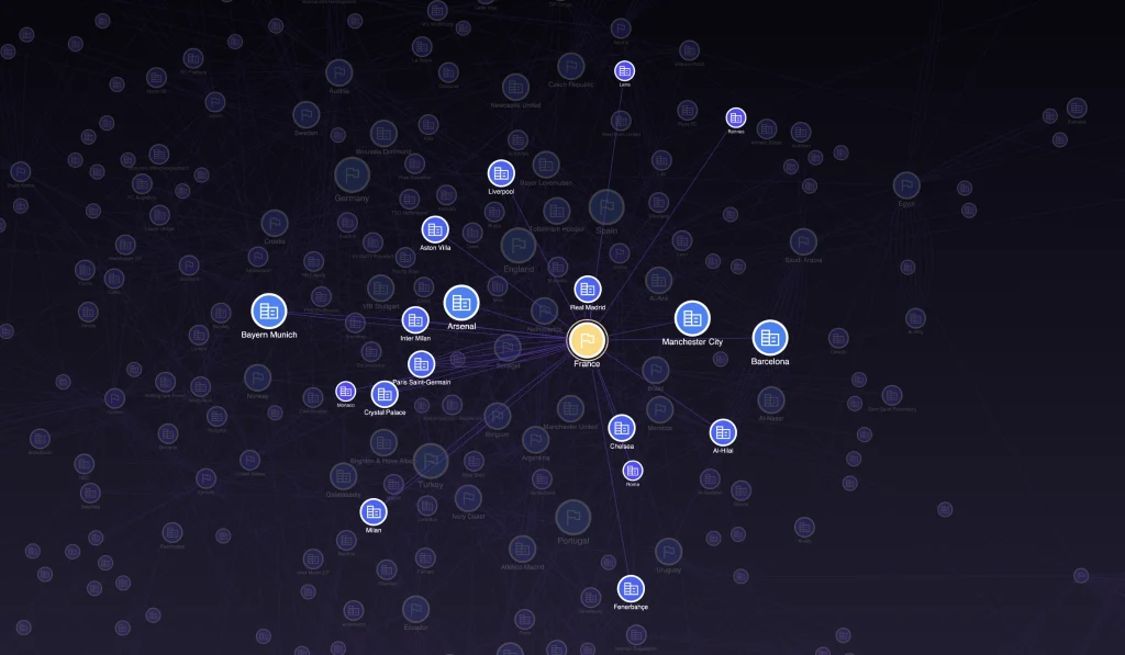
By contrast, a team like France appears right at the center of the network, with players who play at clubs that feed some of the most well connected countries in the network.
So the more central a node in our graph, the more successful (we predict) they should be at the tournament.
The results
When we rank nodes by eigencentrality, we get the following top 5 teams:
- Spain
- England
- France
- Germany
- Portugal
So there you have it – if you want to put your faith in graph theory, picking a winner from that top 5 would be a smart move. And – we’re calling it – Spain is the most central node in the network and is our top pick for the 2026 World Cup!
If you wanted to back a dark horse, then choosing an outlier country whose eigencentrality score is unsually high against FIFA rankings could be worth it. In that case Turkey could outperform expectations based on its position in the network.
Spain is the most central node in the network and is our top pick for the 2026 World Cup!
Let’s take a look at some interesting observations from the analysis.
1. It’s a clean sweep for Europe
Every team in the top 5 is a European team. To see why, we loaded the same data into our MapWeave library for geospatial link analysis.
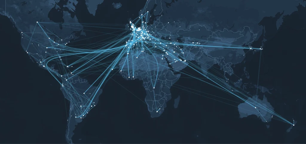
You can see just how many of the teams and countries represented are based in Europe, and thanks to MapWeave’s edge bundling and clutter reduction features, you can see clear flows from other regions, particularly South America and Africa into Europe as the high-paying European clubs source the best talent from overseas.
2. Saudi Arabia – an anomaly?
One surprise for us this year was the score for Saudi Arabia. They were ranked second from bottom in our eigencentrality chart at the World Cup four years ago, but this time round they have leapt up to 9th place. Why is this? The majority of Saudi players play for Saudi clubs, as this MapWeave view confirms:
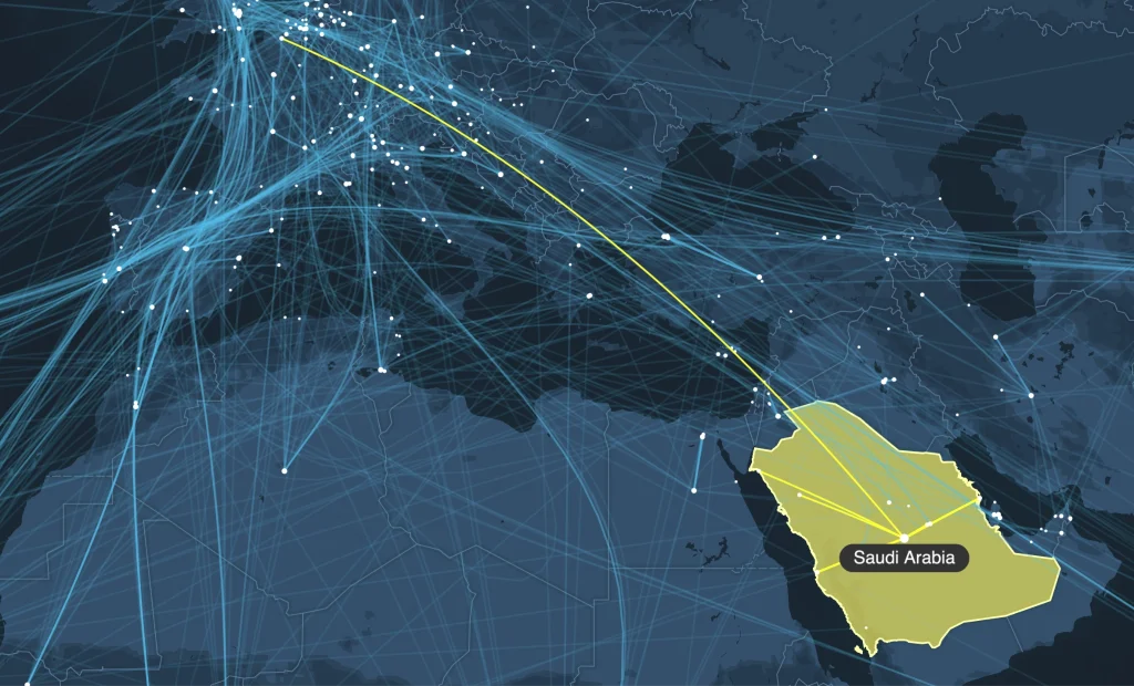
So the answer must be that those Saudi clubs are extremely, unusually, international. And we know this to be true. In 2023, the Saudi Pro League spent nearly $1 Billion on signings, with megastars like Cristiano Ronaldo and Karim Benzema making the headlines for their moves to the Kingdom. Although this spending spree seems to be calming down, it’s done enough to catapult the country to our eigencentrality top 10 in just a few years.
3. England – their best eigencentrality score yet
England have also made an impressive jump from 12th in our table at the last tournament, to 2nd this year. In 2022, only a single England player played his club football outside the country, and at the 2018 World Cup, none of them did.
By contrast, in 2026 there are five England players who play their football abroad – for some big name clubs too – resulting in a more central location in the network and a much better predictive score from us this time round.
Beyond the World Cup
Of course, our predictions are just a bit of fun. We’ll update you after the tournament with a final result to see how closely our graph-based analysis aligned with what happened on the field.
But if nothing else, this exercise demonstrates that deep, powerful insights are hidden in the simple connections that make up everyday life. Whether it’s football tournaments or cybersecurity investigations, graph visualization helps reveal the patterns and relationships that might otherwise go unnoticed.
Learn more about graph visualization?
Explore guides, examples and resources in our graph visualization hub.
Share: