The ultimate guide to time-based data visualization and analysis
Andrew Disney Marketing Director
24th December, 2020 | 6 min read
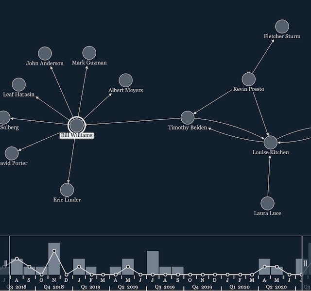
Let’s look at the time bar and how it makes visualizing time-based graph data a breeze. We’ll also...
Andrew Disney Marketing Director
24th December, 2020 | 6 min read
Let’s look at the time bar and how it makes visualizing time-based graph data a breeze. We’ll also...
Andrew Disney Marketing Director
18th November, 2020 | 8 min read
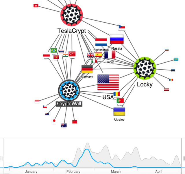
In this updated post, we explore popular dynamic network visualization methods, and look at how our data...
Catherine Kearns Content Strategist & Team Lead
3rd December, 2018 | 8 min read
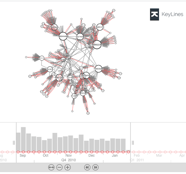
We integrate KeyLines with InfluxDB – a time series database (TSDB) – to see how it can help us...
Registered in England and Wales with Company Number 07625370 | VAT Number 113 1740 61
6-8 Hills Road, Cambridge, CB2 1JP. All material © Cambridge Intelligence .
Privacy Policy | Security Framework
