
How do you measure the value of adding data visualization to your web app?
If you choose to build a visualization component using a data visualization library, what is that investment worth?
And, when others ask how much the data visualization capability will contribute to the success of your product, what do you say?
We’ve blogged extensively about the qualitative justifications for choosing a toolkit approach for your visualization component. Now we have quantitative evidence too.
In this blog post I’ll present a simple method you can use to calculate the return on investment (ROI) of adding a data visualization element to your web app. The formula is useful to everyone – whether you’re a CEO at the early startup stage, a CTO reviewing a project proposal, or a product manager researching the advantages of using a third party vendor for visualization.
You’ll be able to justify whether or not data visualization is a sound investment that’ll reap rewards.

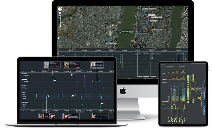
Beautiful visualizations, but what’s the return on your investment?
This is a constant dilemma for software product managers. If you sell a web app made exclusively from assembled off-the-shelf products, you’re not delivering home-grown expertise to your customers.
At the other extreme, if you build every component of your solution from scratch, you’re wasting valuable time, effort and budget reinventing the wheel. And your wheel may not be as good as the ones already out there.
What does this dilemma look like in the data visualization world? We’ve detailed this in our Product Manager’s guide to data visualization options, but here’s a quick summary.
The ‘buy’ data visualization component option
For this you’d need to source a ready-baked component that checked as many boxes as possible on your requirements list, slotted easily into your app, and whose maintenance and bug-fixing overhead didn’t take up too much of your dev team’s time. This only applies to graph visualization though. As far as we’re aware, there isn’t an off-the-shelf timeline analysis visualization available.
The ‘build’ data visualization component option
To create a component from scratch, your development team would need to set aside a significant amount of project time to make it happen. They’d need a WebGL and/or HTML5 for rendering, a bespoke events engine to support interactions, plus dedicated components for whatever specialist features your app needs to support (geospatial, social network algorithms, time analysis, etc).
The sweet spot = somewhere in between
There may be situations where a ‘buy’ or ‘build’ solution provides the maximum return on investment. But in most cases, the best ROI comes from the middle ground: integrate visualization into your application, but license that component from a 3rd party vendor.
This lets your development team quickly customize the component so it fits perfectly into your app, enhances the product and delivers a consistent experience to users, without the risks associated with going it alone.
Before we look at calculations, let’s explore other ways in which data visualization adds value.
The value of visualization
Adding data visualization to your web app is just one of many features that could provide value to your users, and it should be a priority.
According to 2022 research by Fortune Business Insights, the global data visualization market size is expected to reach $19.2 billion by 2027, with a compound annual growth rate of 10.2%.
A number of factors are driving this. The amount of data generated continues to grow exponentially – the International Data Corporation (IDC) predicts it’ll rise from 64.1 zettabytes in 2022 to 163 zettabytes by 2025 – so organizations need better tools to understand and analyze data at scale.
Also, industries that haven’t previously embraced visualization are turning to it to achieve greater insights. And there’s a growing need for data-driven decision making where the reasoning behind a business recommendation (the ‘why’) is as important as the recommendation itself (the ‘what’).
How do these factors affect the value of your product?
If you’ve done your competitor research, you may have found that visualization is a component of their products already. And if it isn’t, it’s probably on their roadmap. Don’t lose sales to the competition because they launched their data visualization component first.
Many of your prospective customers will have visualization capabilities high on their list of requirements. Similarly, existing customers want added value from their products, and may expect visualization as a necessary enhancement. Disappoint both and you limit your target market and increase customer churn.
Even if your competitor products do feature a data visualization element, how good are they? Eye-catching, beautifully-designed, interactive charts stand out in a crowded market. They give users an intuitive, customized experience that most off-the-shelf or homegrown solutions can’t match.
Finally, technology companies thrive on their reputations for innovation. If your products don’t keep up with current trends or meet the predicted needs of future data users, it can adversely affect your brand and reputation.
The precise value varies dramatically depending on the product and the importance of visualization in the web app. But, as you’ll see from our calculations later, it’s not unreasonable to suggest that a visualization feature could comprise 10% of the recurring sales revenue for your product.
How did we reach this figure? First we examined the costs involved.
ROI cost analysis
To calculate the value of any product feature, you need to look at the financial outlay at every stage across the business. Let’s dig into the 4 key areas of a visualization component’s lifecycle and compare the implications for a ‘build’ versus a ‘buy’ option, as well as our toolkit approach.
1. Development costs
For the ‘build’ option, you need to add up what it’ll cost to create the visualization component from scratch, including labor, materials, and other resources. For context, the combined development effort for KeyLines or ReGraph, our graph visualization APIs, and KronoGraph, our timeline visualization library, is dozens of developer years.
Building a component for your specific use case wouldn’t necessarily take you this long. You’d most likely build something to support just the features you’d need, whereas our robust APIs are designed with every possible feature to suit any use case. But the fundamentals still take time to get right – the basic drawing and rendering engine, for example.
We estimate that it’d take you a fraction of this time – 3 developer years – to design and code your own visualization component. That’s assuming your developers are working on this full time without other project distractions.

2. Integration costs
How much will it cost to integrate a data visualization component into your existing application? This affects both ‘build’ and ‘buy’ options. The cost includes development, testing and deployment costs, and usually comes from your development budget.
Smooth and fast integration isn’t something to take for granted. There can be major headaches around getting separate components to fit nicely together, and fit into your existing environment with minimal disruption. Our toolkits ‘just work’ in any environment. There are also detailed integration guides to help you connect with your favorite graph database or other data source.
If you license a component like one of our toolkits, you can customize the public API to match the look and feel of the rest of your app and deliver a consistent user experience. This does take some developer effort, but they’ll get expert support from the team that built the products.
The cost is also a fraction of what it’d be to build the entire thing from the ground up.
Most customers tell us that their developers got a basic visualization featuring their own data up and running within a day or two. They complete the full integration within a month, including customizing the appearance and behavior of the visualizations to match what your users expect, and testing the result.

3. Time to market
The most crucial deadline of all is how soon your product is available for users to buy. ‘Time is money’ isn’t just a cliche: the longer it takes to get your product to market, the later it’ll be before you start generating revenue.
If you’re building a product, there’s an important opportunity cost to consider. While your development team is busy building a visualization component from scratch, what other web app features are being pushed further down the product roadmap? What impact does this have on user demand?
With an off-the-shelf solution, you need to consider how smoothly the integration steps would be, and whether they’d impact your release date. If it’s open source, you’re relying on forums for help with support queries, and hoping somebody else has found, fixed and shared details about the issue you’re having. Stumble across a tricky problem or an unforeseen limitation in your ready-made component and it could put you back by weeks, even months.
A toolkit solution saves time, increases momentum and gets your product to market faster. Who wouldn’t prefer to get a head start on increased revenue?
4. Licensing costs
If you build your own data visualization component or use an open source, off-the-shelf solution, there’s an obvious major financial saving here.
Third party API libraries like ours come at a cost, because we’re a commercial business too. But that license gives you more than just access to comprehensive API libraries. It includes the cost of maintenance, ongoing technical support, access to hundreds of example code snippets, demos of what you can achieve with our toolkits, thorough documentation and tutorials plus frequent releases of new and updated features throughout the year.
Bonus consideration: the complexity tax
There is another factor you should consider.
Companies that build domain-focused products, such as cyber security or anti-fraud products recruit development teams with specific expertise. Web graphics and visualization design is a niche skill and not necessarily one your existing developers possess. You’d either need to hire specialists or contractors, or get your existing developers to switch focus and learn a difficult new technology.
Both of these options are time-consuming and expensive, and they take the focus of the development team away from the core technology where their expertise lies. Is that a sound investment?
The big reveal: how to calculate ROI
Disclaimer: we can’t post actual values here, because that depends on your product, your currency and the market you operate in.
What we have done is come up with simple formulas so you can work out what your own return on investment in a data visualization component would be. It’s based on what we’ve learned over years of experience working with organizations across the globe, and taking into consideration the costs outlined above. All you need to do is calculate your expected revenue to work out whether the return is worth the investment.
You’ll see a positive ROI if:
The licensing cost + the cost of 1 month’s development = <25% of expected revenue in the 1st year
You’ll see a strongly positive ROI if:
The licensing cost + the cost of 1 month’s development = <10% of expected revenue in the 1st year
You’ll see an exceptionally positive ROI if:
The licensing cost + the cost of 1 month’s development = <5% of expected revenue in the 1st year
To summarize, the smaller the expected revenue over 12 months compared with the licensing cost, the higher priority data visualization should be to your product.
Can you afford not to include data visualization in your app?
We hope you’ve found this review of your options and investment potential useful. If you want to talk about specific values to reach a more accurate calculation, get in touch and our team will be happy to help.
You can also try our graph and timeline data visualization toolkits for free. Simply request a trial to get started.
Share:
