
We’ve blogged before about the benefits of graph visualization SDKs over open source graph libraries. There are other data visualization options available too, such as off-the-shelf apps and popular diagramming tools. But which one is right for your project?
Product managers often lead the decision, weighing up the pros and cons of each option. That means assessing the long-term impact for the product, the end users, the development team, and others throughout the organization.
In this blog post I’ll explore that impact in more detail and think about the different stakeholders you need to keep in mind. To illustrate each point, I’ll use examples of our KeyLines, ReGraph and KronoGraph data visualization toolkits throughout.

Does it tick the right boxes for your C-suite executives?
Senior managers in your business are ultimately responsible for the commercial success of your product. At the very least they’ll want a management summary of each data visualization option, along with the impact they’ll have on cost, quality and time to market. Those three considerations are equally important: finding a free or cheaper solution is no good if it lacks essential features or takes a long time to integrate with your existing technology.
The money you save up front is canceled out pretty quickly if the development phase is extended, or sales forecasts don’t meet projections because customers buy from competitors selling feature-rich visualization apps. We’ve worked with teams who’ve chosen our technology after wasting months, or even years, wrangling with open source alternatives.
There’s fierce competition for applications featuring advanced data visualization capabilities. We see this in security and intelligence, fraud detection and cybersecurity markets, but the same is true in many other popular use cases.
Successful products need to stand out from the crowd, so you need to ask yourself, does the visualization option I’ve chosen deliver this? When you present your recommendation to senior management, will they experience that ‘wow’ moment we often get when we visualize data in front of a prospective customer for the first time? If the answer is yes, you can look forward to a similar response when you’re demonstrating it at a busy trade show or using it in an advertising campaign. You want your competitors to wish they’d chosen your option too.
Your C-suite executives also need to know that they’re working with a partner they can trust. We’ve spent years helping Fortune 500 companies, pioneering startups, national governments and more. Find out more about our customers
How can you guarantee happy users?
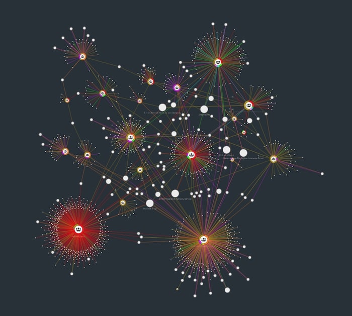
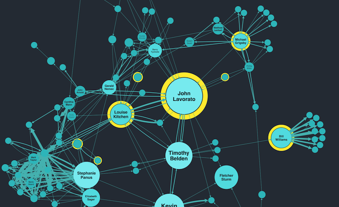
Your users have high expectations. They expect your visualization app to help them work better, faster and smarter. When they’re analyzing huge datasets, they want a tool that doesn’t compromise on performance, makes it easy to spot hidden connections and patterns, and reveals insights.
Do your other data visualization options tick all of these boxes? For example, diagramming tools help to create heavily-curated content (think Microsoft PowerPoint or Visio diagrams). The data is constrained to fit into a specific format such as an organization chart or flow diagram. They might produce great-looking images, but how good are they at representing fully interactive networks of relationships or integrating with your users’ favorite mapping tool?
Can users run complex queries at the touch of a button and visualize the results in seconds? Are there advanced algorithms built in that’ll reveal where the most important nodes in a network exist? You need graph visualization for this.
Another consideration that’s often overlooked is what kind of user experience you’re delivering. You want analysts or investigators to look forward to using your visualization tool and enjoy the time they spend on it, giving you the user ratings you deserve.
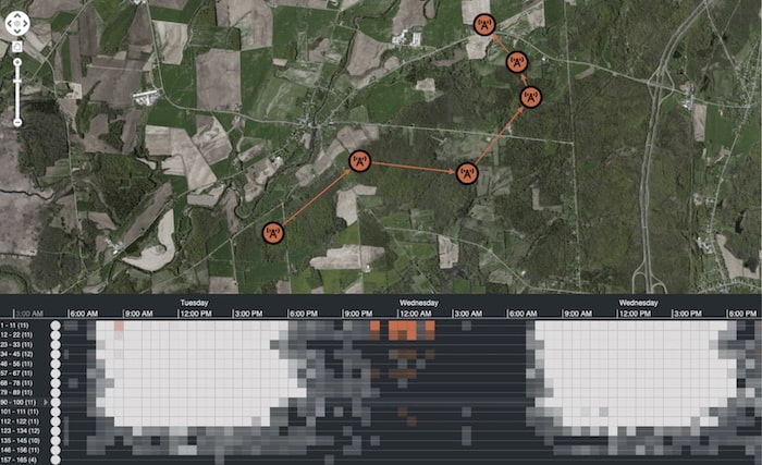
Users of our toolkit also benefit from an innovative way to explore their time-based data. Timeline analytics has become an essential technique of successful visualization tools over recent years. Our KronoGraph timeline visualization tool has helped pave the way for this, providing a unique way of understanding how complex sequences unfold.
It also integrates seamlessly with our graph visualization toolkits, providing users with two powerful views of the same data.
Of course, there are other ways to analyze time-based data, and some diagramming and open source visualization options do a decent job. But do they provide the same levels of interaction and customization that KronoGraph delivers?
What does your development team expect?
On the whole, developers love using new technology, but only if it meets their standards. They don’t want a steep learning curve, patchy documentation and unreliable (or non-existent) support. They need the flexibility to use their chosen frameworks and coding languages, smooth integration with their existing systems, plus easy-to-follow tutorials, guides and examples.
Our toolkits fit seamlessly inside your development environment – you can choose whatever system you want to integrate with and data source you want to visualize. Each intuitive API library is fully-documented, and there are interactive demos, stories and example code to save you coding from scratch. How do your other options compare?
Your developers also need to have confidence that the tool you want them to use has been tested rigorously by dedicated QA engineers. But no matter how many test cycles it’s gone through, you won’t find a piece of software that’s guaranteed to be bug free. It’s how the vendor deals with those bugs or other difficulties you’re facing when you report them that’s important.
For most open source data visualization options, your developers have two choices: rely on community forums for help and hope someone else has already fixed the same problem, or try and figure out their own workaround or solution.
Developers using our data visualization toolkits get expert technical support from the team that built the products. This is unique; most commercial data visualization options rely on first-line support teams. But we know how much developers value getting fast and thorough feedback from those who know the SDKs best. We also have live-coding playgrounds for every SDK, so you can share the exact issue you’re experiencing securely via a URL, and our developers will send you a tailored solution back.
What level of support can you expect from your alternative data visualization options?
Can you create the design you want without compromise?
Whether you have a dedicated design team or rely on a sole developer with a talent for UX and UI design, they’re probably not short of ambitious plans for how your visualization app should look and feel. How much of that ambition is realized, and how much has to be discarded because your chosen visualization tool can’t accommodate it?
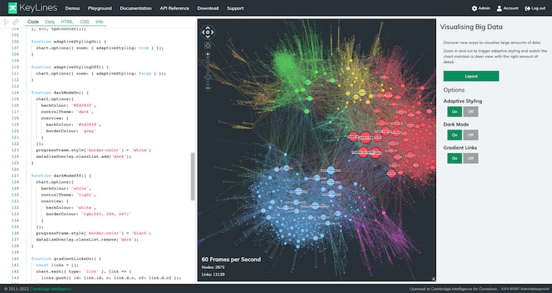
Our toolkit approach means you can customize every interaction and visual entity to suit the needs of your users. What are the limitations of your other options when it comes to customization? How many compromises do you need to make as a result?
We’re about to launch new major versions of our graph visualization toolkits, and the headline features provide infinitely flexible design options. It means designers are in complete control and can achieve exactly what they want without compromise.
Designers are under pressure to make data visualization components consistent with the overall design of the app. It should be seamlessly on brand, so users assume you built the entire thing from scratch. Some data visualization options don’t support this level of customization. When you do your competitor analysis, can you spot in an instant which apps have used an inflexible option? Your visualization component shouldn’t stand out for the wrong reasons.
Can it deliver your product vision?
As a product manager, you’re already used to juggling and prioritizing so many things, from customer needs to market research, competitor analysis to delivering company strategy. When you share your product roadmap with the rest of the business, you want them to see it as a reliable representation of your product vision.
Plans for new and enhanced features to make your product more powerful are great, but is your data visualization component going to make this possible or cause delays to your roadmap? Which of your data visualization options offers a frequent cadence for useful and eye-catching developments? How invested is your data visualization partner in your success? And how easy is it to speak to them?

Our development teams provide multiple, significant product releases throughout the year. We also have dedicated teams to help keep your product roadmap on track. Everyone who starts a free trial gets a customized demonstration of our tools, and our customer success team will work closely with you and your team at every stage of your evaluation process. We’ll help you to create a top-notch prototype to share with colleagues and senior managers.
Our customers benefit from being able to talk to their account manager or our product team at any time. You can also join our Connected Insights sessions throughout the year to learn how to maximize ROI, meet other data visualization practitioners and get a first look at our product roadmap.
Our data visualization tools FTW
Hopefully, this article has given you food for thought. The data visualization tool you choose will impact every aspect of your business, so it’s a big decision. If we’re on your shortlist, request a free free trial today – we can’t wait to start working with you.
Share:
