Deployment guide
Some tips to help you move from prototype to production
Congratulations!
You’ve evaluated graph visualization solutions, and decided our toolkits are right for you. We’re delighted to have you with us.
But what’s next? How will you transform your initial prototype into a production-ready visualization tool that your users love? Don’t worry – we’re here to help.
We’ve supported hundreds of product teams over the years, and created tutorials and guides that answer the most commonly asked questions.

Data modeling
When you’re kicking off a new visualization project, you’ll probably want to start coding right away. After all, you’re eager to see nodes in your charts and events in your timelines.
But we’ve found that teams who take time to plan their data and visual models are more likely to succeed than those who try to figure it out later on.
This is especially true when moving from prototype to production. You’re probably visualizing different data and will have some new, very important stakeholders: end-users. They’ll thank you for taking the time to create a clear, simple, and insightful model from the outset.
The ultimate guide to graph data modeling
How do you transform flat, tabular data into an intuitive graph model that will work for all your users? What becomes a node, a link, or an attribute?
This guide will help you decide.
Data visualization at scale
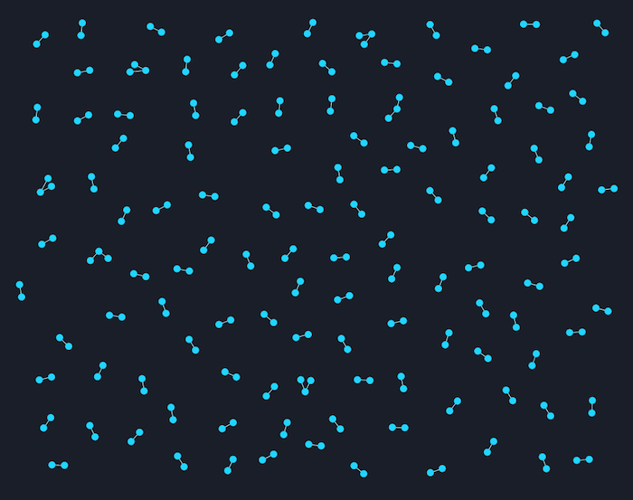
When you’re planning a data visualization, it’s tempting to put all your data in at once, and assume your users will find the answers they need. This rarely works.
Most people can store between 4 and 7 items in their short-term memory, so you’ll need to bring your data down to a more human-friendly scale.
There are plenty of straightforward strategies and techniques to help you do this. Many of them are useful analysis techniques in their own right, so users will discover new and unexpected insights along the way.
Five steps to tackle big graph data visualization
How do you turn millions (or billions) of nodes into something your users will understand?
The data funnel, combined with KeyLines’ and ReGraph’s functionality, makes it simple.
Common first-time problems
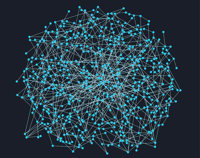
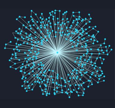
It makes every graph pro’s heart sink: you’ve created a great visualization application, designed a bullet-proof data model and visual model, and you’re ready to see your data for the first time. But you click ‘load’ and… it’s a mess.
Hairballs, snowstorms and starbursts. They’re a problem for many graph visualization projects, obscuring data and preventing users from finding the insight they need. But we have solutions – click on the images below to learn more.
UI and UX
The best data in the world is useless if your users can’t access it. A carefully designed, intuitive user experience (UX) makes all the difference.
You need to think about the user experience on two levels: with the visualization, and with the wider application.
Designing intuitive data experiences
With the right approach to graph visualization UX and UI, even the most complex visualizations can become intuitive tools for discovery – not frustration.
Let’s explore how thoughtful design transforms graph visualizations from overwhelming to empowering.
Building accessible applications
Nearly 15% of people have a disability that could impact their ability to use software. Accessibility is essential.
Help your team design graph UIs that are more usable, inclusive, and effective from the start – not added as an afterthought.

Get inspired
Any guide to using our products can only really scratch the surface. The advantage of an SDK is the flexibility it gives to create applications that are 100% customized to your users, their data and the questions they need to answer.
With that in mind, here are some other places you can find more information.
Find some inspiration
We work with almost 300 organizations worldwide, who use our technology in countless ways – from stopping cyber attacks to detecting fraud.
Some of them have kindly agreed to share their work through case studies. Take a look behind the scenes and get inspiration from other teams who are facing similar challenges to you.

Join our online conversations
Connected Insights is our series of free online conversations and training to help you make the most of your investment in data visualization. Our regular sessions are a great way to connect with peers and discuss your projects and experiences with our team, either face-to-face or virtually.
Look out for our email invitations, or visit the events page for more information.

Check out the SDKs, or ask for support
You’ll find a wealth of resources on each of our products’ SDK sites.
They include ‘getting started’ tutorials, copyable demos, full API documentation and articles explaining common problems or answering frequently asked questions.
If there’s something you can’t find, our dedicated support team is always on hand.
- For KeyLines, email: [email protected]
- For ReGraph, email: [email protected]
- For KronoGraph, email: [email protected]