
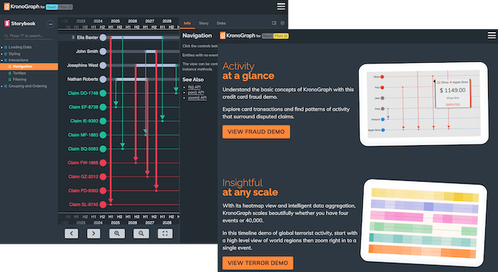
Our new KronoGraph JavaScript timeline visualization toolkit is easy to use, producing beautiful, interactive timelines directly from your data.
If you’re a developer, the good news is that you get to decide which coding language is best for your application. KronoGraph has a plain JavaScript API that you can adapt to any framework, or a React component to quickly drop into React applications.
Next time we’ll focus on React, but in this blog, I’ll show you how to create a timeline visualization using the JavaScript API. And just for fun, it takes a closer look at the chronology of MI6’s most famous secret agent’s luxury accessories.
Start building your JavaScript timeline analysis tool
There are many use cases that’d benefit from visualization timeline data. To celebrate all things time-related, I decided to have a go at visualizing the watches worn by James Bond. Bond’s fans have been quick to identify (almost) every watch worn by their hero.
KronoGraph works with almost any data store. As long as your data has timestamp or duration properties and can be parsed into a JSON object, KronoGraph can visualize it. I created a CSV file of our data then converted it – simple.
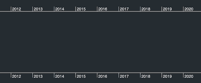
To begin, I followed the simple getting started guide on the KronoGraph SDK site, downloaded the toolkit, and ran the simple recommended Parcel setup to quickly get to an empty timeline.
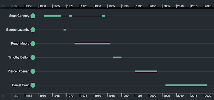
Now I’m ready to load data into my JavaScript timeline analysis app. Let’s start with a simple chronology of Bond actors. Each one is represented as an entity in the timeline, keyed by an id, and with a simple type which we’ll make use of later:
const entities = { "Sean Connery”: { type: "actor" } };
Using types in this way achieves two things:
- We can separate different kinds of entities from each other in the layout. I want actors to appear at the top, with watches underneath.
- We can apply styling to types, so that I don’t have to style each entity separately.
Next I’ll add events to my data. The first kind of event is the time period during which each actor played Bond. This event applies to a particular entity (the actor), and has a corresponding start and end timestamp. An example event looks like this:
const events = {
  "Period1": {
    entityIds: ["Sean Connery"],
    time: {
      start: new Date("1962"),
      end: new Date("1967")
    },
  },
};
Now I’ll add all the actors and dates to my data, and then simply call timeline.set() with my entities and events. From the snippets of JavaScript I’ve used already, I can see the beginnings of my timeline visualization.
So far so good, but currently our timeline doesn’t reflect 007’s love of all things stylish. We’ll fix that next.
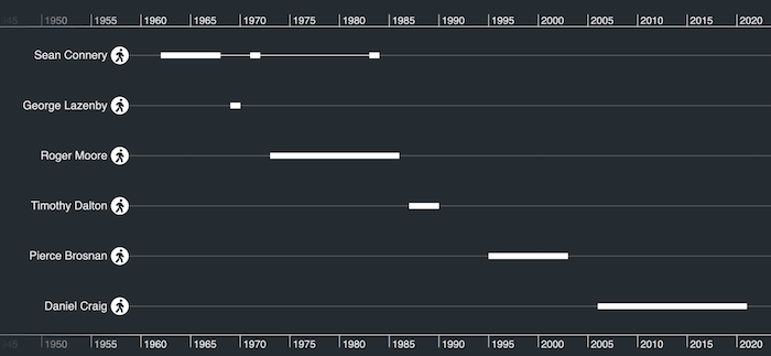
Styling timeline visualizations
There are plenty of options to give your timeline visualizations a custom look ‘n’ feel. Let’s make use of KronoGraph’s simple type styling to define how we want each actor to be displayed. To do this, I’ll add an entityTypes object to our data:
const entityTypes = {
    actor: {
      color: "#ffffff",
      fontIcon: {
        text: "uf554",
        color: "black",
        scale: 1.5,
        fontFamily: "Font Awesome 5 Free Solid",
      }
   }
}
With the relevant font icon preloaded into my page, I can give my timelines more of a real-world feel.
Looking good! Now let’s add the watch data. First I’ll add more entities for each watch. I’d like to group watches by their brand, so I’ll use the data property to do this:
"Omega Seamaster Aqua Terra Ref. 231.10.42.221.03.001": {
      type: "Omega",
      data: { brand: "Omega" },
}
I’ll also add more events, one for each movie, which connect watches to the actor who wore them. For example:
"observation9": {
      entityIds:    ["Sean Connery", "Gruen Precision 510"],
      time: new Date ("1971"),
}
I’ll use watch icons to represent each timepiece, and distinct colors to draw attention to different brands. Let’s make use of the JavaScript API’s style inheritance to do this. Each new watch type inherits from a base type of ‘watch’:
entityTypes: {
    watch: {
      color: "white",
      fontIcon: {
        text: "uf017",
        color: "black",
        scale: 1.8,
        fontFamily: "Font Awesome 5 Free Solid",
      },
    },
    Rolex: {
      baseType: "watch",
      color: "#ff9147",
    },
	...etc.
The result gives us a powerful representation of different brands and models.
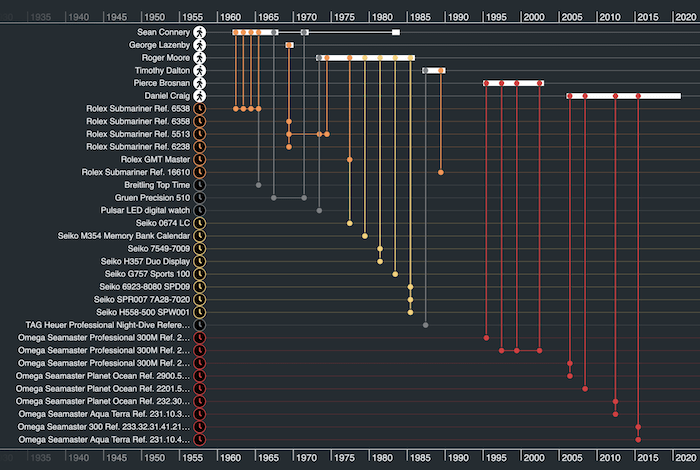
Not bad, eh? But do we need to see so many individual watch models? Let’s look at decluttering our Bond-themed timelines.
Using groups to simplify our timeline visualization
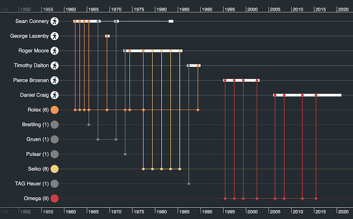
Let’s add another property to my ‘watch’ type, to group by brand:
groupBy: ["brand"]
Now we see a nice summary of how the watches chosen by Bond have evolved over time.
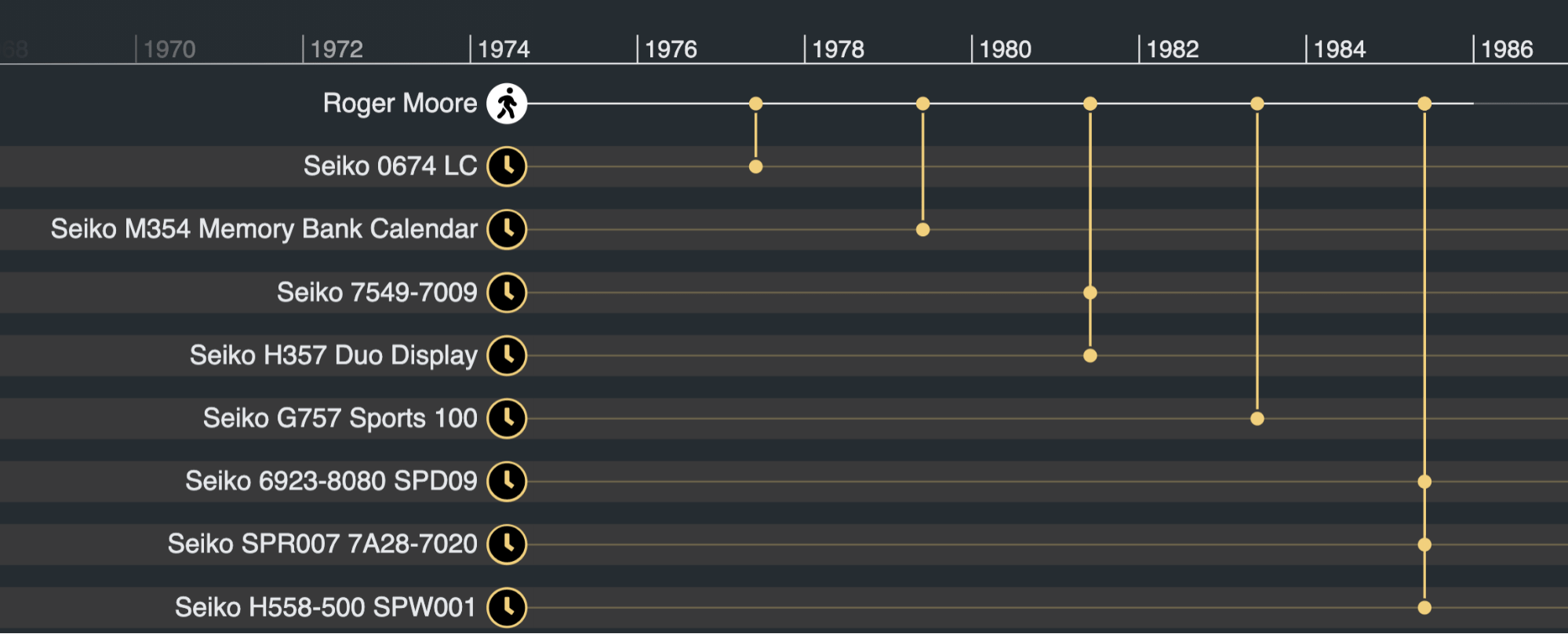
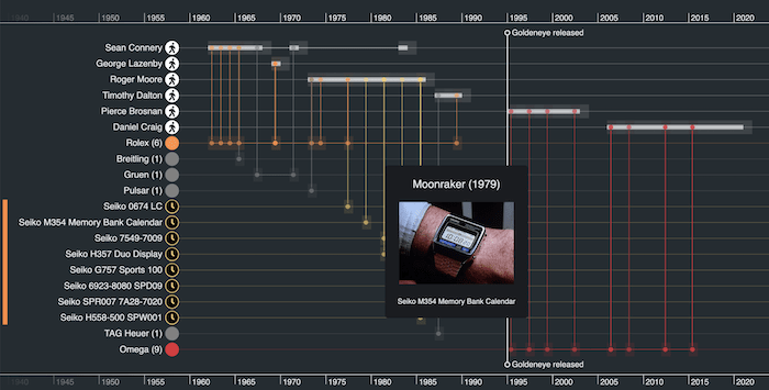
Our JavaScript-built timeline visualization is fully interactive. With a double-click, we can focus on a particular actor or watch to drill down into a mini-timeline of items of interest. Here’s evidence of Roger Moore’s penchant for digital Seiko watches in the 1980s.
You can also see the big shift to Omega watches that happened when the Bond franchise relaunched in the 1990s with the release of GoldenEye. Let’s add some simple JavaScript code to call this out explicitly with a marker:
  timeline.markers([
    {
      label: "Goldeneye released",
      time: new Date("1995"),
    },
  ]);
Markers are a great way to provide context to your timelines with relevant events of interest.
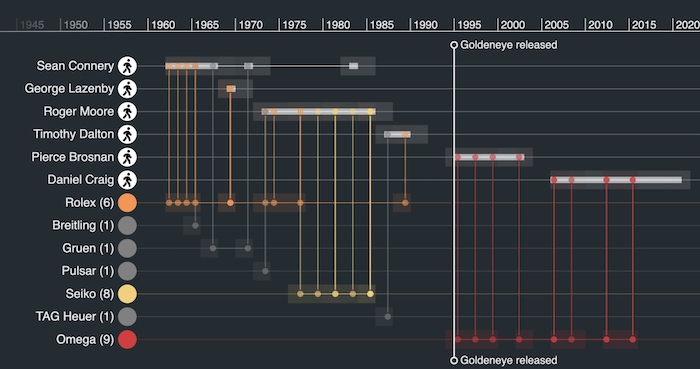
I’ve also added a subtle heatmap effect here, to group the related events together and make them stand out.
The fully interactive timelines users need
Finally, let’s try out KronoGraph’s interaction model, by attaching a handler to the hover event that shows a tooltip:
const handleHover = ({ id, x, y }) => {
  const event = id === undefined ? null : timeline.getEvent(id);
  if (event) {
    showTooltip({ x, y, id });
  } else {
    hideTooltip();
  }
  return false;
};
timeline.on("hover", handleHover);
My simple JavaScript tooltip code shows and hides an HTML tooltip with fields populated for the relevant movie and an associated image. And there you have it – an interactive James Bond KronoGraph of chronographs!
Build your own JavaScript timeline analysis tool
In this JavaScript example, I’ve demonstrated how easy it is to build a simple timeline visualization and add styling, grouping and interactions to bring the data to life. Our next KronoGraph tutorial explains how easy it is to create a timeline visualization for your React application.
If you’d like to have a go at building a timeline of your own data, request a free trial account.
Share:
