The ultimate guide to graph visualization
Everything you need to start designing your best graph visualization application.
When you look at an interactive graph visualization for the first time it can be a little intimidating, no matter how tech-savvy you are.
The best way to get new users comfortable with a graph is to make every touch point look and feel familiar. Design an interactive graph visualization app with cues that are used as standard across the web already, and analysts will find the experience intuitive right away.
The next version of ReGraph, our interactive graph visualization toolkit for React developers, includes a new event type that makes it easier to style every hover and select action to match your users’ expectations.
In this blog post, we look at 4 ways your users will benefit from ReGraph’s new event type, and how it works under the hood. Our focus is on a graph visualization product built to detect fraud at a financial institution, but the key recommendations apply to every one of our use cases.
We’ll also look at what’s new in the latest releases of our data visualization toolkits.
“Why graph visualization?” is a question we’ve addressed many times. By visualizing complex data, users can reveal the unexpected connections and hidden patterns your business needs to understand.
A sensible follow-up question is: “why interactive graph visualization?”. The alternative is a static diagram that might look great but doesn’t give users the tools they need to interrogate the data dynamically to reveal threats and uncover insight. There has to be a two-way flow of information between the graph visualization app and the user. The interactive element is key.
For any app-based design project to succeed, you need to make it easy for users to discover what features are available. And the more natural the discoverability is, the quicker they learn how to use it. [For more on this, here’s a useful article from the Interaction Design Foundation.]
Most interactive graph visualizations are driven by hovers, selections and drags. But how does the user know that clicking on a particular thing will do something?
If you want users to feel comfortable using a graph visualization, you need intuitive visual cues to encourage them to explore the graph.
Let’s check out some simple examples.
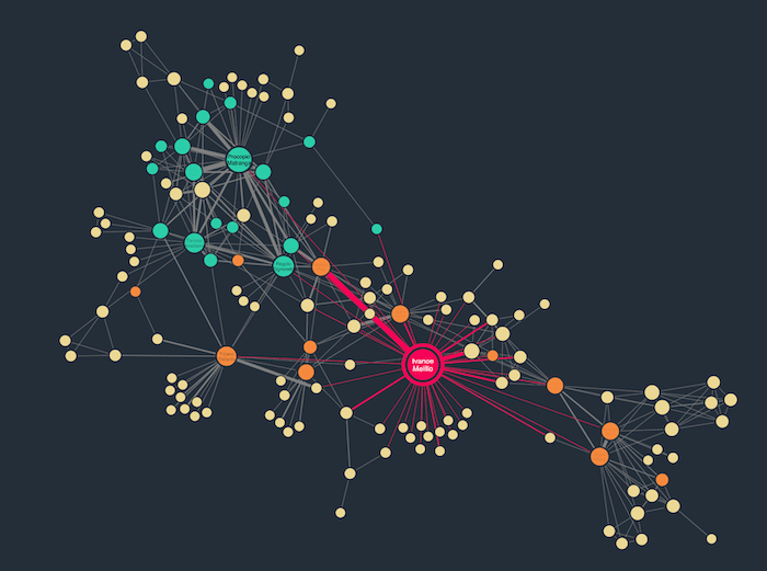
Our anti-fraud use case focuses on a recent rise in customers reporting bogus text messages claiming to be from their bank.
Here’s our analyst connecting individual customers to phone numbers from which scam text messages were sent.
The glyph + decoration at the top right of each node offers a useful visual cue: as you drag from one node to another, the node and glyph’s opacity increases while the link is drawn. It’s a very subtle change but it’s enough to reassure the user that they’re in the process of successfully creating a link.
Once you’ve convinced the user to click on something, what happens next?
In ReGraph, clicking on a node, selects that node. This is a useful property to help users keep track of an item of interest in the graph, but it can also drive additional behaviors.
Default styling in ReGraph highlights a selected node with a red border and emphasizes the label in a similar way.
With the new feature, it’ll be easier than ever to provide custom styling to selected items.
Continuing with our anti-fraud example, the customer and telephone number nodes have very different styles so they’re easy to distinguish. We can maintain those differences in our interactive graph visualization when we select items too.
Everything you need to start designing your best graph visualization application.
Traditional text-based menus can look clumsy and inelegant in an interactive graph visualization. They may clutter the chart and cause unnecessary distraction.
A cleaner, more intuitive solution is to reveal menus as donuts when a user selects a node. With each donut segment representing a different menu option, it’s a stylish way to add powerful, easily-discoverable functionality.
Here, our simple donut menu gives users three options – bring in additional customer nodes of interest from the backend, mark suspicious SMSs for further investigation, or delete nodes that are no longer relevant. The carefully chosen icons that represent each option are instantly recognizable.
We don’t have to stop at styling just the node that has been selected. You can easily do more complex things like style its neighbors – those other nodes that are linked to your selection. In this way, we’re going far beyond providing users with a few helpful visual cues: we’re surfacing analytical capabilities.
In complex interactive graph visualizations, revealing neighbors helps to highlight the key connections worth investigating further. For our anti-fraud use case, perhaps analysts want to see the chain of events that caused customers tricked by the text message fraudsters to add sensitive data to a phishing web form.
ReGraph is designed for React, so it relies on a component-based state model. The good news for your app developers is that they don’t need to keep track of styling as part of the state. That’s because, in the next ReGraph version, we’ve abstracted hover and selection styles to a new chart event: onItemInteraction.
const onItemInteractionHandler = ({ id, item, hovered, setStyle }) => {
  if (item.data.type == 'sms' && hovered) {
    setStyle({
      [id]: {
        border: { color: '#f58c84' },
        fontIcon: { color: '#f9bebd' },
        glyphs: [{ color: '#f9bebd', size: 1.3 }],
      }
    })
  }
}
Every time the onItemInteraction event fires when an item in the chart is hovered over or selected, you can apply whatever styling you want. And once you stop hovering over a particular item or deselect it, ReGraph automatically removes the extra styling without the need for an additional setState call to put everything back.
We’ve demonstrated 4 simple but effective styles you’ll be able to apply to hover and selection behavior using the next ReGraph version. It’ll be much easier to implement whichever style you want – the hardest part is identifying which visual cues your users prefer.
To get started with your own interactive graph visualization styling, request a free trial.
Here’s what’s new in the latest updates to our data visualization toolkits.
Registered in England and Wales with Company Number 07625370 | VAT Number 113 1740 61
6-8 Hills Road, Cambridge, CB2 1JP. All material © Cambridge Intelligence .
Privacy Policy | Security Framework


