FREE: Start your trial today
Visualize your data! Request full access to our SDKs, demos and live-coding playgrounds.
With every version of our KeyLines and ReGraph graph visualization toolkits, we aim to share new features that your users will love working with. Our latest release is no exception.
You can now apply advanced node customization to your open combos, and add powerful, interactive glyphs too. We’ve also introduced an intuitive way to aggregate multiple links and keep charts clutter free.
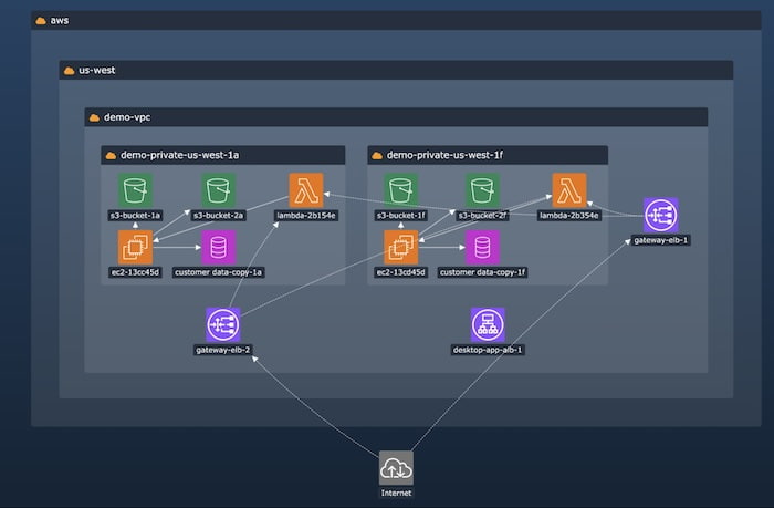
There’s no need to compromise on the look and feel of your graph visualizations – open combos now benefit from near-limitless customization options. Whether you want to add multiple labels, customize label positions or style them to match the rest of your app, you can bring your consistent product design vision to life.

To demonstrate these style updates, you’ll find a new KeyLines Cloud Security demo and ReGraph showcase on the SDK sites.
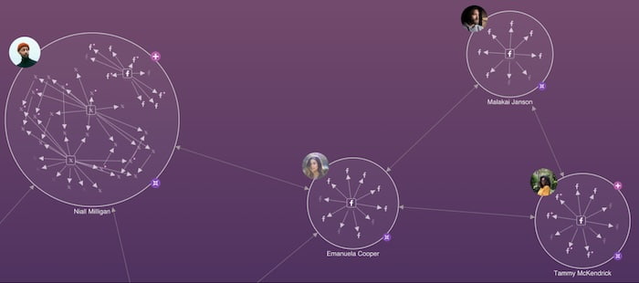
Glyphs are a powerful and versatile design element – position them where you like and use them as decoration, a source of property information, or even as an interactive control with customizable actions. They’re a popular choice for adding value to nodes and closed combos: now you can style open combos with them too.

To showcase some of the many ways glyphs can be used to powerful effect on open combos, check out the newly-revamped Social Media Analysis demo on the KeyLines SDK.
Combos are an effective way to group related nodes in busy charts. New aggregated links apply the same logic to the connections between nodes and combos.
If a pair of chart items have multiple links between them, you can end up with masses of connection loops that clutter the chart and make it look messy. By aggregating those links, you see a cleaner visualization with the details of each underlying link still available on demand. Style them with glyphs to summarize the number of links inside, and customize them to match the rest of your chart items.
To see examples in a supply chain scenario, head to the KeyLines Aggregating Links demo, or the ReGraph Basic Link Aggregation story.
If you’re an existing user, simply download the latest version from the KeyLines or ReGraph SDK site to take advantage of these great features. And if you’re new to us but want to try out these features for yourself, sign up for a free trial today.