FREE: Start your trial today
Visualize your data! Request full access to our SDKs, demos and live-coding playgrounds.
Since we first launched rectangular combos, we’ve had many positive responses from our graph visualization toolkit customers. This stylish alternative to traditional circular combos offers a great space-saving solution for busy charts, and a slick way to arrange subgroups of nodes in a grid formation.
With our latest toolkit releases, we’re excited to announce that rectangular combos have moved from alpha to beta development, so you can now use them in your production environments.
Read on to find out how we improved rectangular combos, and discover what else is new in KeyLines 6.6, ReGraph 3.3 and KronoGraph 1.7.
You’ll notice how rectangular combos using grid arrangements now keep their neat shape at all times. You won’t see overlaps, even after opening or closing combos or transferring items.
Rectangular combos are a good option when you’re visualizing levels or hierarchies of data. This kind of data works best with our sequential layout, so we’ve improved the way that layout works with this combo type. By preserving the sequential layout of the chart through every combo action, the chart maintains the tiered arrangement your users expect.
To see rectangular combos in action, try the updated Arranging IT Networks KeyLines demo, or the ReGraph Static Combos story.
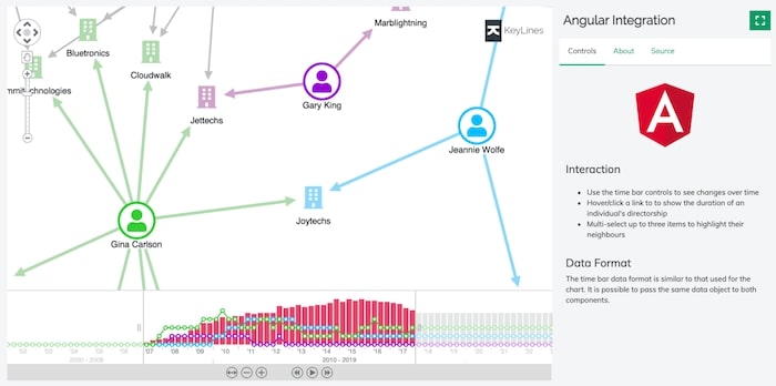
Version 12 is the latest major release of Angular, and an important step on their road to converging with Angular Ivy.

Using dark mode for your React graph visualizations?
You can now apply dark mode to your ReGraph navigation controls and overview window without resorting to custom controls. Try it for yourself in the Dark Mode story, one of many interactive examples in ReGraph’s Storybook.
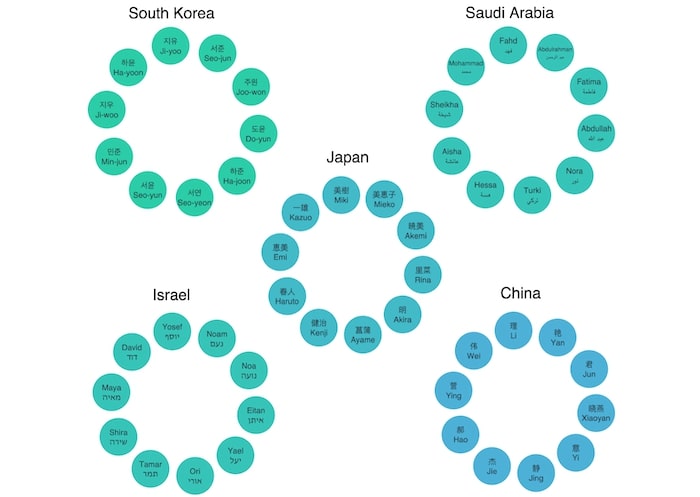
You’ll also find a new story for Right to Left Text. It demonstrates how ReGraph now applies right-to-left (RTL) support automatically whenever it detects RTL characters. This means users will always see their RTL or bidirectional text rendered correctly.

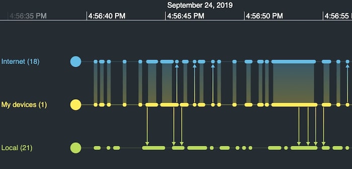
Many of our graph visualization users integrate their apps with KronoGraph, our timeline visual analysis tool. They’ve enjoyed some significant updates lately, including a new Playground for live code editing, smoother transition options for heatmaps, and an elegant grouping option for summarizing events.

KeyLines and ReGraph SDKs have showcase demos that integrate graph visualizations with KronoGraph timelines. Each demo has been updated to include the latest KronoGraph improvements, so it’s worth checking them out.
Our experts have spent years developing high quality data visualization toolkits. They’re used by some of the world’s most successful intelligence, cyber security and fraud detection organizations.
To find out why they choose our SDKs, request a free trial of KeyLines, ReGraph or KronoGraph.