Customer 360 visualization – or the drive towards a single, definitive view of the customer – is an area of growing investment. From banking and retail to government and healthcare, the effective use of data drives better service, a more engaging customer experience and significant bottom-line results.
In this blog post, we’ll see how customer 360 visualization, with graph analytics, gives a unified picture of customers.
What is Customer 360?
Customer 360 projects collate and integrate all the information an organization holds about its customers. This could be demographic data, buying history, web analytics, or information from any other channel. Visualizing this data enables them to make predictions about future customer behavior and take the actions needed to reduce churn, improve service and increase revenue.
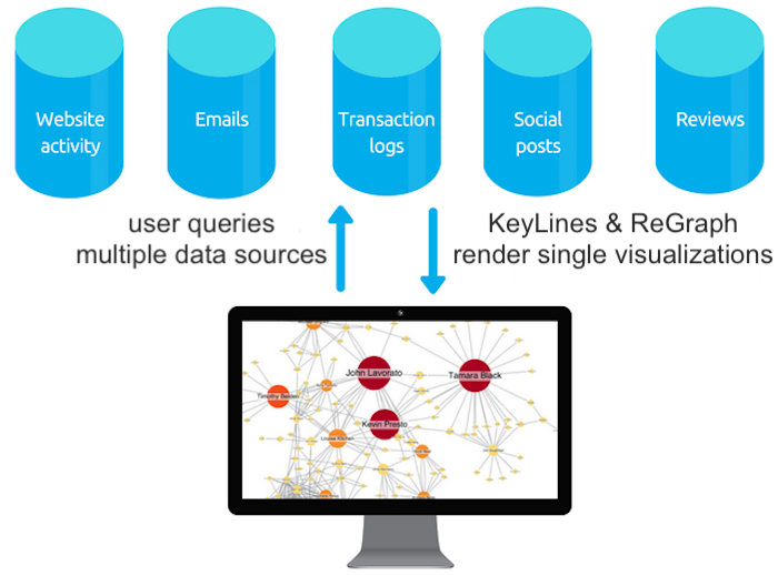
The role of graph visualization in Customer 360 projects
There are two approaches to Customer 360 visualization:
The global approach
Visualizing large amounts of data about many customers in one chart to find trends and patterns. This is great for making high-level product or organizational decisions.
The local approach
Visualizing information about a specific customer to quickly see their account history. This is great for customer-facing teams who need reliable and fast insight to decide on the best course of action.
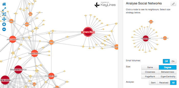
Customer 360 platforms, enhanced with graph visualization, can:
- Increase sales: Visualizing customer touchpoints as a graph reveals buying trends that can be exploited to increase sales.
- Decrease churn: Customer behavior is a key indicator of their propensity to churn. Visualizing their behavior as a graph makes it easier to spot key indicators and take quick action to rectify any problems.
- Improve customer service: With graph visualization, customer-facing staff get an ‘at a glance’ view of the customer so they can understand their history faster and provide better service.
Customer 360 in action
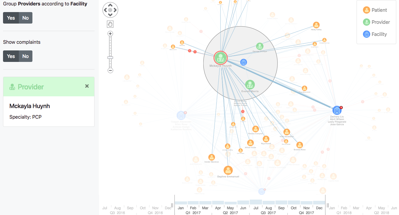
The fictitious dataset below represents part of a city’s healthcare system. We’ve color-coded nodes to make them easy to identify:
- Blue nodes are medical facilities
- Green nodes are doctors
- Orange nodes are patients
We’ve styled the links too. The light blue links represent patient visits or doctor referrals, and the red glyphs on links are complaints made by a patient against a provider. Links are weighted by volume of visits and referrals.
Our graph visualization toolkits come with some handy features to help uncover useful insight.
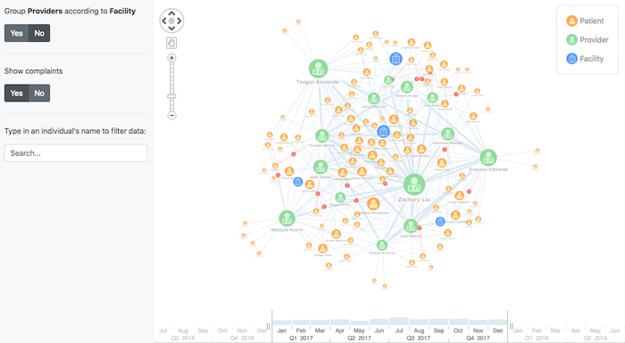
1. Get a global and local view with combos
Using combos – our powerful node-grouping functionality – we can group the doctors by the facilities they work in, instantly removing clutter.
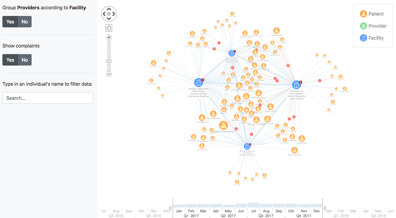
This gives a clearer high-level view of the connections between patient and facility, which we can drill into further.
Here, combos help us switch from a global view to a local view, giving trend insight for one audience and individual node-level insight to another audience.
2. Visualize dynamic networks with the time bar
Using the time bar, we can explore how data changes over time.
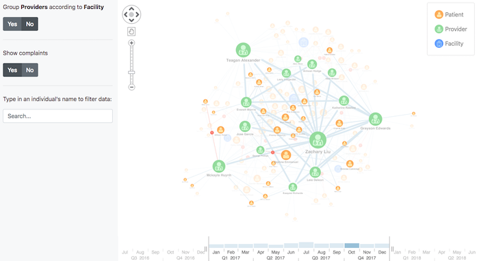
We can bring to the foreground only the appointments that occurred in a particular month and “ghost” the rest of the data.
3. Reduce network noise with filtering
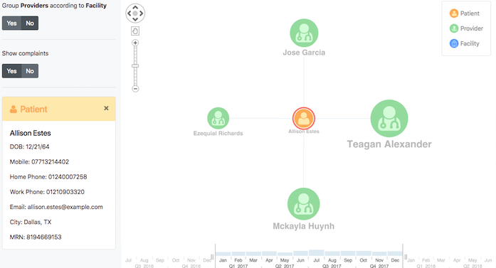
Another powerful feature is the filtering tool. This filters out the noise so we can focus on the most important data points.
Focusing on one of the patients, Allison Estes, we can see the doctors she’s had appointments with. The side panel shows additional information, including her date of birth and contact details. This comes from a separate records database, collated in a graph visualization, helping to establish a 360-degree view of a customer.
We can see that Jose Garcia has received a few complaints, with three of them coming from one patient, Rachel Jackson. Focusing on Rachel, we see she has complained about other doctors too.
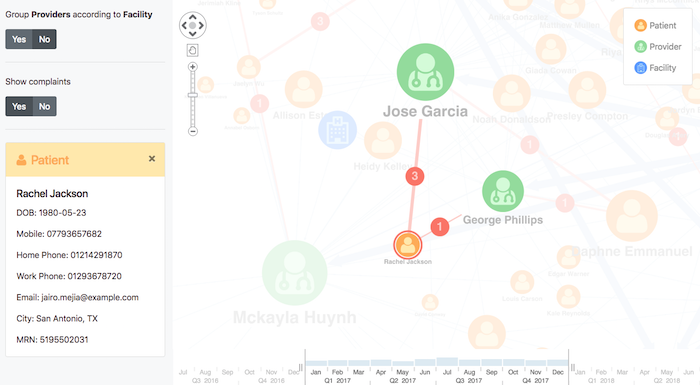
Is there a quality issue associated with these doctors? This is a starting point an analyst can use for further investigation.
Power Customer 360 with our toolkits
Customer 360 is a complex data challenge, but graph visualization makes information accessible and easy to understand. Our toolkits offer a huge range of useful functionality, designed to enrich and reveal insight in your data visualizations.
Get a step closer to obtaining a 360-degree view of your customers – request a free trial.


