FREE: Buyer's guide to graph visualization
This practical guide to choosing the right technology for your project includes a handy comparison template.
Connected data is everywhere, and it’s growing at an exponential rate. It’s predicted that by 2025, there’ll be 175 zettabytes of data in the global datasphere.
We’ve found that, for many organizations, ‘big data’ means collecting every bit of information available – call records, financial transactions, email traffic, etc. – then figuring out how to use it.
It’s a costly challenge: once you’ve invested heavily in gathering the data, how do you uncover the value hidden inside it?
The first step is to get the data into a format that anyone can explore and understand. That’s where interactive data visualization comes in.
It’s the most effective way to bring your data to life, revealing patterns and connections that’d be difficult to find in millions of rows of raw data. The value comes from making the data accessible to users, turning something unusable into a powerful source of insight.
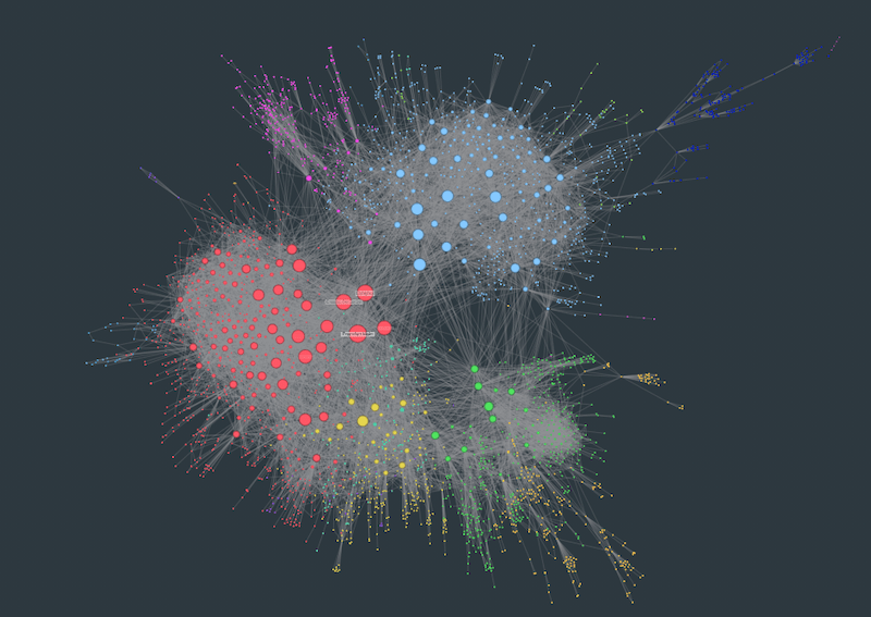
Exploring data visually instantly makes sense, even to people who’ve never worked with complex connected data before. That’s because our brains are great at spotting patterns, but only when they’re presented in a tangible format.
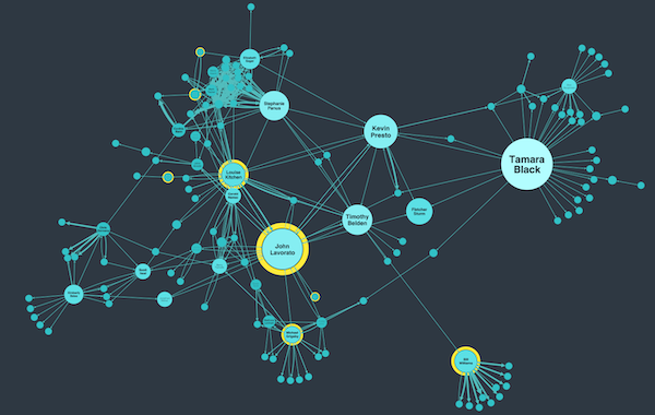
Most adults can only store between 4 and 7 items in their short term memory, so we’re definitely not big data creatures. It’s not enough just to present a huge dataset in a visual way; data visualization applications must also provide the tools to simplify complexity, filter out noise, and drill down on the right details.
By interacting with the data, changing the way it’s laid out, running sophisticated algorithms at the touch of a button, plotting the data onto maps, users gain much deeper knowledge and understanding.
Our focus is on connected data visualization, primarily:
Combine both graph and timeline visualization, and you get a powerful 360-degree view of your dataset.
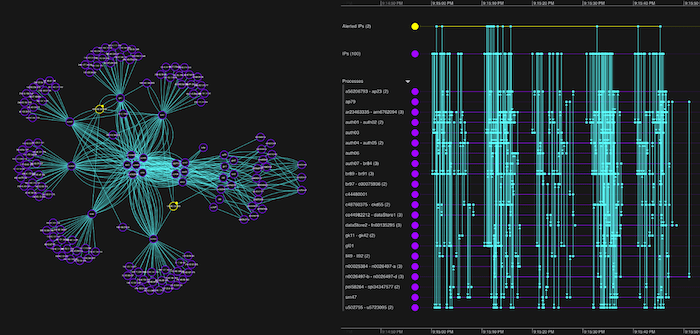
This style of data visualization isn’t new – law enforcement and government agencies have used visual link and timeline analysis for decades to help ‘join the dots’ in their investigations. But the visualization tools they used were inflexible, complex and available to only a select few expert analysts.
What has changed in recent years is the availability of technology like ours that makes understanding connected data a simpler, scalable process.
For many years, our technology has helped drive the success of organizations working in fraud detection, security and intelligence, and cyber security. We’re now working with many other industries worldwide that recognize the untapped possibilities in the connected data they’re collecting.
Broader domains including compliance, healthcare, business intelligence, supply chain management and IT infrastructure all benefit from exploring data and uncovering important insight. See our use cases
According to a 2021 Gartner report, the graph technology market has huge growth potential as it “forms the foundation of modern data and analytics”.
Once you’ve invested in your graph data stack, you need to find the best way to access the data and the insight it holds. You need data visualization tools that’ll integrate quickly and easily with any data source. That’s exactly what our technology does.
The most popular integration option is the graph database. Graph data is perfect for visualizing because the relationships in the data are as important as the data itself. And all the things we need to be able to visualize the data – connections, entities and properties – are built-in already.
The graph technology market is driven by scalable and robust graph databases like Neo4j, Amazon Neptune and Microsoft Azure CosmosDB. Through seamless integration with whichever graph database you choose, getting started with graph visualization has never been easier.
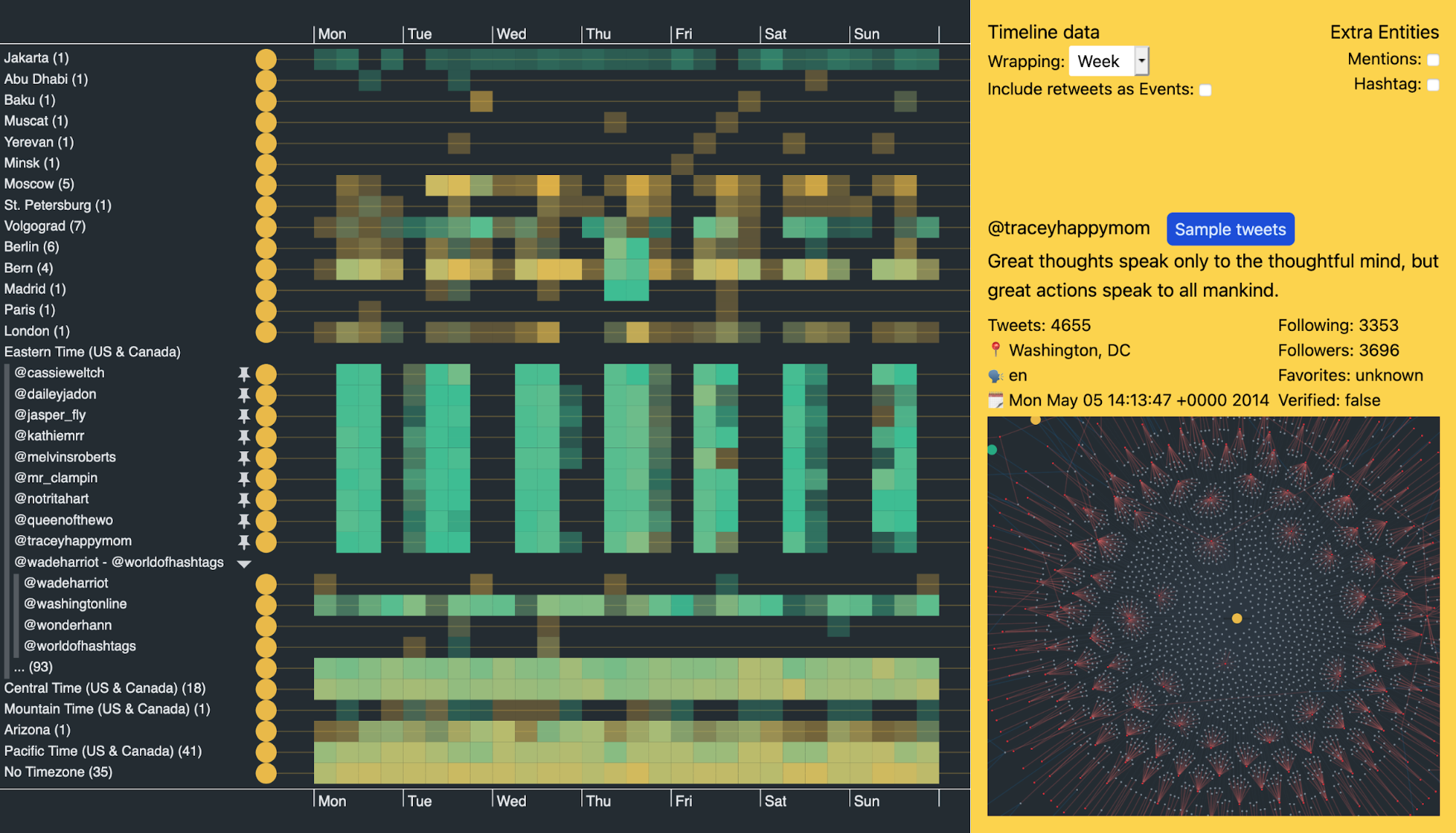
The future looks bright for data visualization as more and more organizations recognize the need to get the right return on investment in data collection, storage and management.
With graph and timeline visualization, the focus is always on the most valuable element: the data itself. By making that data accessible and providing easy-to-use analytical capabilities, users uncover hidden insight fast.
To talk to one of our experts about your connected data visualization project, get in touch or request a free trial.